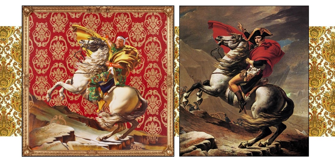
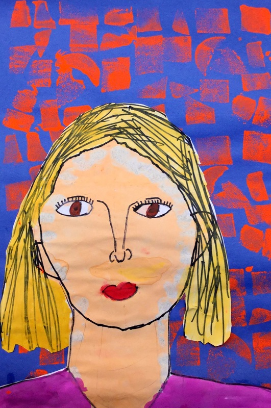
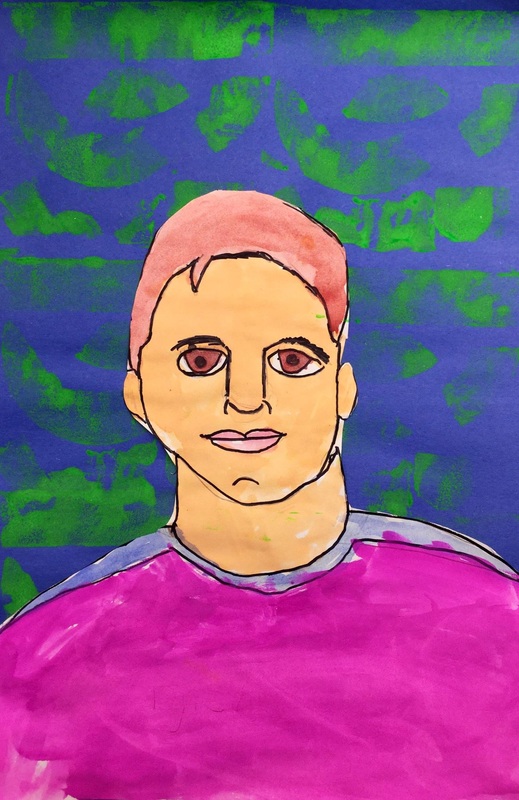
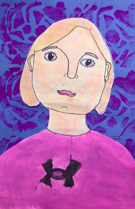
 Kehinde's painting can be seen to the left and the picture that he based it on is to the right. My goal with 3rd grade this is to introduce them to a completely contemporary curriculum. They will be introduced to famous artists of the past all throughout their life. I want to shed light on artists of today. This is an area that is typically overlooked when teaching. Kicking off the year, we learned about one of my favorite artists, Kehinde Wiley. Kehinde is an African-American portrait artist. Growing up in a rough neighborhood in LA, his mom enrolled him in as many art classes as she could to keep him out of trouble and this really fostered his artful side. His work focuses on the lack of black people throughout art history. He has taken it upon himself to re-paint history. His work shows appropriated paintings from master painters. However, he replaces typically white powerful men in the paintings with young black men in their hip hop/urban attire. He also replaces the traditional background with a patterned one that is influenced by the depicted man’s culture. While our school is vastly of Euro-American decent, the students were super interested in Kehinde’s work and his struggle to give blacks a place in art history. The first day of class was spent talking and practicing drawing self-portraits. I gave them 5 minutes to draw a self-portrait without any help from me. Nearly all students drew their self-portraits with their eyes on their foreheads, their nose where their eyes belong, etc. After the five minutes, we re-convened and I talked to them about where each facial feature actually belongs. After their crash course in portraits, they began working on a larger final version of their self-portrait. The 2nd day of class is when I introduced Kehinde’s work to them. They continued to work on their self-portraits and if they finished early, they began tracing their self-portraits with a sharpie. The 3rd day of class we finished up drawing and tracing and erasing our self-portraits. Then students painted their respective skin tones. If they finished all of that, they began working on a stamp that we would use to print their backgrounds. The 4th day was spent painting the rest of their self-portrait (hair, clothes, eyes, etc). They also continued working on their background stamp. The background stamp consisted of a piece of tagboard with pieces of foam attached to it. The previous art teacher before me left behind a bunch of foam pieces that have sticker backing on them. Students cut up these pieces of foam and attached them to the tagboard. The last day of the project was spent cutting out their self-portraits. Then they used their foam stamp to print a pattern across the background before gluing down their self-portrait. This was a long project for the students but they really seemed to dig learning about one of my favorite artists! 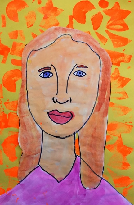
3 Comments
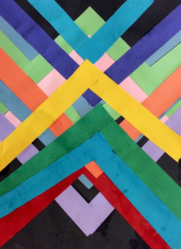
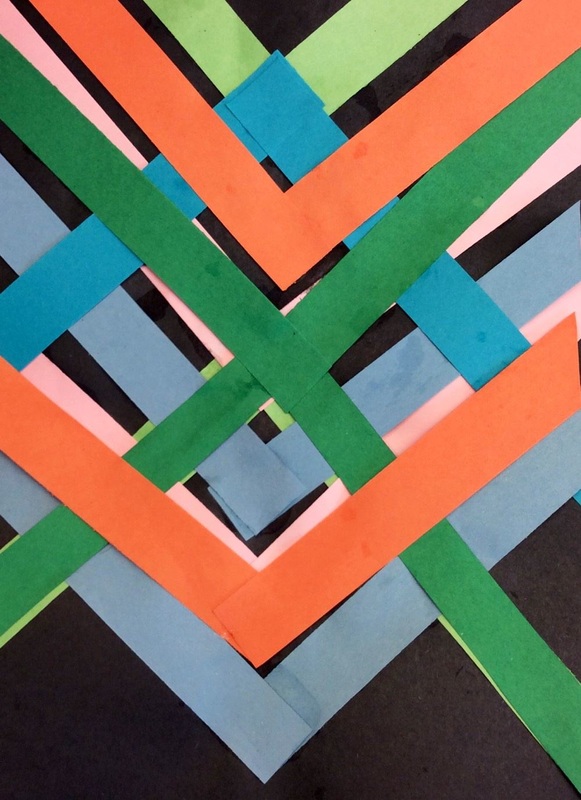
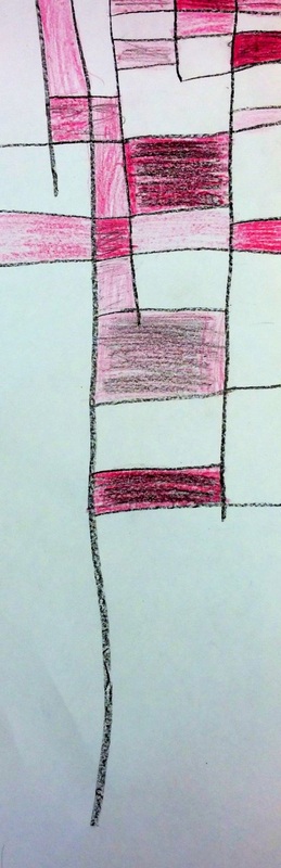
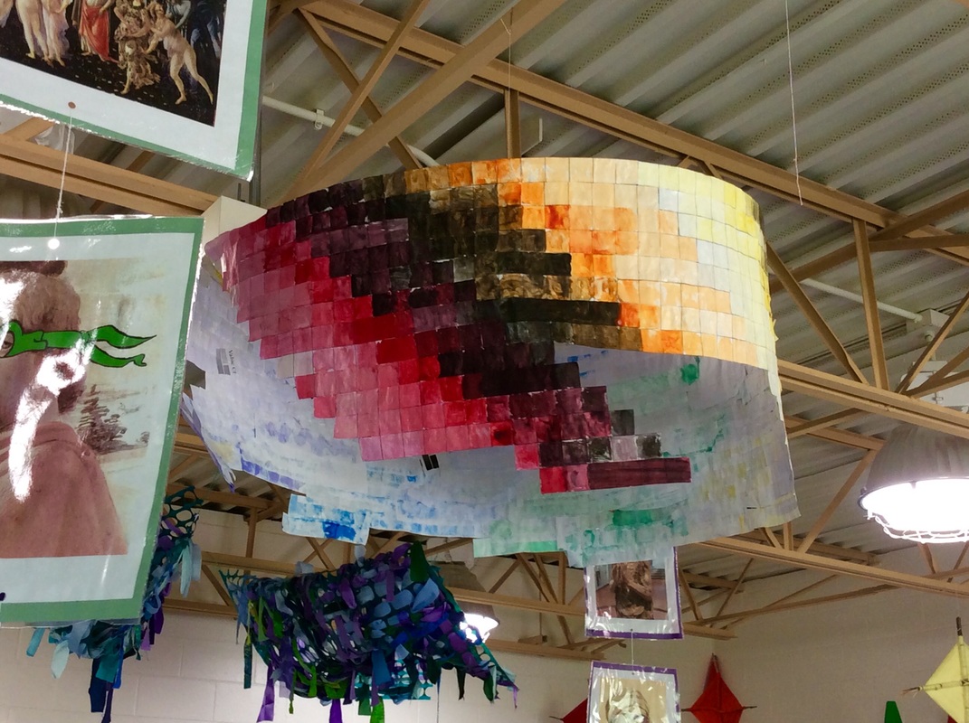
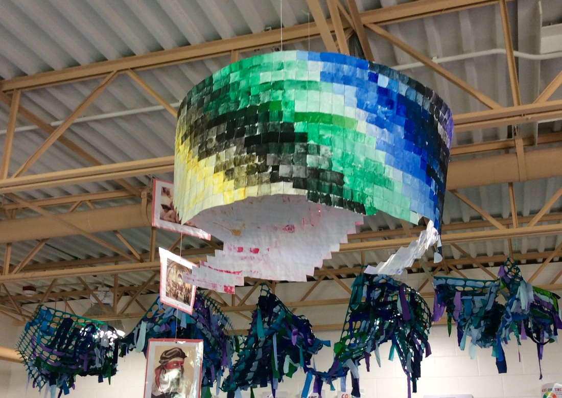
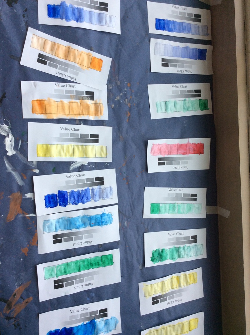
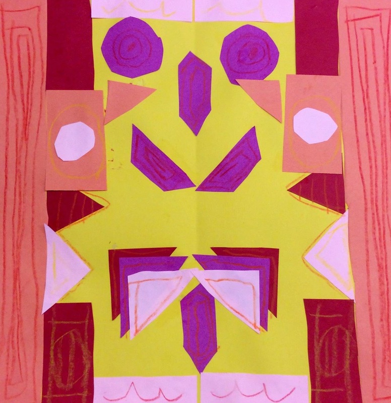
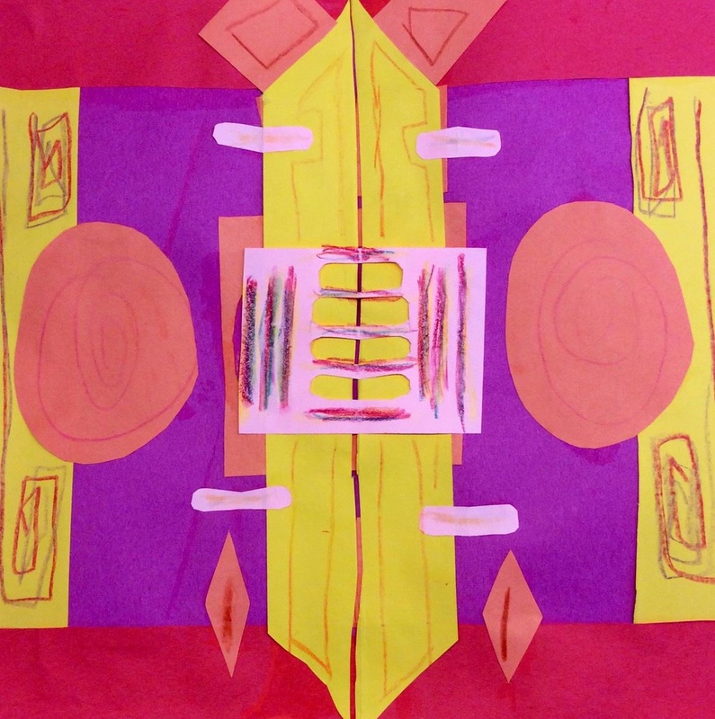
Only one of my 3rd grade classes got to learn about Maya Hayuk because they were a couple classes ahead of the other three classes. Maya Hayuk is a living female artist out of Brooklyn. She creates large, geometric murals made of intersecting diagonals. The interesting creates an interwoven effect. Her murals use bright vibrant colors oftentimes overlaid on top of lighter colors. She uses a watered down paint that often runs down her walls. Because of the thinness of the paint, you can also see the mixing of colors when they overlap. 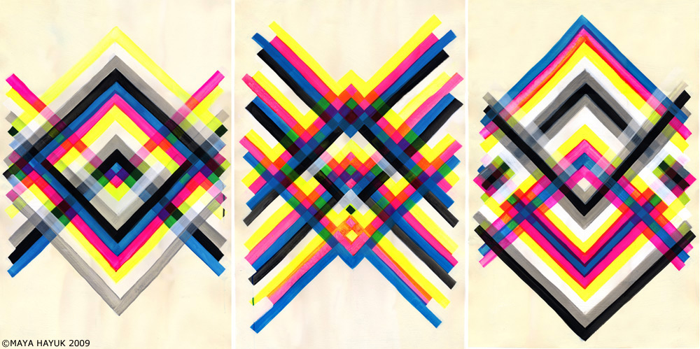 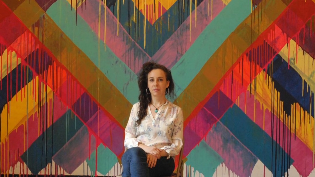 With Maya's work, we talked about the symmetry she creates. We also noticed that a lot of her paintings have light colors with bright vibrant ones painted on top. This use of color creates a sort of space or depth to her artwork, similar to the effect that we got from some of Frank Stella's paintings a couple months ago. I showed students how to line up a strip in the center of their paper and then mirror a strip across from it on the other side of the paper. This created a "V" shape with the paper strips. I encouraged them to use various colors, to overlap, and to turn their paper upside down so that they had paper strips going both directions. The first day was spent using light tints of colors. The second day the students continued to add strips, this time using brighter colors to help create that sense of space/depth. 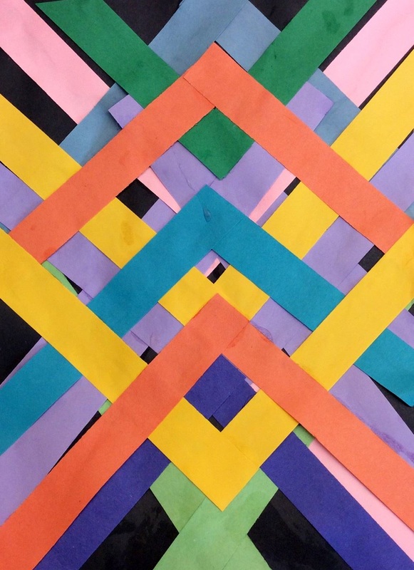 I've seen these pictures of stained glass floating around Pinterest a lot and also saw that Don Masse did it with his kiddos. You can check out his write up for it on his blog shinebritezamorano.com I'm really drawn to these pieces of stained glass for three reasons 1.) Their asymmetrical design 2.) Their use of similar colors on each piece and 3.) the organic feel that each one has. 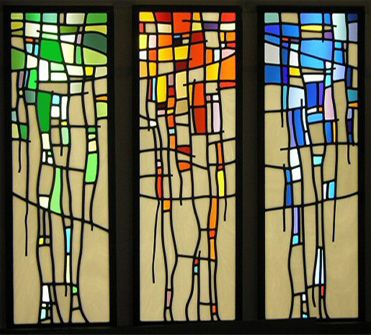 This was a real quick one day project that my artists did. We started off by drawing five vertical lines. We talked about how using wavy lines creates an organic feeling while straight lines create a rigid geometric feeling. I emphasized that each line should end at a different spot. They then drew several horizontal lines across the vertical ones. Lastly, they needed to decided on a color scheme to color their stained glass with. They could color using warm, cool, or by picking one color and creating tints and shades of it. 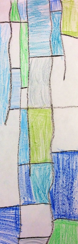 3rd grade FINALLLLLLY worked with clay. I was starting to get worried we wouldn't be able to fit it in before the end of the year! We learned how to create the body out of a pinch pot. Students then created a coil which is like a clay snake. They could take chunks off of that coil and that manipulate them into different details they needed like eyes, eyebrows, feathers, etc. I stressed that they needed to slip, score, and smooth the clay detail pieces or else they would fall off in the kiln. After they got out of the kiln, we painted them with tempera paint. Students put their color theory knowledge to the test and were allowed to mix whatever colors they wanted. I was impressed with how well they knew which colors could be mixed and which colors didn't mix well! 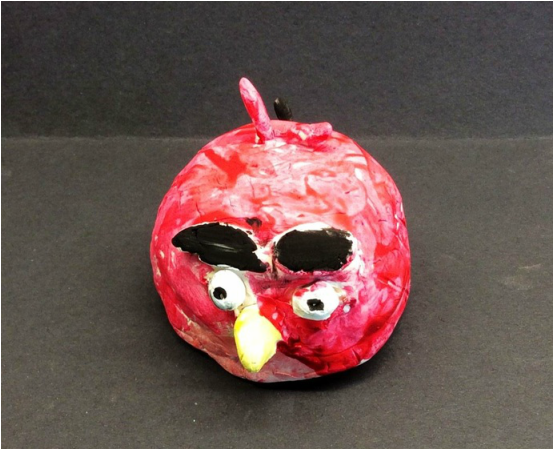 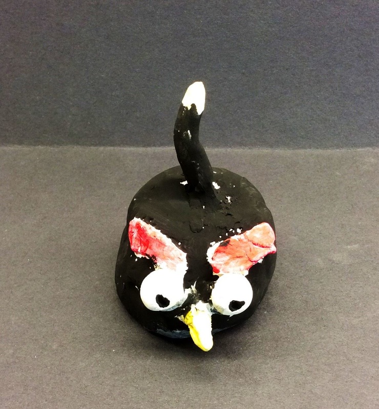 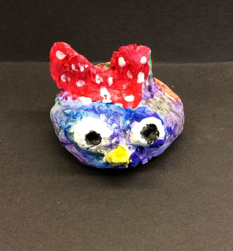 I love the bow on this one! In our last project, we learned about Karina Eibatova's mineral paintings and painted tints and shades. I collected all of the strips of paper that our artists' painted tints and shades on and created a large collaborative artwork out of them which can now be seen hanging in our classroom. We based our chandelier on the installation artist, Olafur Eliasson. Eliasson is one of my FAVORITE artists. I love the way that he uses light and color to change a person's sense of space. I was particularly inspired by his work "Your Rainbow Panorama." This is an installation that is above a museum in Denmark. Viewers can walk through the colored glass-wall path. A video of the experience can be found below. 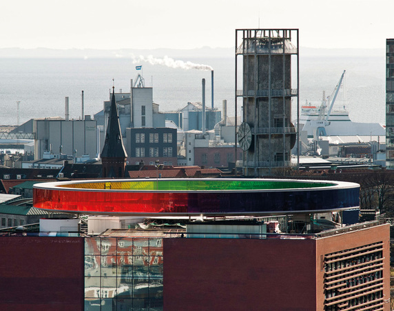 I assembled the strips of tints and shades by color and created a gradient so that colors move from tints to shades and vice versa. Because there were not an equal amount of each colored strip, some spots of the chandelier are longer than others. I like the asymmetrical-ness of the piece. 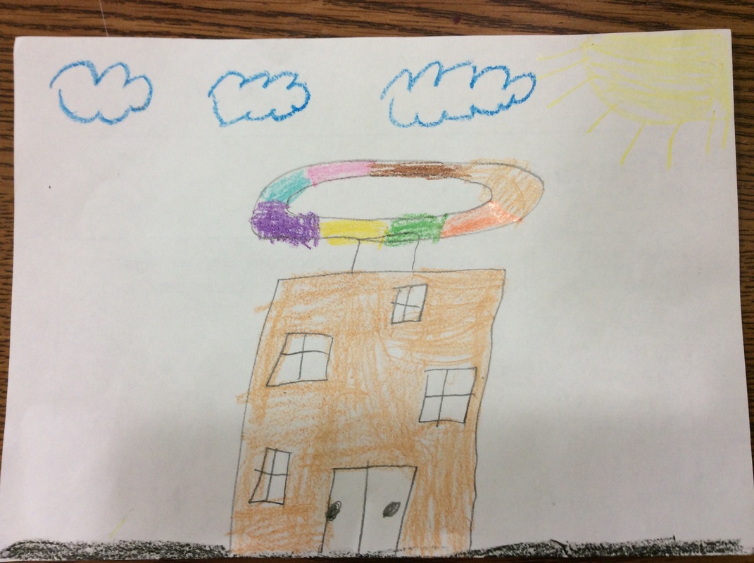 Here's a drawing a 3rd grader did of the installation piece. With 3rd grades recent trip to Cave of the Mounds and all of their learning about rocks and minerals, I thought it would be cool to do a project based on minerals. We looked at Karina Eibatova's work for influence. Karina is a young Russian artist who moved from Russia to Sweden when she was 19. While in Sweden, she drew upon nature as inspiration for her works. While she depicts a variety of things from nature, I was really drawn to her mineral series. 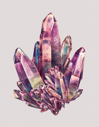 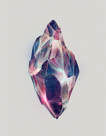 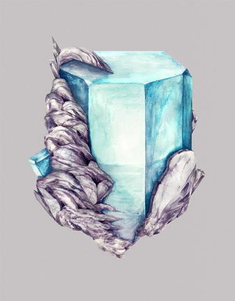 We got the project rolling by looking at the shapes seen in minerals. They are made of geometric shapes due to the chemical make-up of the mineral. We used this knowledge and a ruler as a straight edge to draw an angular shape. Then we drew lines inward from each point along the edge to break the shape up into triangles and other polygons. I really emphasized holding the ruler still while drawing so that all of their lines were nice and straight. We finished off the day by picking one color and painting about a third of the shapes in our mineral with it. For the second day, we talked about value and how it can be used to create form. The students had already unknowingly used form on their chalk drawings of Jeff Koons' balloon dog. I introduced them to tints and shades and talked about how tints are lighter and look like light is hitting the mineral. Shades are darker and look like they are shadows on the mineral. We practiced mixing tints this class and placed them onto a value scale, showing a range of tints. I collected all of these strips of value scales and am in the process of putting them together into a big collaborative project. After finishing their practice value scale, they mixed tints and added them to their mineral. You can bet that we used sparkle paint to add a bit of shine to our minerals! For the third day, they did the same as the second, except they worked with shades this time. Students finished painting on this day. The last day, we cut out our mineral and glued chunks of cardboard to the back of it before gluing it onto a black background. Because the students didn't have much to do this day, I introduced them to the installation artist, Olafur Eliasson. While the students will not be directly making a project about Olafur, their collaborative project made from all the value scales will be based on one of his works.  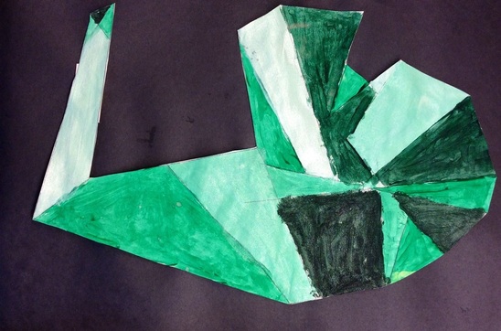 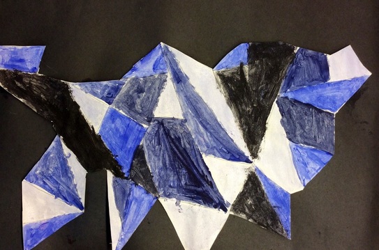 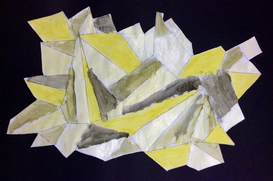 Recently, my 3rd graders over at Consolidated had the chance to Mystery Skype with another art class. We Skype'd with my art teachin' friend Tasha Newton who teaches K-6 in Fall Creek, WI. You can check out her blog at: http://iartmyjob.weebly.com/
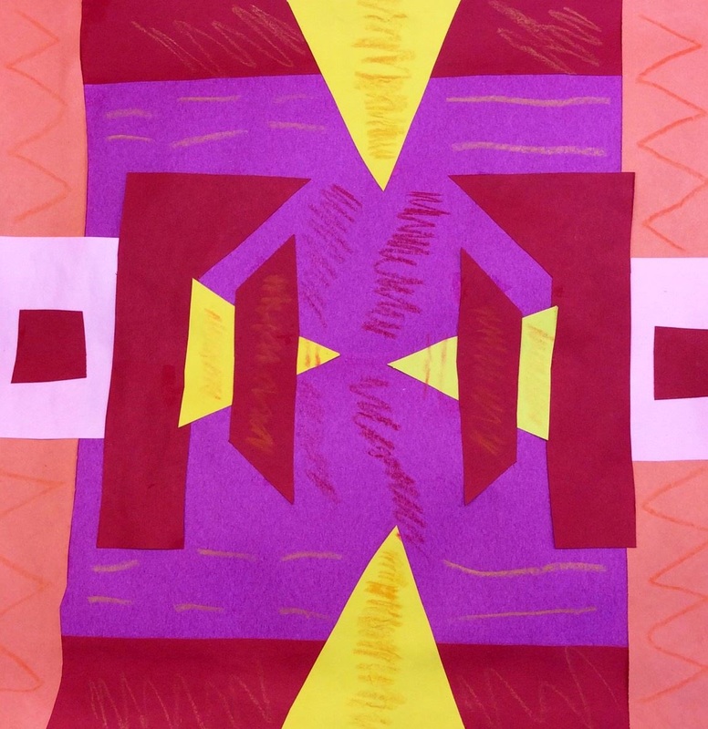
When we Skype'd with them, a couple of my students introduced our school to them with a couple paragraphs that we wrote together. Then we played a live version of "Guess Who" except instead of trying to guess a person, we tried to guess what art medium they were thinking of. This challenged the kids to start with broad questions and work their way down to more specific questions. It was a great chance for our students to practice thinking on their feet! After we played a couple rounds with them, then we played a quick drawing game with them as well. It was a blast and we can't wait to Skype with them again! To go along with the NCAA March Madness Tourney, we had a little tournament of our own in art class. I selected 10 Pop Artists (a few who my 3rd graders had already learned about) and placed them into a bracket. Each class did their own voting to determine who they thought the King of Pop was. I was nervous about doing it at first because we wouldn't be doing any art-making during the two days it took us to do the tourney. To my surprise, the kids didn't see to mind that we were taking a couple days off from making art. For each round, I showed a selection of the artists' work up on the screen. Students voted for which artist they liked better and then we read off votes. There were some super close match-ups that really got the kids excited. After each round, I asked the kids why they chose the artist that they did over the opposing artist. I was blown away when I had nearly every kid wanting to talk about their choice. It was awesome hearing the kids explain their rationale! All in all, Jeff Koons won in 2 of the classes and Claes Oldenburg (who was beat out by Koons in the finals in the other two classes) won in 1 class. 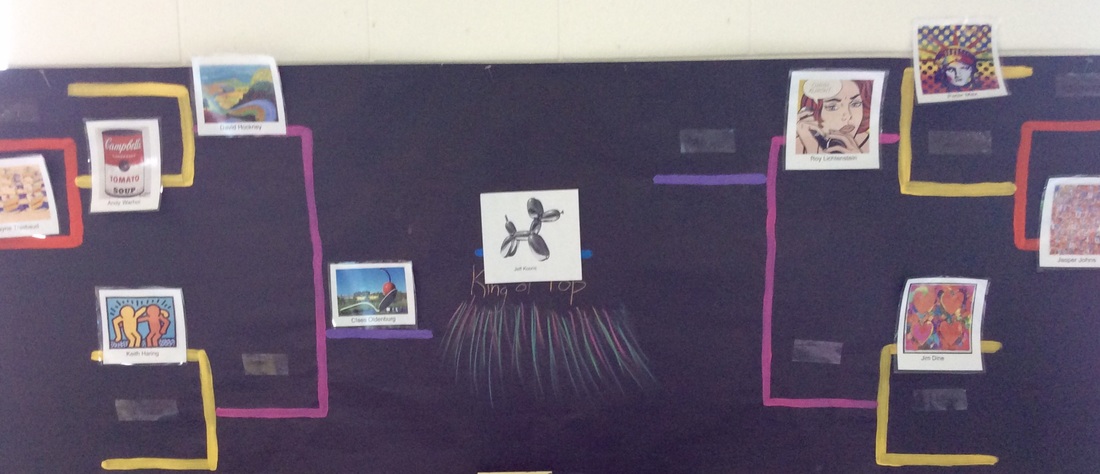 Mrs. Kelleher's class bracket. Koons was chosen as the winner of Oldenburg. 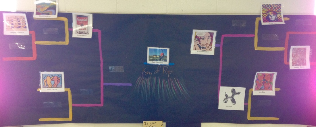 Mrs. Murphy's class chose Oldenburg over Lichtenstein in the finals! 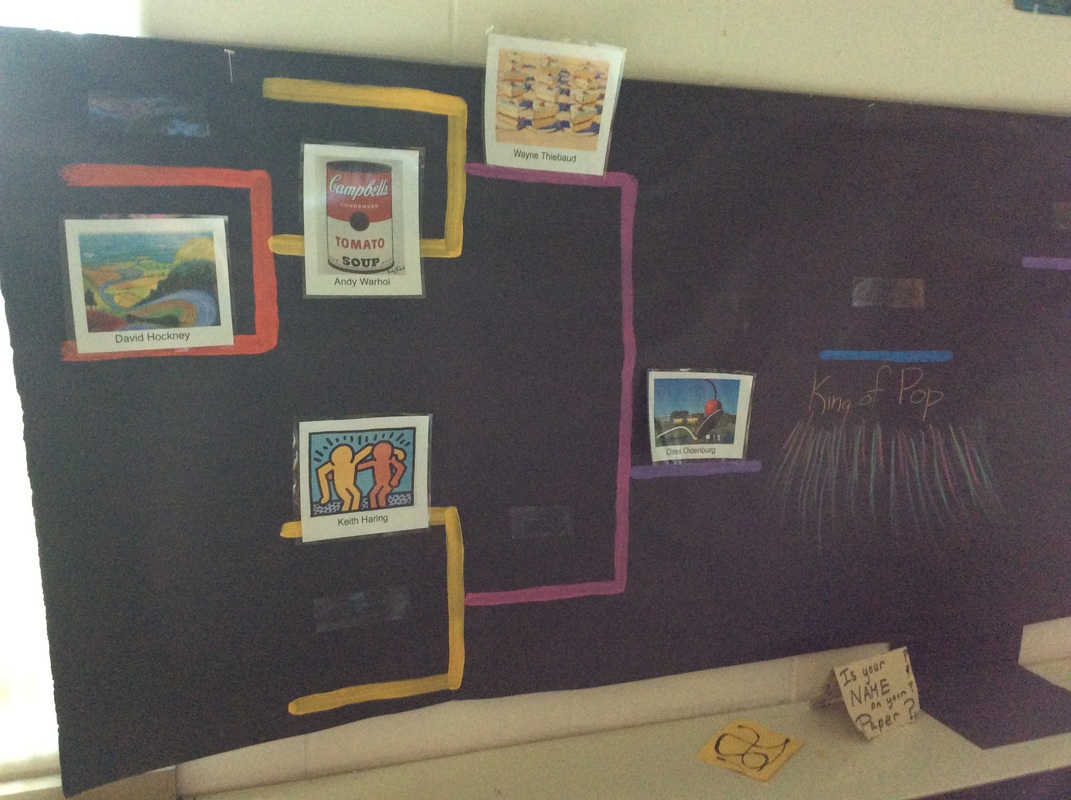 Mrs. Palan's voting after day one. 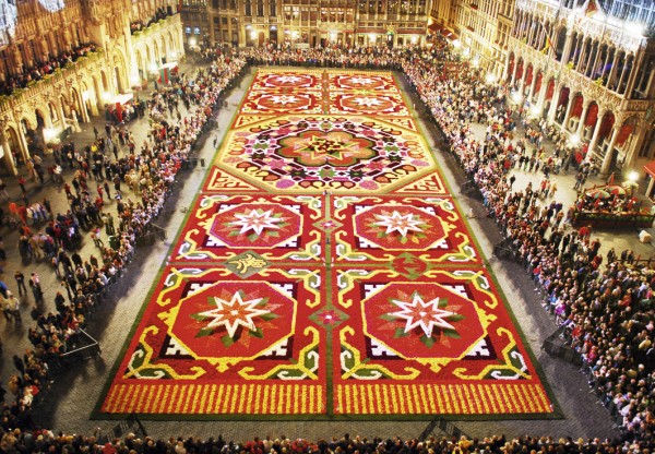 Brussels' Flower Carpet I've been so busy lately but I have been wanting to write about this project for the last few weeks. Right off the bat, I wanted to say how proud I am of my 3rd graders for handling such a serious topic. Over spring break, Brussels experienced a horrific attack upon their city. Like our Paris project after their attack, I thought we would take a couple classes to honor Belgium with a project. We had a down-to-Earth discussion about what happened in Belgium and I was so impressed with how well they handled the topic. In the center of Brussels is a large courtyard. Once every two years, they cover the courtyard in a design made of locally-grown begonia flowers. Each time they make the flower carpet, their design is based on a new theme. I used Don Masse's project idea for his mud cloths and spun it towards what I wanted to cover. Throughout the project, we talked about warm colors, geometric shapes, and symmetry. After cutting and gluing shapes for a couple classes, they finished it off by adding some more intricate details with warm colored crayons. This was probably one of my favorite projects from the year. They did such an awesome job on it! 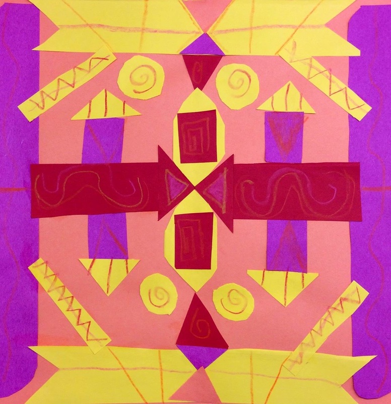 I love how vibrant the colors are! 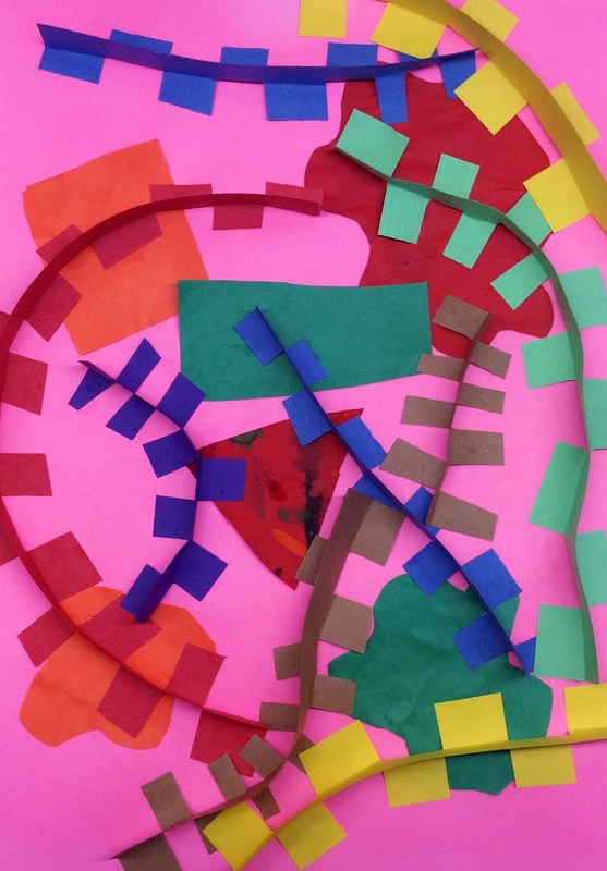 With spring break fast approaching, 3rd grade knocked this quick project out of the park! We super duper quickly looked at a few of Wassily Kandinsky's paintings. His paintings are a combination of various shapes and lines. This lead into a discussion about the two different kinds of shapes: organic and geometric. We also looked at and named a bunch of different lines. For the background, we took some of our scrap paper and made 3 organic shapes and 3 geometric. After gluing those down, we made all kinds of crazy lines! To make the lines, we took a strip of paper and cut little tabs down one side of it. Then we folded the tabs in either direction so that we could bend and curve our line easily. Students were also encouraged to intersect lines. |
Devon CalvertHarmony and Consolidated Elementary Art Teacher in Milton, WI. UW-Eau Claire graduate. WAEA President. Apple Teacher. 
Archives
March 2019
Categories
All
|


 RSS Feed
