|
0 Comments
Here is the link to my Youtube playlist that has all of my demo videos for this project, as well as any other supporting videos I use.
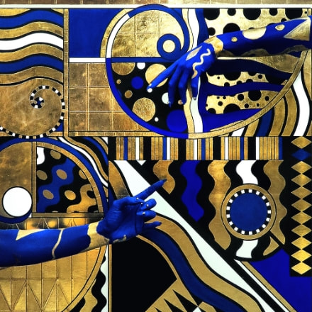
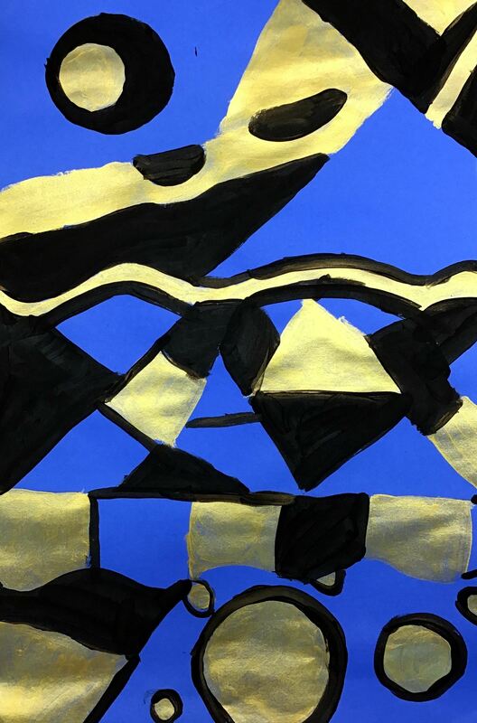
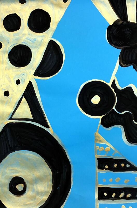
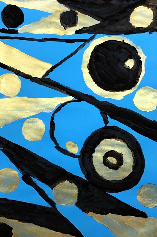
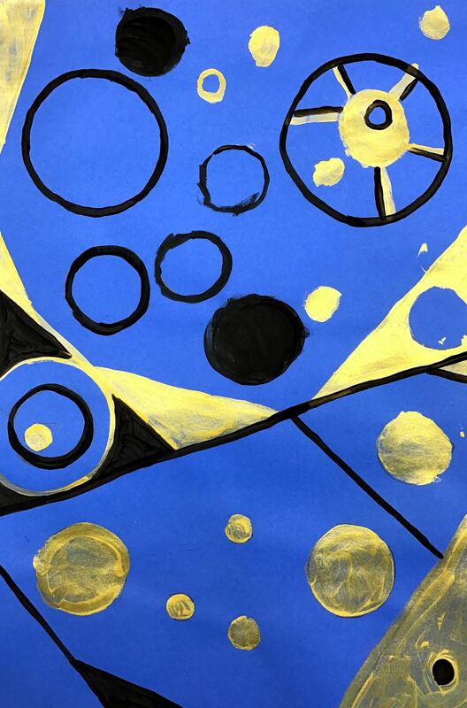
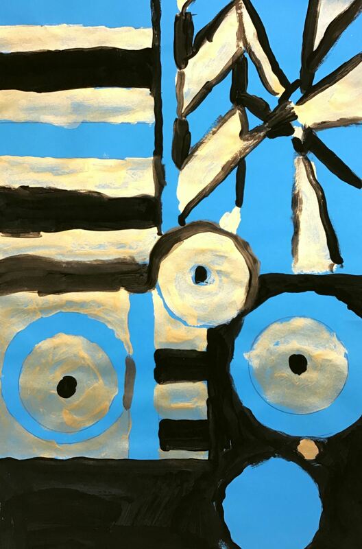
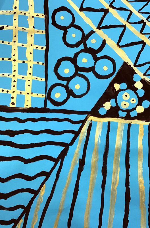
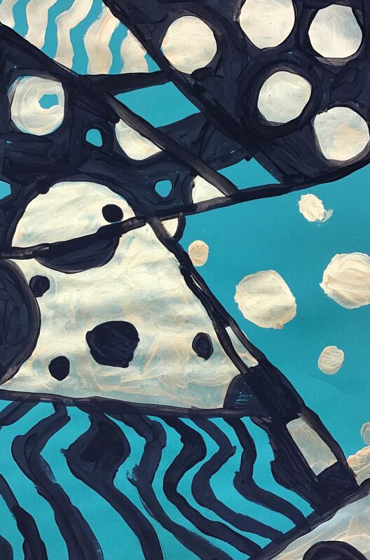
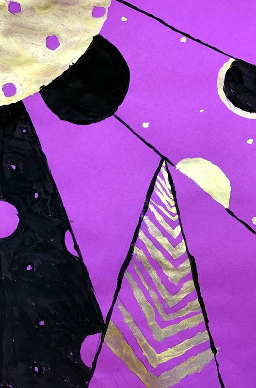
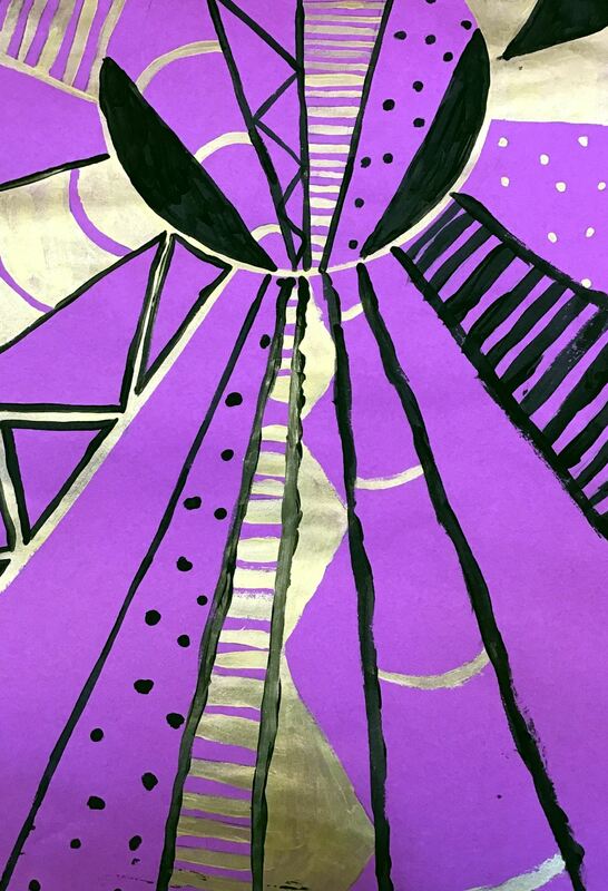
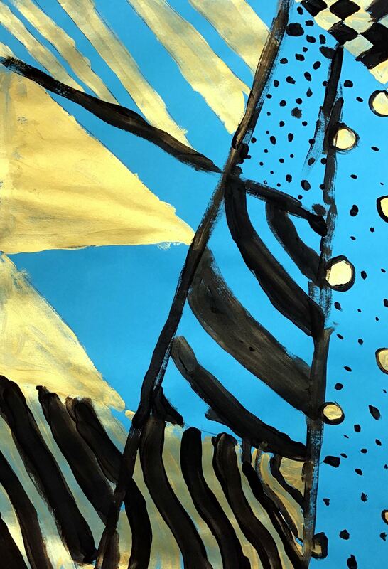
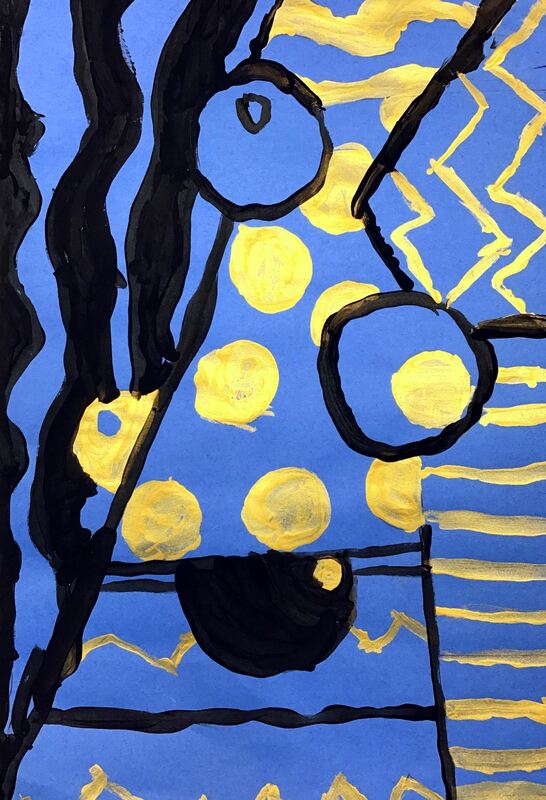
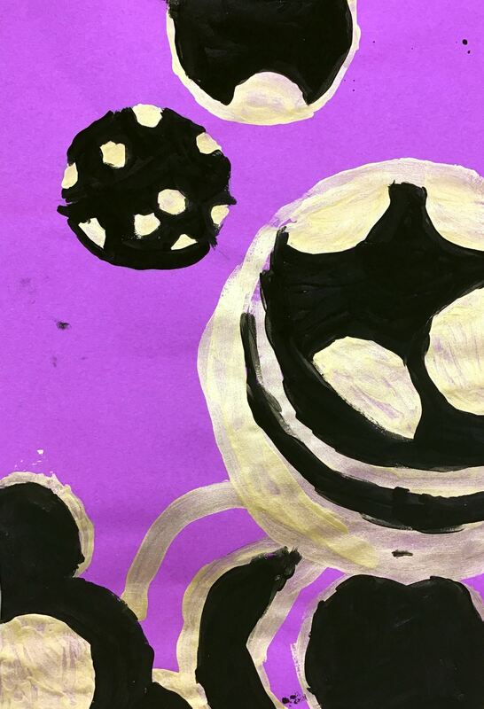
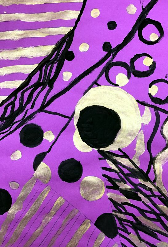
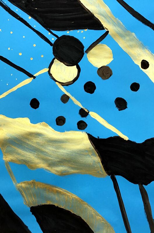
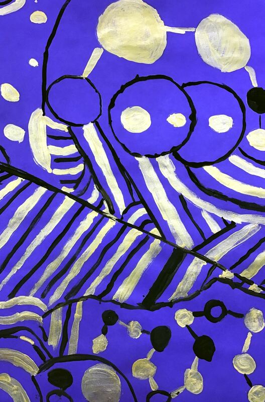
Lina Iris Viktor is the youngest artist any of my students have learned about and they thought it was SOOOO cool that she is just a few years older than I am. Lina's work is characterized by many circles and straight lines that break her paintings up into many geometric shapes. She also restricts her color palette to a particular hue of blue, 24 karat gold, black, and sometimes white. The students noticed that some of her work reminded them of Egyptian Hieroglyphs based on the symbols and her use of gold. Lina's work was recently plagiarized for a Kendrick Lamar video. This was a great opportunity for the students and I to have a discussion because they have learned about copyright and plagiarism in the past in other classes. The first day of class, students created two sketches using some of the elements they saw in Lina's work (lines, circle, geometric shapes). After their two sketches, they chose the one they believed was their strongest design and had it ok'd by me. To finish class, they transferred their sketch to a large sheet of colored paper (color of their choice). They were expected to use rulers and different circle tracers I had put out to ensure that they had nice, clean, crisp lines. On the 2nd day of the project, students used gold paint to fill in about a third of their artwork. You would've thought they were using actual gold! They went nuts for it! We talked about different ways to fill in spaces of their artwork (outlining, painting in a shape, painting the space around a shape, etc). I also emphasized outlining things first and then filling in the space. This helps to make smooth outlines. The final day was spent using black on about a third of their project. They were expected to have every pencil line either outlined or filled in. This is my favorite project that I do with any grade. I love how strong many of their designs! I'd love to have some of these famed and hung up on my wall! Here is the link to my Youtube playlist that has all of my demo videos as well as other supporting videos.
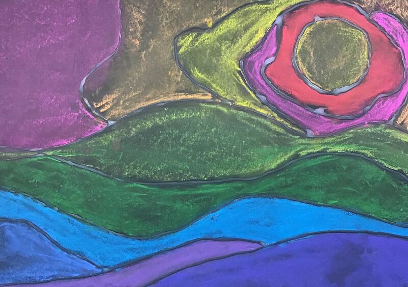
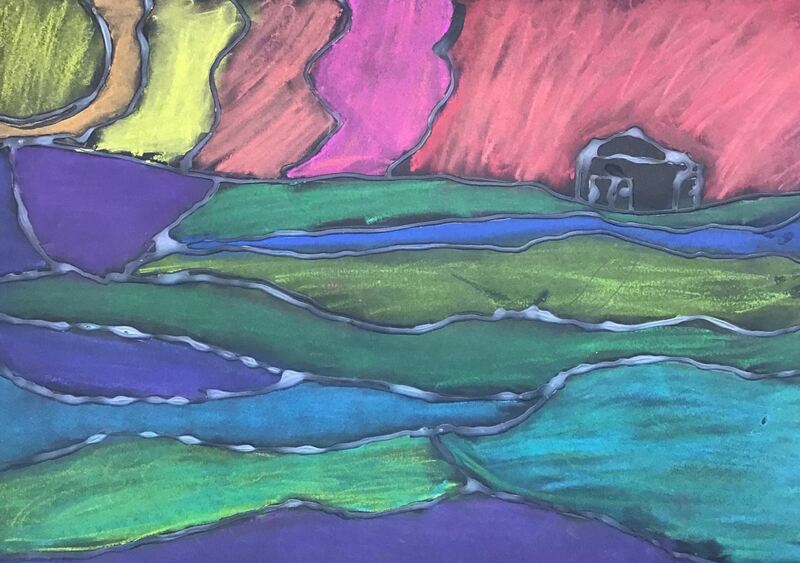
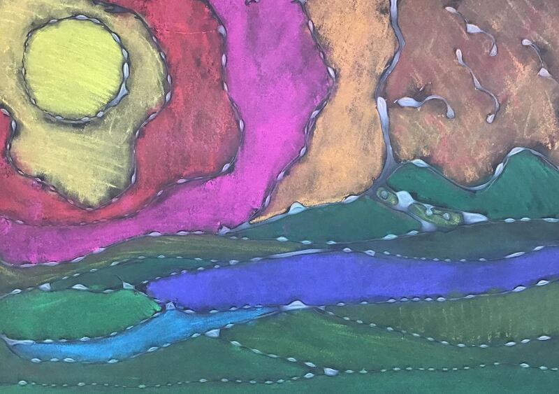
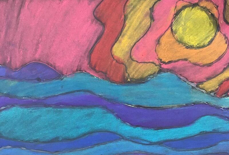
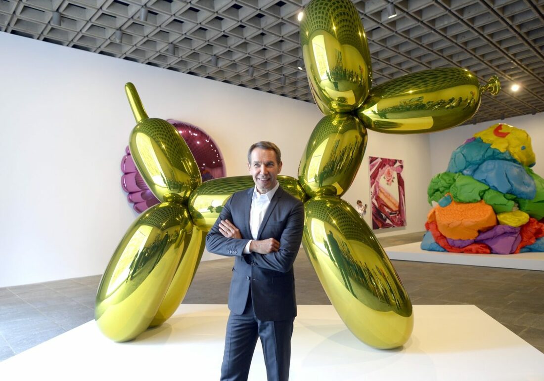
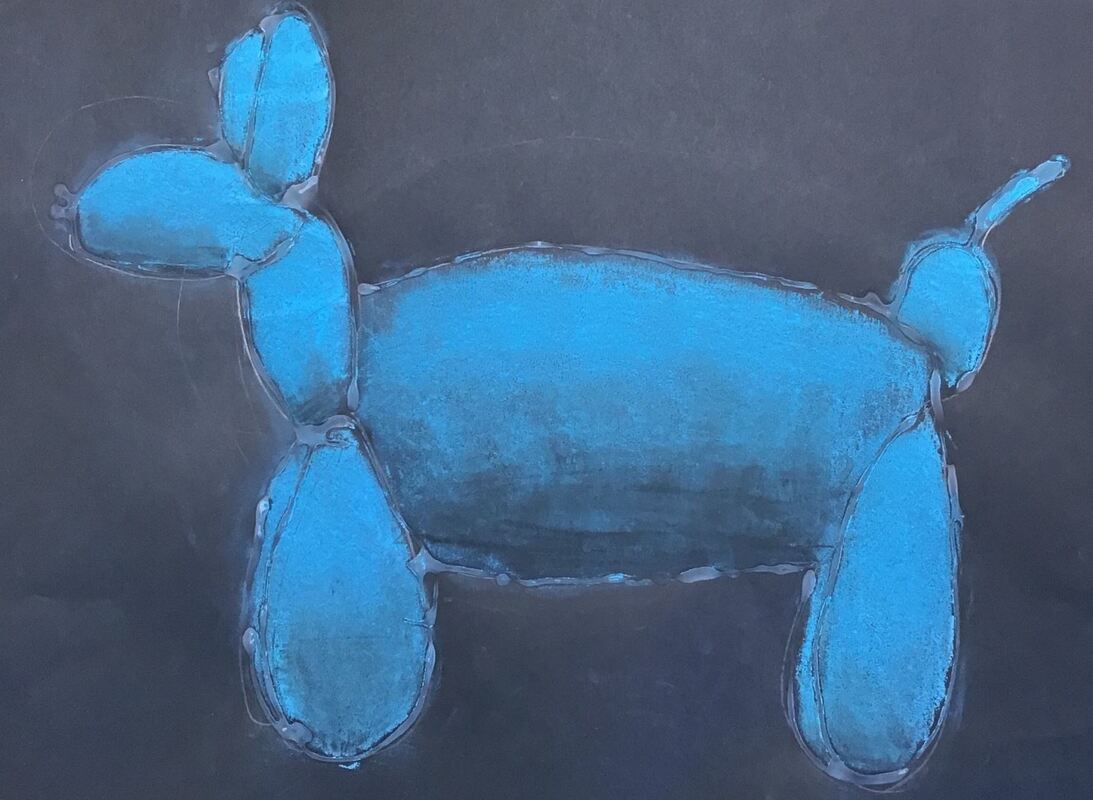
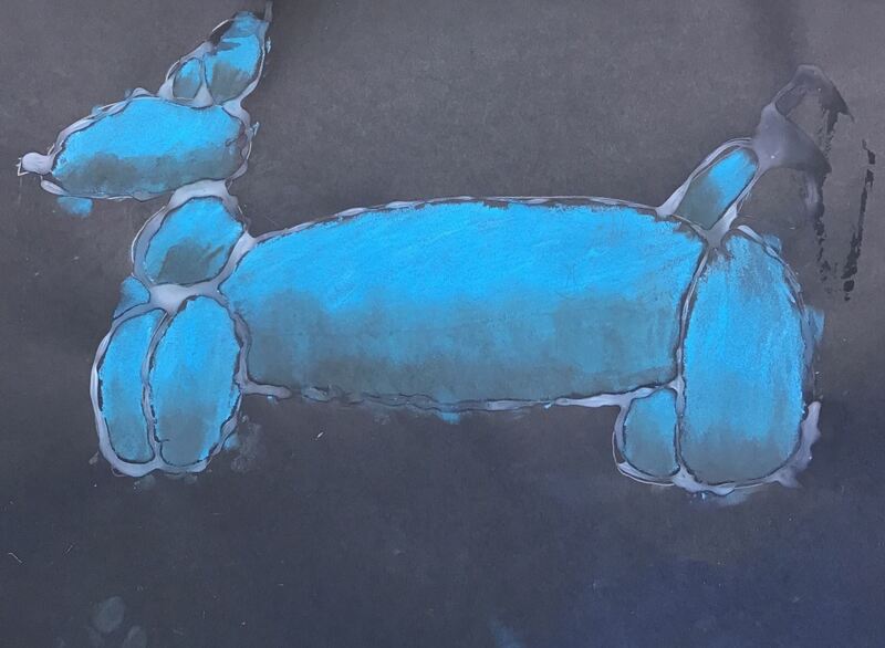
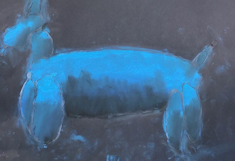
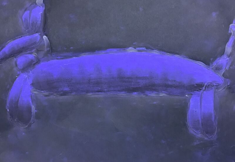
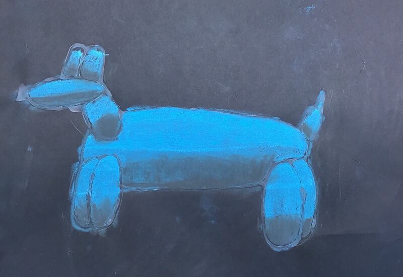
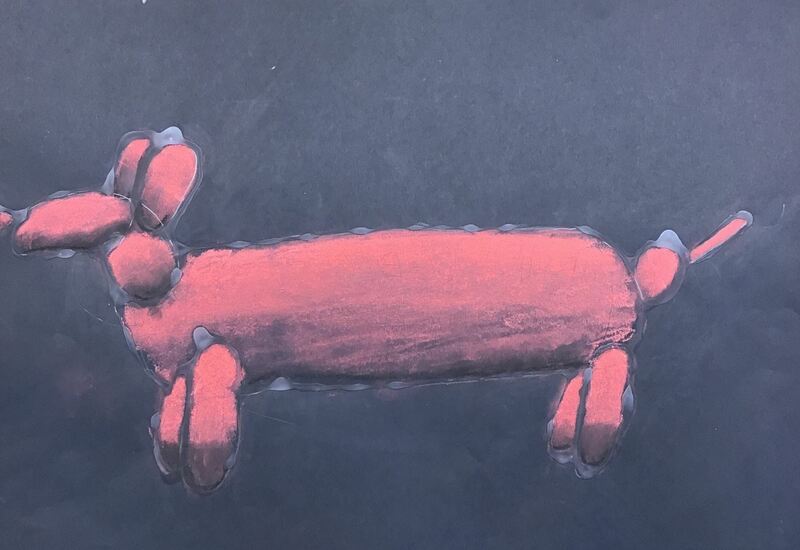
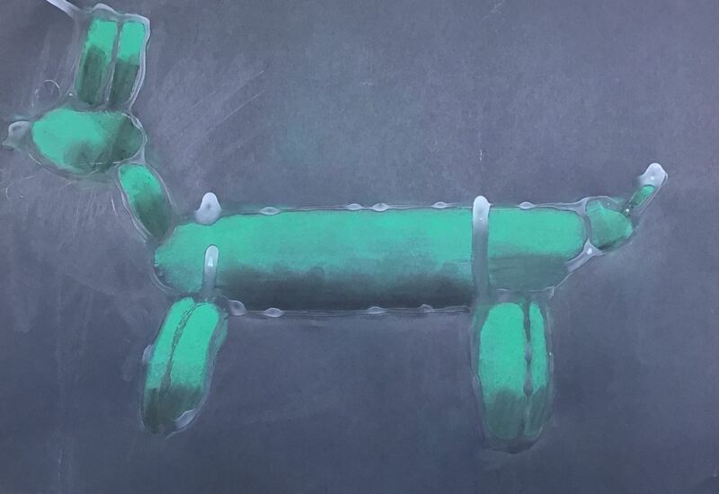
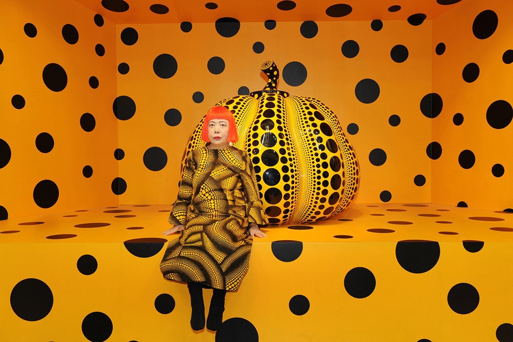
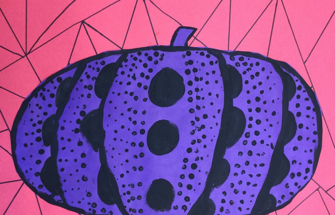
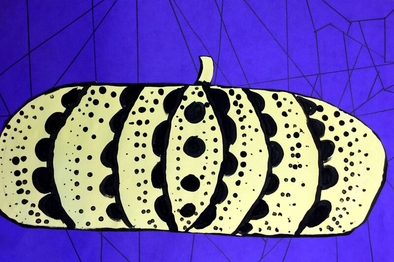
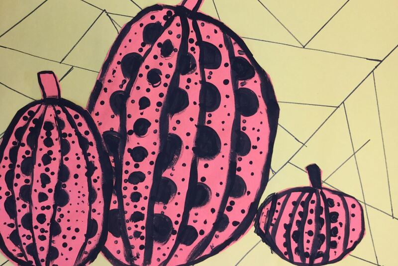
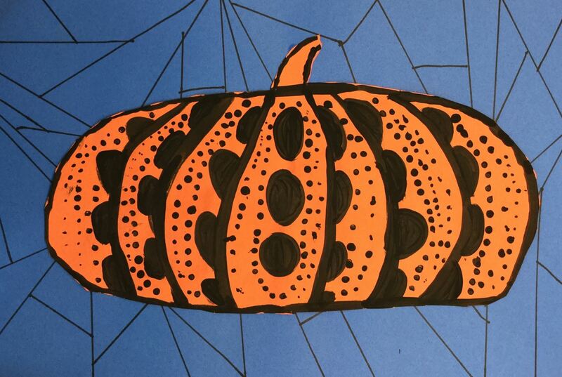
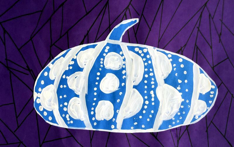
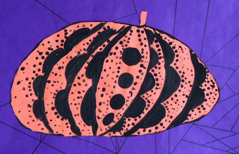
We looked at Jeff Koons' work. Koons is an American Post-Pop artist. He is most well-known for his large reflective sculpture balloon dogs. Most of his sculptures use a reflective surface. He likes how the reflective surface changes the way you perceive the area around you by warping and distorting the room on its shiny shell. He depicts objects that are popular in pop culture such as balloon animals, Popeye, and pool inflatables. His sculptures are highly rendered, down to the subtle creases along the seems of his metal pool inflatables. I find his balloon dogs particularly interesting because they toy with the idea of life and death. When something is full of air/breath like a human or a balloon, the item is thought to have life. But when those things run out of air, they become deflated or lifeless. By creating balloon dogs out of metal, they lose their ability to deflate making them immortal. The kids were amazed that he is the second richest living artist and is worth $500 million. We did an observational drawing of a balloon dog inspired by Koons. To do this, we had to learn to break the dog's shape down into different sized ovals. After drawing it, we then traced over our lines with glue then left them to dry on the drying rack. For the second day of the project, we talked about form. Typically, we talk about form as being something that is 3D but it can ALSO be something that has the illusion of being 3D. To do this, we would need to add shadows and highlights to our dogs. We chose a color and LIGHTLY chalked the various sections of our dog. The glue lines help to contain the chalk and the chalk also wipes off of the glue lines easily at the end of the project. They gently blended the chalk and then re-chalked it, making sure not to chalk quite to the bottom this time. Then smoothed and chalked again, going even less far down on the dog. By going over parts of the dog over and over, it creates a bright spot on the dog called a highlight. This gives the illusion that the sun/light is hitting that part of the dog. Lastly, we added a touch of black opposite of the highlight to give the dog some shadows. By adding highlights and shadows, our dogs now looked like they were 3D or had form. Here are the details from the Kusama project that I've done in the past.
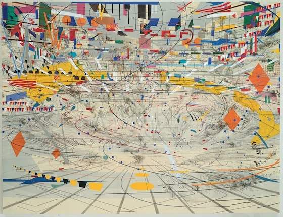
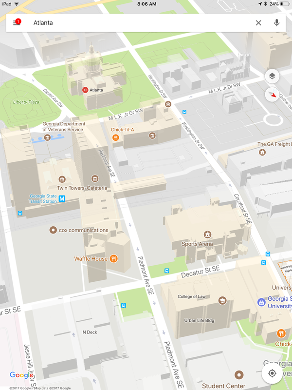
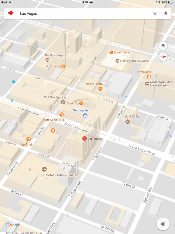
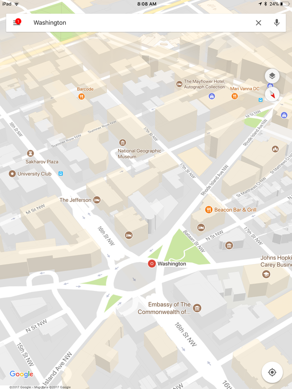
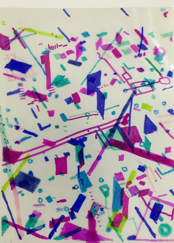
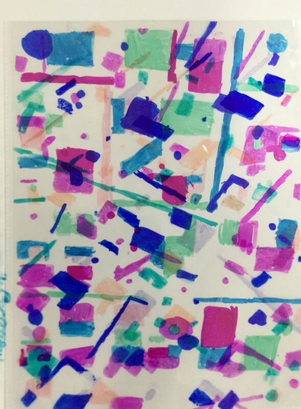
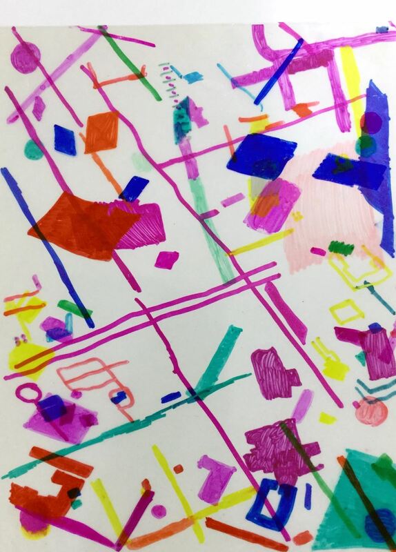
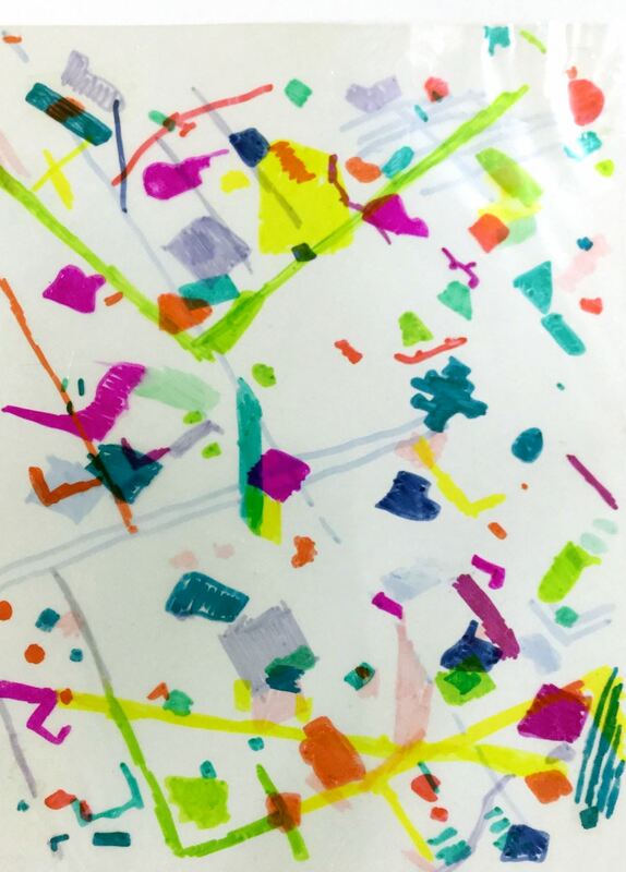
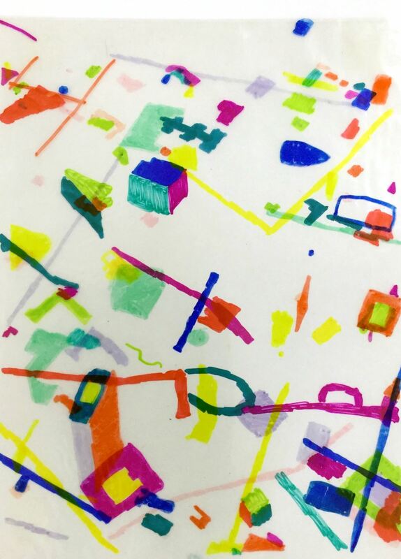
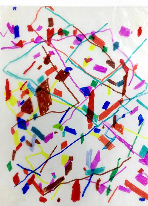
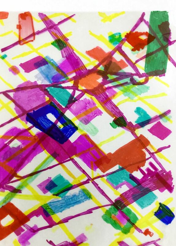
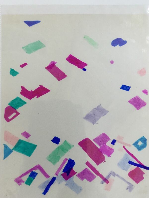
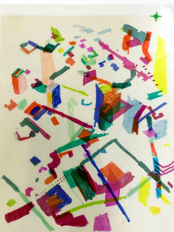
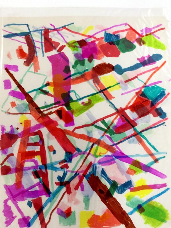
Also, here is a link to my youtube playlist that has all of my demo videos and other videos that I show. Enjoy the pictures from this year! I switched it up just slightly this year and had students use sharpies from the background instead of black colored pencils. I like how much better the lines show up with the sharpies. I also didn't ask students to use complementary colors this year. I'm thinking next year we might try to make paper mache pumpkins instead?! 3rd grade is currently wrapping up learning about one of my favorite artists, Julie Mehretu! Each year, I give the table groups in my room a different theme and last year's theme was contemporary female artists. Julie Mehretu is one of my table groups and students have been hoping to learn about her! This project was also inspired by another art teacher who made abstractions of maps on iPads that were inspired by Mehretu. Mehretu is originally from Ethiopia but has since moved to Michigan where she has spent most of her life. She is very inspired by architecture and chooses bits and pieces from different buildings and perspectives to paint. She also uses a lot of maps, charts, blueprints, etc in her work. She puts layer upon layer upon layer of different lines, shapes, and colors to build up her eye-catching paintings. Students were given the opportunity to choose from quite a few different maps that I had screen-shotted from Google Maps. After choosing a map, they slid their map into a see-through paper protector. Students then used sharpies to color in certain parts of the map. They could color entire buildings, parts of buildings, roads, etc. The second class, they chose a new map and slid it into their paper protectors. This time, they put it in backwards so they were working on the side of the paper protector that they didn't work on last time. They continued to color in parts of the map.
The final day, students chose a final map and colored in parts of the map on a transparency sheet. While they worked, I used double-sided tape to tape their paper protector to a white sheet of paper. I did this so that their lines and shapes of color would show up better on the finished product. At the end of class, students slid their transparency into their paper protectors and this created a work of art that used 3 different layered maps. This has become one of my favorite projects due to how successful ALL my students are making these! This was a project that I snagged from Cassie Stephens. You can check out her details here.
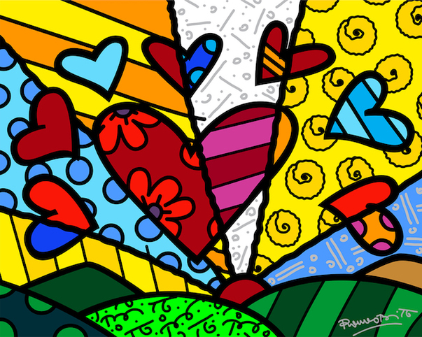
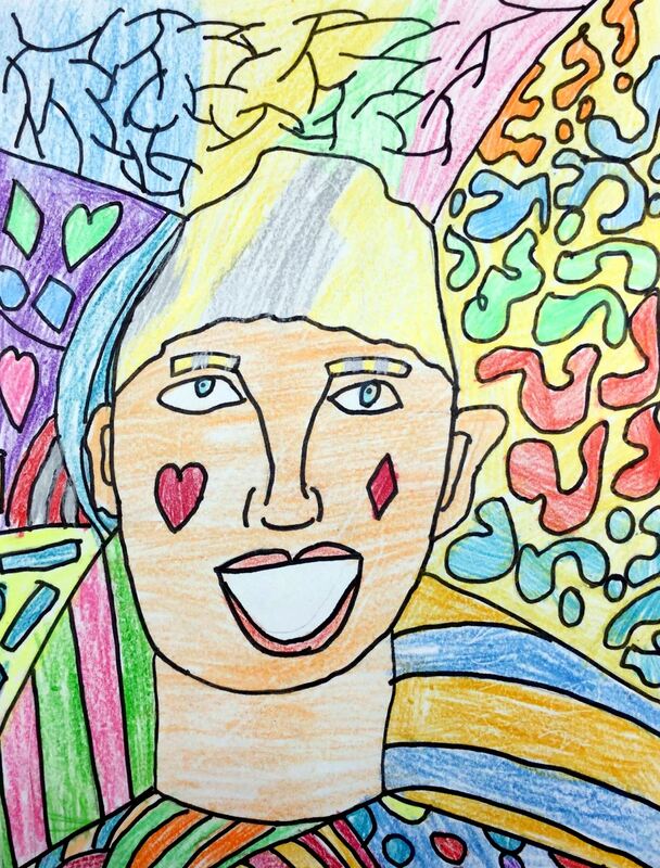
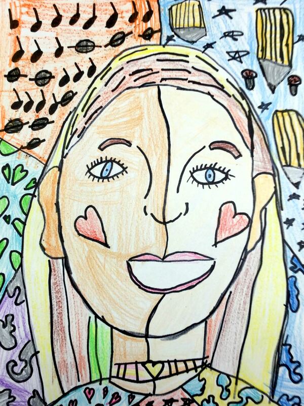
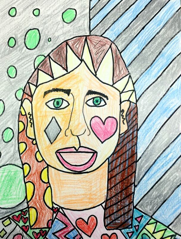
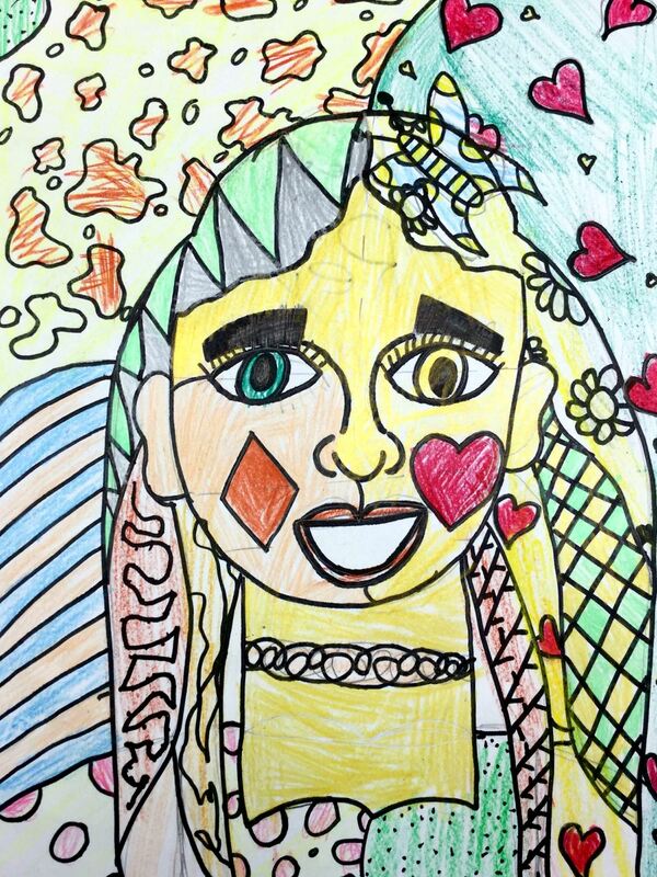
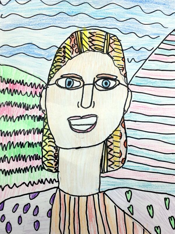
To start off the year, third grade learned about the pop artist, Romero Britto. Romeo's work also draws upon influences from cubism. His work typically shows a picture that has been divided up into many shapes by bold black lines. then within all those shapes, she adds bright colors and patterns. he is a very popular artist at the moment, having made work for many large events such as: the Super Bowl, World Cup, Olympics, and Disney. I always start off the year with my third graders by making self portraits. I do this because I like to show students how much they can grow over the course of one project. I typically give them five minutes to draw the best self portrait that they can without any instruction. Afterwards, I give them a crash course in facial proportions, teaching them where things belong on your face. With this information, they begin to redraw their self portrait while keeping this new information in mind. After drawing their self portraits, they use a Sharpie to outline everything and then erase their pencil line. Then they divide their paper into different sections by drawing lines across it. Then they are expected to add patterns in each section of the background. They are also encouraged to add some patterns to their hair. After everything has been drawn, sharpie'd, and erased, then they used plastic crayons to fill in their artwork. |
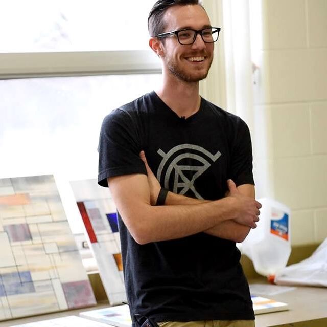
Devon CalvertHarmony and Consolidated Elementary Art Teacher in Milton, WI. UW-Eau Claire graduate. WAEA President. Apple Teacher. Archives
March 2019
Categories
All
|



 RSS Feed
