|
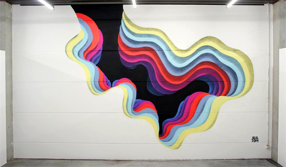
1010 (pronounced ten-ten) is an anonymous street artist who creates optical illusion-esque portals. He typically paints large-scale murals but also does some paper cuts (not the kind that hurt!). Although his paintings are 2D, they have a sense that you can walk into them. He creates this effect by working from darkest at the very center and working his way outwards to the lightest colors. This creates a tunnel-like effect. His choice of colors, combined with the gradual change in size of his shapes combine to create this effect. Sometimes he chooses to use geometric shapes, other times he uses organic. I really like that he doesn't always just use blues or greens during his work; he shifts through several different colors.
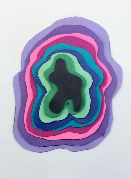
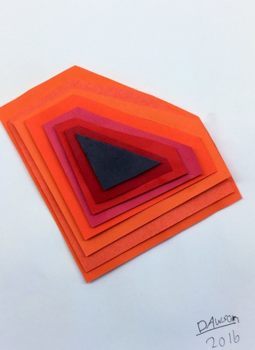
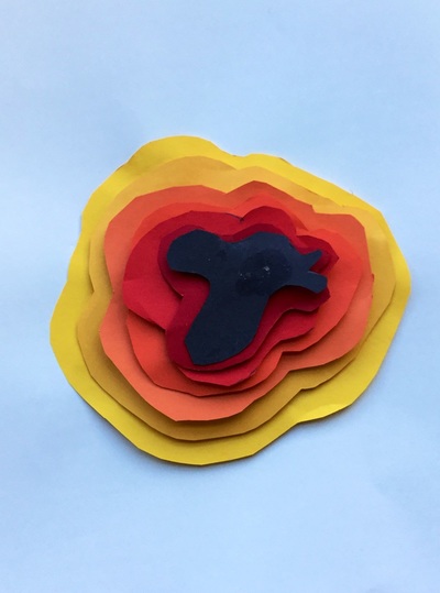
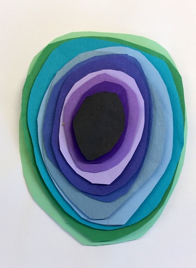
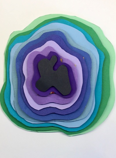
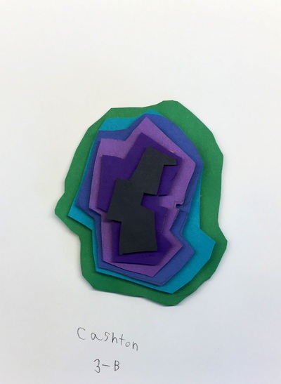
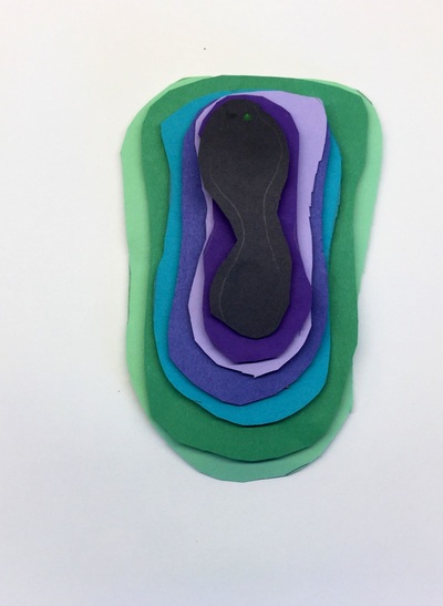
After introducing 1010, students were introduced to analogous colors. Analogous colors are three colors in a row on the color wheel. Technically, analogous colors include a tertiary but because I didn't have many tertiary colored papers, I just told the students that it was 3 regular colors on the color wheel (yellow, green, blue for example). All students created a small shape using black. From there, they needed to stop and think about what colors they were going to use and how they would transition between them. They were expected to use at least 6 colors including the black one they started with. After cutting out their black shape, they bubble-traced around their shape which made it slightly larger. Each new shape they cut out was bubble-traced so that their artwork would continue to get bigger and bigger. Students were very conscious of working from the darkest colors first to the lightest while also remembering to keep their analogous colors in order. The second and final day of the project was spent finishing cutting out any shapes they had left. Some stopped at six shapes while others cut out up to twelve different colors! Lastly, students glued them down from biggest to smallest, lightest to darkest. Each layer had pieces of cardboard glued to the back of it. This caused each layer to be slightly raised above the previous one. This differed from 1010's work because his is completely flat, however, ours took on more of a pyramid form. I was really nervous about this project. Although it was only a two-day project, I thought it was kind of a complex idea working from darkest to lightest using analogous colors but the kids knocked this out of the ballpark!
0 Comments
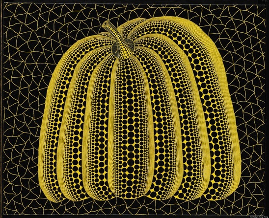
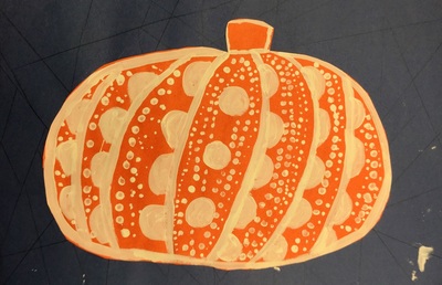
To get into the fall/Halloween spirit, we studied the Yayoi Kusama's pumpkins. She doesn't just do paintings of pumpkins but even paints polka dots onto physical pumpkins! Kusama is a pop artist originally from Japan. She is known as the "Princess of Polka Dots" due to her obsession with them. As a child, she had a hallucination in which she saw a field of flowers except that the flowers had been replaced by polka dots. Since then, they have become an integral part to her work. While looking at her painting, students noticed that the pumpkin seemed as if it was 3D because of the various sized polka dots. We talked about how these polka dots created the illusion that the pumpkin had form.
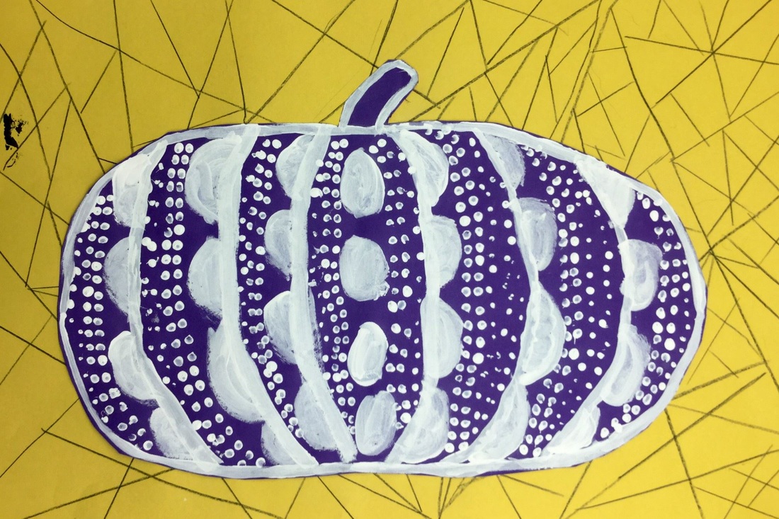
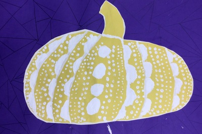
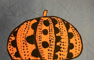
The first day of class we used a ruler as a straight edge to divide our background paper into geometric shapes. Students then drew a large pumpkin onto the complementary color of their background. The second day, we outlined our pumpkins with either black or white. Then we added large polka dots to each section of the pumpkin. The last day, we cut and glued our pumpkin to the background. Then students created rows of polka dots with a q-tip and lastly they used the backend of their brush to add more dots. Using the q-tip and back of the brush created more variations in polka dot sizes. |
Devon CalvertHarmony and Consolidated Elementary Art Teacher in Milton, WI. UW-Eau Claire graduate. WAEA President. Apple Teacher. Archives
March 2019
Categories
All
|

 RSS Feed
