|
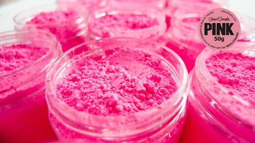
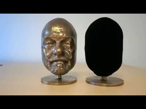
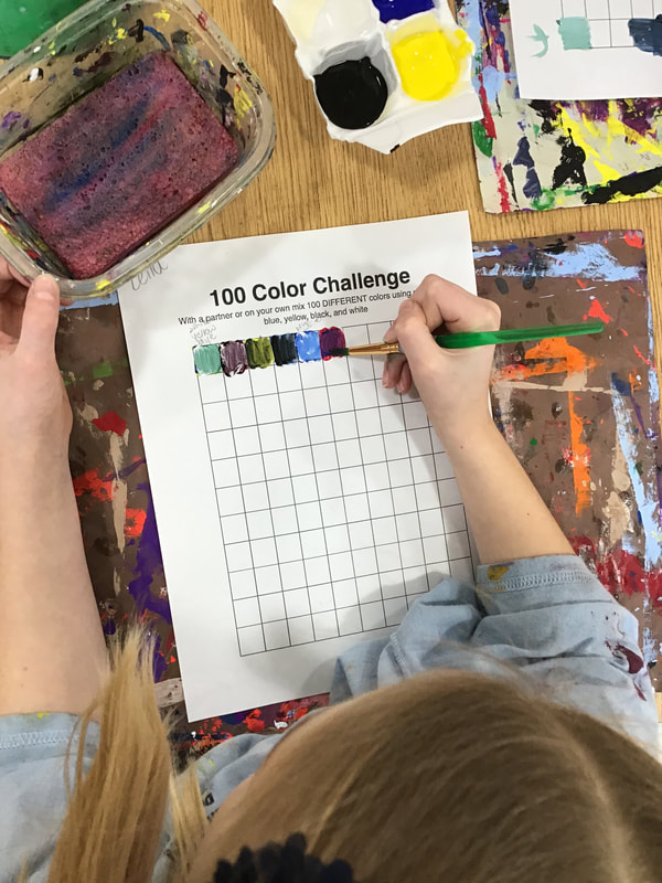
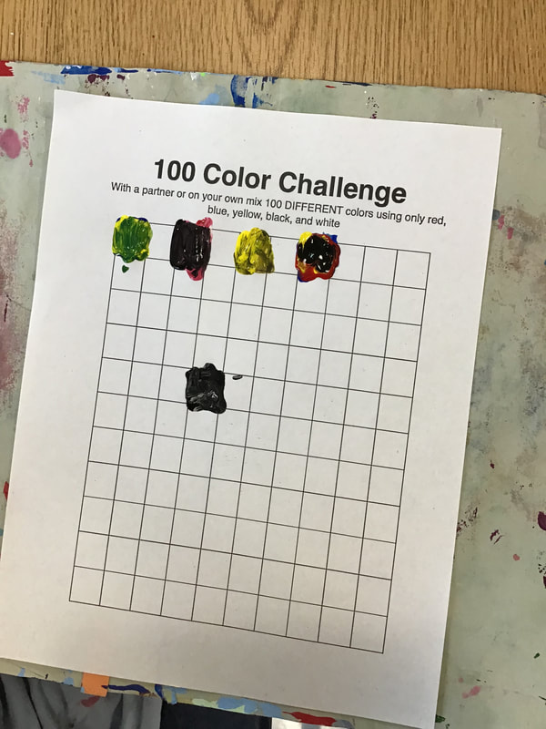
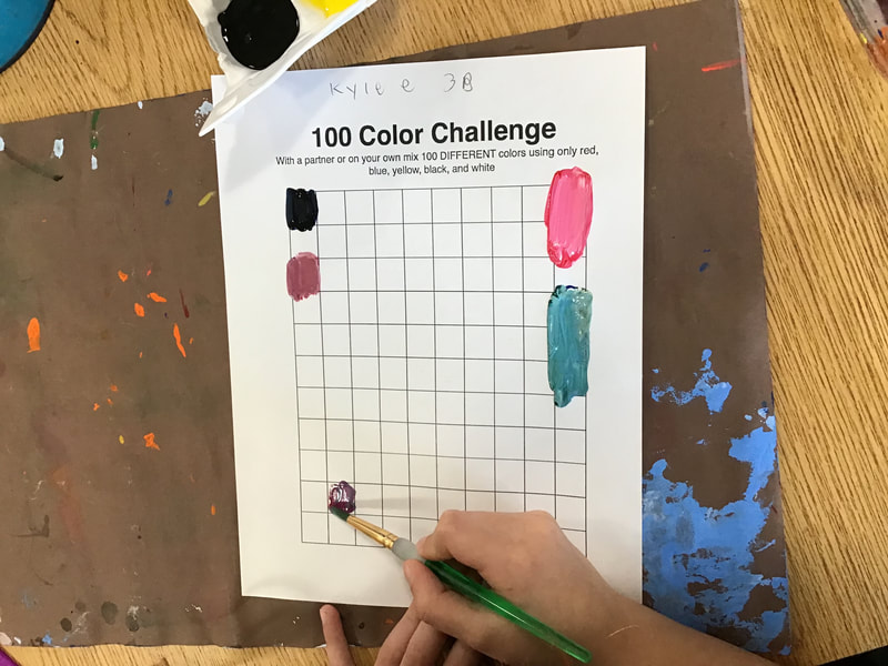
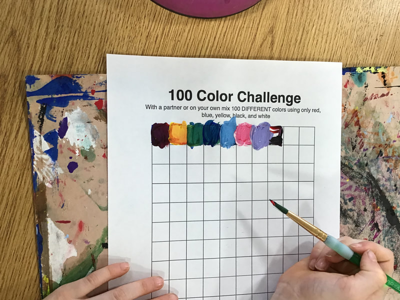
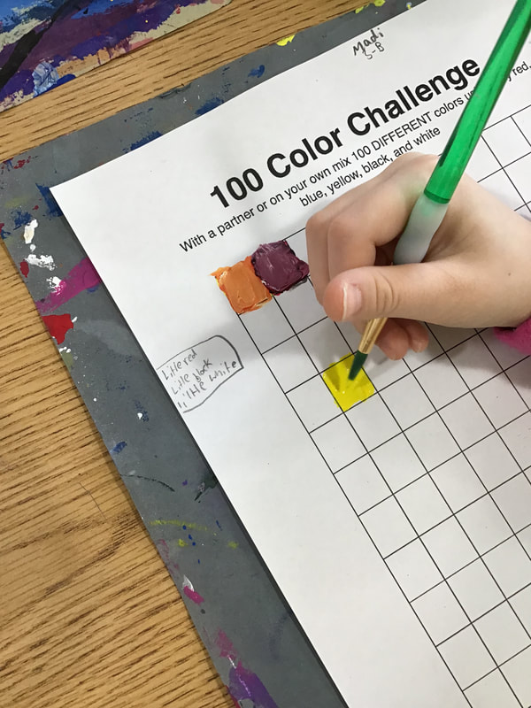
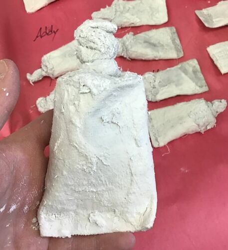
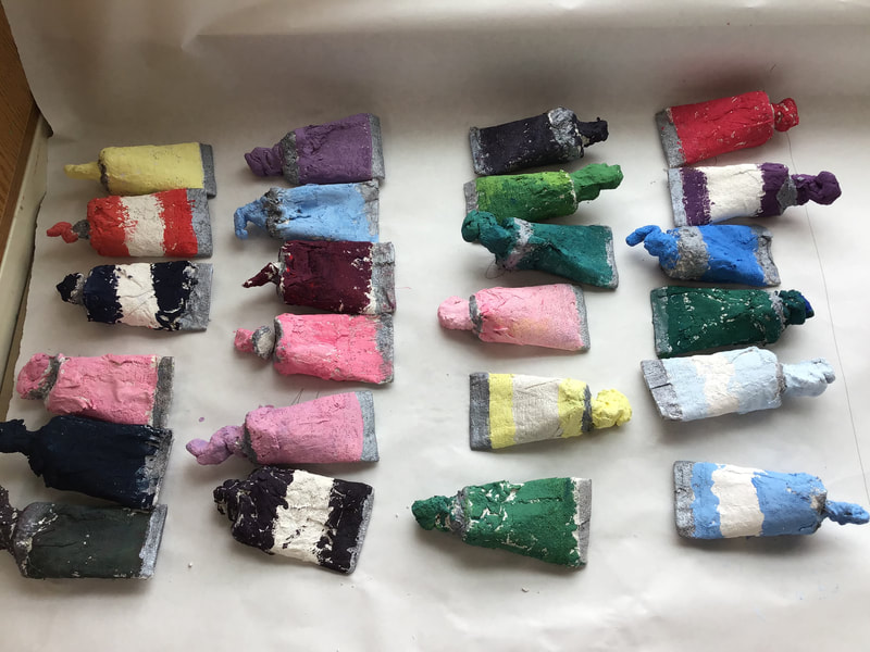
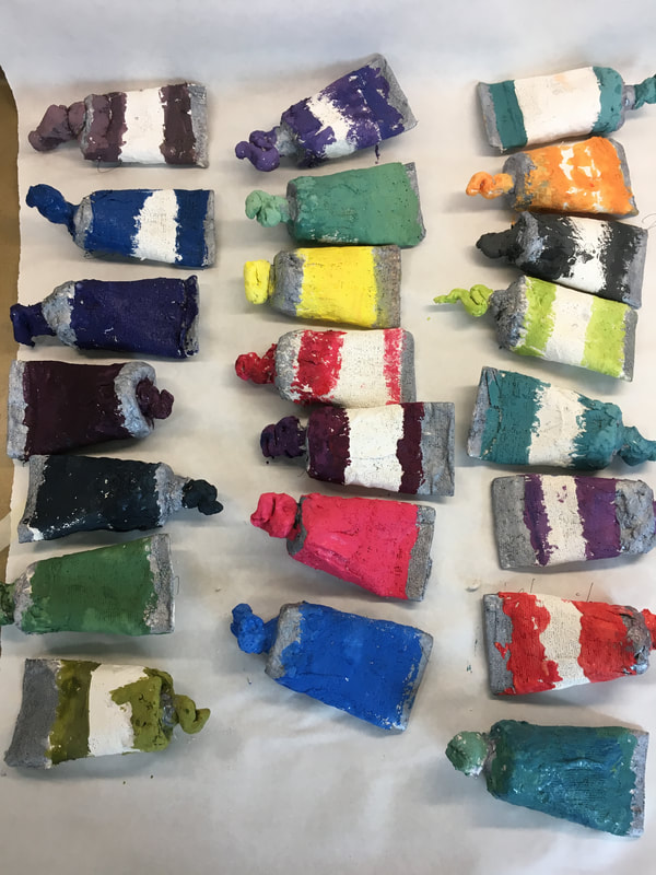
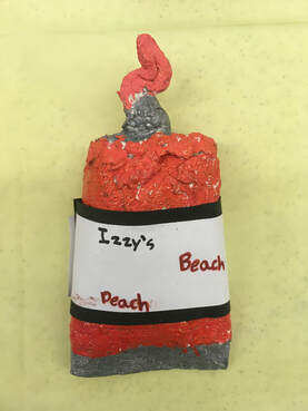
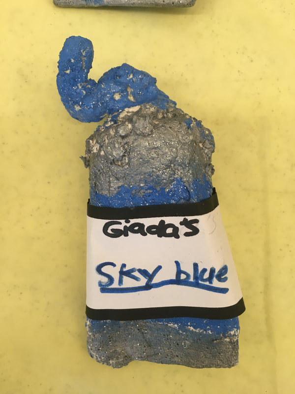
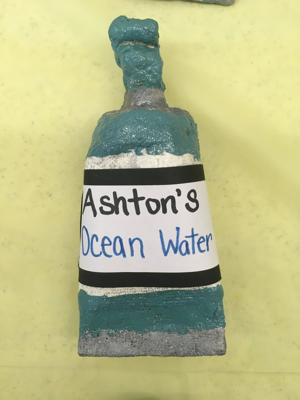
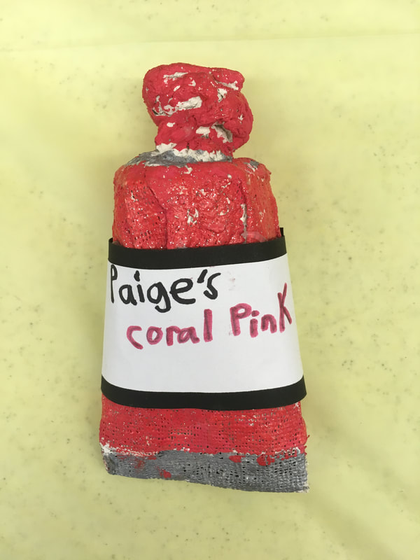
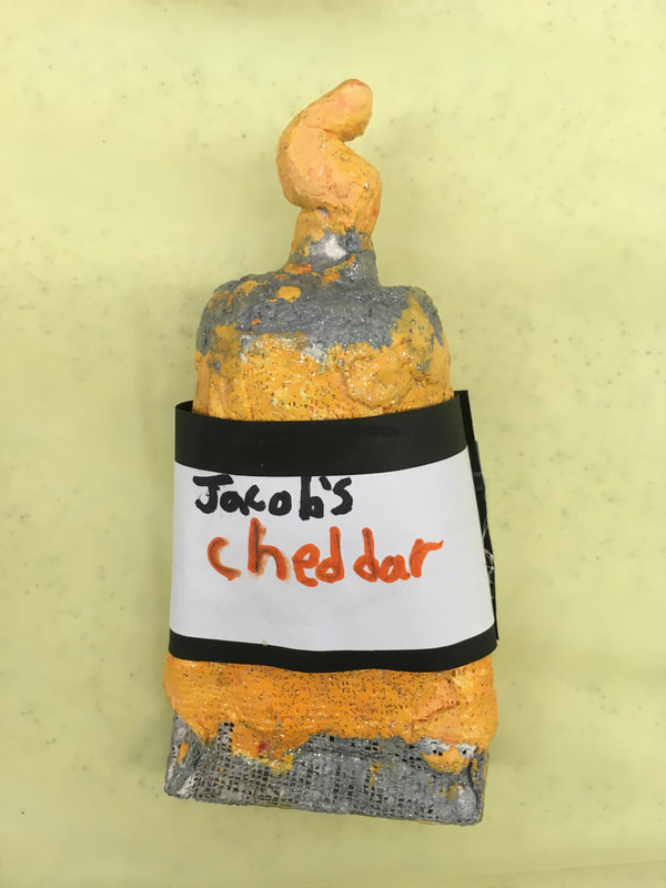
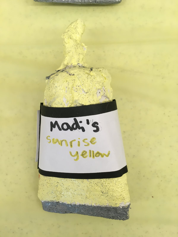
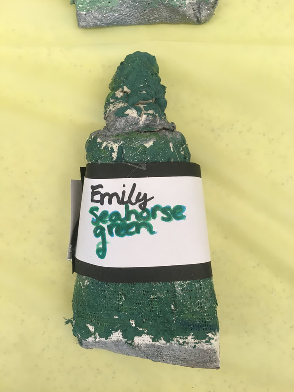
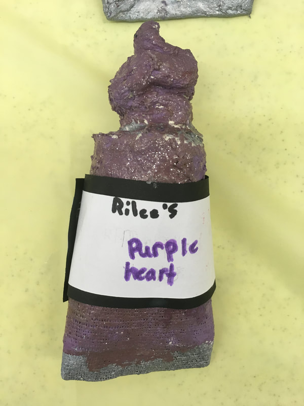
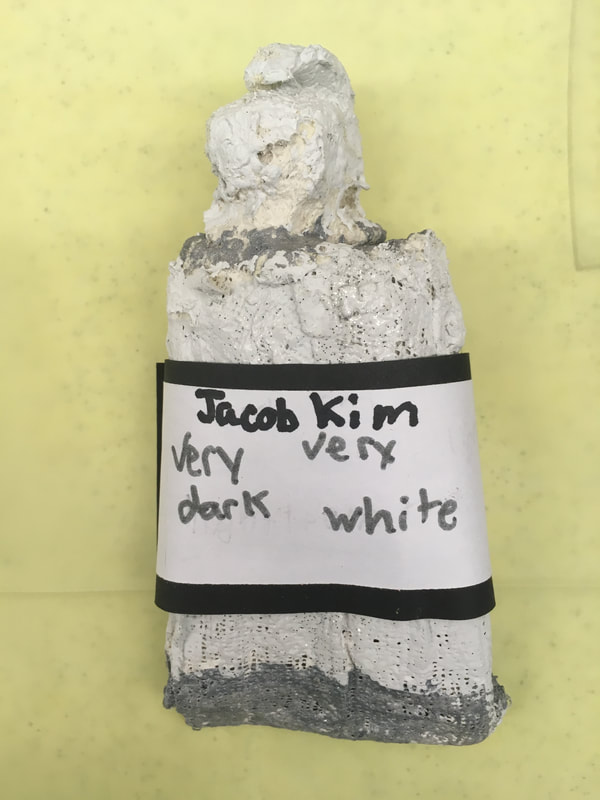
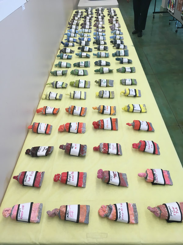
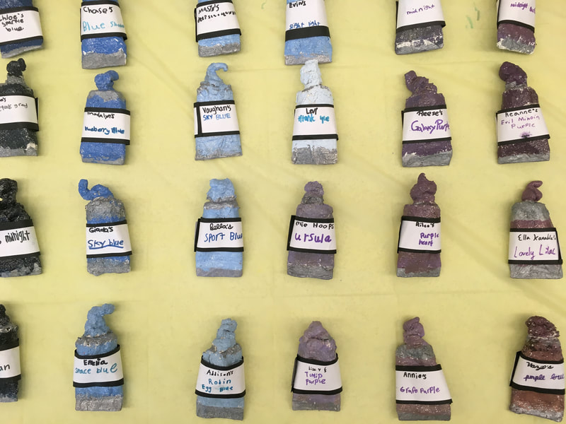
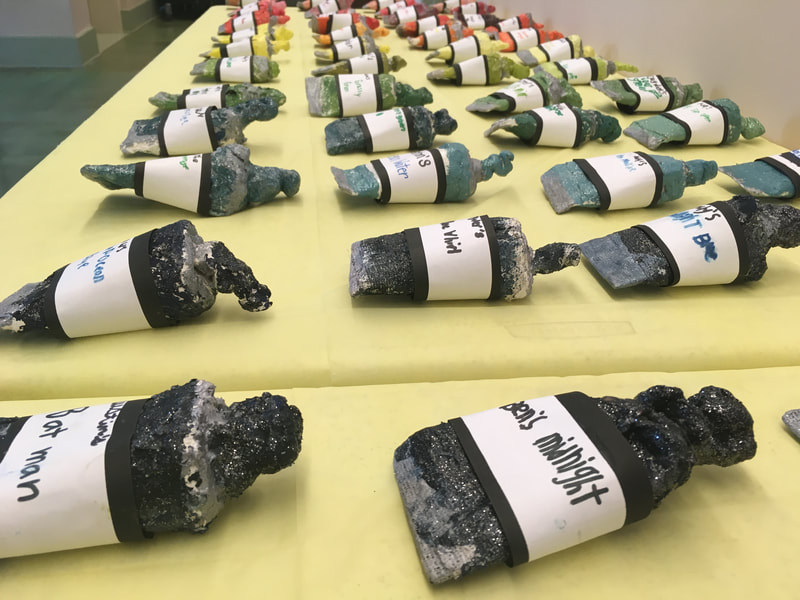
The paint-tube making part of the project came from Cassie Stephens over at cassiestephens.blogspot.com A few years back, in 2016, a feud took place in the art world that I have always been fascinated by. A laboratory in Britain created a substance called Vantablack. Vantablack is the darkest man-made substance on the planet and absorbs 99.95% of light. It essentially looks like a blackhole. This substance was created to coat the inside of telescopes so that light won’t reflect inside of the them. Anish Kapoor, an artist from Mumbai who is most well-known for creating “Cloud Gate/ The Bean” in Chicago, is a very famous, wealthy, and powerful artist. Using his wealth, he purchased exclusive artistic rights to Vantablack so that he is the only artist who can use it. This obviously upset artists all over the world. Along came Stuart Semple, a Pop Artist who has been making his own paints for many years. Stuart didn’t agree with what Anish did and set out to make things right in the art world. Stuart created a powdered pigment called Pinkest Pink that is so bright and pink, that it can’t be accurately portrayed when viewing it on a computer screen. Here’s the catch: Stuart made his paint available to everyone EXCEPT Anish. When you purchase Stuart’s paints, you agree on his website that you are not Anish Kapoor. Due to the success of his paint and the world-wide support for what Stuart was doing, he made the rest of his paints available for purchase and use… Except to Anish of course. Over the last few years, he has taken an open-source approach with his paints, asking users to give feedback and ideas on ways to make his paints better. This has led to his own version of Vantablack which recently celebrated its 3rd updated release. After introducing Stuart Semple and Anish Kapoor to my artists, I presented them with the 100 Color Challenge. Over the next class and a half, their goal was to mix red, yellow, blue, black, and white to create as many different colors as they could. Their goal was to find a favorite color that could then be painted on their paint tube sculpture later on. The 3rd day of the project was the actual making of the sculptures. Students were given a toilet paper tube that had one end pinched and stapled to resemble a paint tube. Students used four strips of plaster gauze to cover their tube. Next, they were given a small ball of celluclay that was used to sculpt the squirt of paint that was coming out of their paint tube. This was a tough project for the students that really challenged them. If their paper tubes got too wet, they would get soggy and squishy which then made it really hard for them to attach the squirt of paint to the top. Students were expected to problem-solve and/or ask a friend for help if they needed it. The 4th day of the project was spent mixing up the color that they liked from the 100 Color Challenge. They remembered how to mix the paint because they were told to make notes on their paper of how they mixed the colors they liked. They also added some silver to the top and bottom of the tube to look like metal foil. Lastly, they told me the name that they wanted to call their paints. I logged these names on a sheet with the correct spelling for them so they could reference it next class. For the 5th and final day of the project, I mixed some glitter medium into mod podge. Students used this glittery mix to coat their sculptures. This helped to strengthen them, as well as giving them a glossy and glittery sheen. Next, students wrote their paint name on a white strip of paper and then glued that thin strip of white to a slightly thicker strip of black. After these dried, I hot glued them to their paint tube for them. Lastly, I introduced students to an artist statement. I discussed how artists write about their work so that viewers know why they made it, how they made it, and what they made. I simplified their artist statement by making it a fill-in-the-blank form that they filled out.
Here’s a link to the artist statement! This is probably my 3rd graders’ favorite project! They looooooved mixing the colors, making the sculpture, and learning about the Stuart/Anish dispute.
0 Comments
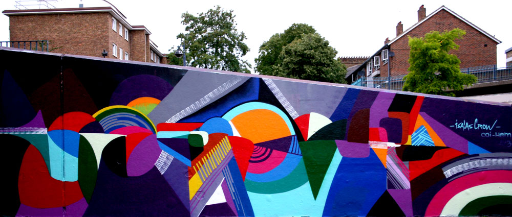
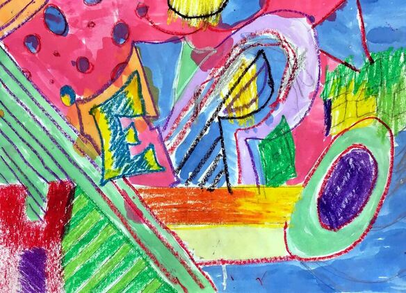
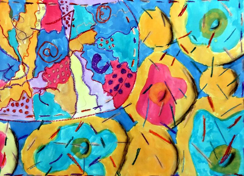
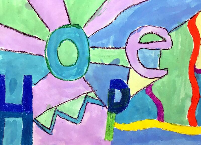
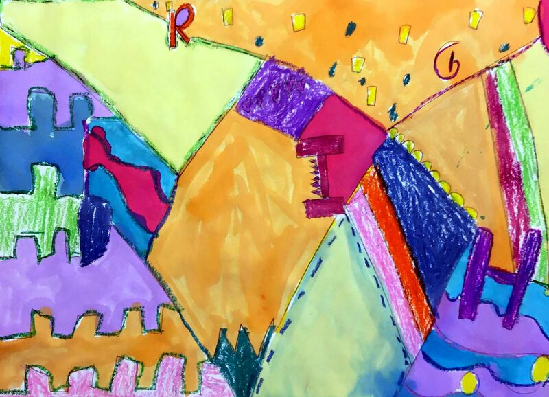
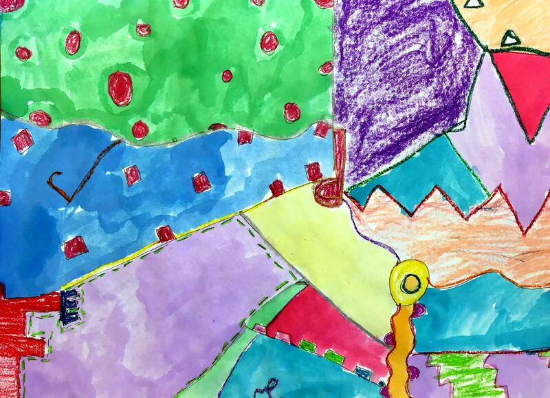
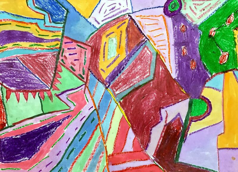
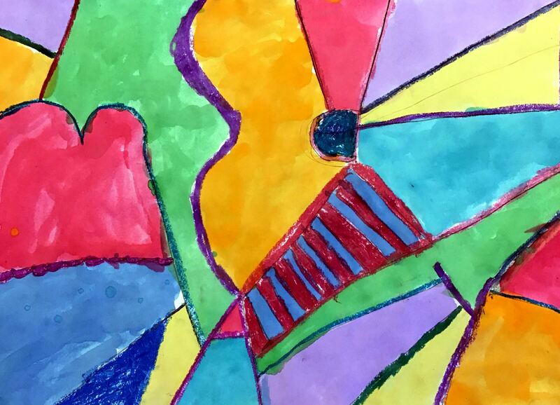
This is a project that I snagged from Don Masse over at shinebritezamorano.com Students learned about the muralist, Isaias Crow, for this project. Isaias is an artist who believes that his art can send a positive, uplifting message. He typically chooses an encouraging word and then incorporates it into his murals. Sometimes the word is easy to read, other times it is near impossible. His work also features many geometric lines and shapes with strong, bold colors. After introducing Isaias’ work to the students, students were given some time to brainstorm positive words that they may want to use in their artwork. Then they worked with a partner to brainstorm some more words. Next they chose one of their words and created two different abstract sketches that incorporated their word. Some students chose to really hide their letters while others made their letters more obvious. Lastly, they transferred their favorite sketch to a large sheet of paper.
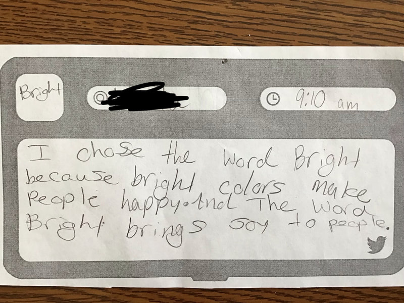
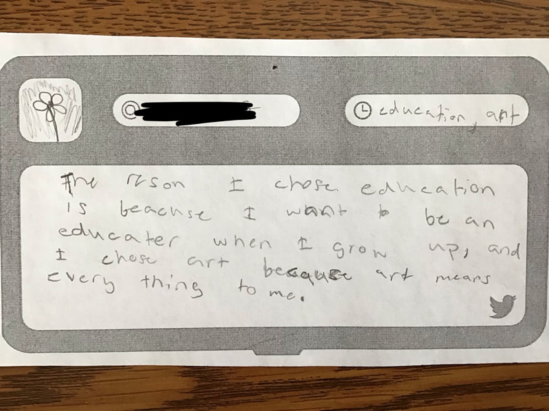
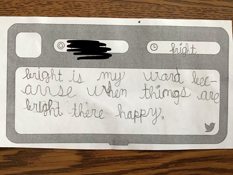
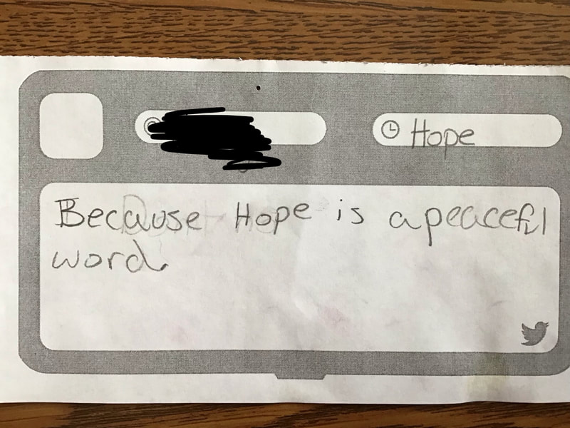
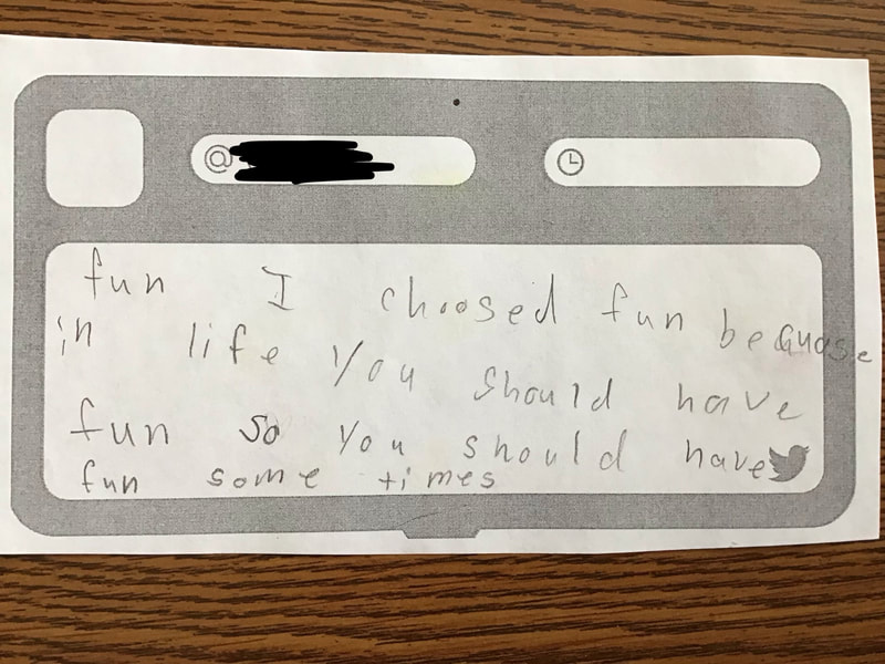
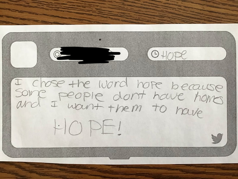
The 2nd and 3rd days were spent using oil pastels to outline all of their design and then selectively filling in parts of their artwork with color. The final 2 days were spent using liquid watercolors to fill in the last of their artwork. Then they were asked to write about why they chose the word that they did. I loved reading about some of the deep thinking that went into their word choice. |
Devon CalvertHarmony and Consolidated Elementary Art Teacher in Milton, WI. UW-Eau Claire graduate. WAEA President. Apple Teacher. Archives
March 2019
Categories
All
|


 RSS Feed
