|
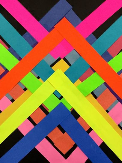
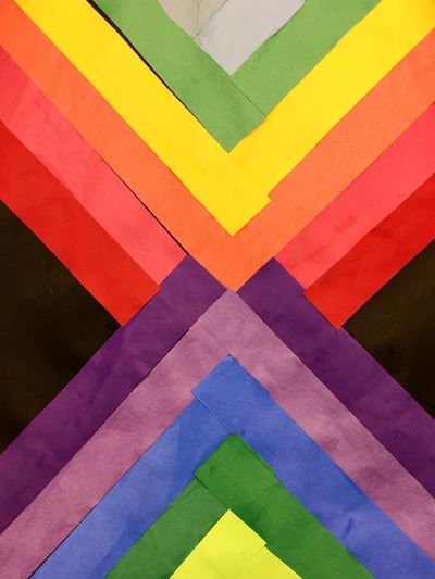
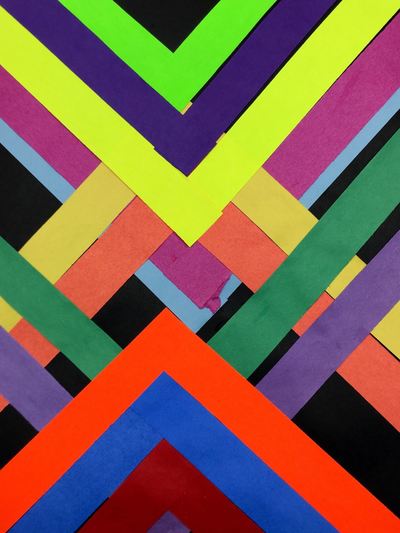
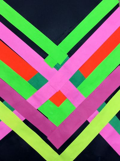
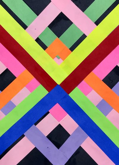
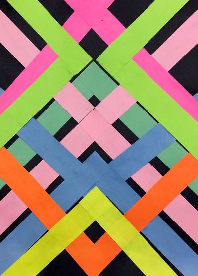
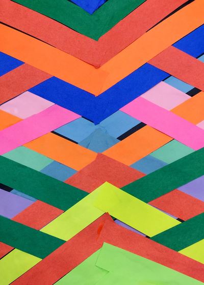
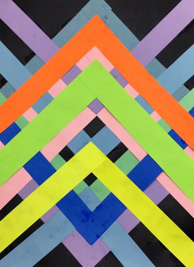
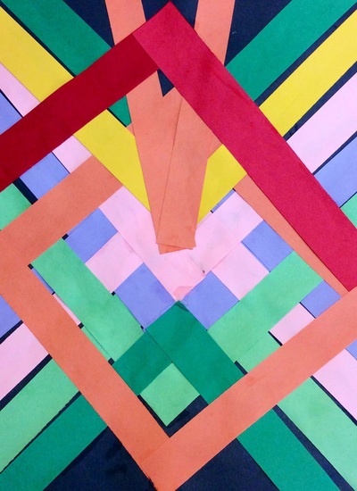
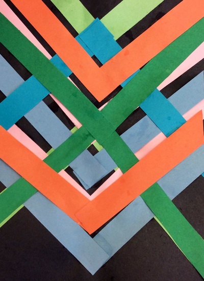
Maya Hayuk is always one of my favorite artists to teach each year! I just love her use of bright colors! Here is the write up on this project from previous years. Enjoy the pictures from this year's students!
0 Comments
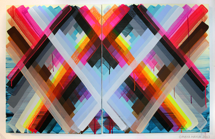
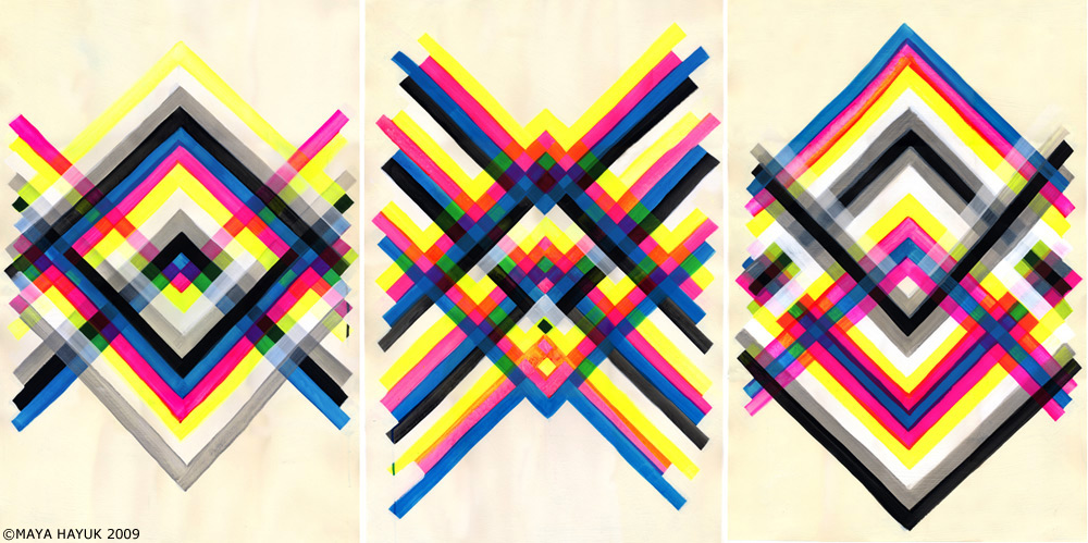
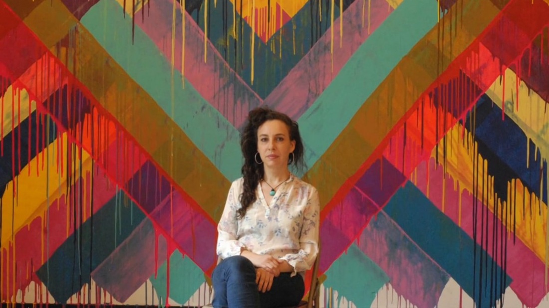
Maya Hayuk is a contemporary female artist out of Brooklyn. She creates large, geometric murals made of intersecting diagonals. The intersecting lines create an interwoven effect. Her murals use bright vibrant colors oftentimes overlaid on top of lighter colors. She uses a watered down paint that often runs down her walls. Because of the thinness of the paint, you can also see the mixing of colors when they overlap. I thought her work would be a good introduction to symmetry for our artists! With Maya's work, we talked about the symmetry she creates. We also noticed that a lot of her paintings have light colors with bright vibrant ones painted on top. This use of color creates a sort of space or depth to her artwork, similar to the effect that we got from some of Frank Stella's paintings a couple months ago.
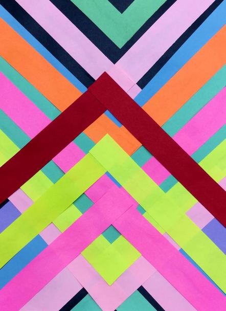
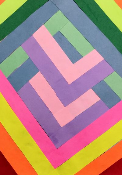
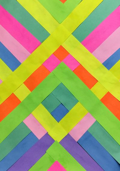
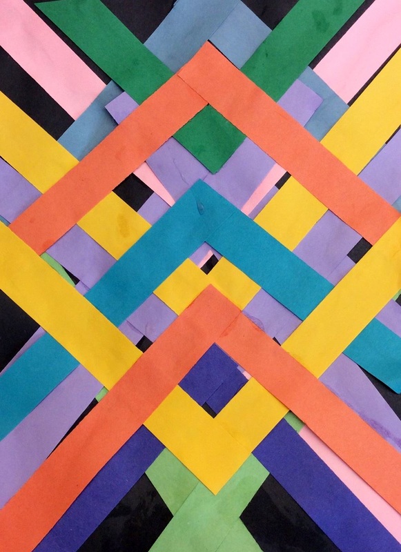
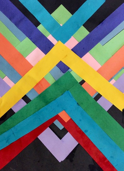
I showed students how to line up a strip in the center of their paper and then mirror a strip across from it on the other side of the paper. This created a "V" shape with the paper strips. I encouraged them to use various colors, to overlap, and to turn their paper upside down so that they had paper strips going both directions. The first day was spent using light tints of colors. The second day the students continued to add strips, this time using brighter colors to help create that sense of space/depth. They were pretty excited about using some neon colors! Only one of my 3rd grade classes got to learn about Maya Hayuk because they were a couple classes ahead of the other three classes. Maya Hayuk is a living female artist out of Brooklyn. She creates large, geometric murals made of intersecting diagonals. The interesting creates an interwoven effect. Her murals use bright vibrant colors oftentimes overlaid on top of lighter colors. She uses a watered down paint that often runs down her walls. Because of the thinness of the paint, you can also see the mixing of colors when they overlap. With Maya's work, we talked about the symmetry she creates. We also noticed that a lot of her paintings have light colors with bright vibrant ones painted on top. This use of color creates a sort of space or depth to her artwork, similar to the effect that we got from some of Frank Stella's paintings a couple months ago.
I showed students how to line up a strip in the center of their paper and then mirror a strip across from it on the other side of the paper. This created a "V" shape with the paper strips. I encouraged them to use various colors, to overlap, and to turn their paper upside down so that they had paper strips going both directions. The first day was spent using light tints of colors. The second day the students continued to add strips, this time using brighter colors to help create that sense of space/depth. |
Devon CalvertHarmony and Consolidated Elementary Art Teacher in Milton, WI. UW-Eau Claire graduate. WAEA President. Apple Teacher. Archives
March 2019
Categories
All
|

 RSS Feed
