|
0 Comments
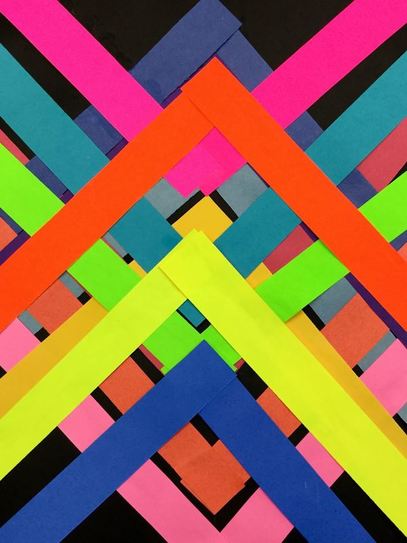
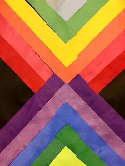
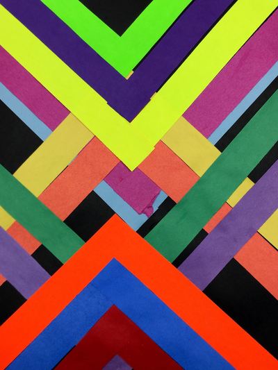
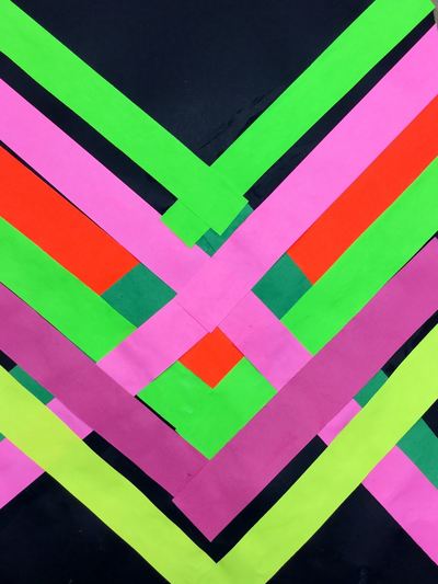
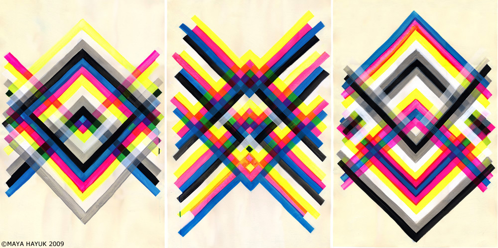
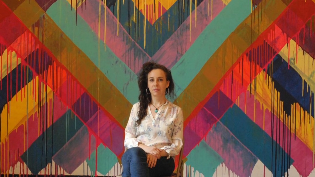
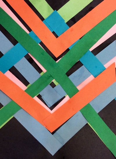
Maya Hayuk is always one of my favorite artists to teach each year! I just love her use of bright colors! Here is the write up on this project from previous years. Enjoy the pictures from this year's students!
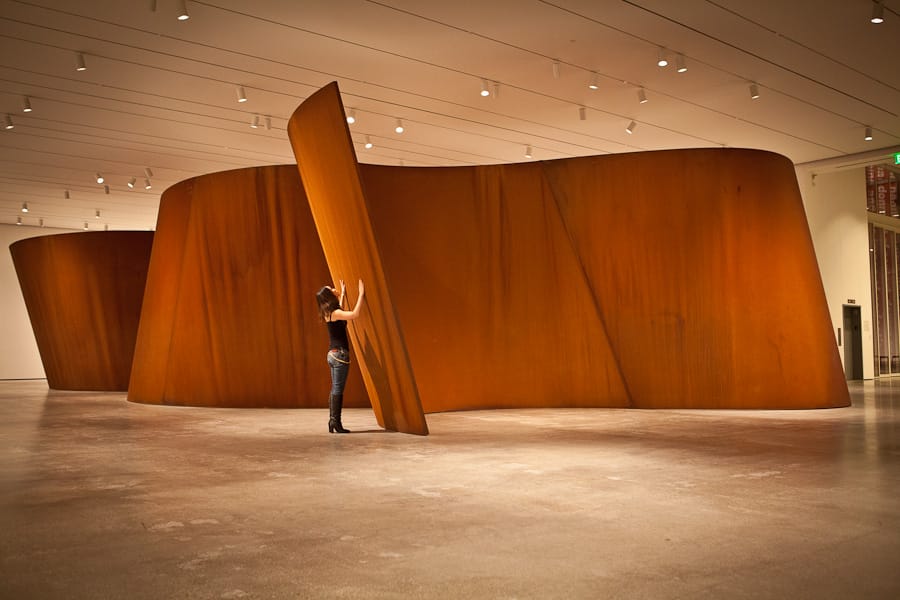
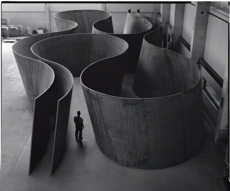
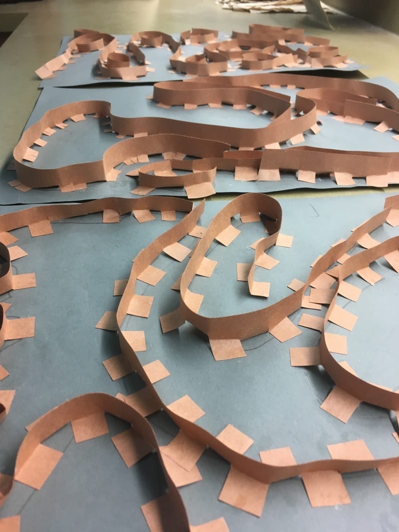
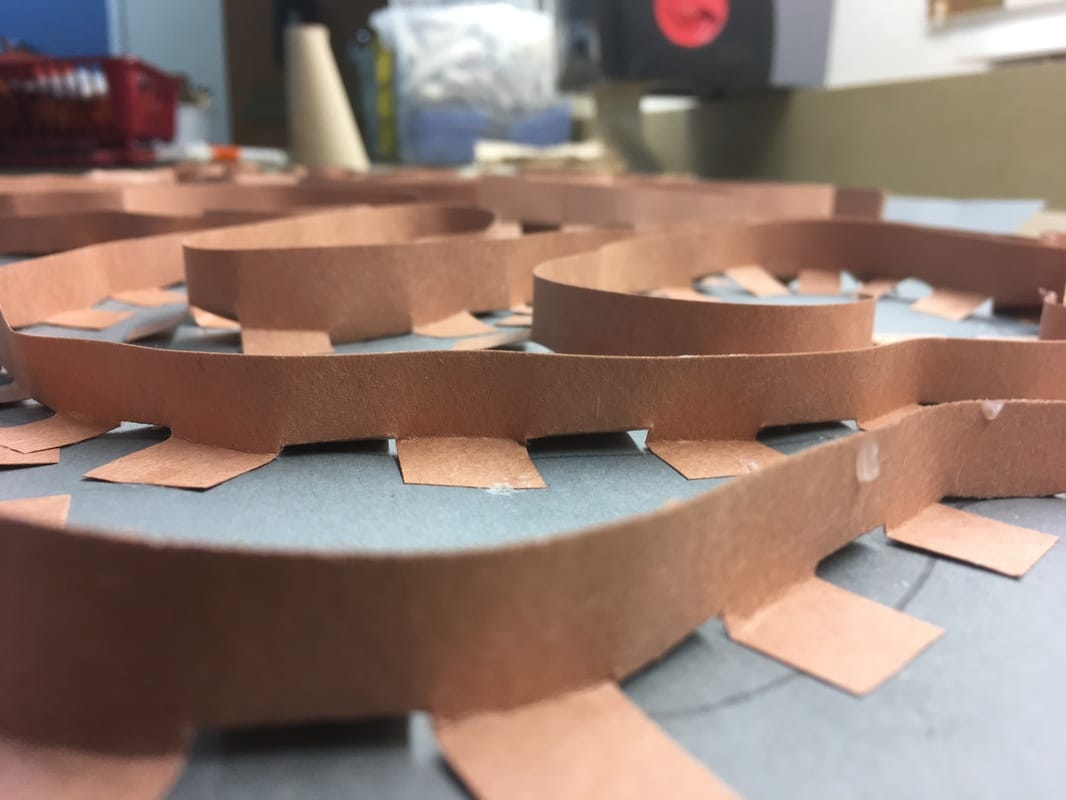
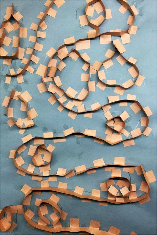
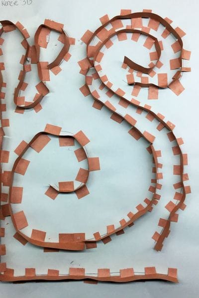
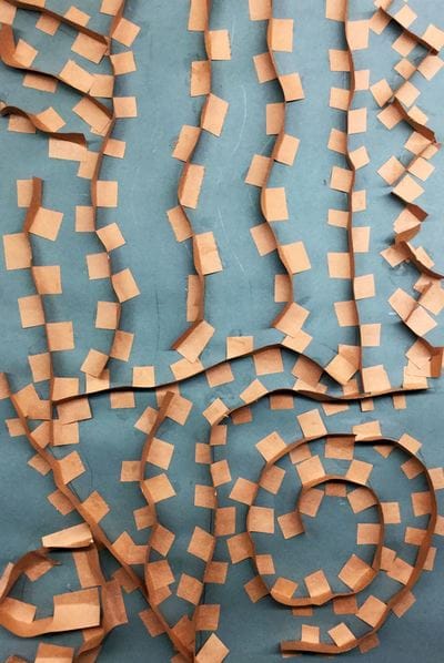
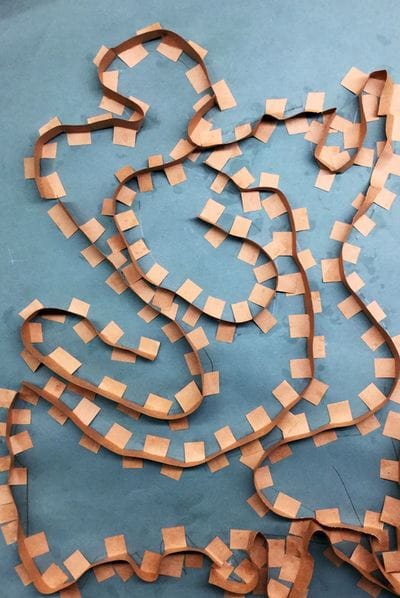
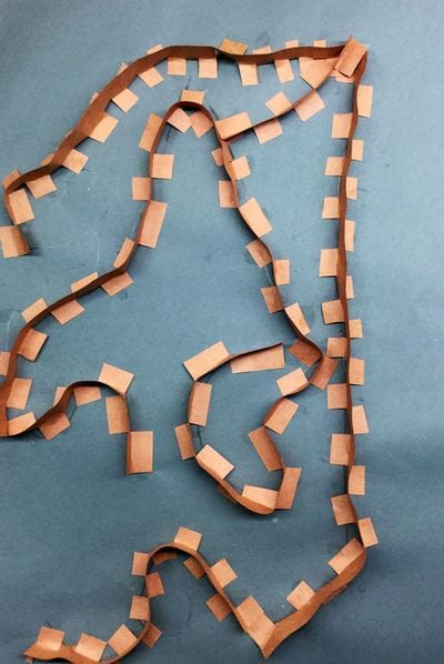
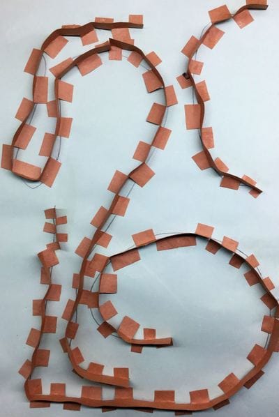
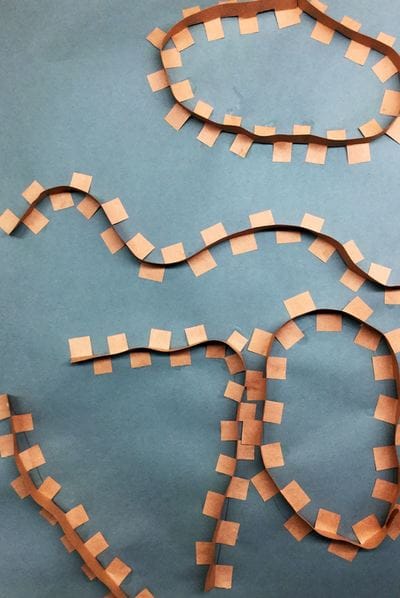
Richard Serra is an American installation artist who uses large sheets of steel to create warped walls. As a steel mill worker in college, he was influenced by the material and began to incorporate it into his work. His large walls slant at different angles with some angling over you while others angle away from you. Some walls are also close together and other areas are more open. His walls are meant to challenge a person's sense of personal space. We have talked about space as something being close or far away from us throughout this school year. This project however, we talked more about our own personal space and how those walls might change our perceptions of space. Because I didn't have this grade when they were in kindergarten and first grade, I haven't done any solid line projects with them. I like how when you can see Serra's work from above, it looks like a line design. I used this as influence to teach our artists about some different kinds of lines. After learning about Richard Serra, students created two sketches of line designs. After settling on their stronger design and getting it okay'd by me, they transferred it to a large sheet of grey paper. The 2nd and 3rd day of this project were spent adding “lines/walls” to our artwork. We did this by cutting small slits into brown strips of paper. Students then folded the tabs those slits created back and forth so that it kind of looked like a zipper. Lastly, they put a dot of glue on the bottom of each tab and glued the strip down onto their line drawings.
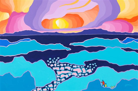
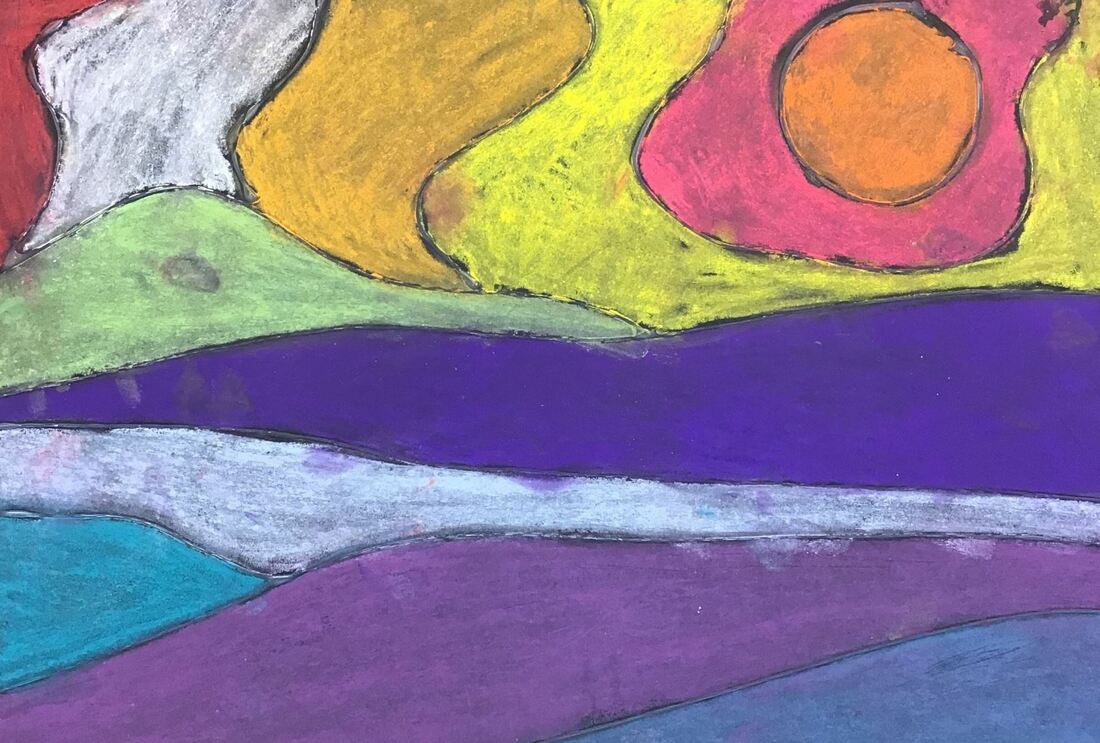
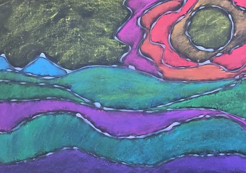
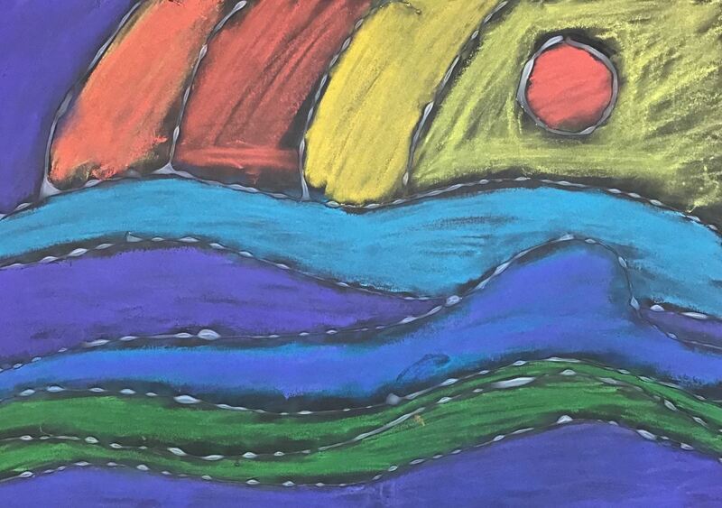
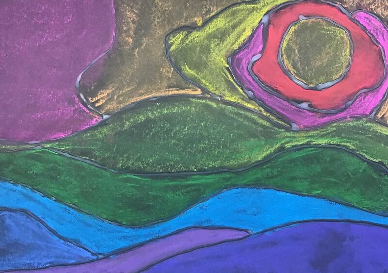
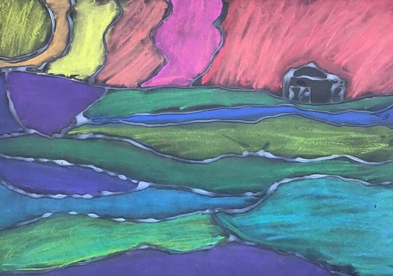
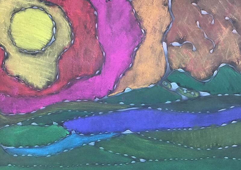
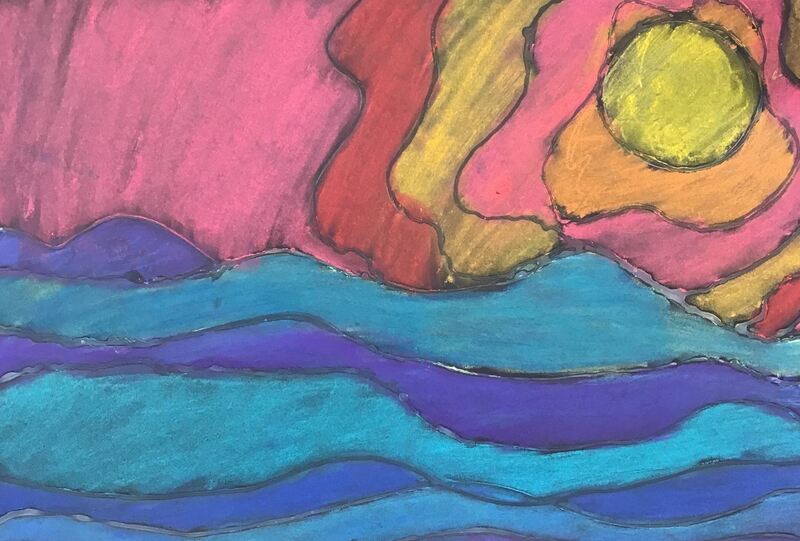
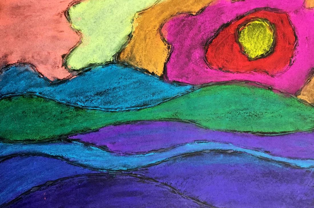
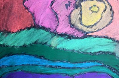
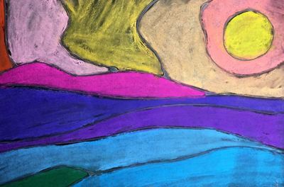
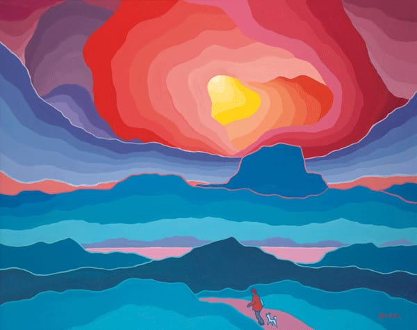
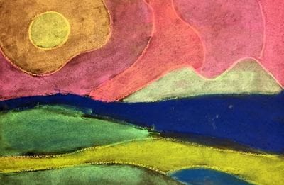
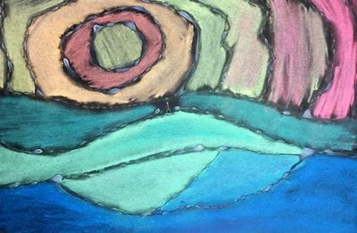
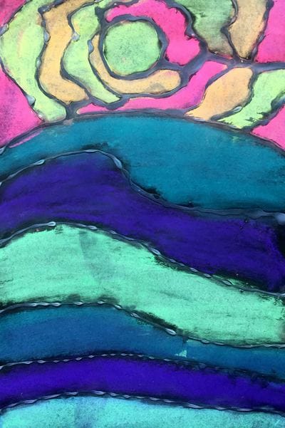
I'm blown away by these! This is one of my favorite projects this year! Ted Harrison was a British-Canadian artist who is well-known for his bright, stylized landscapes of the Yukon. Although I told my artists that we would be learning about living artists this year, I made the exception with Ted because he passed away this past January. I thought Mr. Harrison's work would be a good chance for us to study space and warm/cool colors.
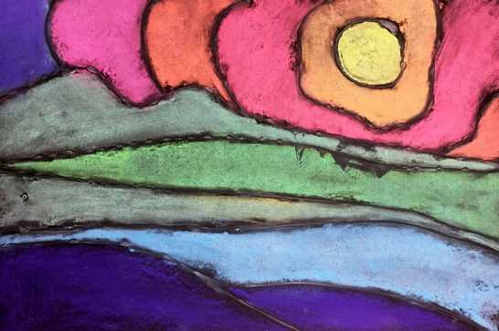
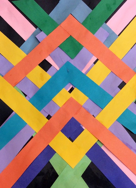
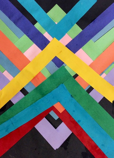
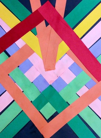
Lately, I have been stressing the importance of sketching out ideas and designs before diving into projects. After we took a look at Ted's work, we did two landscape sketches. Students decided on their stronger design and got it okay'd with me. Then they transferred that sketch to a large black sheet of paper. Lastly, they used a glue bottle to carefully trace over their lines. The second day and final day of the project was spent adding color to our landscapes with chalk. We emphasized using cool colors on the ground and warm colors in the sky. Because we used glue to draw last class, the now dry glue creates strong black lines to divide up the sections of background. Our chalk colors are pretty limited so students had to mix a lot of their chalks to create new colors. It was good to see them take advantage of their color mixing knowledge. Only one of my 3rd grade classes got to learn about Maya Hayuk because they were a couple classes ahead of the other three classes. Maya Hayuk is a living female artist out of Brooklyn. She creates large, geometric murals made of intersecting diagonals. The interesting creates an interwoven effect. Her murals use bright vibrant colors oftentimes overlaid on top of lighter colors. She uses a watered down paint that often runs down her walls. Because of the thinness of the paint, you can also see the mixing of colors when they overlap. With Maya's work, we talked about the symmetry she creates. We also noticed that a lot of her paintings have light colors with bright vibrant ones painted on top. This use of color creates a sort of space or depth to her artwork, similar to the effect that we got from some of Frank Stella's paintings a couple months ago.
I showed students how to line up a strip in the center of their paper and then mirror a strip across from it on the other side of the paper. This created a "V" shape with the paper strips. I encouraged them to use various colors, to overlap, and to turn their paper upside down so that they had paper strips going both directions. The first day was spent using light tints of colors. The second day the students continued to add strips, this time using brighter colors to help create that sense of space/depth. |
Devon CalvertHarmony and Consolidated Elementary Art Teacher in Milton, WI. UW-Eau Claire graduate. WAEA President. Apple Teacher. Archives
March 2019
Categories
All
|

 RSS Feed
