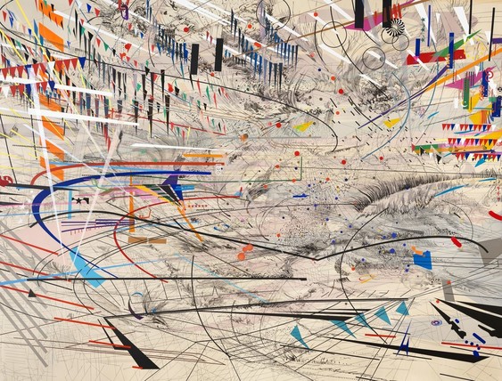
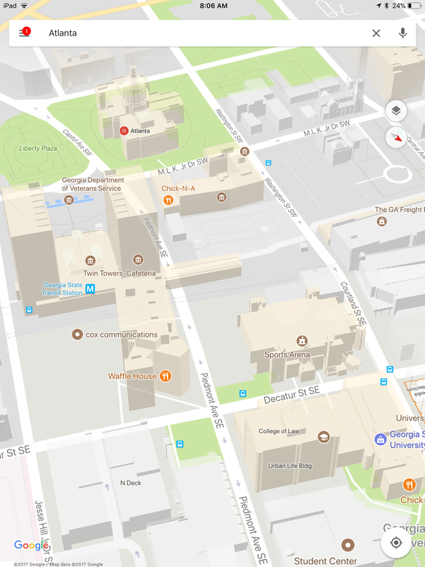
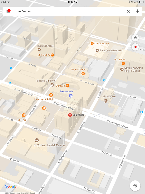
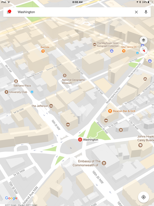
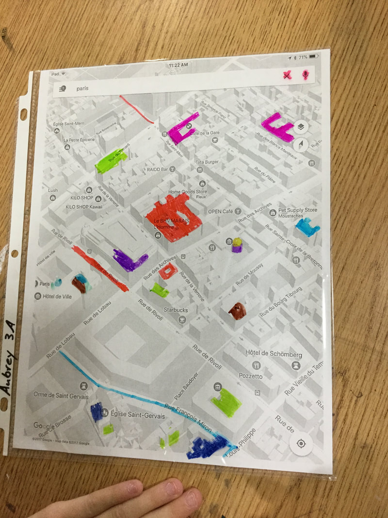
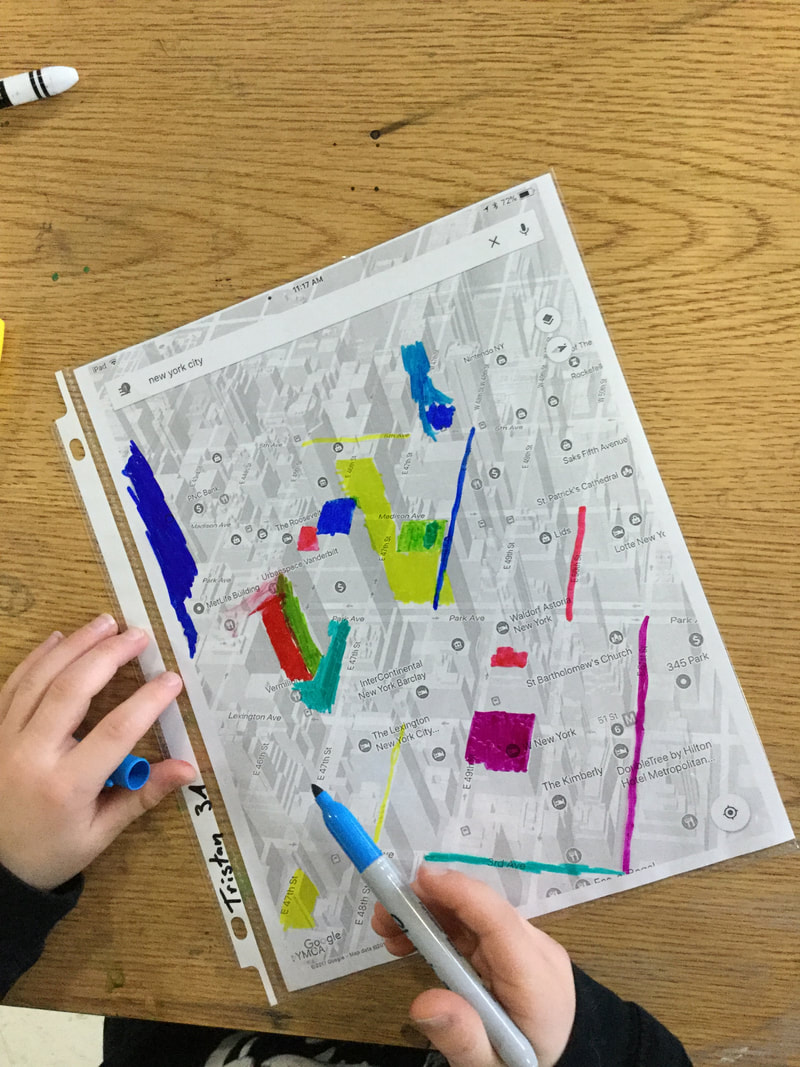
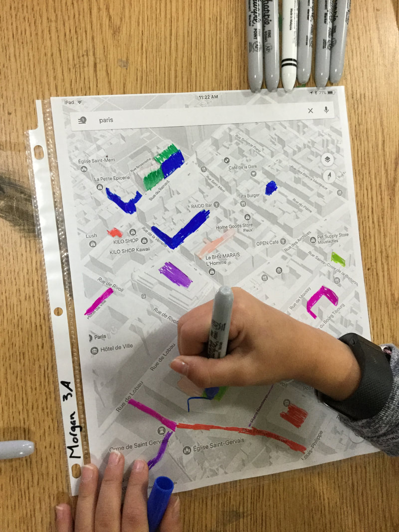
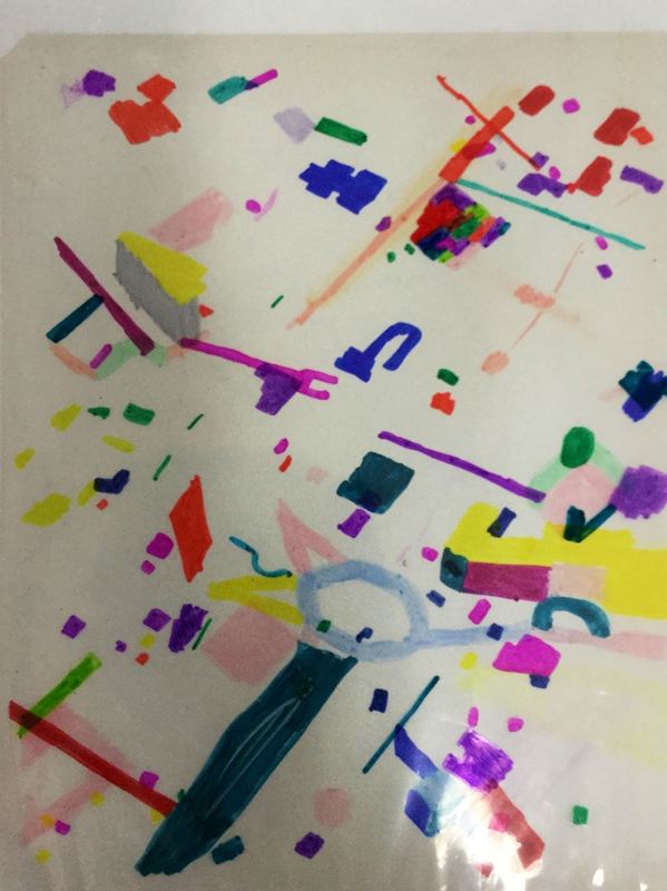
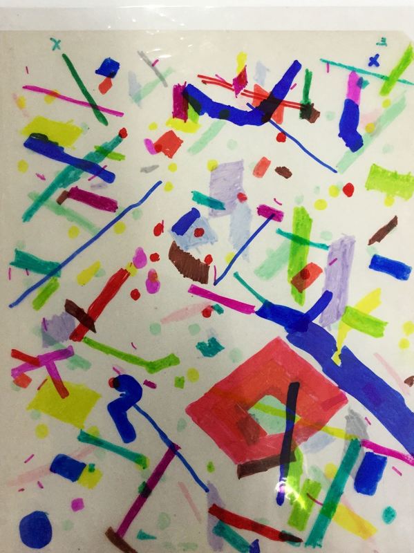
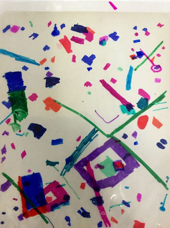
 3rd grade is currently wrapping up learning about one of my favorite artists, Julie Mehretu! Each year, I give the table groups in my room a different theme and this year's theme is contemporary female artists. Julie Mehretu is one of my table groups and students have been hoping to learn about her! This project was also inspired by another art teacher who made abstractions of maps on iPads that were inspired by Mehretu. Mehretu is originally from Ethiopia but has since moved to the Michigan where she has spent most of her life. She is very inspired by architecture and chooses bits and pieces from different buildings and perspectives to paint. She also uses a lot of maps, charts, blueprints, etc in her work. She puts layer upon layer upon layer of different lines, shapes, and colors to build up her eye-catching paintings. Students were given the opportunity to choose from quite a few different maps that I had screen-shotted from Google Maps. After choosing a map, they slid their map into a see-through paper protector. Students then used sharpies to color in certain parts of the map. They could color entire buildings, parts of buildings, roads, etc. The second class, they chose a new map and slid it into their paper protectors. This time, they put it in backwards so they were working on the side of the paper protector that they didn't work on last time. They continued to color in parts of the map. The final day, students chose a final map and colored in parts of the map on a transparency sheet. While they worked, I used double-sided tape to tape their paper protector to a white sheet of paper. I did this so that their lines and shapes of color would show up better on the finished product. At the end of class, students slid their transparency into their paper protectors and this created a work of art that used 3 different layered maps. I'm super pumped with how awesome these turned out! This has become one of my favorite projects! 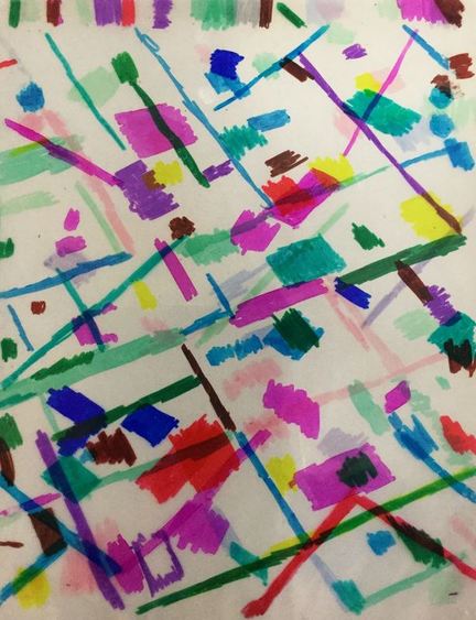
0 Comments
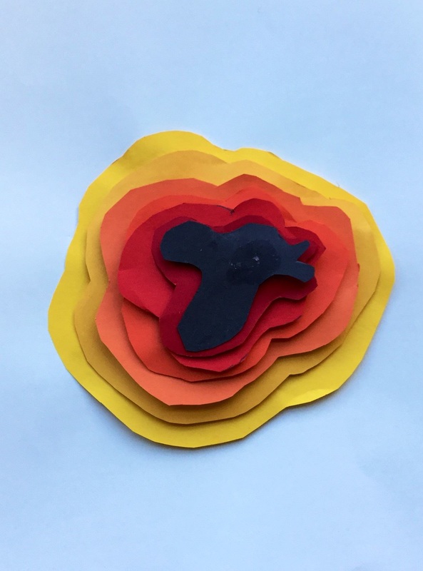
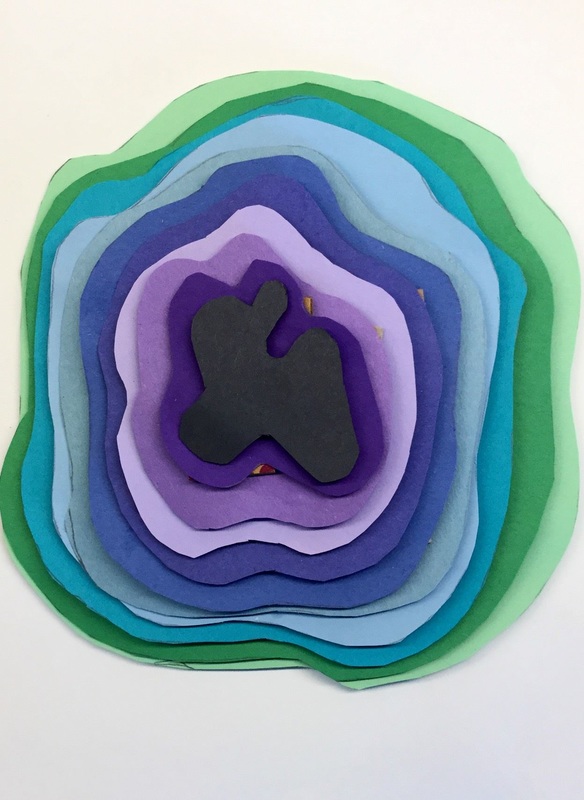
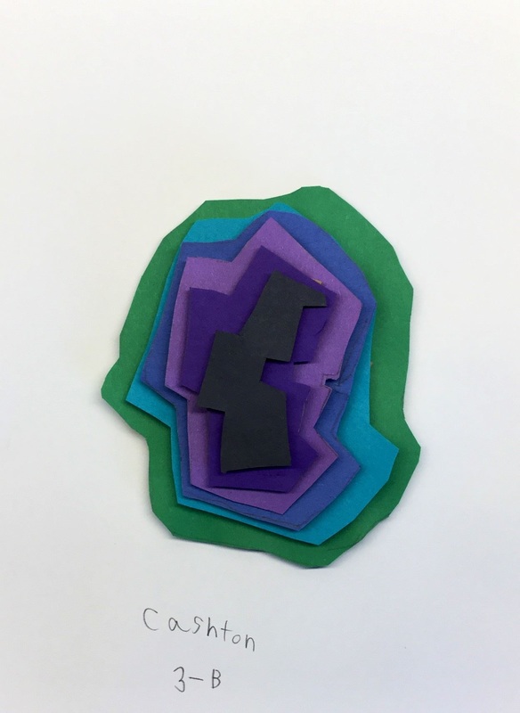
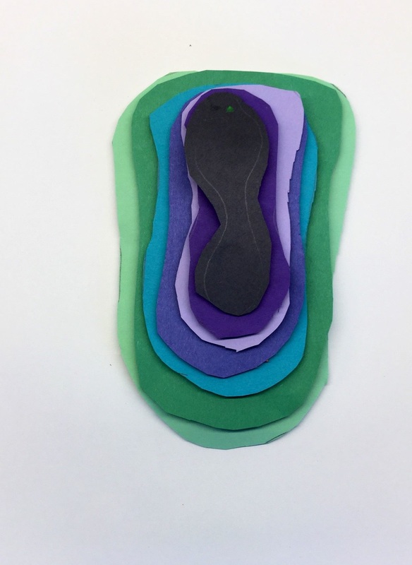
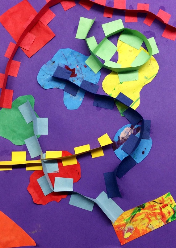
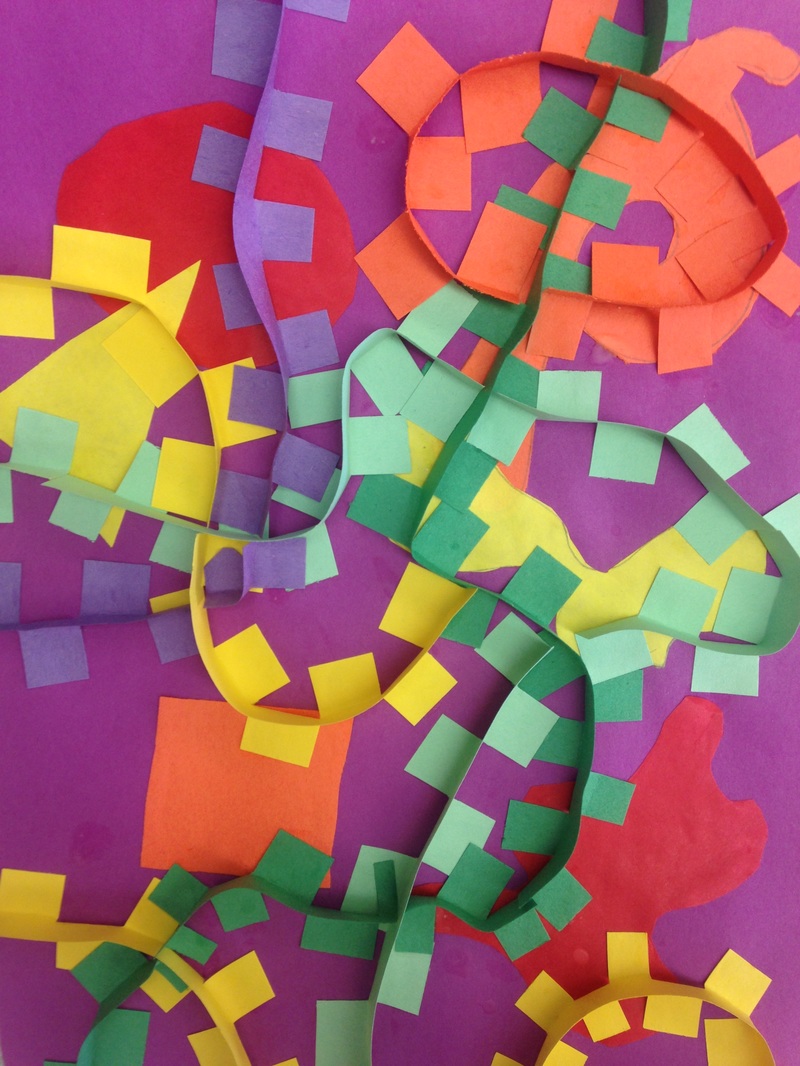
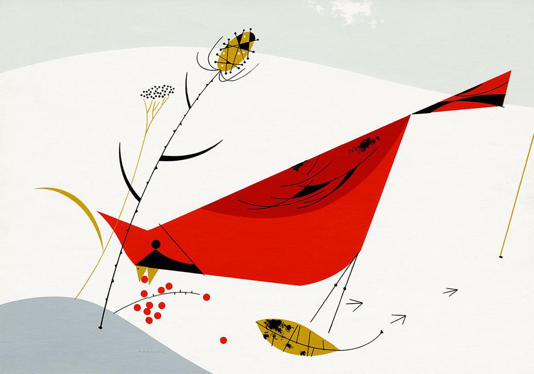
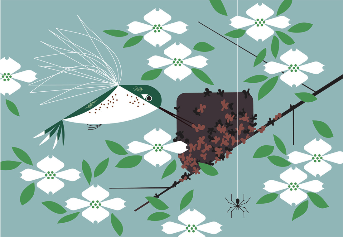
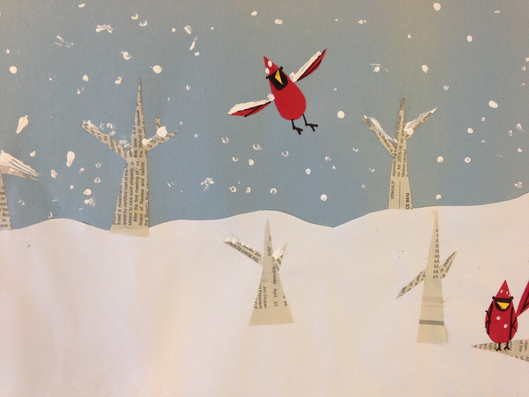
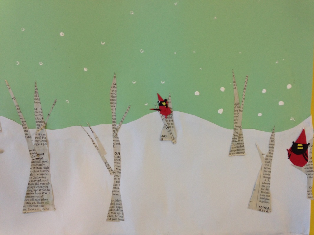
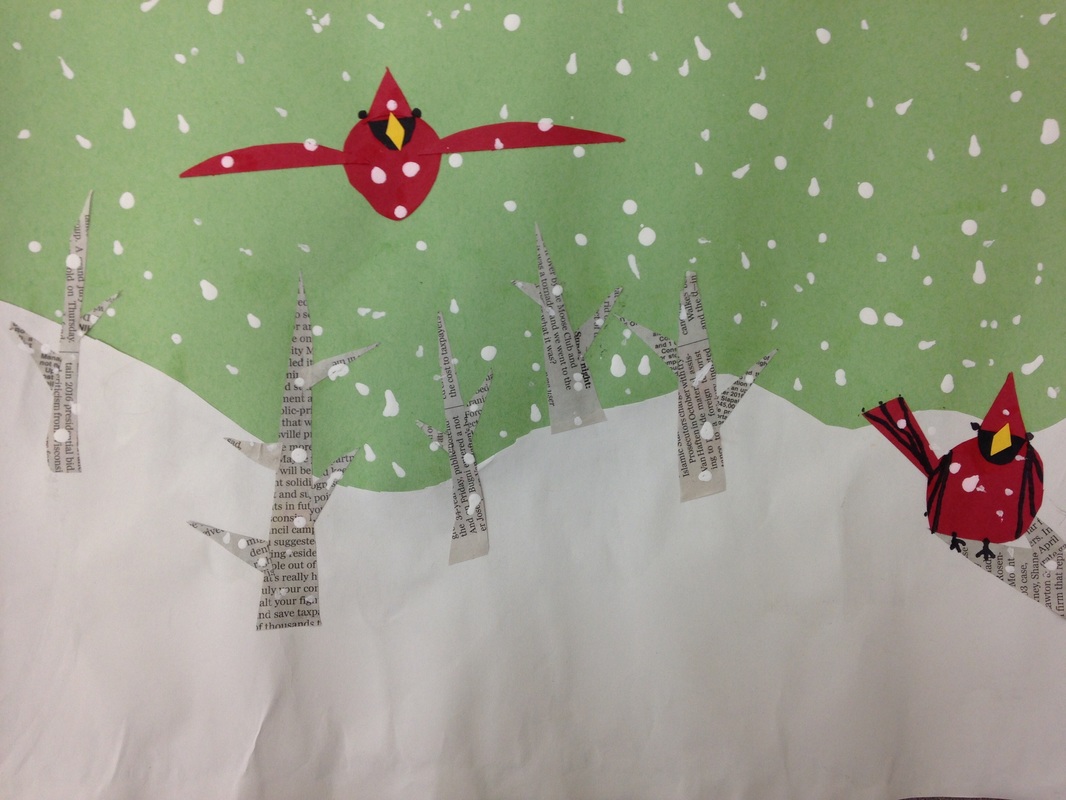
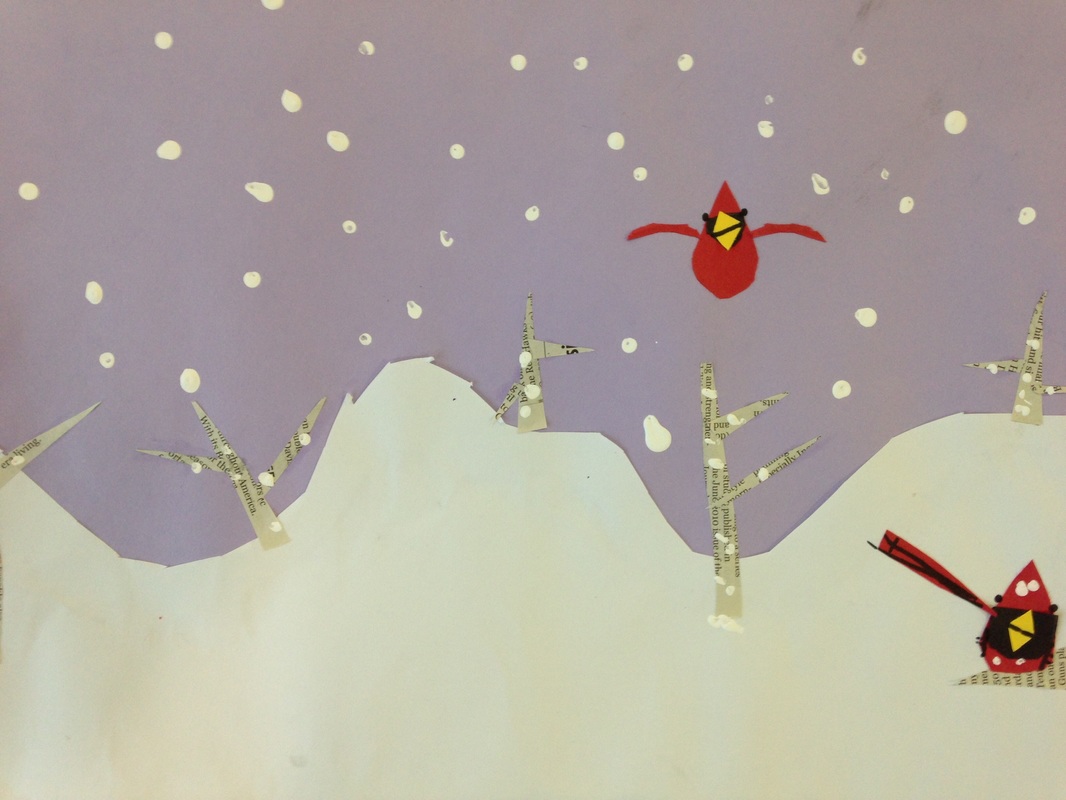
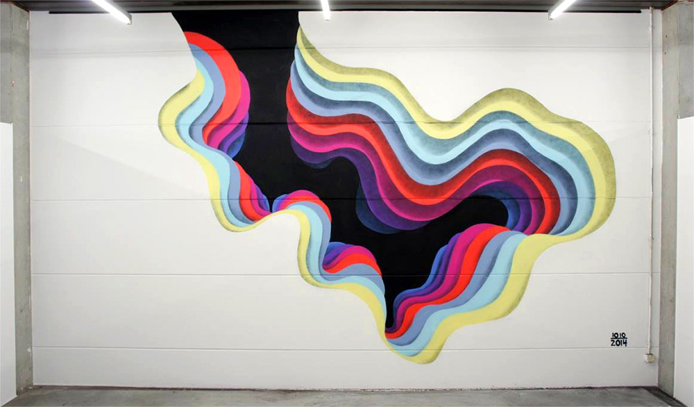 1010 (pronounced ten-ten) is an anonymous street artist who creates optical illusion-esque portals. He typically paints large-scale murals but also does some paper cuts (not the kind that hurt!). Although his paintings are 2D, they have a sense that you can walk into them. He creates this effect by working from darkest at the very center and working his way outwards to the lightest colors. This creates a tunnel-like effect. His choice of colors, combined with the gradual change in size of his shapes combine to create this effect. Sometimes he chooses to use geometric shapes, other times he uses organic. I really like that he doesn't always just use blues or greens during his work; he shifts through several different colors. After introducing 1010, students were introduced to analogous colors. Analogous colors are three colors in a row on the color wheel. Technically, analogous colors include a tertiary but because I didn't have many tertiary colored papers, I just told the students that it was 3 regular colors on the color wheel (yellow, green, blue for example). All students created a small shape using black. From there, they needed to stop and think about what colors they were going to use and how they would transition between them. They were expected to use at least 6 colors including the black one they started with. After cutting out their black shape, they bubble-traced around their shape which made it slightly larger. Each new shape they cut out was bubble-traced so that their artwork would continue to get bigger and bigger. Students were very conscious of working from the darkest colors first to the lightest while also remembering to keep their analogous colors in order. The second and final day of the project was spent finishing cutting out any shapes they had left. Some stopped at six shapes while others cut out up to twelve different colors! Lastly, students glued them down from biggest to smallest, lightest to darkest. Each layer had pieces of cardboard glued to the back of it. This caused each layer to be slightly raised above the previous one. This differed from 1010's work because his is completely flat, however, ours took on more of a pyramid form. I was really nervous about this project. Although it was only a two-day project, I thought it was kind of a complex idea working from darkest to lightest using analogous colors but the kids knocked this out of the ballpark! 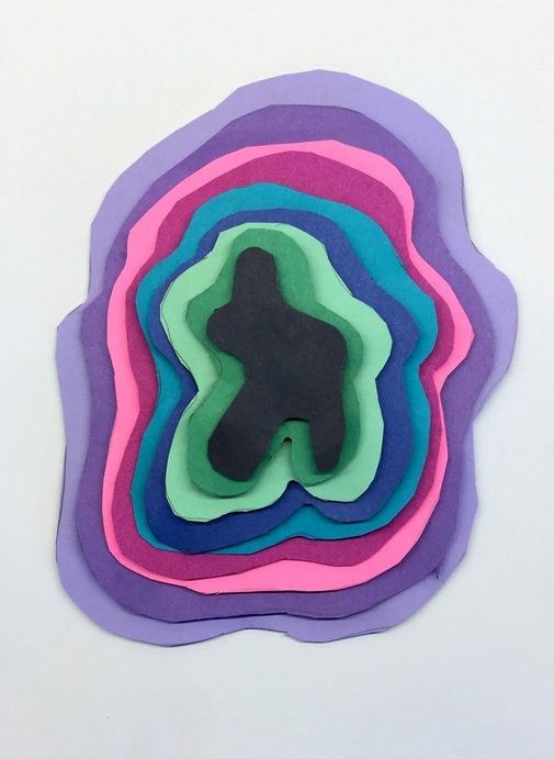 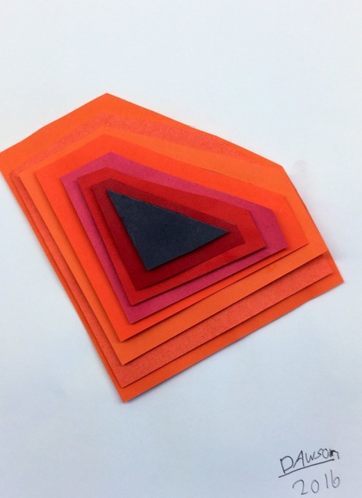 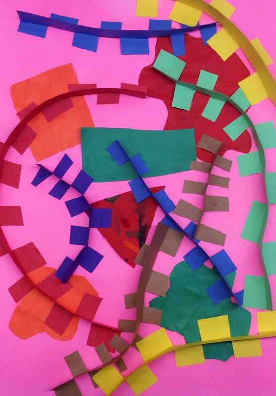 With spring break fast approaching, 3rd grade knocked this quick project out of the park! We super duper quickly looked at a few of Wassily Kandinsky's paintings. His paintings are a combination of various shapes and lines. This lead into a discussion about the two different kinds of shapes: organic and geometric. We also looked at and named a bunch of different lines. For the background, we took some of our scrap paper and made 3 organic shapes and 3 geometric. After gluing those down, we made all kinds of crazy lines! To make the lines, we took a strip of paper and cut little tabs down one side of it. Then we folded the tabs in either direction so that we could bend and curve our line easily. Students were also encouraged to intersect lines. This was a quick project that only a couple of my 3rd grade classes got to do. I used it as a filler because we lost a few of our art classes due to practicing for the winter concert (which they did fabulous at!). Mr. Harper was an American illustrator who is most well-known for his depictions of wildlife. His works are featured often in calendars, prints, and books. He referred to his style as minimal realism. This meant that he attempted to depict his animals as realistically as he could with as few shapes, colors, lines, and textures as he could. To get this project rolling, students chose a pastel colored background. Then they cut some curves into a white sheet of paper which created our snowy ground. Then we used newspaper to cut various shaped triangles out which we then glued together to become trees. The white newspaper with the black text made for a good birch tree effect. On our second day, we began to create our cardinals. We took a look at how Mr. Harper used simple shapes to create more elaborate pictures. Our cardinals could be broken down into tear-shaped bodies with curved wings. A black "mask" and beak were added to each bird. On the final day, we finished up our birds. We added a couple details to the birds with sharpies, such as eyes, legs, and feathers. Lastly, we used white paint and Q-tips to create some falling snow. |
Devon CalvertHarmony and Consolidated Elementary Art Teacher in Milton, WI. UW-Eau Claire graduate. WAEA President. Apple Teacher. 
Archives
March 2019
Categories
All
|


 RSS Feed
