|
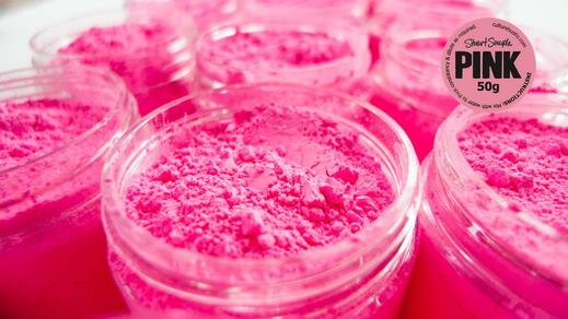
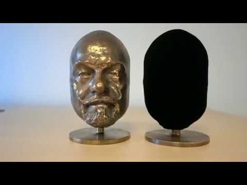
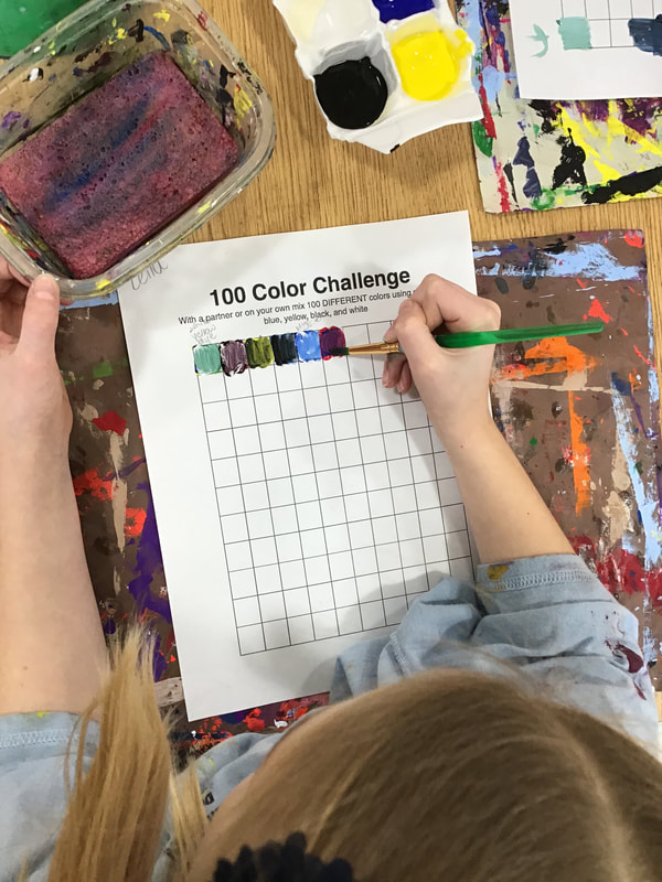
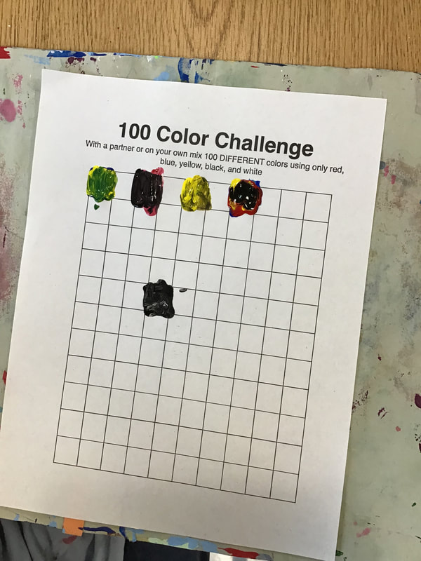
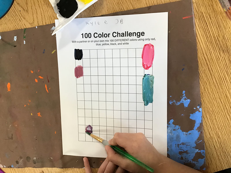
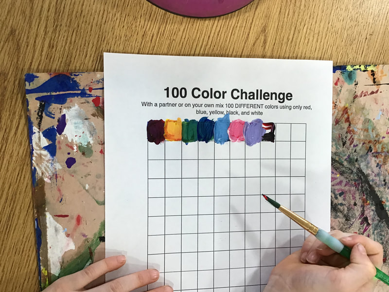
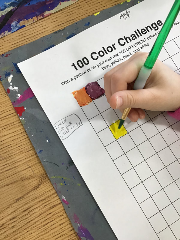
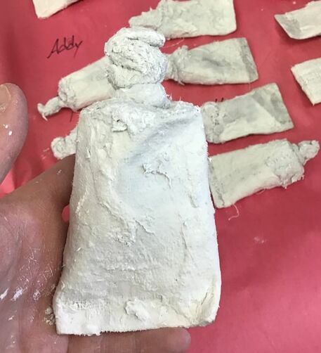
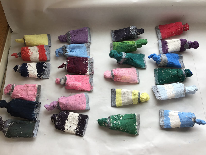
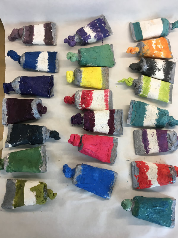
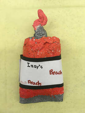
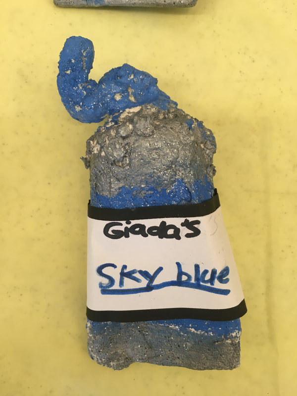
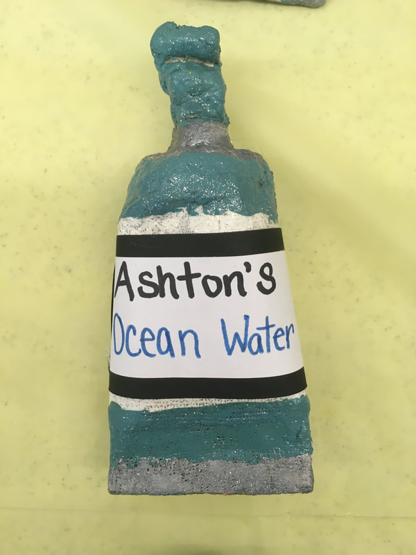
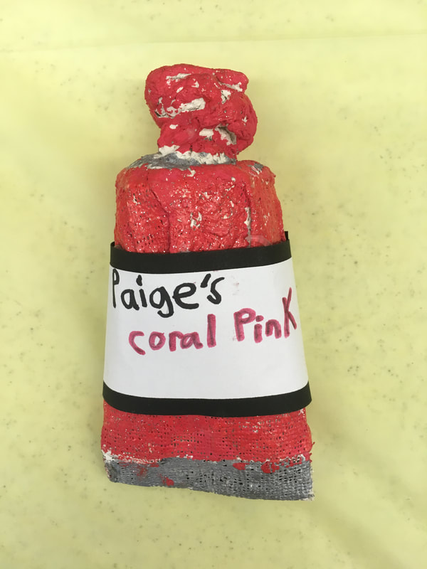
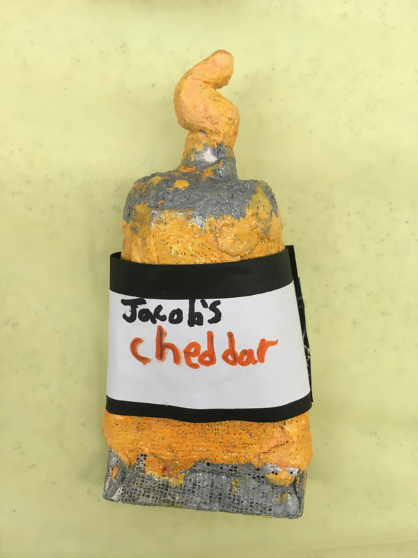
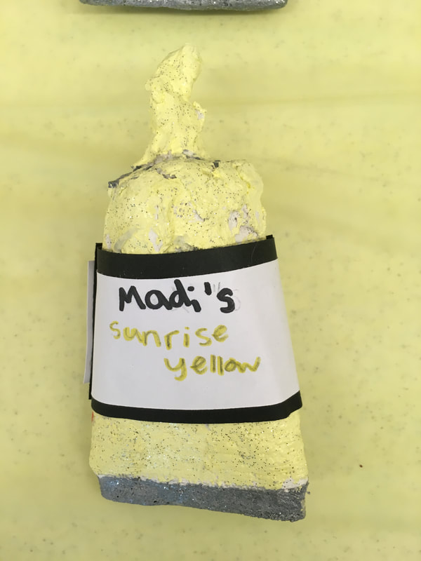
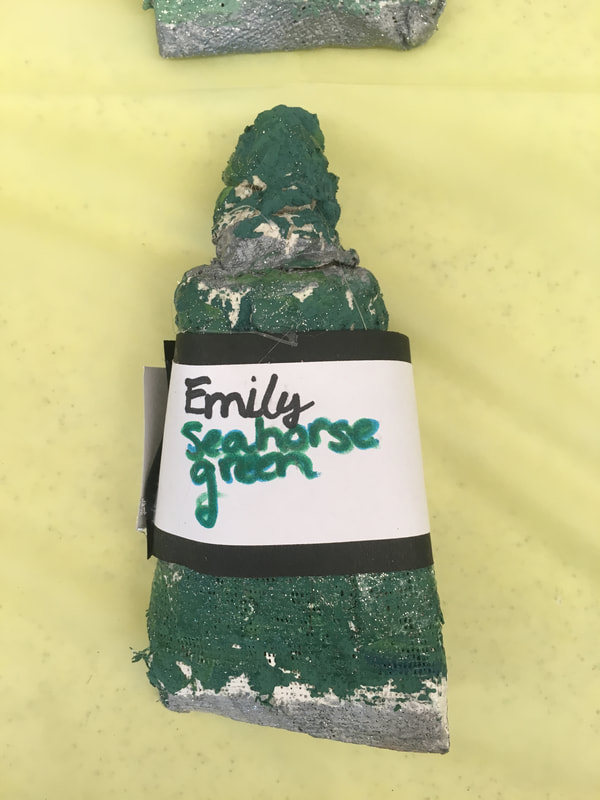
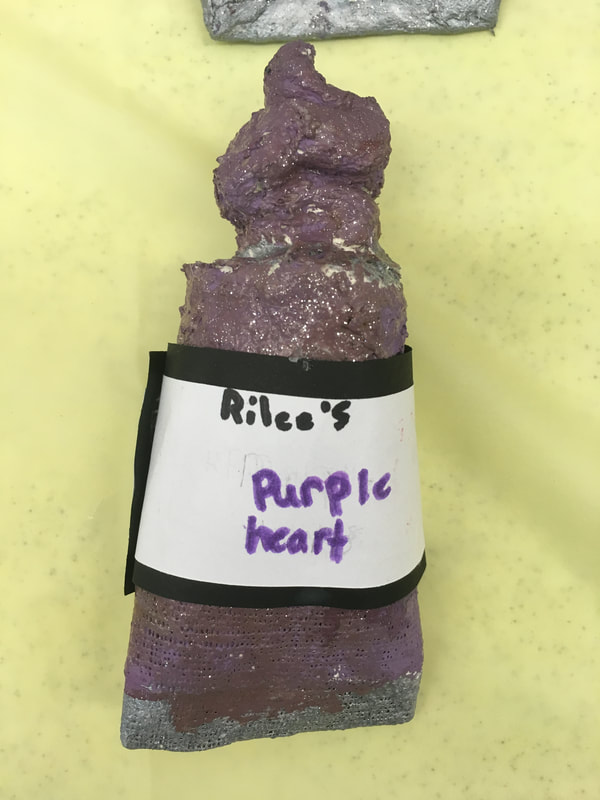
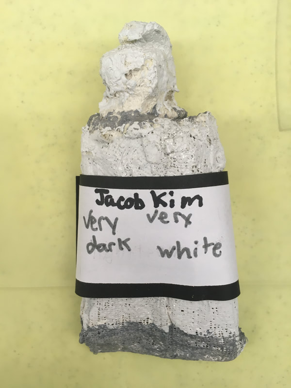
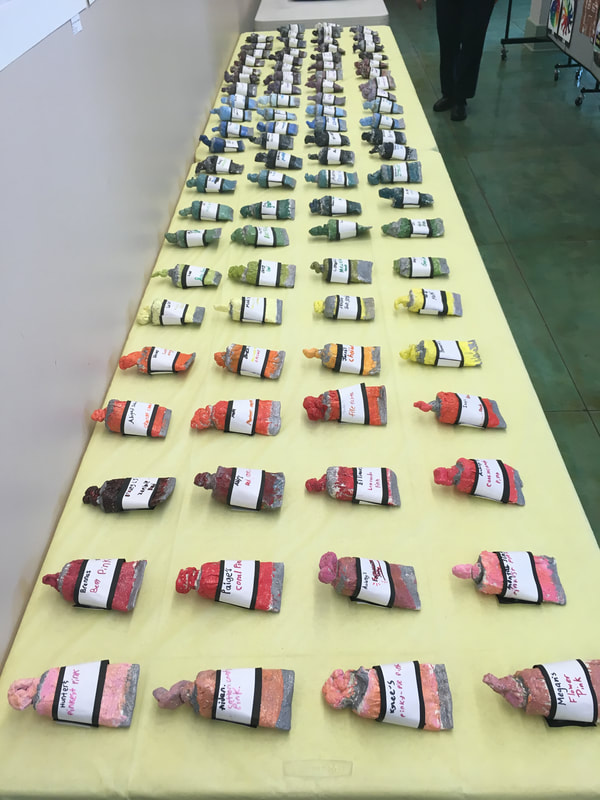
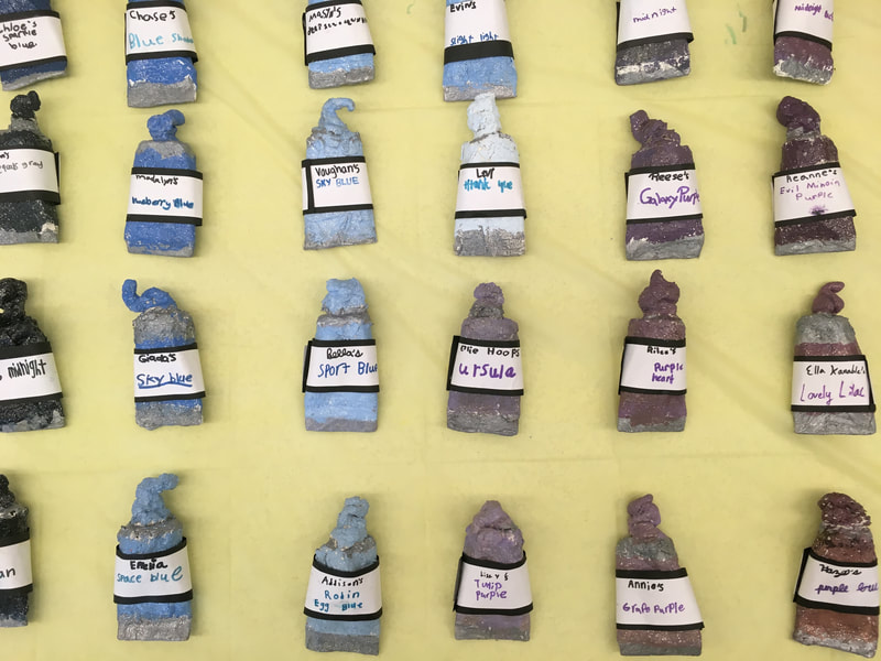
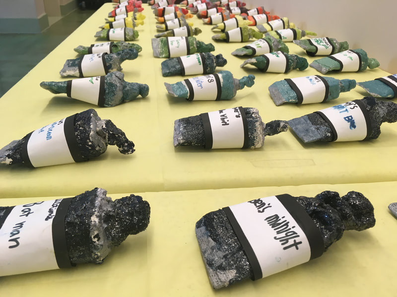
The paint-tube making part of the project came from Cassie Stephens over at cassiestephens.blogspot.com A few years back, in 2016, a feud took place in the art world that I have always been fascinated by. A laboratory in Britain created a substance called Vantablack. Vantablack is the darkest man-made substance on the planet and absorbs 99.95% of light. It essentially looks like a blackhole. This substance was created to coat the inside of telescopes so that light won’t reflect inside of the them. Anish Kapoor, an artist from Mumbai who is most well-known for creating “Cloud Gate/ The Bean” in Chicago, is a very famous, wealthy, and powerful artist. Using his wealth, he purchased exclusive artistic rights to Vantablack so that he is the only artist who can use it. This obviously upset artists all over the world. Along came Stuart Semple, a Pop Artist who has been making his own paints for many years. Stuart didn’t agree with what Anish did and set out to make things right in the art world. Stuart created a powdered pigment called Pinkest Pink that is so bright and pink, that it can’t be accurately portrayed when viewing it on a computer screen. Here’s the catch: Stuart made his paint available to everyone EXCEPT Anish. When you purchase Stuart’s paints, you agree on his website that you are not Anish Kapoor. Due to the success of his paint and the world-wide support for what Stuart was doing, he made the rest of his paints available for purchase and use… Except to Anish of course. Over the last few years, he has taken an open-source approach with his paints, asking users to give feedback and ideas on ways to make his paints better. This has led to his own version of Vantablack which recently celebrated its 3rd updated release. After introducing Stuart Semple and Anish Kapoor to my artists, I presented them with the 100 Color Challenge. Over the next class and a half, their goal was to mix red, yellow, blue, black, and white to create as many different colors as they could. Their goal was to find a favorite color that could then be painted on their paint tube sculpture later on. The 3rd day of the project was the actual making of the sculptures. Students were given a toilet paper tube that had one end pinched and stapled to resemble a paint tube. Students used four strips of plaster gauze to cover their tube. Next, they were given a small ball of celluclay that was used to sculpt the squirt of paint that was coming out of their paint tube. This was a tough project for the students that really challenged them. If their paper tubes got too wet, they would get soggy and squishy which then made it really hard for them to attach the squirt of paint to the top. Students were expected to problem-solve and/or ask a friend for help if they needed it. The 4th day of the project was spent mixing up the color that they liked from the 100 Color Challenge. They remembered how to mix the paint because they were told to make notes on their paper of how they mixed the colors they liked. They also added some silver to the top and bottom of the tube to look like metal foil. Lastly, they told me the name that they wanted to call their paints. I logged these names on a sheet with the correct spelling for them so they could reference it next class. For the 5th and final day of the project, I mixed some glitter medium into mod podge. Students used this glittery mix to coat their sculptures. This helped to strengthen them, as well as giving them a glossy and glittery sheen. Next, students wrote their paint name on a white strip of paper and then glued that thin strip of white to a slightly thicker strip of black. After these dried, I hot glued them to their paint tube for them. Lastly, I introduced students to an artist statement. I discussed how artists write about their work so that viewers know why they made it, how they made it, and what they made. I simplified their artist statement by making it a fill-in-the-blank form that they filled out.
Here’s a link to the artist statement! This is probably my 3rd graders’ favorite project! They looooooved mixing the colors, making the sculpture, and learning about the Stuart/Anish dispute.
0 Comments
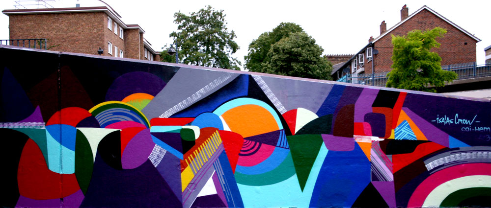
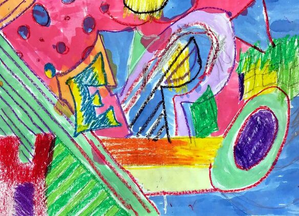
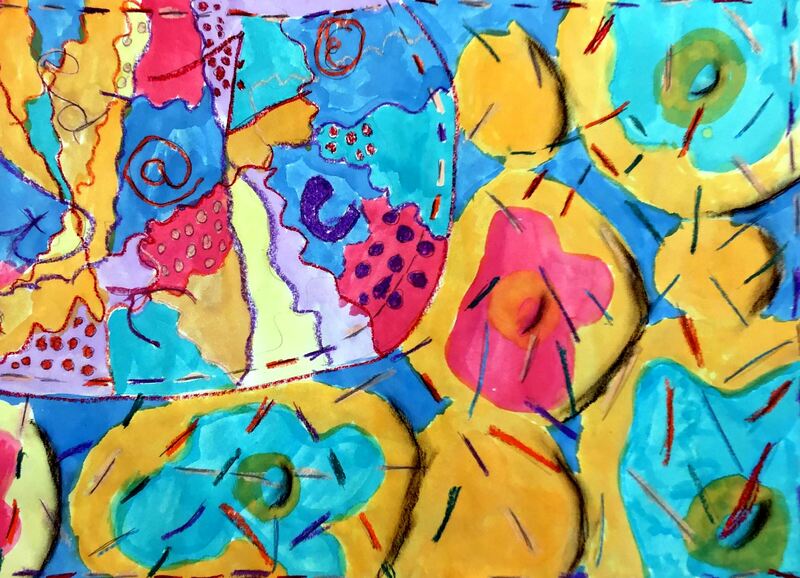
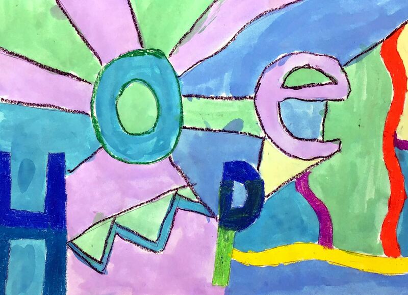
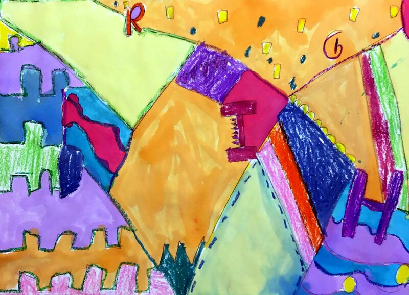
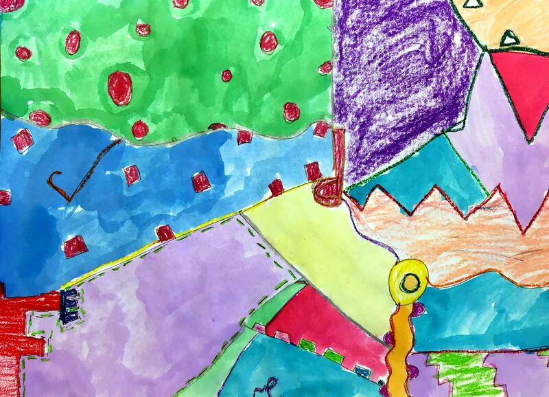
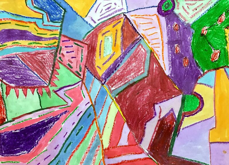
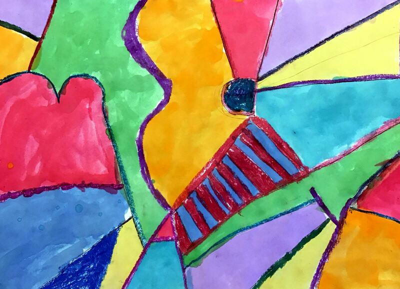
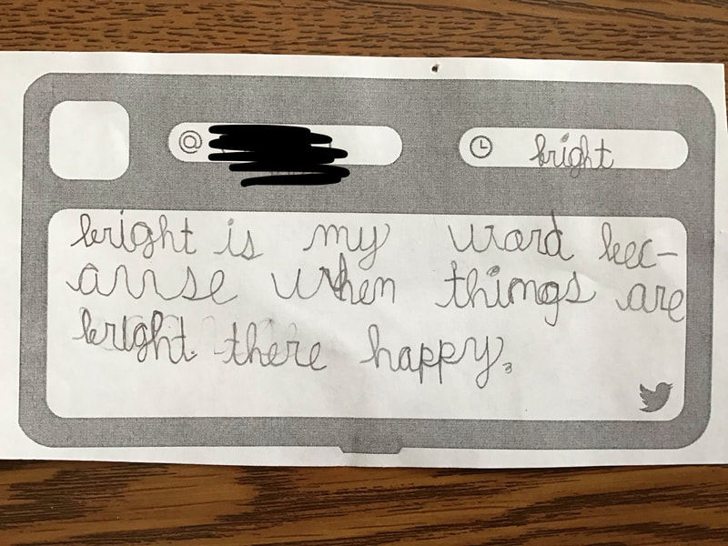
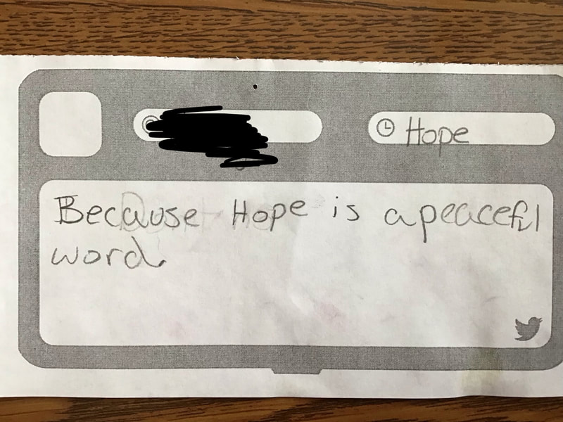
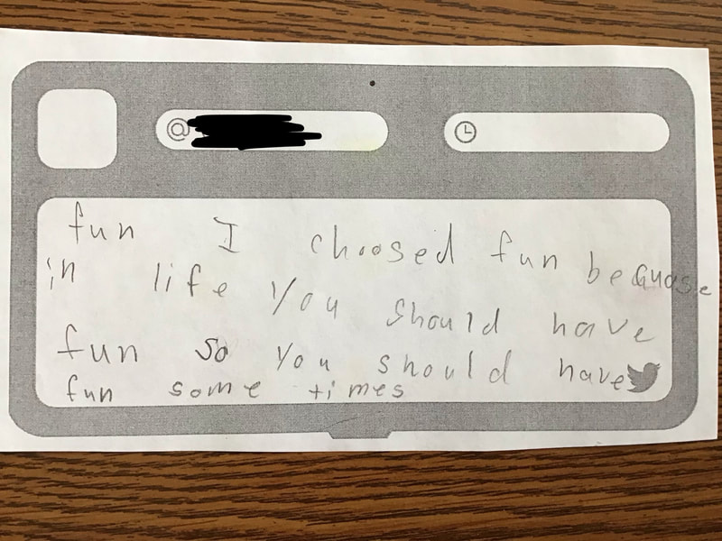
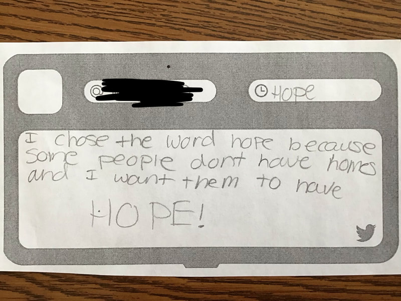
This is a project that I snagged from Don Masse over at shinebritezamorano.com Students learned about the muralist, Isaias Crow, for this project. Isaias is an artist who believes that his art can send a positive, uplifting message. He typically chooses an encouraging word and then incorporates it into his murals. Sometimes the word is easy to read, other times it is near impossible. His work also features many geometric lines and shapes with strong, bold colors. After introducing Isaias’ work to the students, students were given some time to brainstorm positive words that they may want to use in their artwork. Then they worked with a partner to brainstorm some more words. Next they chose one of their words and created two different abstract sketches that incorporated their word. Some students chose to really hide their letters while others made their letters more obvious. Lastly, they transferred their favorite sketch to a large sheet of paper.
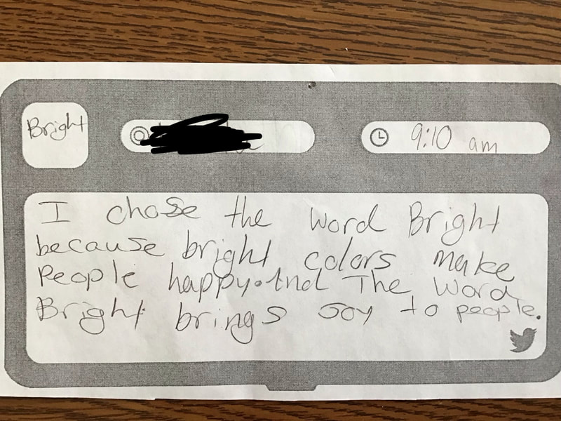
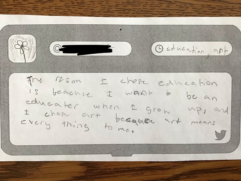
The 2nd and 3rd days were spent using oil pastels to outline all of their design and then selectively filling in parts of their artwork with color. The final 2 days were spent using liquid watercolors to fill in the last of their artwork. Then they were asked to write about why they chose the word that they did. I loved reading about some of the deep thinking that went into their word choice. Here is the link to my Youtube playlist that has all of my demo videos for this project, as well as any other supporting videos I use.
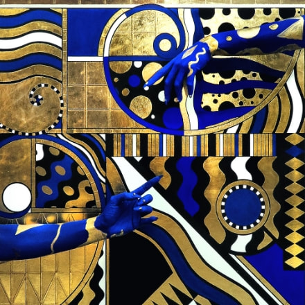
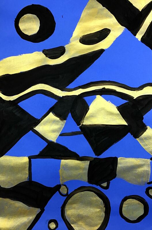
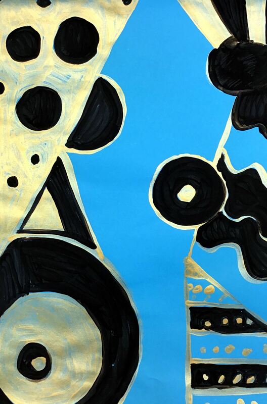
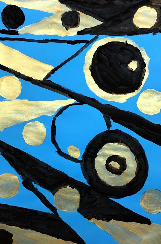
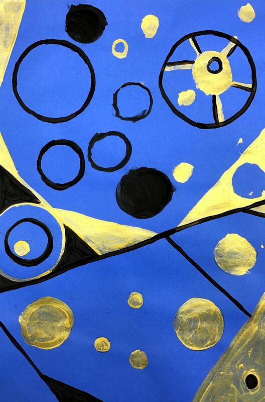
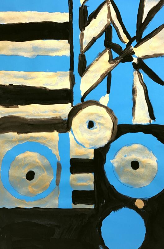
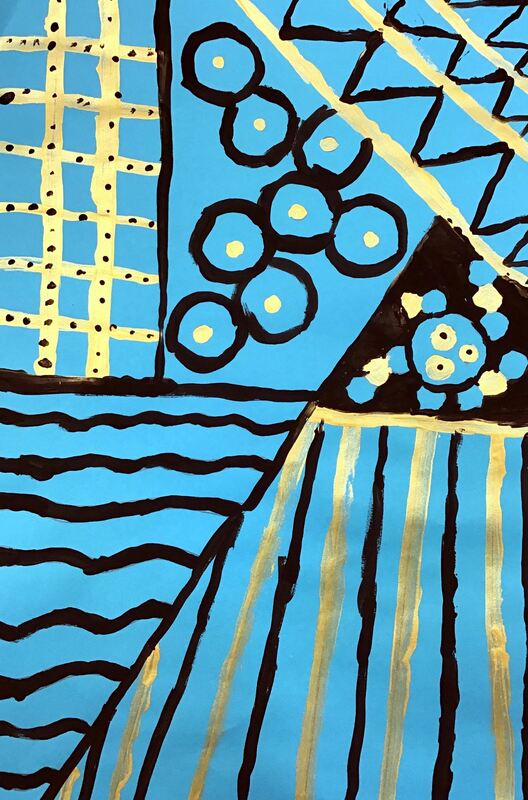
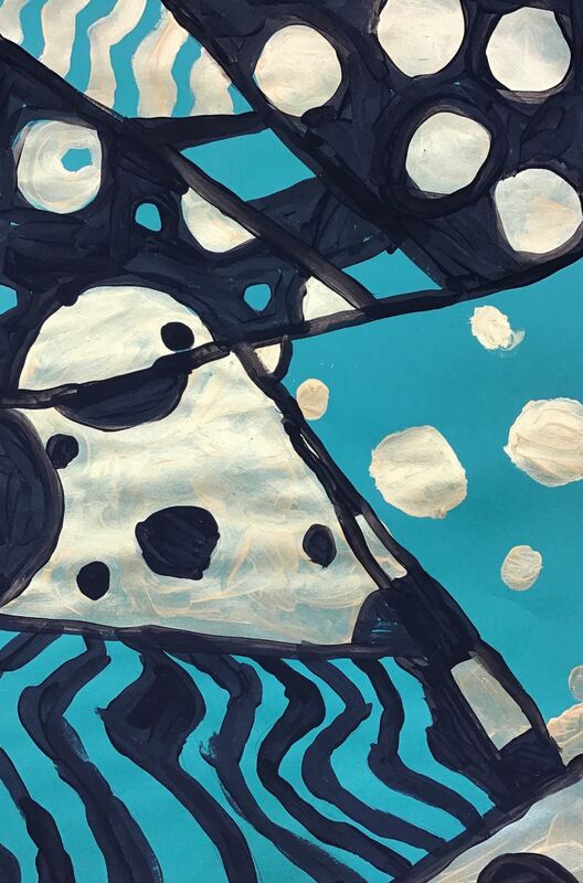
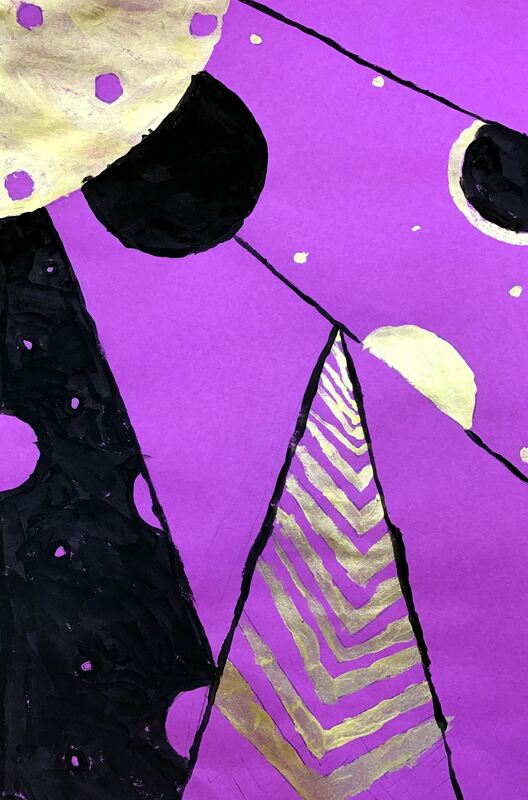
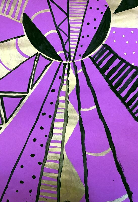
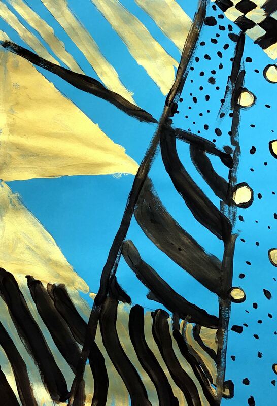
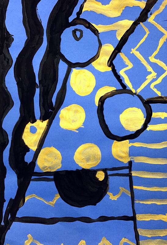
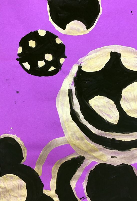
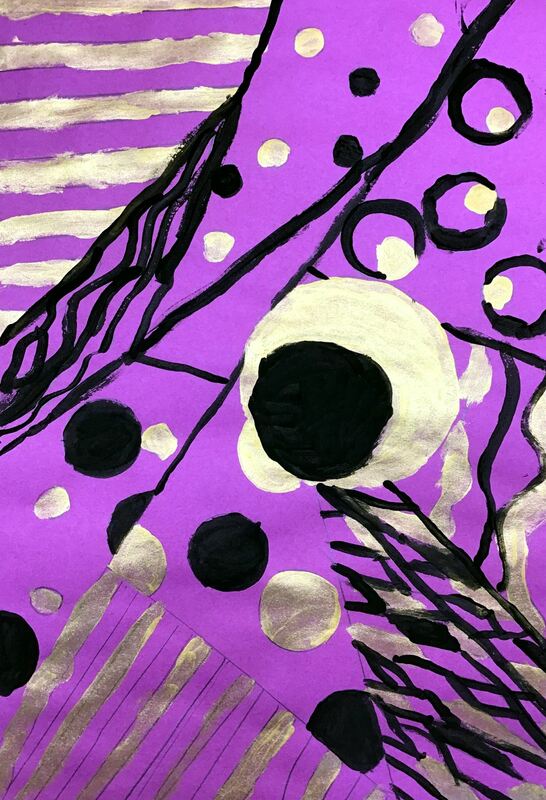
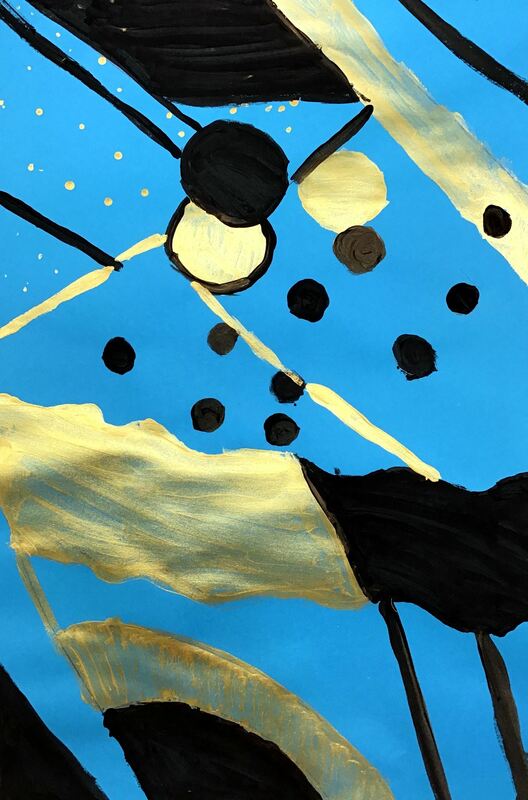
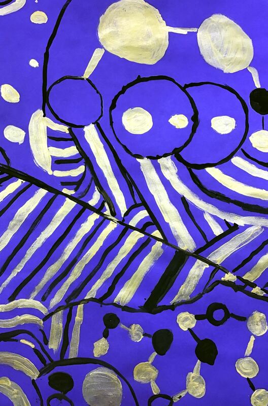
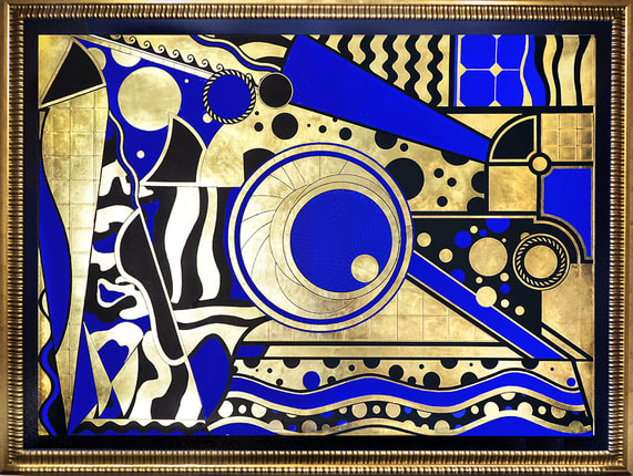
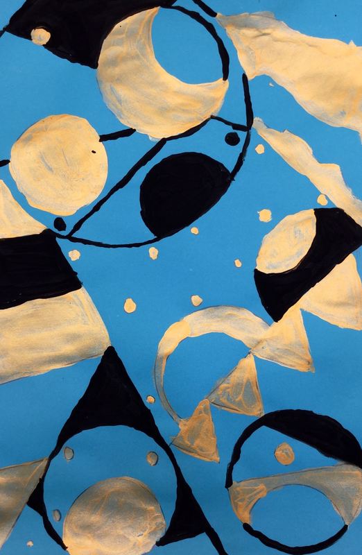
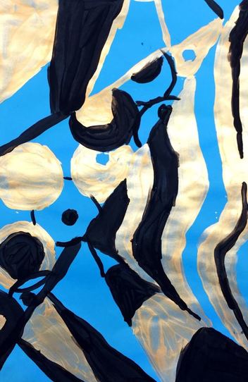
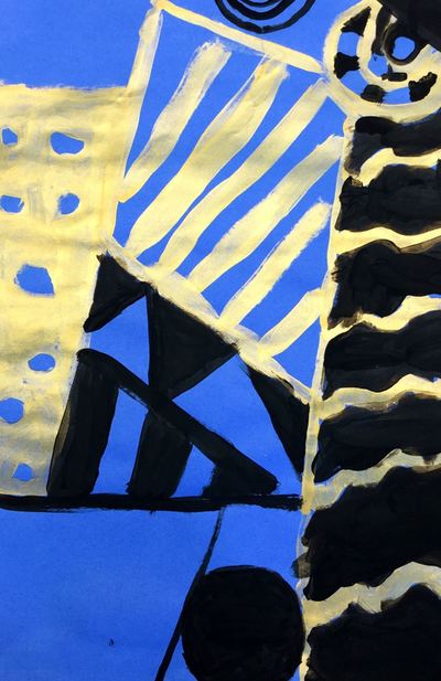
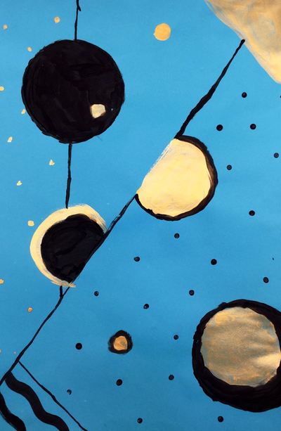
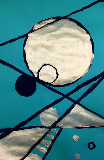
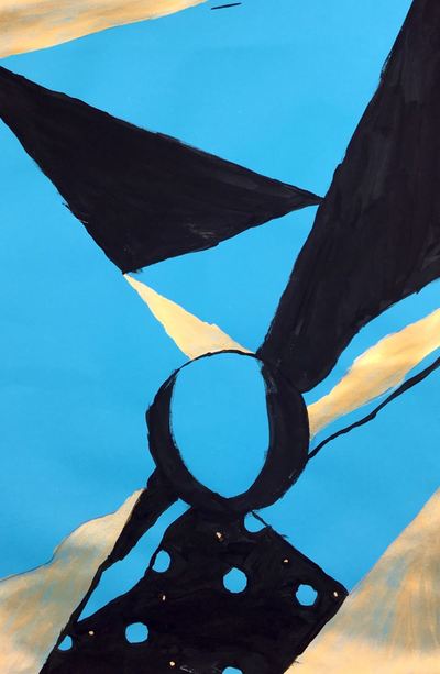
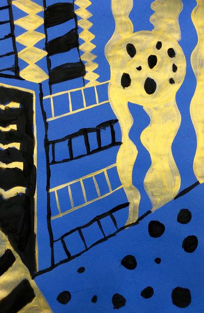
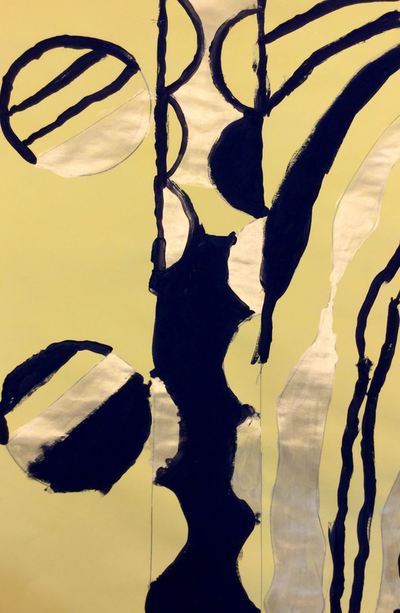
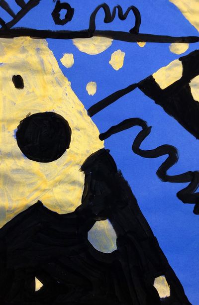
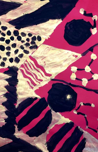
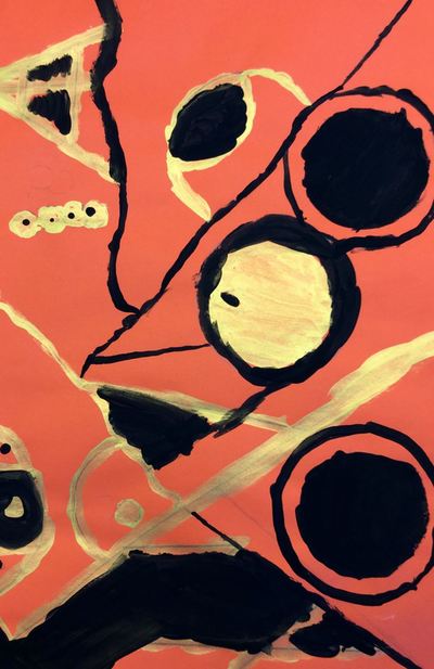
Lina Iris Viktor is the youngest artist any of my students have learned about and they thought it was SOOOO cool that she is just a few years older than I am. Lina's work is characterized by many circles and straight lines that break her paintings up into many geometric shapes. She also restricts her color palette to a particular hue of blue, 24 karat gold, black, and sometimes white. The students noticed that some of her work reminded them of Egyptian Hieroglyphs based on the symbols and her use of gold. Lina's work was recently plagiarized for a Kendrick Lamar video. This was a great opportunity for the students and I to have a discussion because they have learned about copyright and plagiarism in the past in other classes. The first day of class, students created two sketches using some of the elements they saw in Lina's work (lines, circle, geometric shapes). After their two sketches, they chose the one they believed was their strongest design and had it ok'd by me. To finish class, they transferred their sketch to a large sheet of colored paper (color of their choice). They were expected to use rulers and different circle tracers I had put out to ensure that they had nice, clean, crisp lines. On the 2nd day of the project, students used gold paint to fill in about a third of their artwork. You would've thought they were using actual gold! They went nuts for it! We talked about different ways to fill in spaces of their artwork (outlining, painting in a shape, painting the space around a shape, etc). I also emphasized outlining things first and then filling in the space. This helps to make smooth outlines. The final day was spent using black on about a third of their project. They were expected to have every pencil line either outlined or filled in. This is my favorite project that I do with any grade. I love how strong many of their designs! I'd love to have some of these famed and hung up on my wall! Here are the details from the Kusama project that I've done in the past.
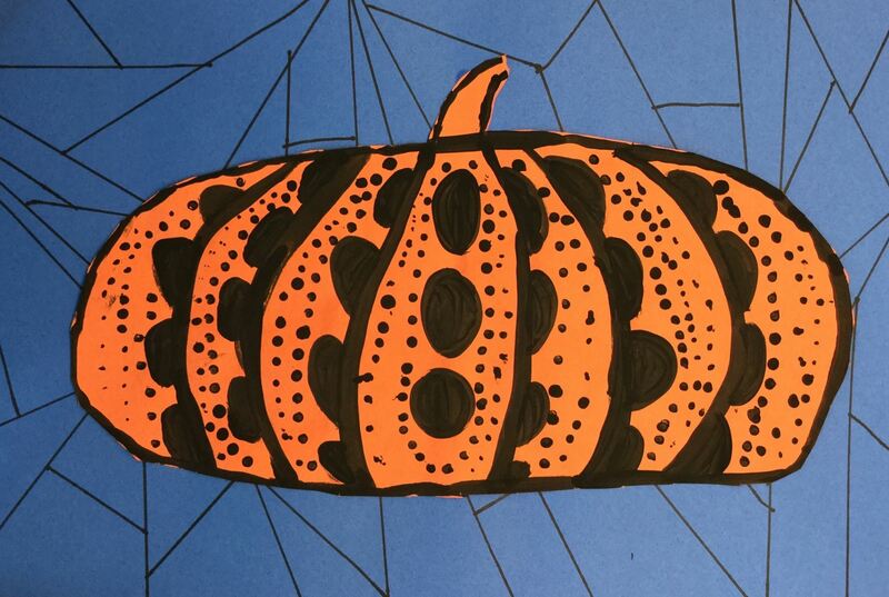
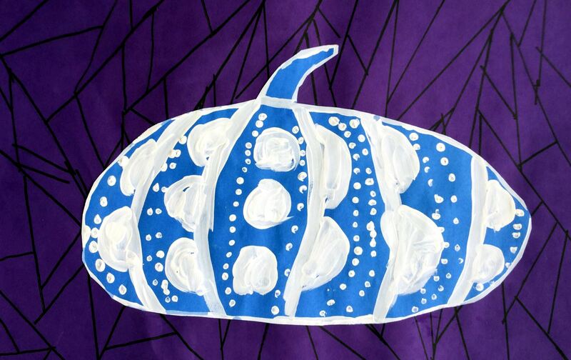
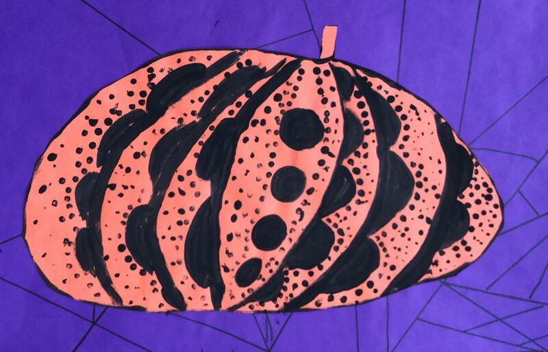
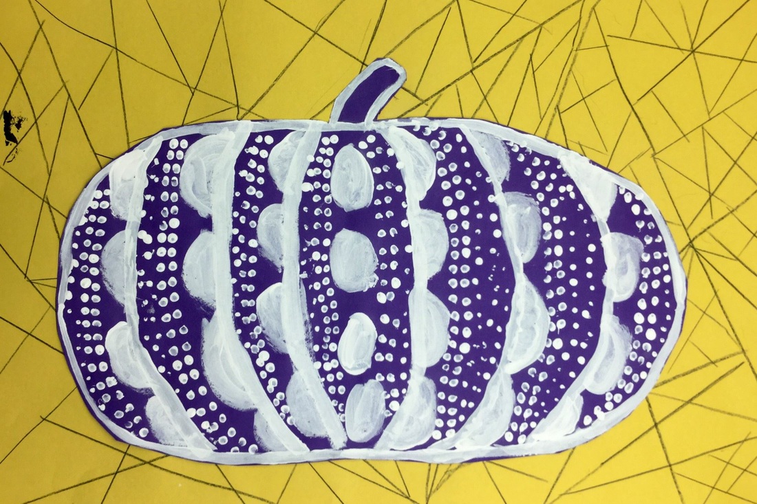
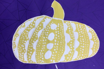
Also, here is a link to my youtube playlist that has all of my demo videos and other videos that I show. Enjoy the pictures from this year! I switched it up just slightly this year and had students use sharpies from the background instead of black colored pencils. I like how much better the lines show up with the sharpies. I also didn't ask students to use complementary colors this year. I'm thinking next year we might try to make paper mache pumpkins instead?! This year, I put a special emphasis on Black History Month and did my best to teach a black artist for each grade level. With 3rd grade, we looked at an artist named Lina Iris Viktor. Lina is the youngest artist any of my students have learned about and they thought it was SOOOO cool that she is just a few years older than I am. Lina's work is characterized by many circles and straight lines that break her paintings up into many geometric shapes. She also restricts her color palette to a particular hue of blue, 24 karat gold, black, and sometimes white. The students noticed that some of her work reminded them of Egyptian Hieroglyphs based on the symbols and her use of gold. Lina's work was recently plagiarized for a Kendrick Lamar video. This was a great opportunity for the students and I to have a discussion because they have learned about copyright and plagiarism in the past in other classes. The first day of class, students created two sketches using some of the elements they saw in Lina's work (lines, circle, geometric shapes). After their two sketches, they chose the one they believed was their strongest design and had it ok'd by me. To finish class, they transferred their sketch to a large sheet of colored paper (color of their choice). They were expected to use rulers and different circle tracers I had put out to ensure that they had nice, clean, crisp lines.
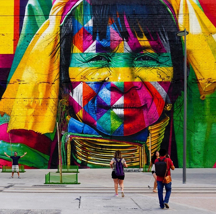
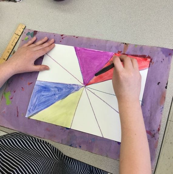
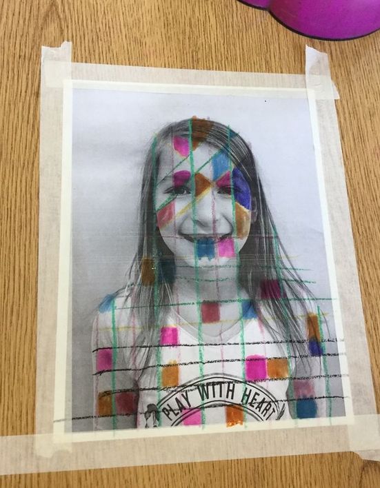
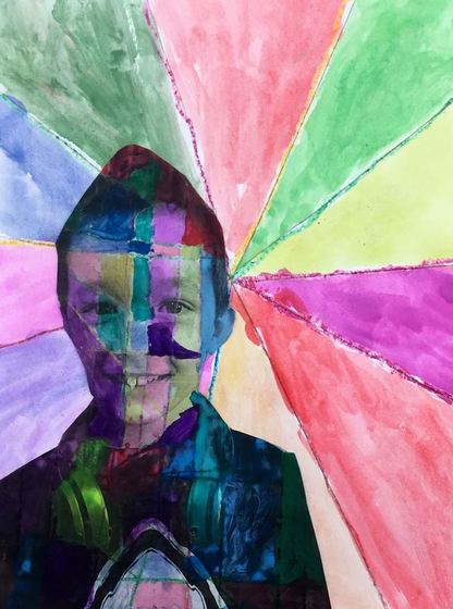
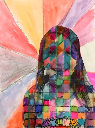
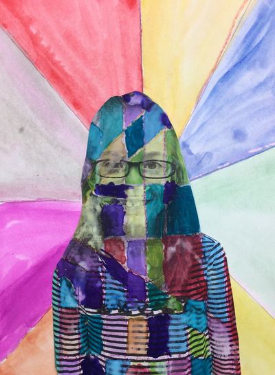
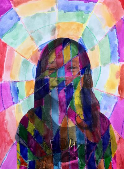
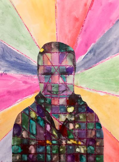
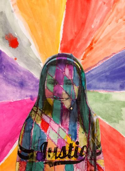
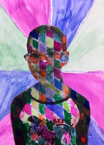
On the 2nd day of the project, students used gold paint to fill in about a third of their artwork. You would've thought they were using actual gold! They went nuts for it! We talked about different ways to fill in spaces of their artwork (outlining, painting in a shape, painting the space around a shape, etc). I also emphasized outlining things first and then filling in the space. This helps to make smooth outlines. The final day was spent using black on about a third of their project. They were expected to have every pencil line either outlined or filled in. This has probably turned into one of my favorite projects! I love how strong many of their designs! Eduardo Kobra is a street artist from Brazil who makes large murals of important historical figures. He breaks the figures into geometric shapes and overlays bright colors on top of a black base-layer. He recently painted the world's largest mural for the past Olympic Games that were in Rio de Janeiro. We have been plugging away on self-portrait projects for our upcoming art show at the end of the school year. After learning a bit about Eduardo during our Art Madness tournament, I thought he would be a great artist to inspire our latest project! We started off by making the background. Each student put a dot somewhere on their paper and then drew lines from the edges of their paper to the dot. Students traced their lines with crayons and then used tempera cakes to paint in each section they had created. While students worked, I pulled some of them aside and took headshots of them for the next part of the project. The next day, I precut some strips of tagboard that were half an inch wide. Students used these strips to draw straight vertical lines on top of their black and white photo that I had printed out. After drawing their vertical lines, they drew horizontals and diagonals. This broke their photo up into a bunch of small shapes that they would then paint next class. The final two days were spent filling in their self-portraits with watercolors. Before they could paint, I had them tape their paintings to the table to prevent them from wrinkling. They were expected to fill in each little section with a different color. Because of watercolors translucency, the black from the photo showed through the paint while also adding some color. Some of the students really rocked it when it came to painting, others added just a bit too much paint and were left with more opaque colors in which you couldn't see the details of their photos.
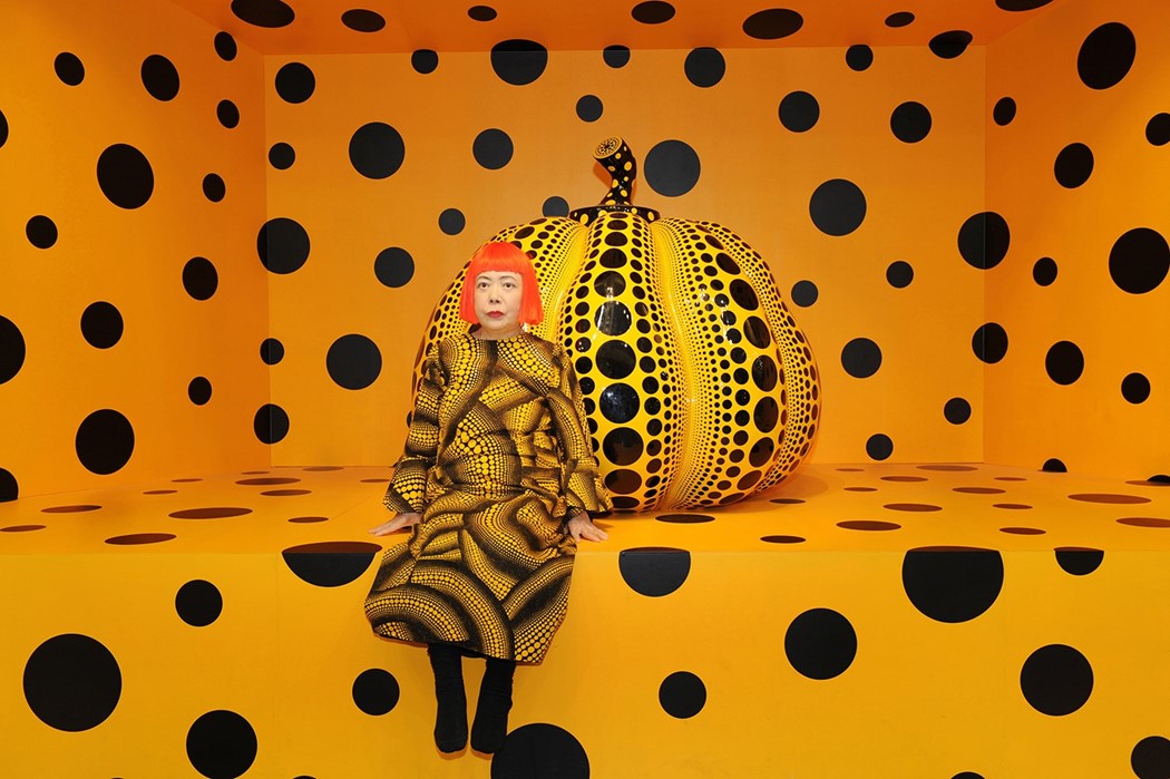
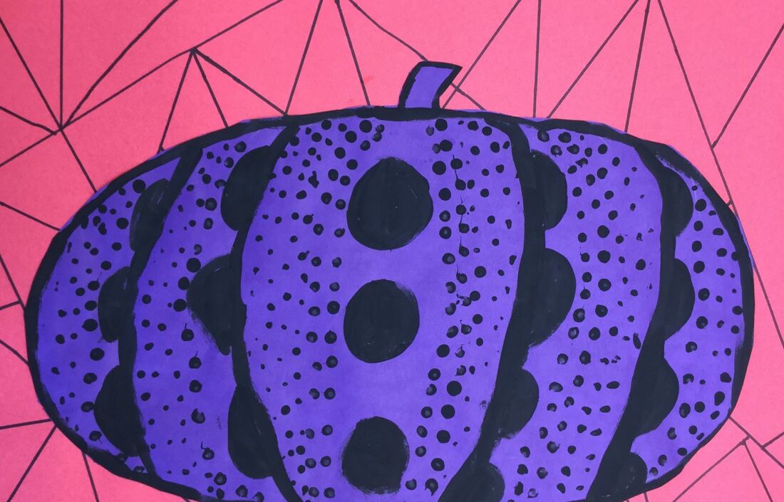
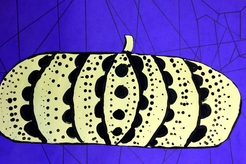
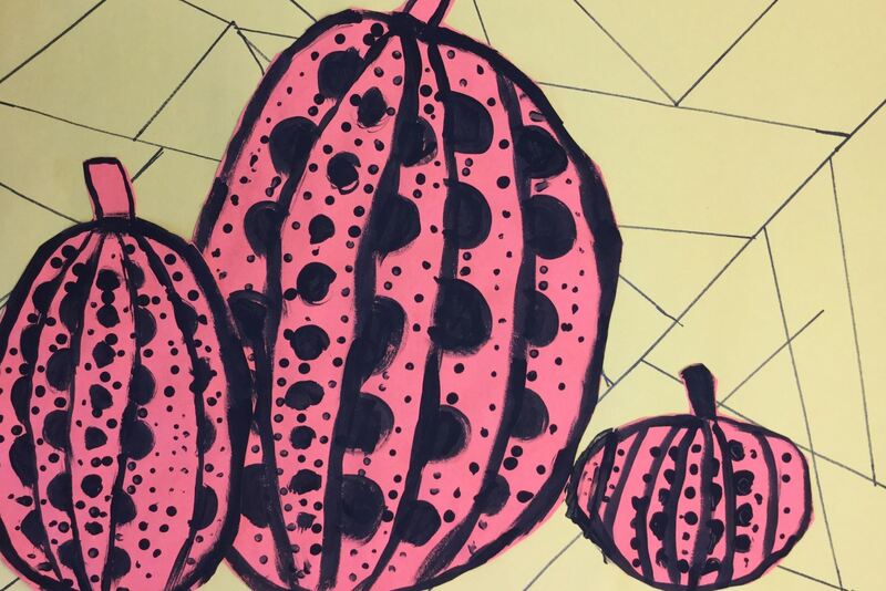
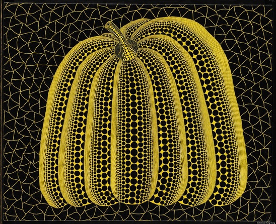
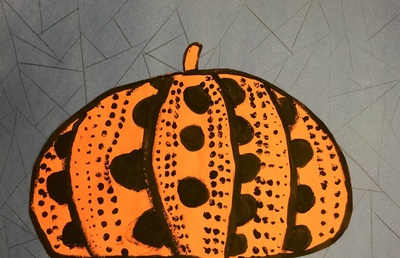
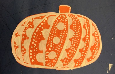
I was super psyched with this project and can't wait to see it up for our art show at the end of the year! To get into the fall/Halloween spirit, we studied the Yayoi Kusama's pumpkins. She doesn't just do paintings of pumpkins but even paints polka dots onto physical pumpkins! Kusama is a pop artist originally from Japan. She is known as the "Princess of Polka Dots" due to her obsession with them. As a child, she had a hallucination in which she saw a field of flowers except that the flowers had been replaced by polka dots. Since then, they have become an integral part to her work. While looking at her painting, students noticed that the pumpkin seemed as if it was 3D because of the various sized polka dots. We talked about how these polka dots created the illusion that the pumpkin had form.
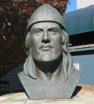
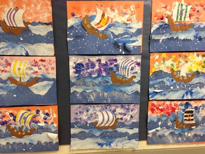
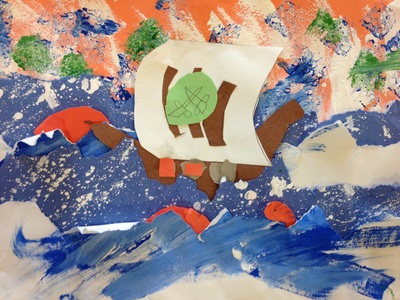
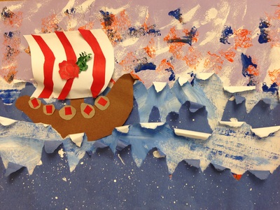
The first day of class we used a ruler as a straight edge to divide our background paper into geometric shapes. Students then drew a large pumpkin onto the complementary color of their background. The second day, we outlined our pumpkins with either black or white. Then we added large polka dots to each section of the pumpkin. The last day, we cut and glued our pumpkin to the background. Then students created rows of polka dots with a q-tip and lastly they used the backend of their brush to add more dots. Using the q-tip and back of the brush created more variations in polka dot sizes. Leif Erikson Day was on October 9th so that seemed like a good idea to do a project on! Leif Erikson was the first European to come to North America, about 500 years before Christopher Columbus arrived. The kids thought I was joking when I told them that vikings were real. They thought that vikings were just something that was on the Minnesota Vikings (SKOL VIKINGS!) helmet. Then we had to have a discussion about the difference between vikings and dwarfs which was an understandable confusion due to their similar appearances. This is another one of Cassie Stephens' amazingggg projects.
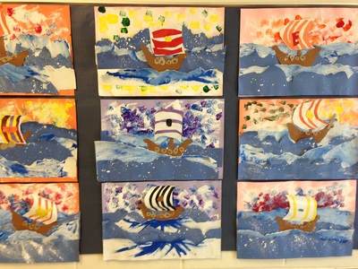
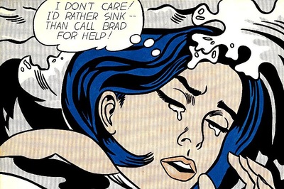
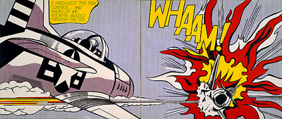
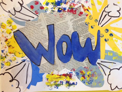
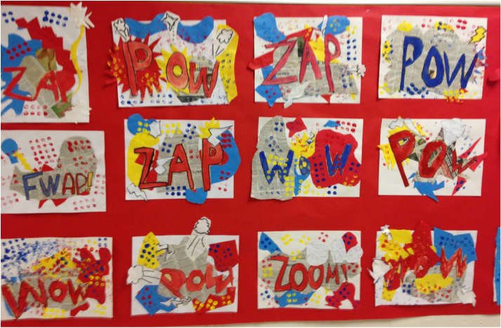
Our first day of the project was probably the most hectic art class I've ever had. It was CRAZY how much we had going on. First, students needed to sponge paint a large sheet of paper white. Then they were to sponge over top of that with two other colors of their choosing. Then they needed to pick up a strip of white paper and a strip of blue. With the blue one, we gently splatter painted white paint onto it. With the white one, we dry-brushed blue and then white paint, going from the center of the page out to the edge. On the second day, we tore our two strips of paper the long way. Then we layered the torn strips on top of each other, starting at the center and working our way down to the bottom of our sponge-painted paper. We only put glue on the straight edges of our torn strips, NOT the torn edges. This would allow us to curl our waves later in the project. We also used a tracer to create a ship and then added a mast. For the third day, we created a sail. We added stripes to the sail and a small tribe symbol. When we attached the sail to our mast, we put glue on the top and bottom of the sail and gave it a slight pinch when gluing it down. This created a small curve to our sail so that it popped out from our artwork a bit. On our last day, we added small shields to the edge of our ship. Then we curled our torn-edge waves around a pencil so that the waves popped off the paper like our sails did. After they were done with their project, we had a little writing assignment about our viking ships. Writing in art?!?! I know. Crazy right? I asked the kids to tell me about their viking ship. Where were they going? Why were they going there? They were asked to write four COMPLETE SENTENCES. They had some pretty comical and creative responses! I got so many compliments from the other teachers about these! Our artists did so well! Continuing with our Pop Art unit, we learned about the second most famous Pop Artist (behind Mr. Warhol), Roy Lichtenstein! Roy Lichtenstein started out as a graphic designer. One day, his kids challenged him to recreate a picture of Mickey Mouse and Donald Duck that they had seen in a comic book. He took the challenge upon himself and recreated it perfectly. This would go on to spur his iconic style. He is most well-known for his paintings of comic book pictures. Many of his paintings depict women or scenes from WWII comics. He is also known for only using the primary colors (red, yellow, and blue). To create other colors, he used ben-day dots. If you have ever looked at a comic closely, the colors are made up of tiny dots of colors. If a bunch of red dots are placed closely together, the image appears red. If they red dots are spaced further apart so that there is more white space between them, the color begins to appear more purple. The primary colored dots can also be overlapped to give the appearance of other colors, such as putting red and blue on top of each other to create the illusion of purple. We started off the project by talking about words that are oftentimes seen in comics, such as whaam, pow, wow, zap, zip, boom, pow, etc. These words are called 'onomatopoeias.' Onomatopoeias are words that sound like what they look like. Our first day we learned how to make box letters and then drew an onomatopoeia word that way.
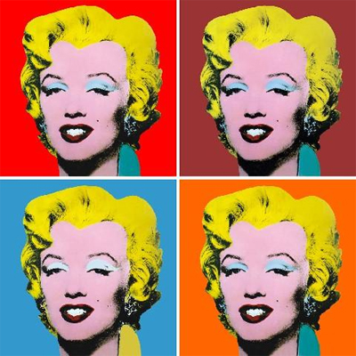
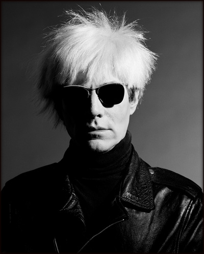
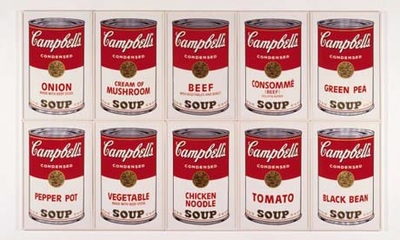
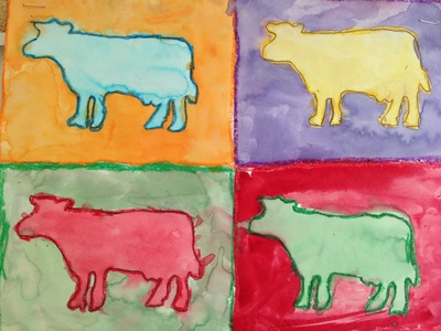
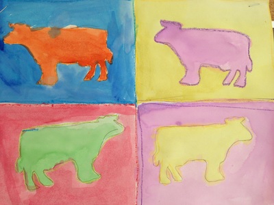
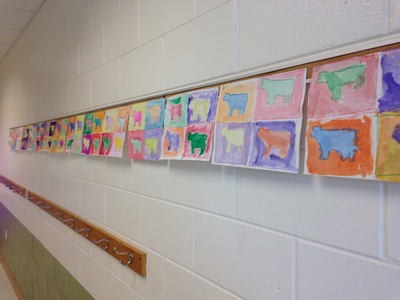
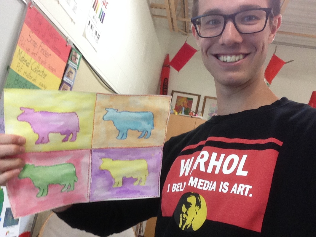
The second day of class, we outlined our word with sharpie and then used tempera cakes to paint them using a primary color. Then we began to assemble our background. We cut out shapes and explosions out of primary colored paper and glued them to our background. The last step of their background was to add a large explosion cut out of newspaper to their background that went on top of all their other shapes. This was so that their words wouldn't blend into their background. On the third day, they cut out their words and glued them onto their background. Then we painted the tops to legos using the primary colors and used those to print ben-day dots onto our backgrounds. Lastly, they cut out details to add to their art such as puffs of air, lightning bolts, small explosions, etc. I told them to think about their word and to choose details that would be appropriate for that word. I decided that 3rd grade was going to do a few projects on Pop Art so I thought we would kick things off with the king of Pop Art, Andy Warhol. Warhol was an American artist who liked to depict things that were popular at the time, hence the name 'Pop Art.' This included celebrities like Marilyn Monroe, rock stars like Elvis Presley, and everyday objects like Campbell's Soup cans. He is also well-known for portraying the same picture several times, just using different colors. We started off the project talking about things that were popular in the Milton/Janesville area. We agreed that Bessie the Cow outside of Arby's was a pretty iconic sculpture for the area. This became the subject matter for our paintings. We took our paper and folded it in half going both directions so we had 4 rectangles on our paper. Then we used one of my cow tracers to trace a cow into each square.
The next couple classes were spent talking about complementary colors which were used to color their artwork. Complementary colors are colors that are directly across from each other on the color wheel. I usually tell them to remember the Minnesota Vikings (yellow and purple), Chicago Bears (blue and orange), and Christmas (red and green). First, they had to outline their cow using a crayon. Then they had to outline the square around that cow with its complementary color. The crayon outlines help to keep our paint from running together during the next step of the project. After they were done with their crayons, they used watercolors to paint the cows the colors of the crayons that they had used. |
Devon CalvertHarmony and Consolidated Elementary Art Teacher in Milton, WI. UW-Eau Claire graduate. WAEA President. Apple Teacher. Archives
March 2019
Categories
All
|




 RSS Feed
