 Here is my Youtube playlist that has all of the demo videos needed for this project, as well as other supplemental videos. Here are previous details for this project. Enjoy this year's pictures! 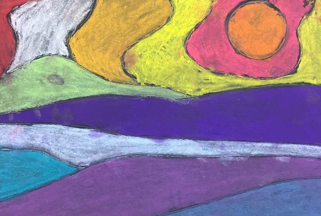
0 Comments
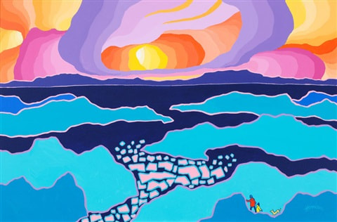
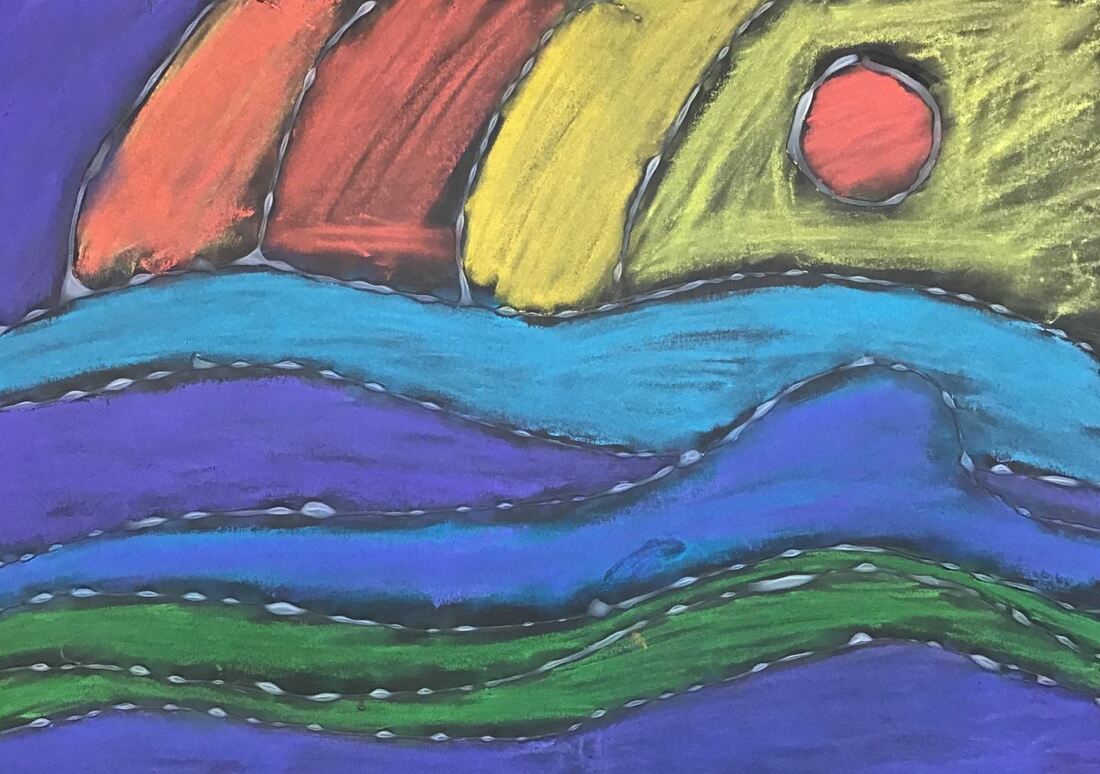
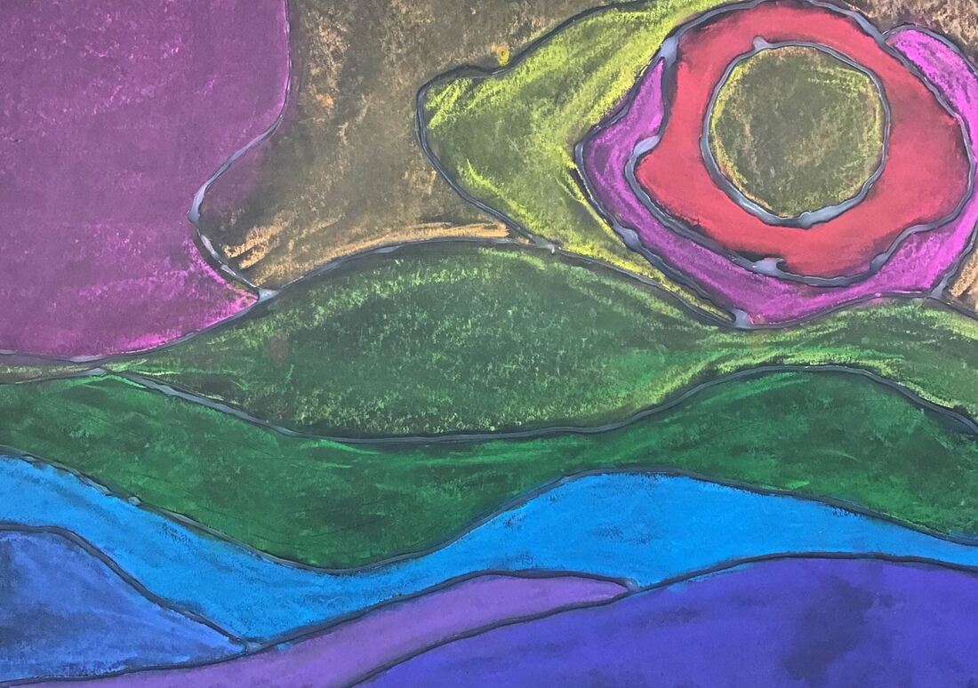
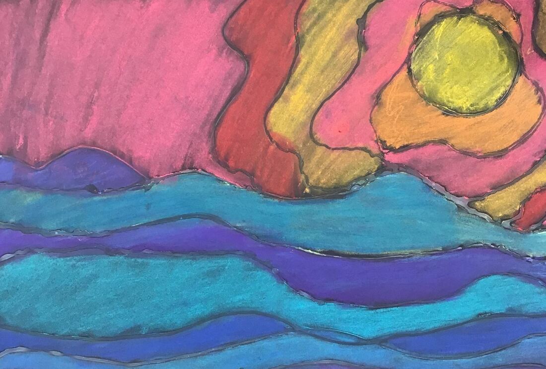
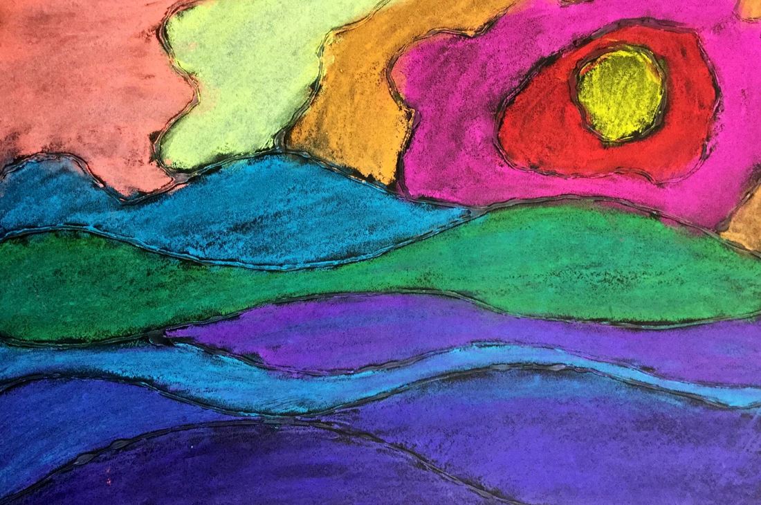
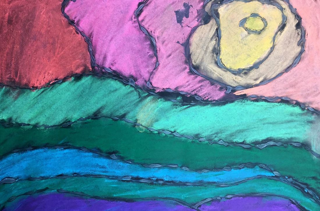
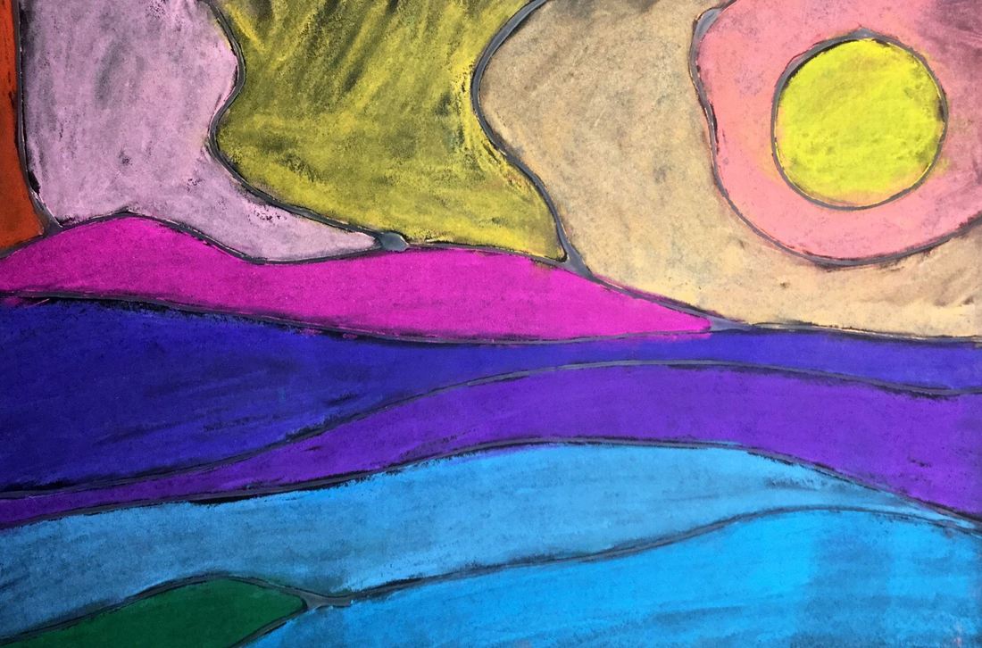
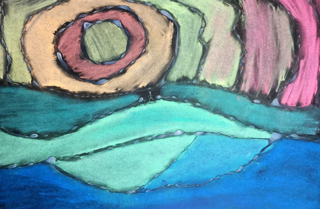
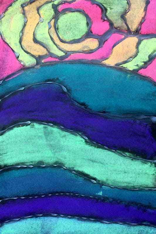
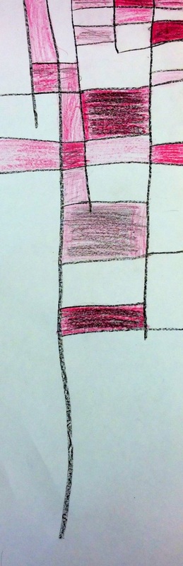
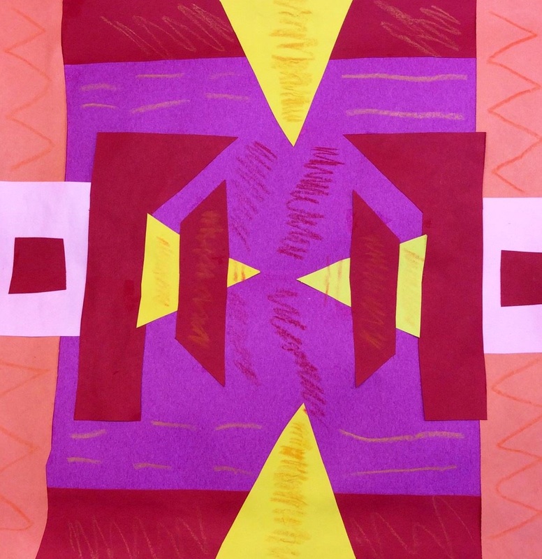
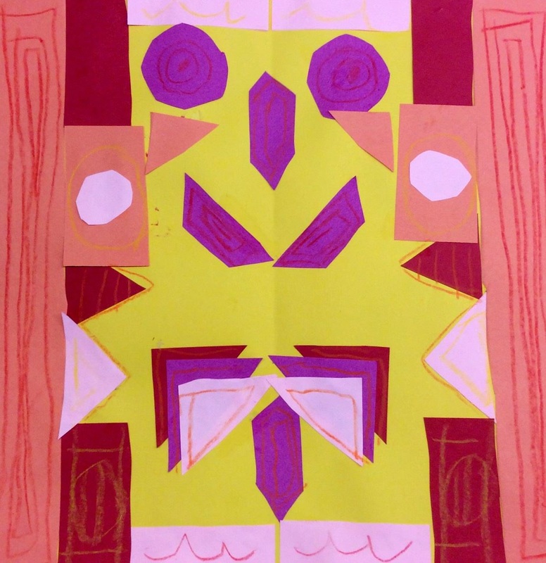
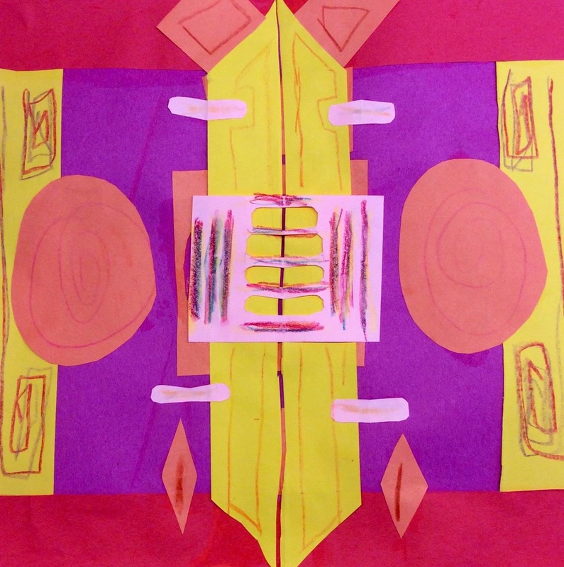
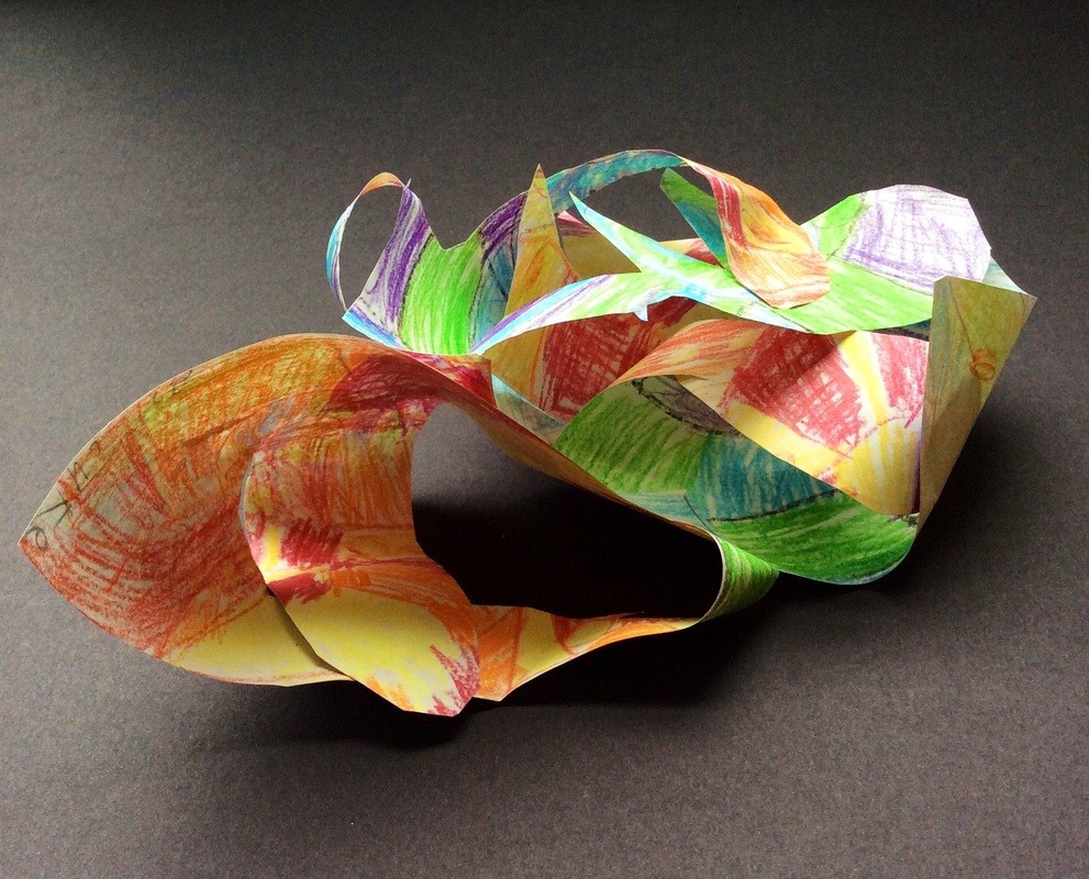
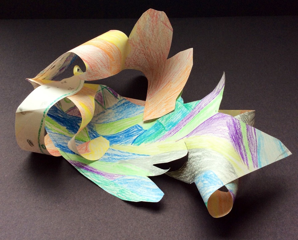
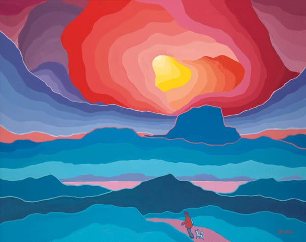 Ted Harrison was a British-Canadian artist who is well-known for his bright, stylized landscapes of the Yukon. Although I told my artists that we would be learning about living artists this year, I made the exception with Ted because he passed away this past January. I thought Mr. Harrison's work would be a good chance for us to study space and warm/cool colors. Lately, I have been stressing the importance of sketching out ideas and designs before diving into projects. After we took a look at Ted's work, we did two landscape sketches. Students decided on their stronger design and got it okay'd with me. Then they transferred that sketch to a large black sheet of paper. Lastly, they used a glue bottle to carefully trace over their lines. The second day and final day of the project was spent adding color to our landscapes with chalk. We emphasized using cool colors on the ground and warm colors in the sky. Because we used glue to draw last class, the now dry glue creates strong black lines to divide up the sections of background. Our chalk colors are pretty limited so students had to mix a lot of their chalks to create new colors. It was good to see them take advantage of their color mixing knowledge. 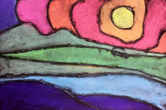 I've seen these pictures of stained glass floating around Pinterest a lot and also saw that Don Masse did it with his kiddos. You can check out his write up for it on his blog shinebritezamorano.com I'm really drawn to these pieces of stained glass for three reasons 1.) Their asymmetrical design 2.) Their use of similar colors on each piece and 3.) the organic feel that each one has. 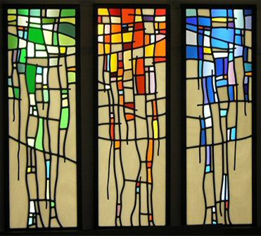 This was a real quick one day project that my artists did. We started off by drawing five vertical lines. We talked about how using wavy lines creates an organic feeling while straight lines create a rigid geometric feeling. I emphasized that each line should end at a different spot. They then drew several horizontal lines across the vertical ones. Lastly, they needed to decided on a color scheme to color their stained glass with. They could color using warm, cool, or by picking one color and creating tints and shades of it. 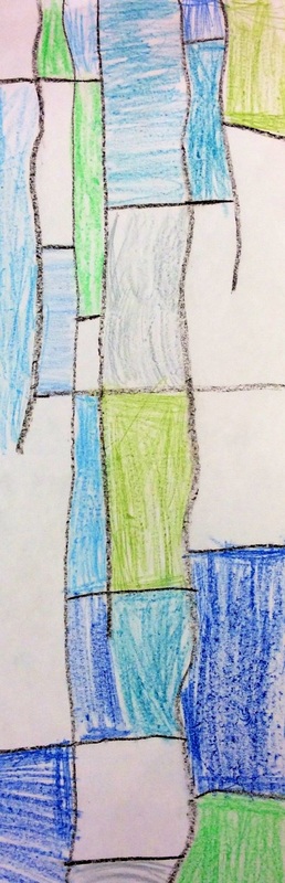 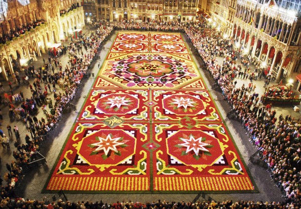 Brussels' Flower Carpet I've been so busy lately but I have been wanting to write about this project for the last few weeks. Right off the bat, I wanted to say how proud I am of my 3rd graders for handling such a serious topic. Over spring break, Brussels experienced a horrific attack upon their city. Like our Paris project after their attack, I thought we would take a couple classes to honor Belgium with a project. We had a down-to-Earth discussion about what happened in Belgium and I was so impressed with how well they handled the topic. In the center of Brussels is a large courtyard. Once every two years, they cover the courtyard in a design made of locally-grown begonia flowers. Each time they make the flower carpet, their design is based on a new theme. I used Don Masse's project idea for his mud cloths and spun it towards what I wanted to cover. Throughout the project, we talked about warm colors, geometric shapes, and symmetry. After cutting and gluing shapes for a couple classes, they finished it off by adding some more intricate details with warm colored crayons. This was probably one of my favorite projects from the year. They did such an awesome job on it! 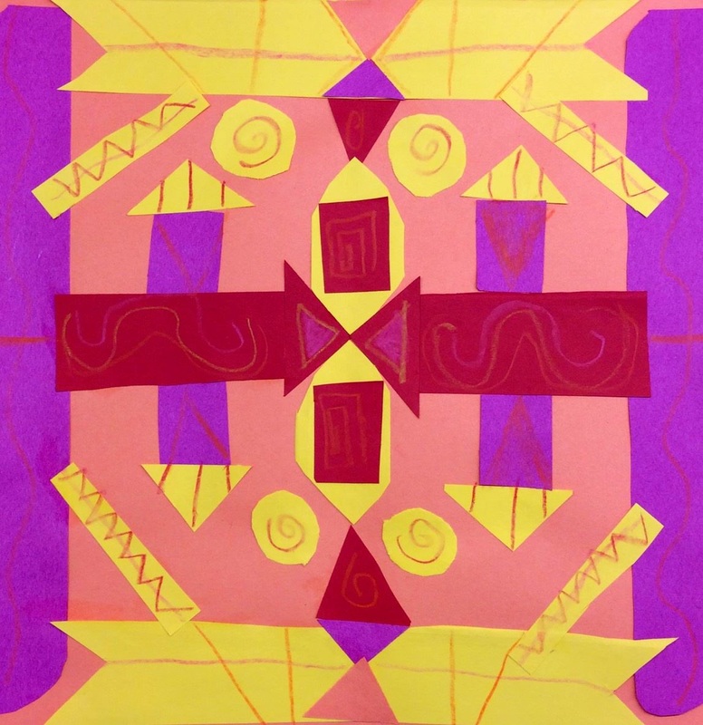 I love how vibrant the colors are! 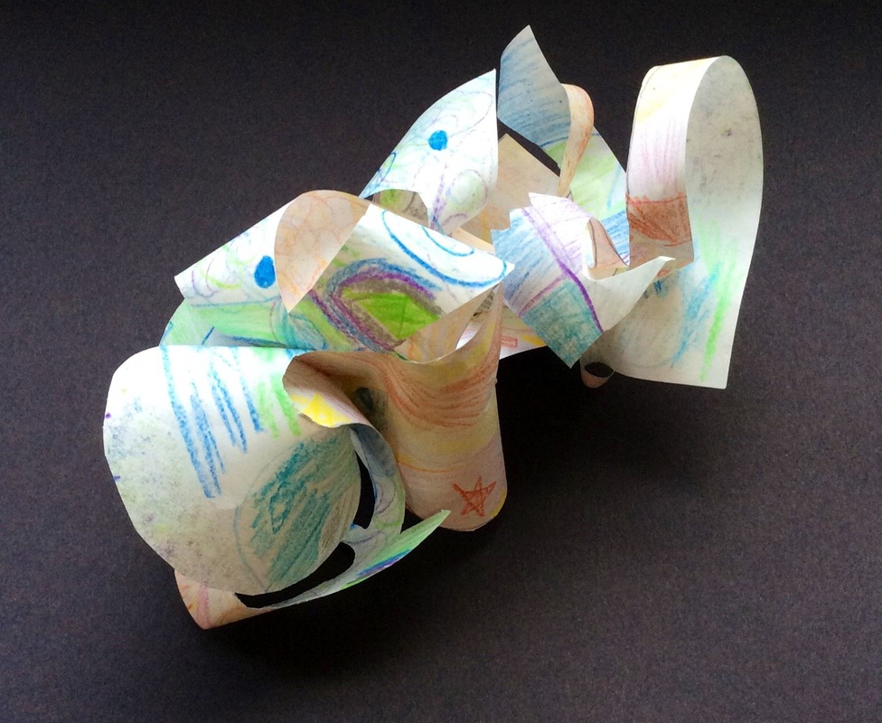 This is a project that I got from Don Masse over at his blog: shinebritezamorano.com I really like Don's use of contemporary artists with his students. Forms again!!!!!! We've really been hammering form a lot lately. Form is when something is 3D or has the appearance of being 3D. First we made our 3D paper mache dogs which have form. Then we did our chalk drawings of the paper mache dogs and made them look 3D. For this project, we manipulated a 2D piece of paper into something that was 3D. We we looked at Frank Stella's work. Frank is a living American artist known for his minimalist style, most notably his paintings. However, we really focused on his sculptures which look like sheets of metal that have been twisted and turned into sculptures. For this project, we talked about the difference between warm and cool colors. Warm colors appear to be active and seem closer to us while cool colors are perceived as looking further away. They used warm colors to create designs on one side of a sheet of paper and they used cool on the other. This creates contrast for when we twist and turn our sculpture later on in the project. After they finished coloring one side warm and the other side cool they drew and then cut a line that started somewhere on the inside of their paper and only touched the edge of the paper once. This created a long goofy looking strip of paper. Lastly, they twisted and turned and glued parts of their paper together to create forms. These turned out super cool! |
Devon CalvertHarmony and Consolidated Elementary Art Teacher in Milton, WI. UW-Eau Claire graduate. WAEA President. Apple Teacher. 
Archives
March 2019
Categories
All
|


 RSS Feed
