|
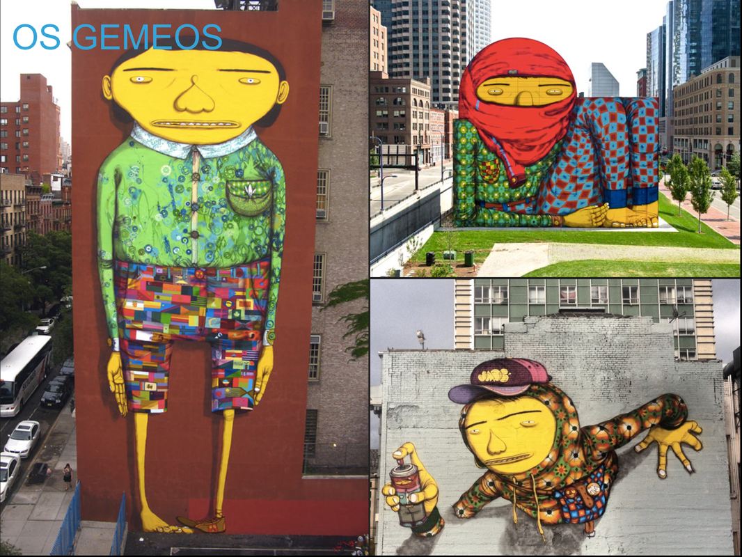
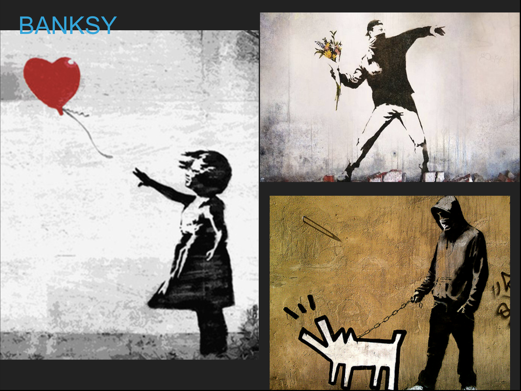
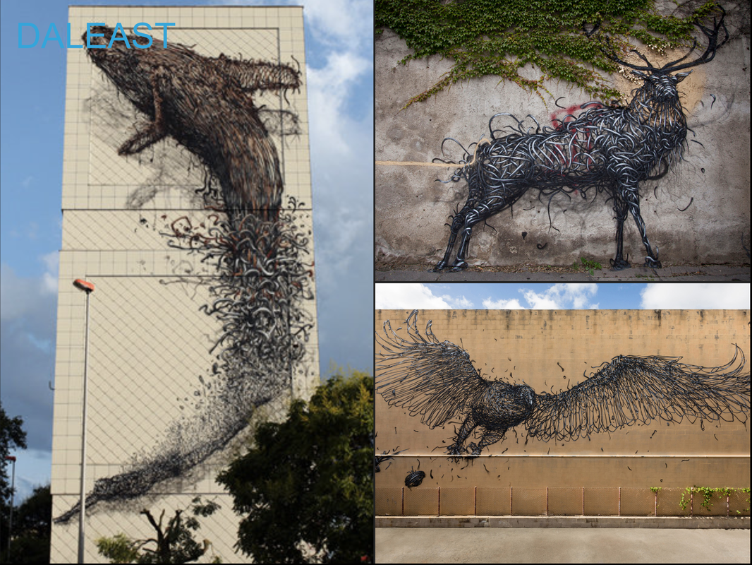
This past March 3rd grade finished up their Art Madness Tournament. This year's theme was street artists. Over two days, students vote and discuss who they think the best artist is in the tournament. The first day is spent doing one half of the bracket, the second day is spent doing the other half. After each round, students are expected to discuss why they think one artist is better than another. Two classes had Banksy beating Jim Bachor in the finals, another class had Os Gemeos winning it all, and the final class had DALeast winning. This is one of my favorite things to do all year because it’s so interesting to hear students defend the artists they like. 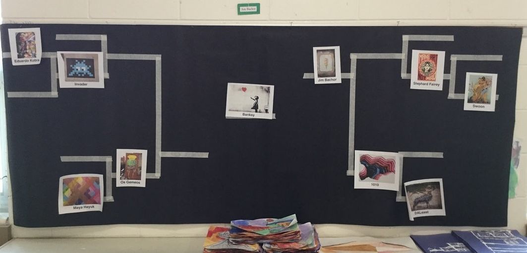 
0 Comments
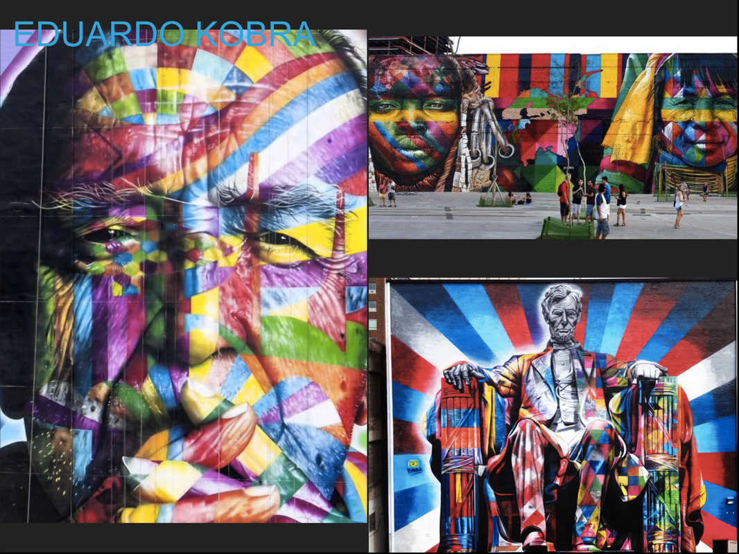
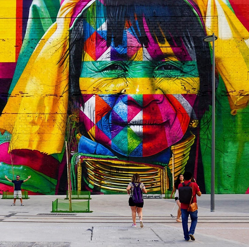
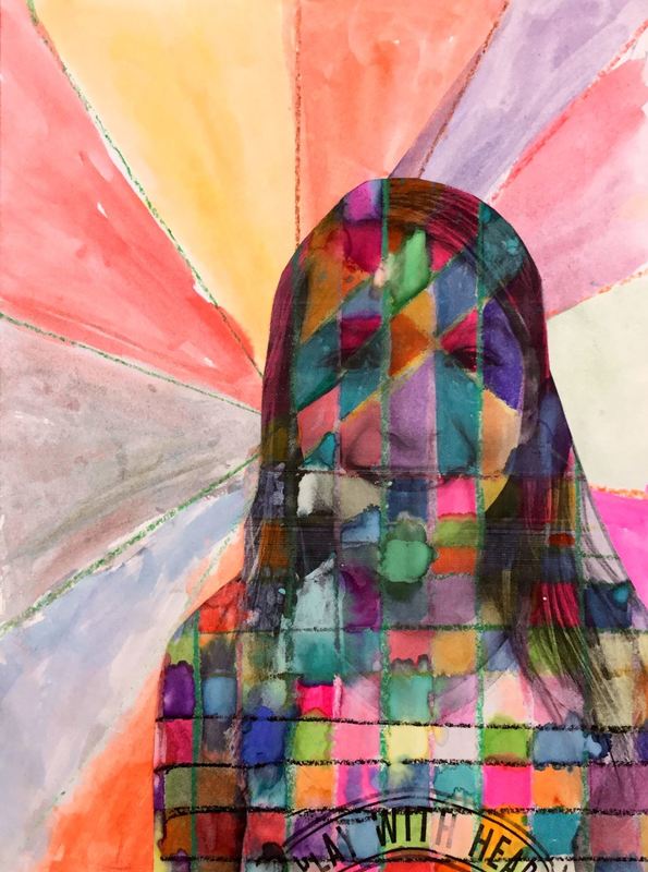
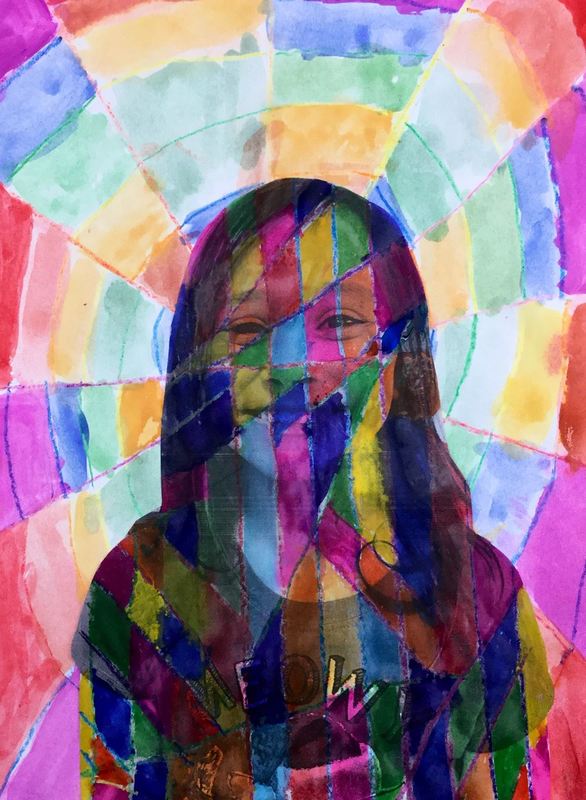
Eduardo Kobra is a street artist from Brazil who makes large murals of important historical figures. He breaks the figures into geometric shapes and overlays bright colors on top of a black base-layer. He recently painted the world's largest mural for the past Olympic Games that were in Rio de Janeiro.
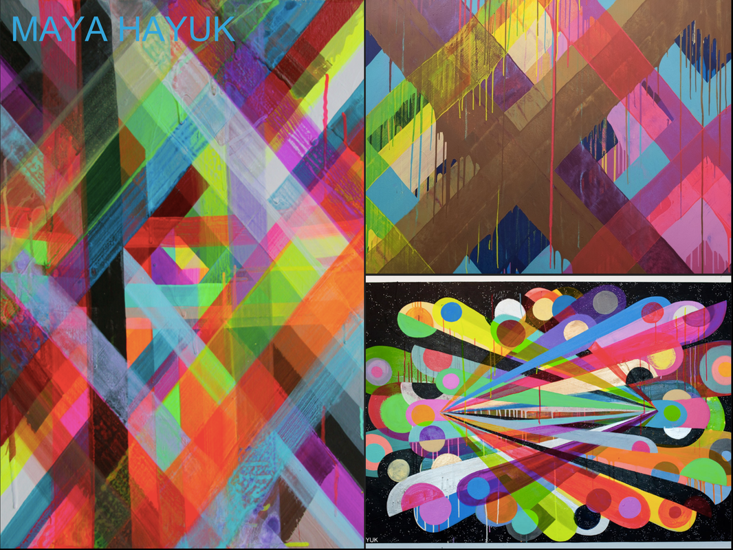
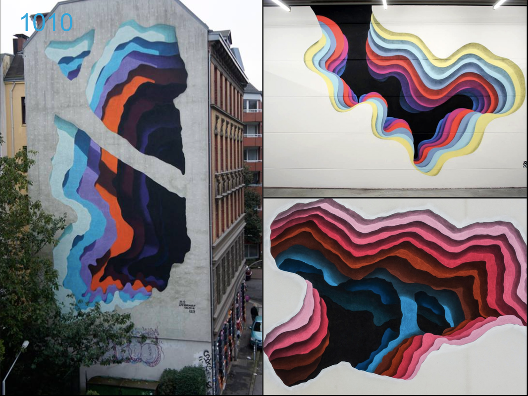
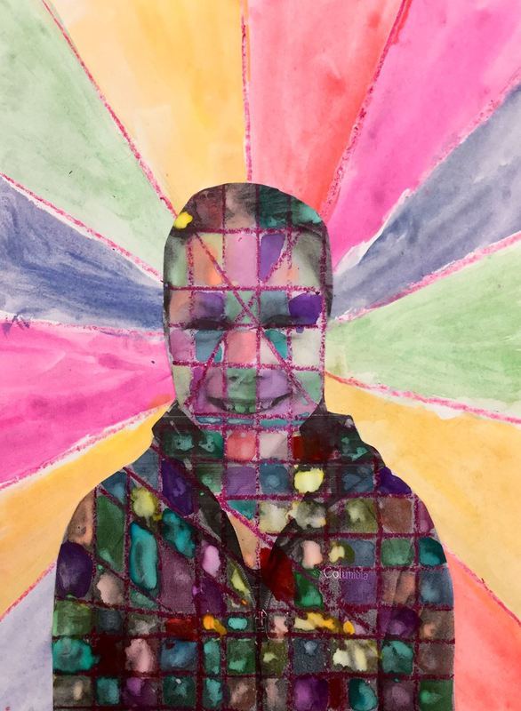
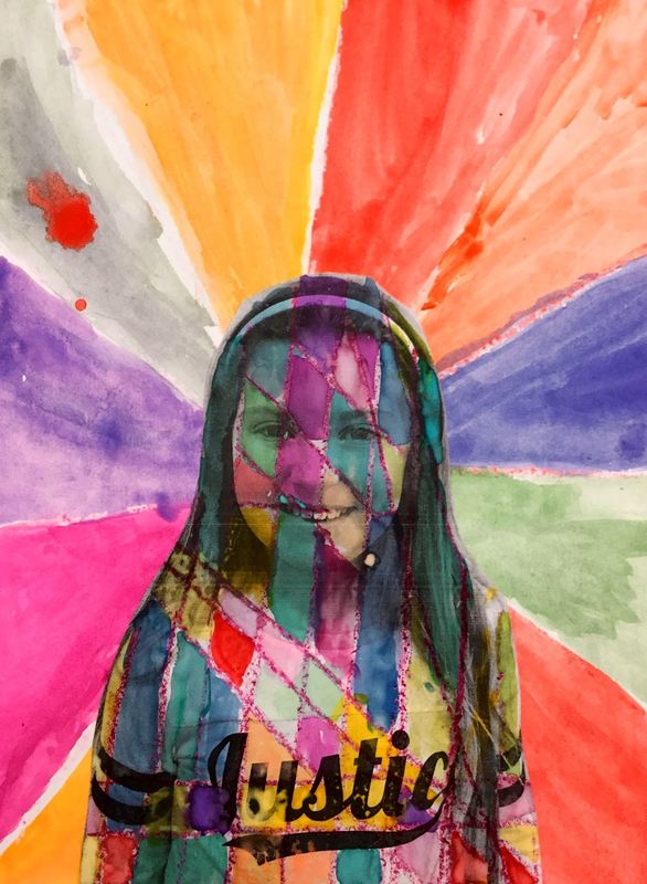
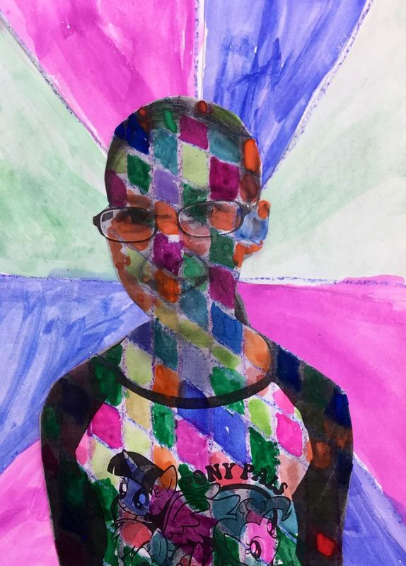
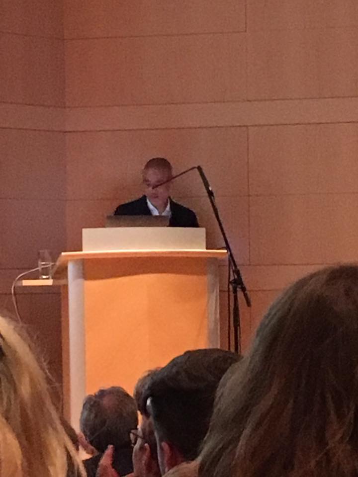
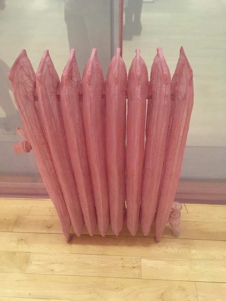
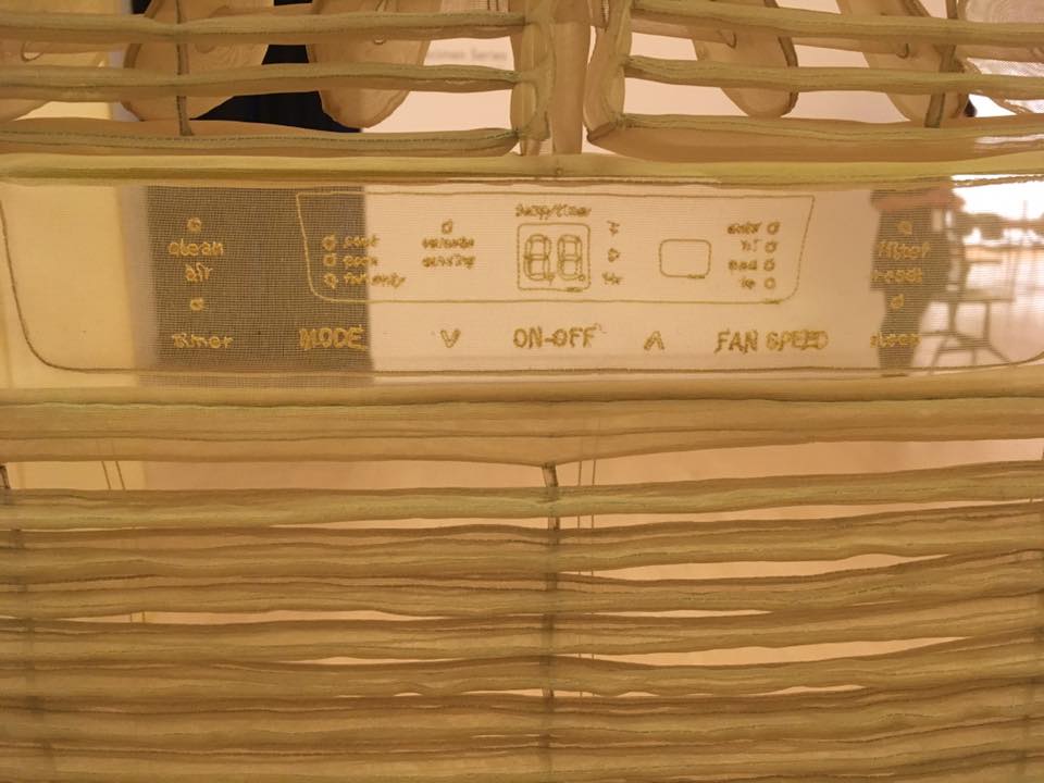
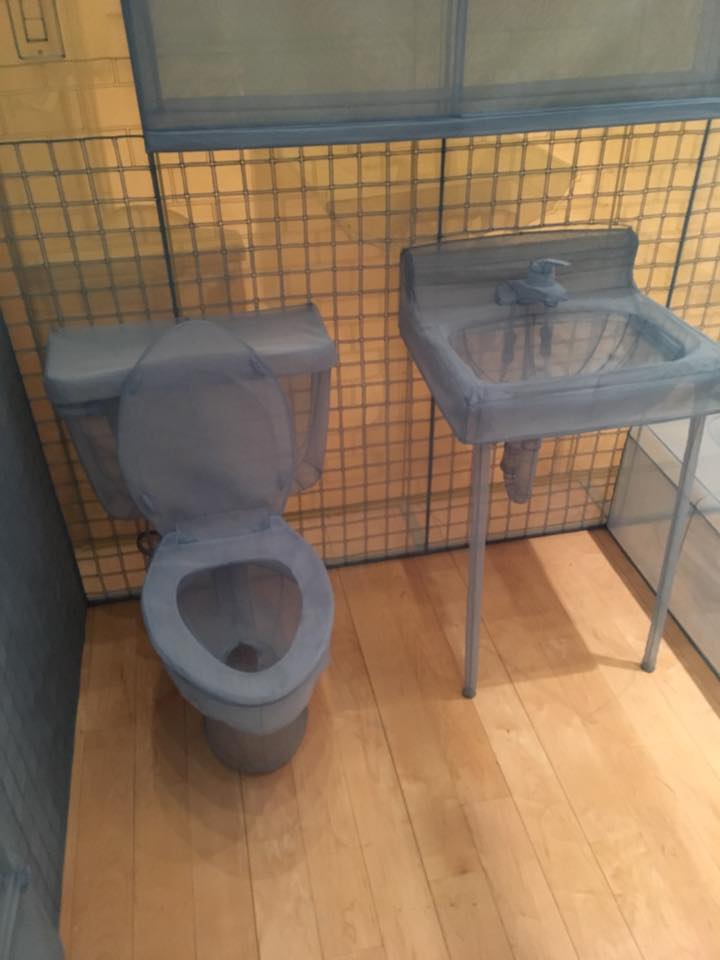
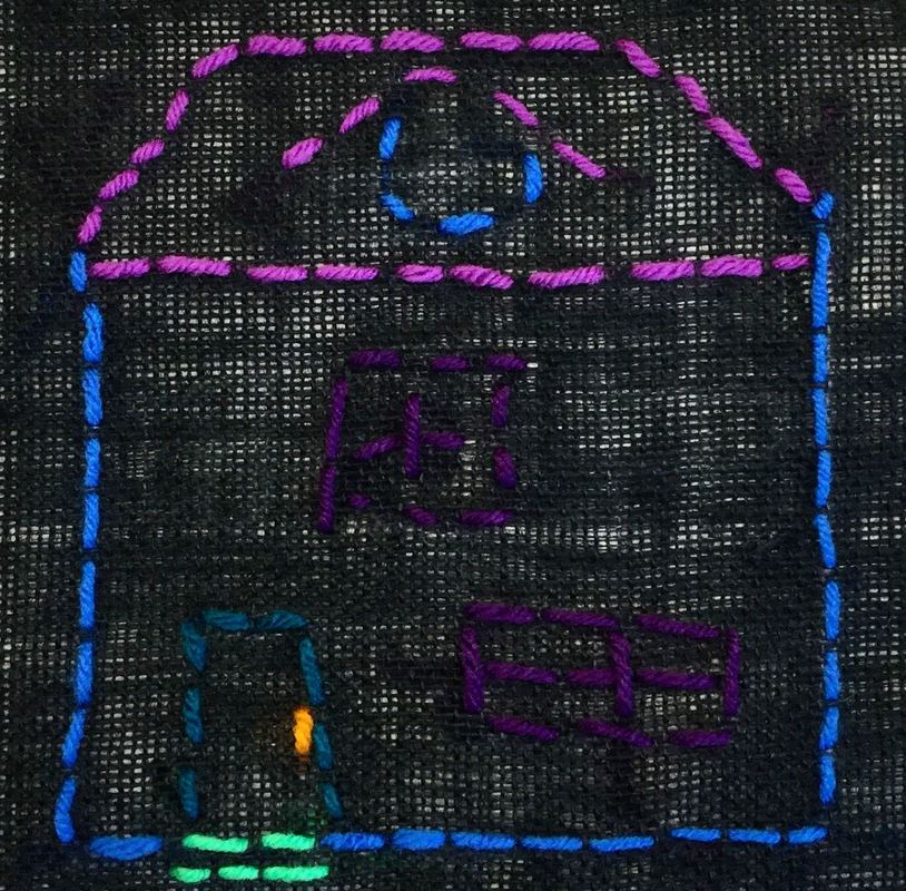
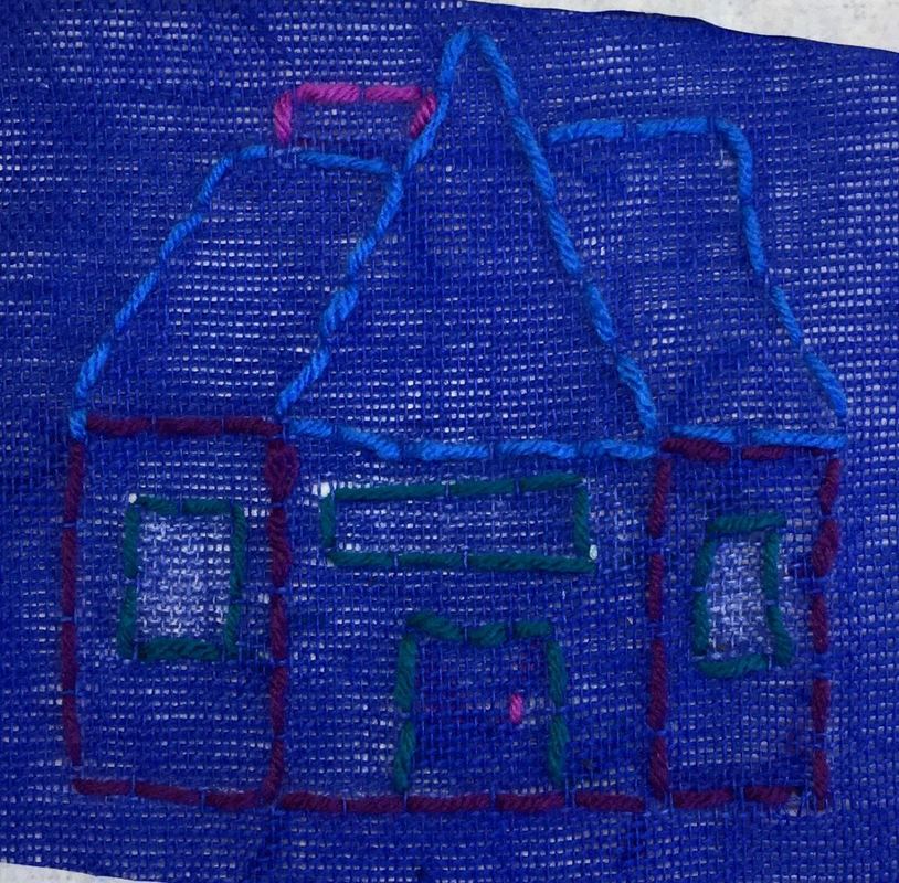
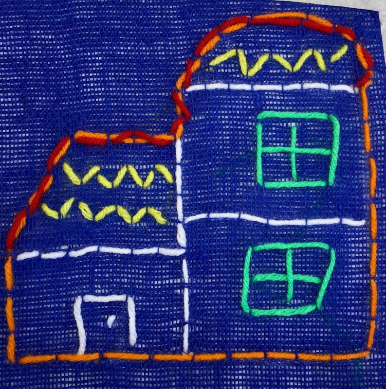
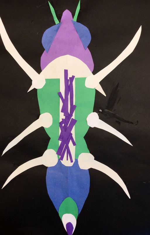
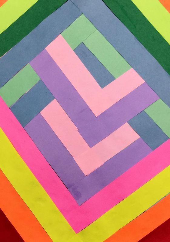
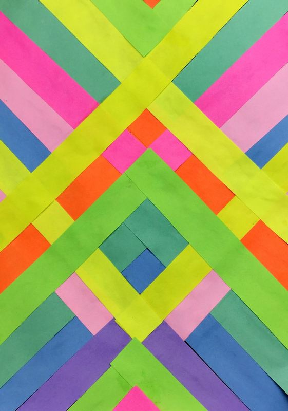
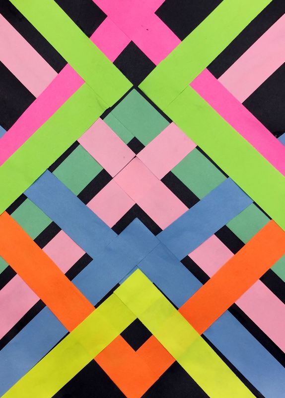
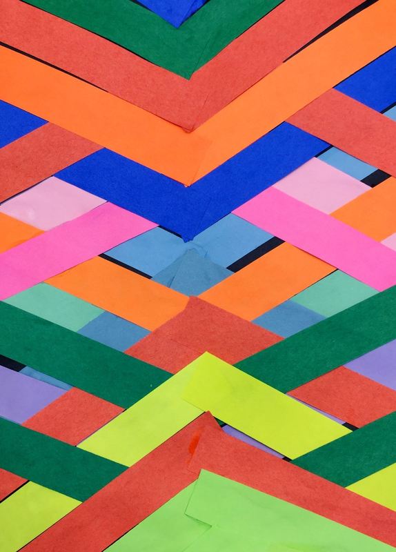
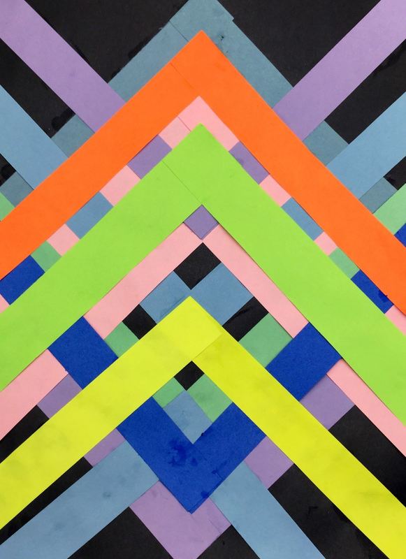
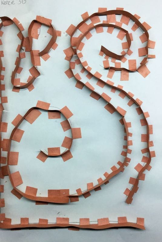
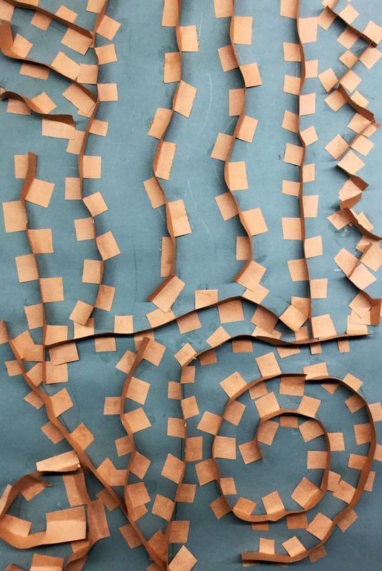
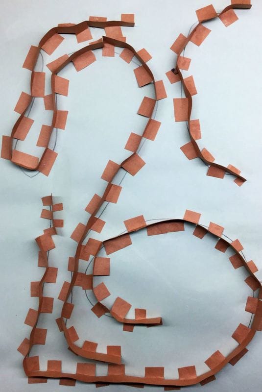
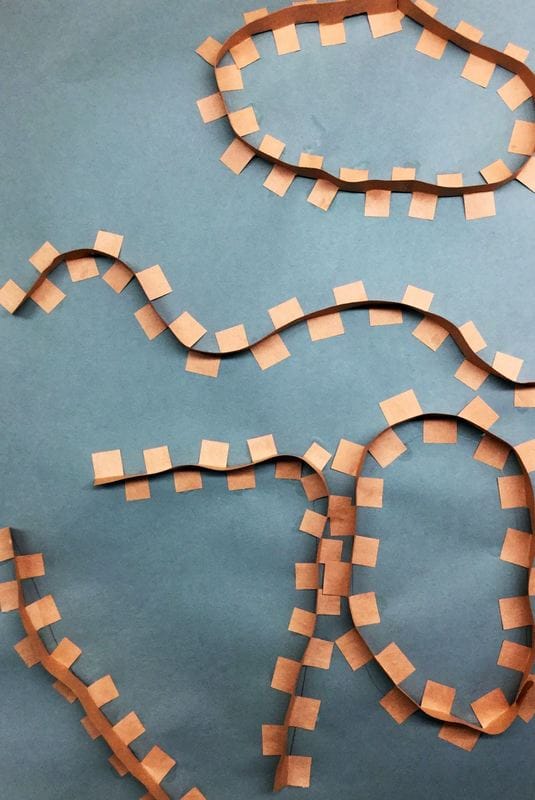
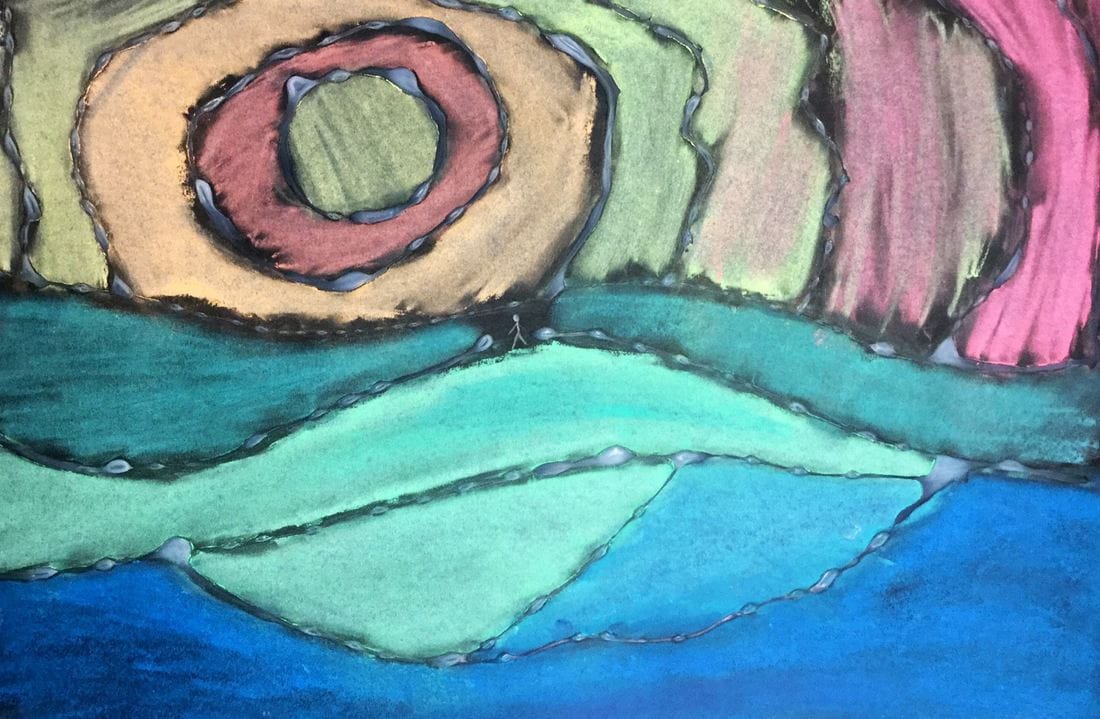
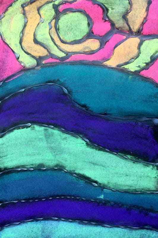
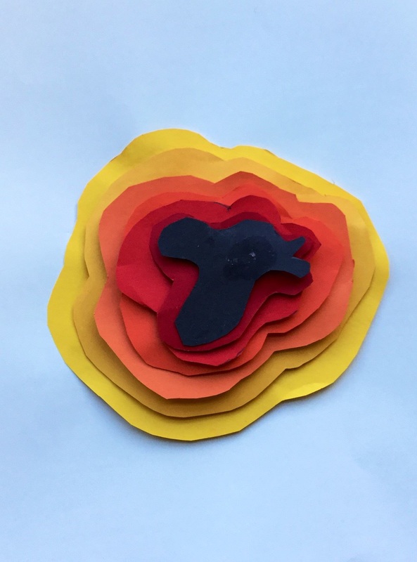
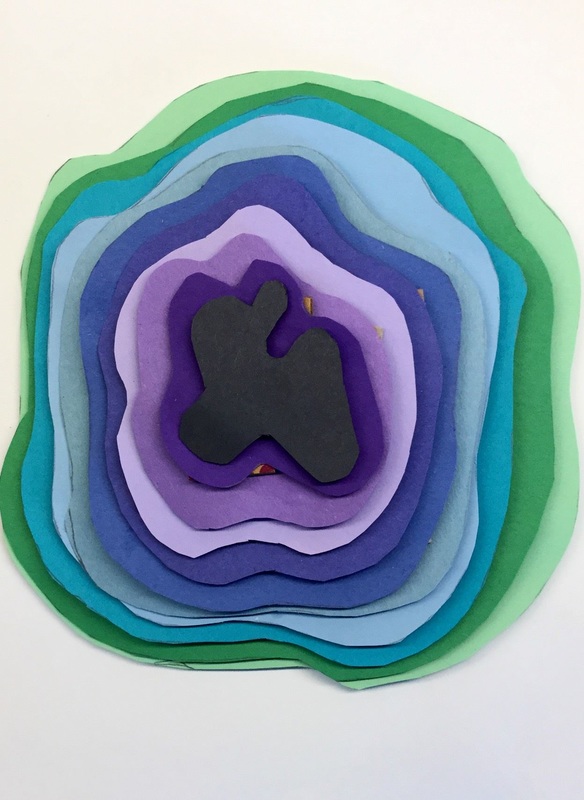
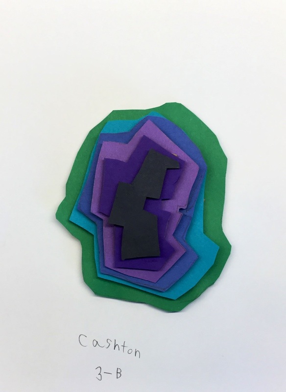
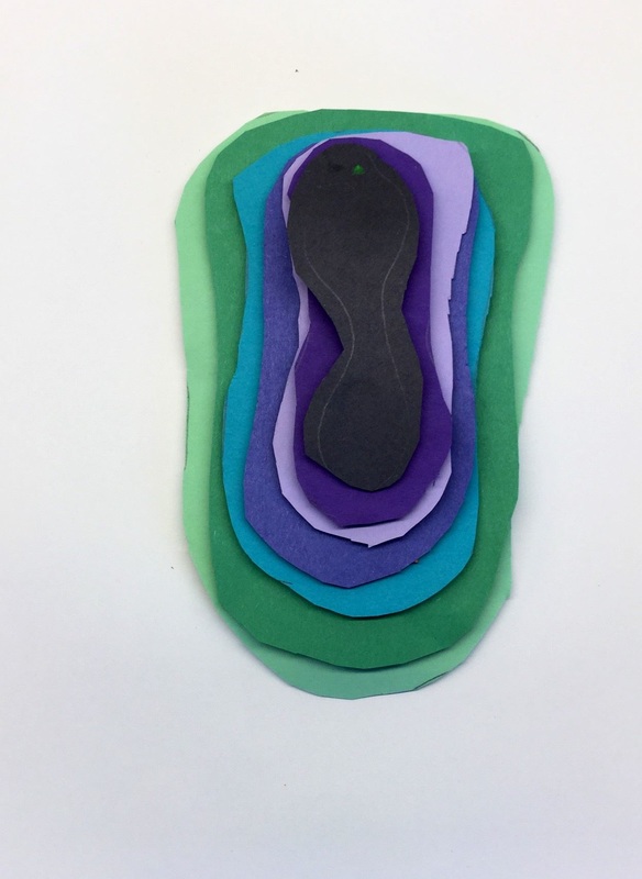
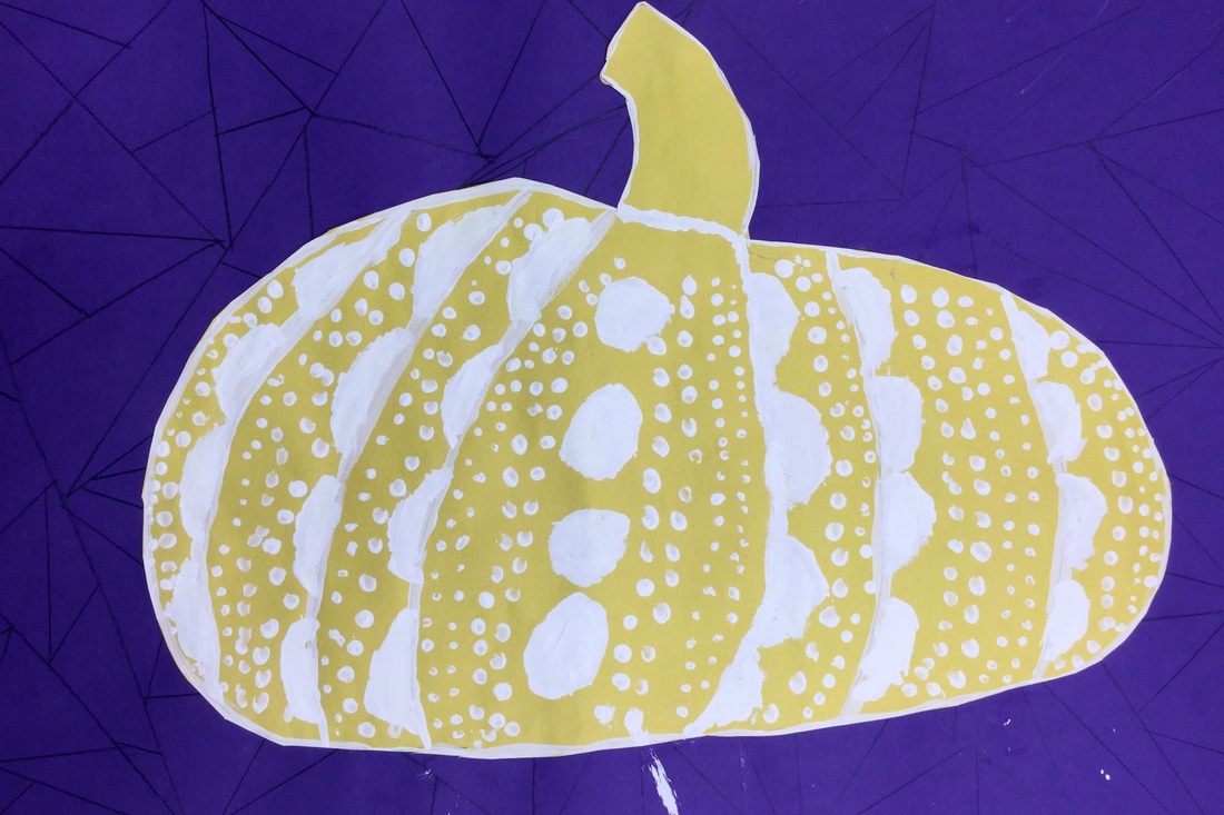
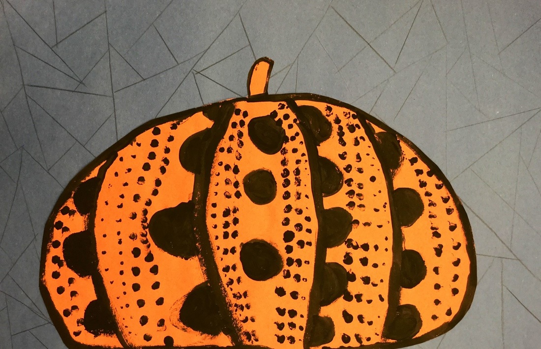
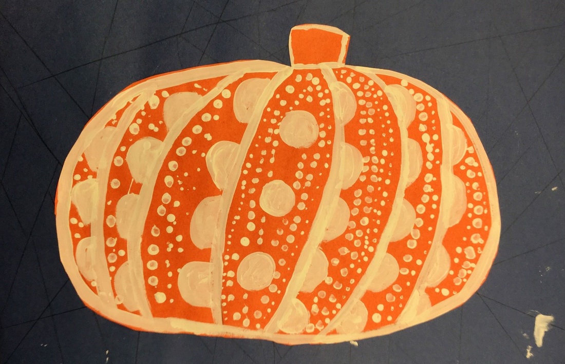
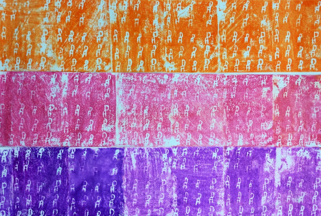
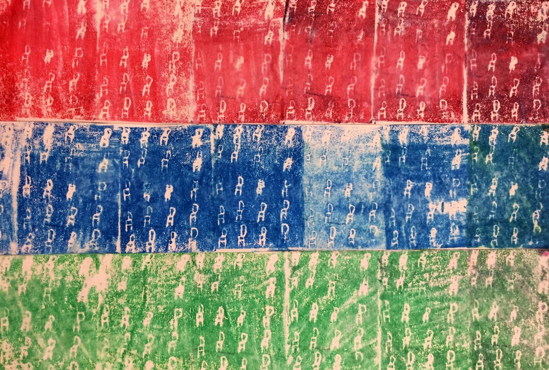
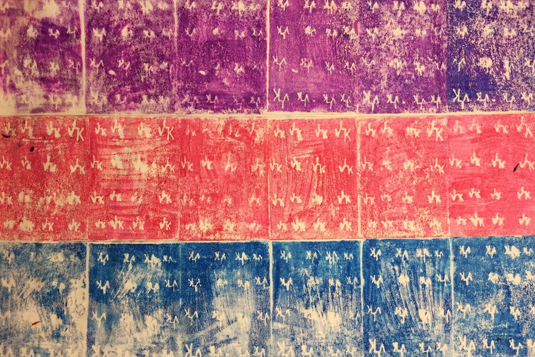
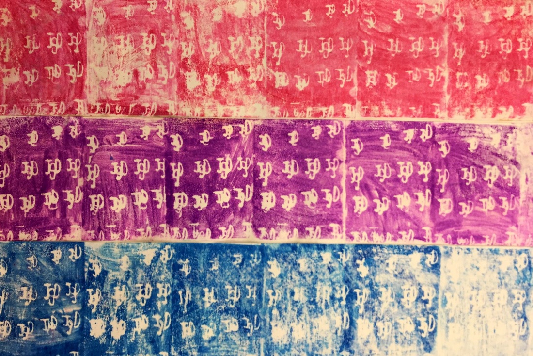
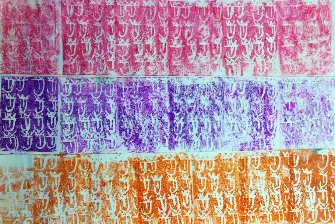
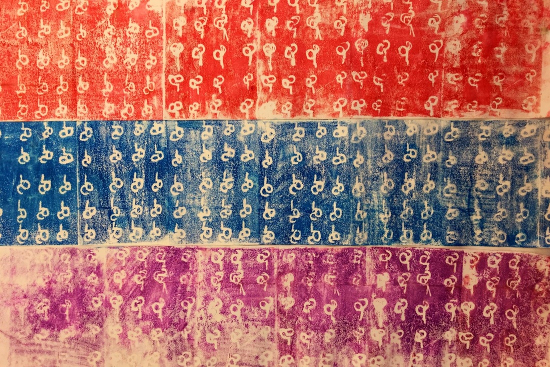
We have been plugging away on self-portrait projects for our upcoming art show at the end of the school year. After learning a bit about Eduardo during our Art Madness tournament, I thought he would be a great artist to inspire our latest project! We started off by making the background. Each student put a dot somewhere on their paper and then drew lines from the edges of their paper to the dot. Students traced their lines with crayons and then used tempera cakes to paint in each section they had created. While students worked, I pulled some of them aside and took headshots of them for the next part of the project.  The next day, I precut some strips of tagboard that were half an inch wide. Students used these strips to draw straight vertical lines on top of their black and white photo that I had printed out. After drawing their vertical lines, they drew horizontals and diagonals. This broke their photo up into a bunch of small shapes that they would then paint next class. 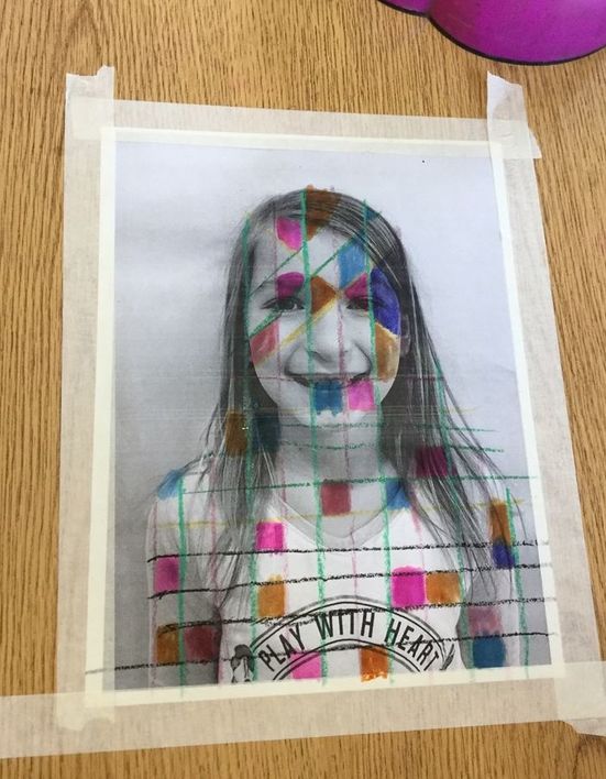 The final two days were spent filling in their self-portraits with watercolors. Before they could paint, I had them tape their paintings to the table to prevent them from wrinkling. They were expected to fill in each little section with a different color. Because of watercolors translucency, the black from the photo showed through the paint while also adding some color. Some of the students really rocked it when it came to painting, others added just a bit too much paint and were left with more opaque colors in which you couldn't see the details of their photos. I was super psyched with this project and can't wait to see it up for our art show at the end of the year! 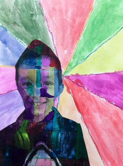 For this project, we focused on Do Ho Suh. Do Ho is a South Korean artist who recreates the places that he has lived out of a semi-transparent mesh/silk. He includes every little detail, right down to the numbers/buttons on the microwave and the switches in the breaker box. His homes that he builds are 1:1 scale so everything is actual size. He plays with this idea of being able to take the memory his home with him wherever he goes. So he creates it out of a light fabric and then could literally pack it up into a briefcase and take it with him. 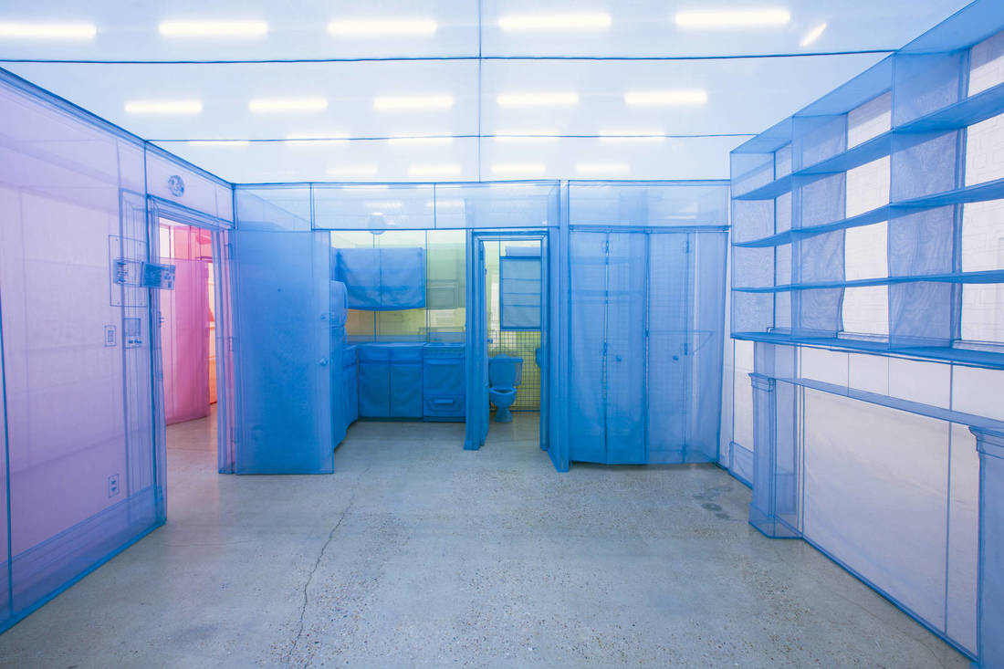 A look inside his apartment. This was recently showing in Madison! Coincidentally, Do Ho had a piece go up in Madison at the Madison Museum of Contemporary Art right when we were beginning to learn about him. I even attended an artist talk that he gave. It was AMAZING to hear him talk about his work in person. This was a really long project for the 3rd graders but they hung tough and rocked it. The first day, they were given a worksheet and they had to draw a house in the space provided. They were expected to use rulers so that their lines were nice and straight. The worksheet guaranteed that all their houses would be the same size and would fit onto their pieces of burlap. If they finished drawing their house, then they could cut it out. The 2nd day was spent getting everyone’s house drawings finished and cutout. When they were that far, they chose a piece of burlap that I had pre-cut and carefully taped off all four edges so that it wouldn’t unravel as they worked. Lastly, they gently traced their house onto their burlap using chalk and could then fill in the houses details from there. The next 3 or 4 days were spent stitching. At first, I taught students how to tie knots at the end of their yarn so that it wouldn’t slide through the burlap, but I was about ready to tear my hair out after doing that for a couple classes. To fix this, we ended up just taping the loose ends of the yarn on the back of the burlap, that way students didn’t have to futz with tying knots. I was also aided in my instruction by the fabulous Cassie Stephens because we all know how much I struggle with using fibers! Overall, this was a super awesome project. These turned out great and the kids loved learning about Do Ho Suh! I only wish that these photos did my students' work justice! 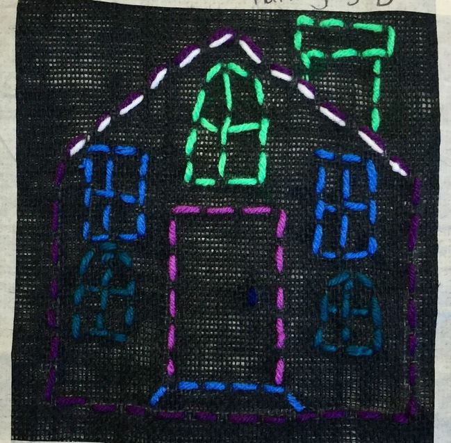 3rd grade took a few days to check out some photographs by Levon Biss. Levon is a commercial photographer who typical takes pictures of athletes for advertisements. He started a side-project and began taking pictures of bugs in his free-time. I love the bugs because of the incredible amounts of detail and his excellent lighting of the subjects. Levon takes around 8,000-10,000 pictures of a single bug, focusing in on tiny sections of the bug while changing the lighting over and over to get rid of shadows. He then takes all these photos of bug parts and jigsaws them together using computer software. Lastly, he prints these out on HUGE posters! 3rd grade loved looking at these itty bitty creatures and their symmetrical bodies! 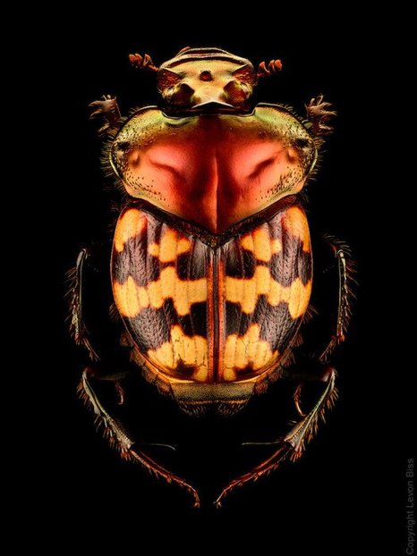 The main focus was to build on our understanding of symmetry after recently completing our project on Maya Hayuk. The first day was spent making the 3 main body parts. We did this by folding our papers in half and cutting out a shape. This ensured that each body part was symmetrical. The next two days were spent adding smaller details to the bugs such as legs, wings, antennas, stingers, pinchers, and other small designs. Students had to keep in mind that these additional details also needed to be symmetrical. I'm so excited by how these turned out and I could hear other classes pointing which ones were their favorites in the hallway! 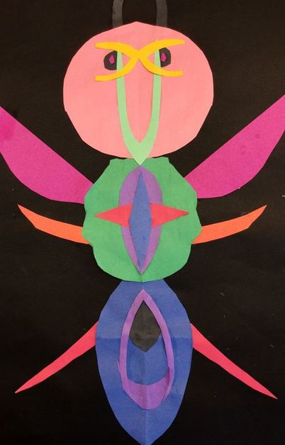 Maya Hayuk is a contemporary female artist out of Brooklyn. She creates large, geometric murals made of intersecting diagonals. The intersecting lines create an interwoven effect. Her murals use bright vibrant colors oftentimes overlaid on top of lighter colors. She uses a watered down paint that often runs down her walls. Because of the thinness of the paint, you can also see the mixing of colors when they overlap. I thought her work would be a good introduction to symmetry for our artists! 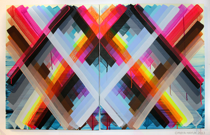 With Maya's work, we talked about the symmetry she creates. We also noticed that a lot of her paintings have light colors with bright vibrant ones painted on top. This use of color creates a sort of space or depth to her artwork, similar to the effect that we got from some of Frank Stella's paintings a couple months ago. I showed students how to line up a strip in the center of their paper and then mirror a strip across from it on the other side of the paper. This created a "V" shape with the paper strips. I encouraged them to use various colors, to overlap, and to turn their paper upside down so that they had paper strips going both directions. The first day was spent using light tints of colors. The second day the students continued to add strips, this time using brighter colors to help create that sense of space/depth. They were pretty excited about using some neon colors! 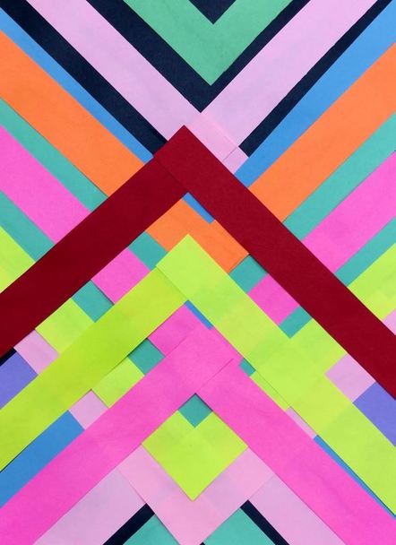 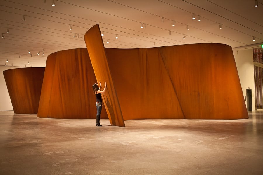 Richard Serra is an American installation artist who uses large sheets of steel to create warped walls. As a steel mill worker in college, he was influenced by the material and began to incorporate it into his work. His large walls slant at different angles with some angling over you while others angle away from you. Some walls are also close together and other areas are more open. His walls are meant to challenge a person's sense of personal space. We have talked about space as something being close or far away from us throughout this school year. This project however, we talked more about our own personal space and how those walls might change our perceptions of space. 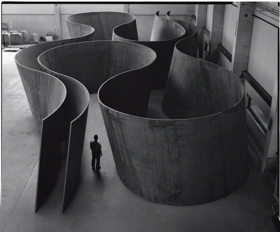 Because I didn't have this grade when they were in kindergarten and first grade, I haven't done any solid line projects with them. I like how when you can see Serra's work from above, it looks like a line design. I used this as influence to teach our artists about some different kinds of lines. After learning about Richard Serra, students created two sketches of line designs. After settling on their stronger design and getting it okay'd by me, they transferred it to a large sheet of grey paper. 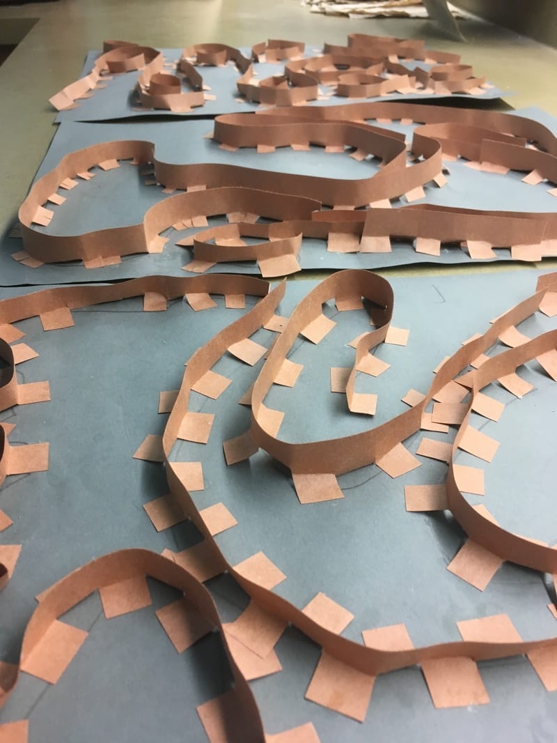 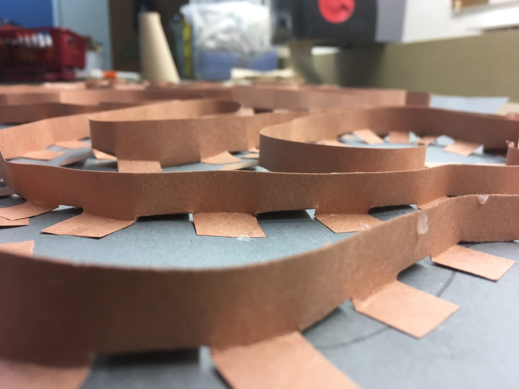 The 2nd and 3rd day of this project were spent adding “lines/walls” to our artwork. We did this by cutting small slits into brown strips of paper. Students then folded the tabs those slits created back and forth so that it kind of looked like a zipper. Lastly, they put a dot of glue on the bottom of each tab and glued the strip down onto their line drawings. I'm blown away by these! This is one of my favorite projects this year! 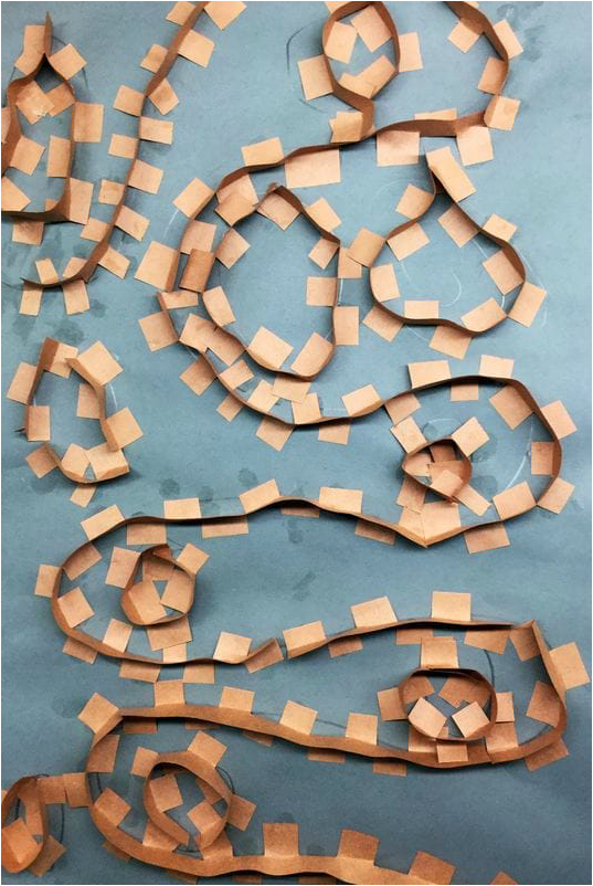 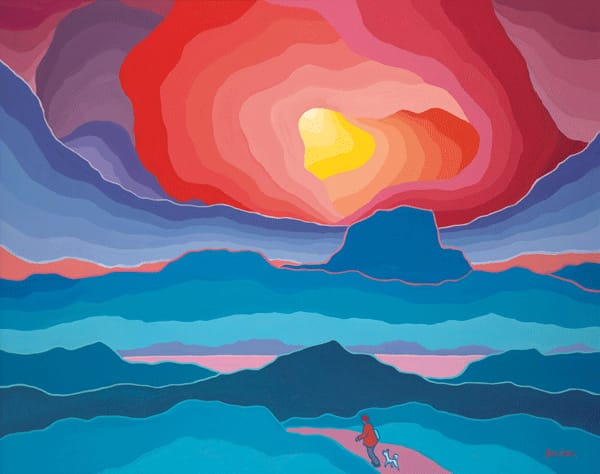 Ted Harrison was a British-Canadian artist who is well-known for his bright, stylized landscapes of the Yukon. Although I told my artists that we would be learning about living artists this year, I made the exception with Ted because he passed away this past January. I thought Mr. Harrison's work would be a good chance for us to study space and warm/cool colors. Lately, I have been stressing the importance of sketching out ideas and designs before diving into projects. After we took a look at Ted's work, we did two landscape sketches. Students decided on their stronger design and got it okay'd with me. Then they transferred that sketch to a large black sheet of paper. Lastly, they used a glue bottle to carefully trace over their lines. The second day and final day of the project was spent adding color to our landscapes with chalk. We emphasized using cool colors on the ground and warm colors in the sky. Because we used glue to draw last class, the now dry glue creates strong black lines to divide up the sections of background. Our chalk colors are pretty limited so students had to mix a lot of their chalks to create new colors. It was good to see them take advantage of their color mixing knowledge. 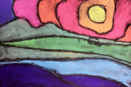 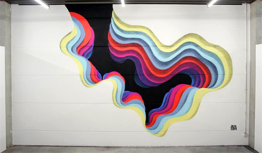 1010 (pronounced ten-ten) is an anonymous street artist who creates optical illusion-esque portals. He typically paints large-scale murals but also does some paper cuts (not the kind that hurt!). Although his paintings are 2D, they have a sense that you can walk into them. He creates this effect by working from darkest at the very center and working his way outwards to the lightest colors. This creates a tunnel-like effect. His choice of colors, combined with the gradual change in size of his shapes combine to create this effect. Sometimes he chooses to use geometric shapes, other times he uses organic. I really like that he doesn't always just use blues or greens during his work; he shifts through several different colors. After introducing 1010, students were introduced to analogous colors. Analogous colors are three colors in a row on the color wheel. Technically, analogous colors include a tertiary but because I didn't have many tertiary colored papers, I just told the students that it was 3 regular colors on the color wheel (yellow, green, blue for example). All students created a small shape using black. From there, they needed to stop and think about what colors they were going to use and how they would transition between them. They were expected to use at least 6 colors including the black one they started with. After cutting out their black shape, they bubble-traced around their shape which made it slightly larger. Each new shape they cut out was bubble-traced so that their artwork would continue to get bigger and bigger. Students were very conscious of working from the darkest colors first to the lightest while also remembering to keep their analogous colors in order. The second and final day of the project was spent finishing cutting out any shapes they had left. Some stopped at six shapes while others cut out up to twelve different colors! Lastly, students glued them down from biggest to smallest, lightest to darkest. Each layer had pieces of cardboard glued to the back of it. This caused each layer to be slightly raised above the previous one. This differed from 1010's work because his is completely flat, however, ours took on more of a pyramid form. I was really nervous about this project. Although it was only a two-day project, I thought it was kind of a complex idea working from darkest to lightest using analogous colors but the kids knocked this out of the ballpark! 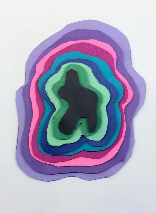 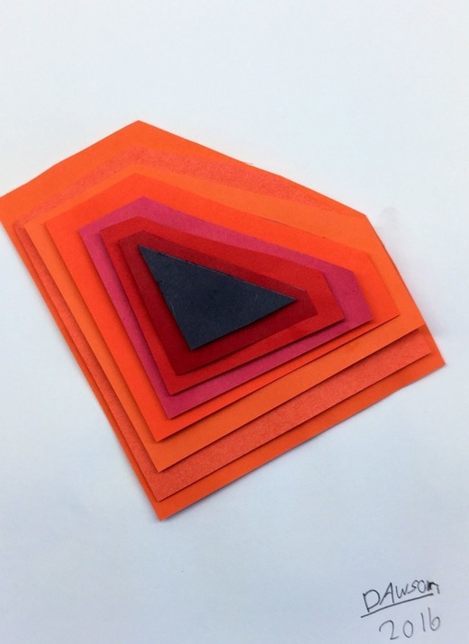 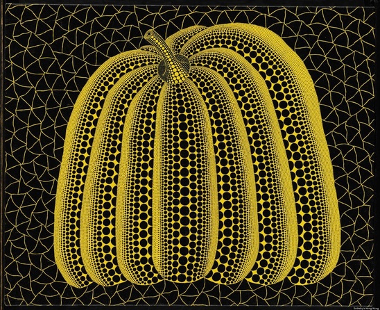 To get into the fall/Halloween spirit, we studied the Yayoi Kusama's pumpkins. She doesn't just do paintings of pumpkins but even paints polka dots onto physical pumpkins! Kusama is a pop artist originally from Japan. She is known as the "Princess of Polka Dots" due to her obsession with them. As a child, she had a hallucination in which she saw a field of flowers except that the flowers had been replaced by polka dots. Since then, they have become an integral part to her work. While looking at her painting, students noticed that the pumpkin seemed as if it was 3D because of the various sized polka dots. We talked about how these polka dots created the illusion that the pumpkin had form. The first day of class we used a ruler as a straight edge to divide our background paper into geometric shapes. Students then drew a large pumpkin onto the complementary color of their background. The second day, we outlined our pumpkins with either black or white. Then we added large polka dots to each section of the pumpkin. The last day, we cut and glued our pumpkin to the background. Then students created rows of polka dots with a q-tip and lastly they used the backend of their brush to add more dots. Using the q-tip and back of the brush created more variations in polka dot sizes. 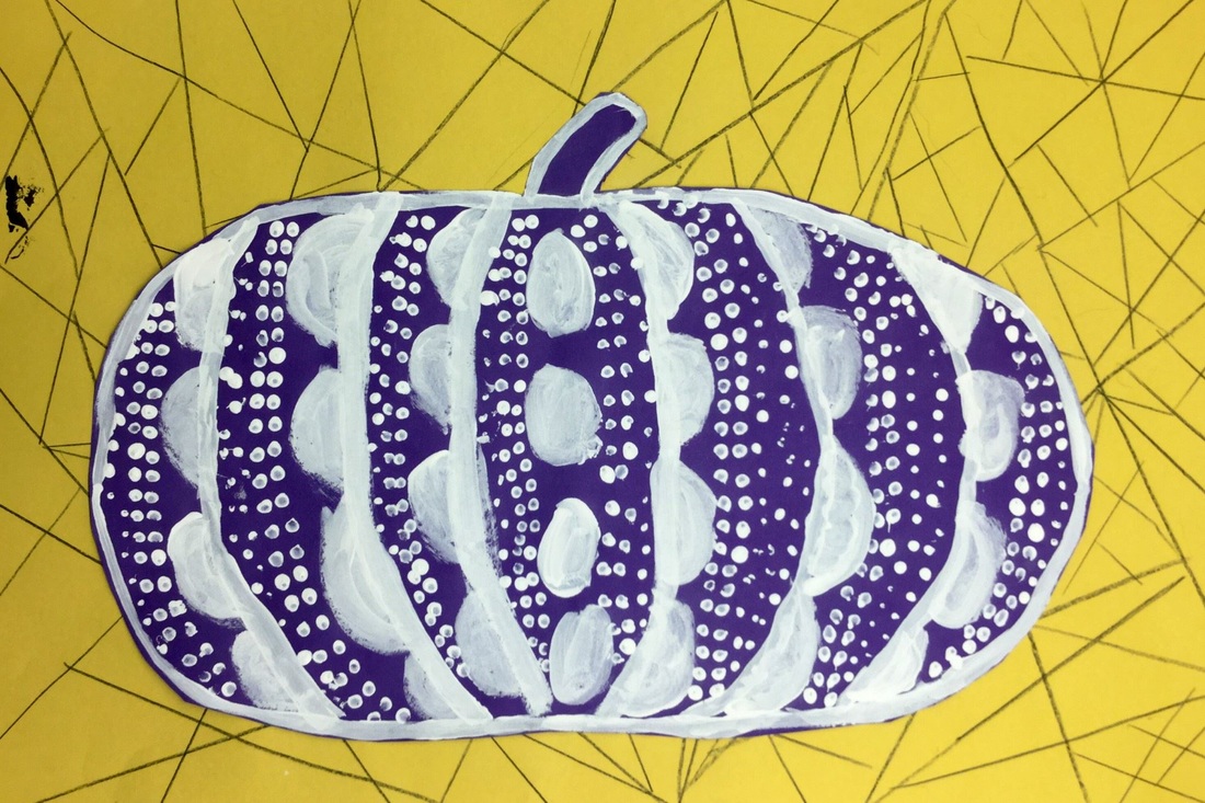 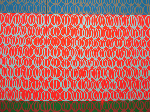 We just finished up learning about contemporary artist, Judy Ledgerwood. Judy is a Chicago-based artist who is influenced by textiles and the pattern/decoration artists of the 1970s. She repeats a motif over and over with slight variations of the design throughout the painting. While Judy is a painter, we practiced our printmaking skills for the project. We started the project with a worksheet that used our initials to create a design. After creating three initial designs, students chose one and then redrew that design over and over on a small slip of paper. Then they took that slip of paper and taped it to a piece of styrofoam and retraced all of their initial designs with a pen. By doing this, it presses parts of the foam in and creates a relief print. The second day was spent finishing up their designs and styrofoam. Then we talked about relief printing and I showed them a quick video of what a relief printer does. I then showed them how we would use our styrofoam as a relief print. Students colored their styrofoam with a washable marker. I then went around and sprayed their strip of water with a spray bottle. They wiped off the extra water with a sponge so that their paper was damp and then printed their styrofoam onto the damp paper. Lastly, they gently rolled over their styrofoam with a brayer to make sure that they smoothed all the edges. Having them use the brayer as a smoother really helped their prints turn out better. Students printed for about two and a half days. They were expected to print the same color all the way across their strip of paper, over and over. When they finished a strip, they could choose another color and do it all over again. They had to finish at least 3 strips of paper but were welcome to print more. The last day was spent choosing their 3 best strips of paper and gluing them down onto a larger sheet of paper so that it made one large artwork. 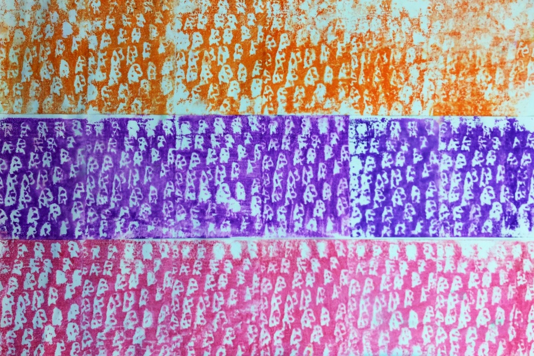 |
Devon CalvertHarmony and Consolidated Elementary Art Teacher in Milton, WI. UW-Eau Claire graduate. WAEA President. Apple Teacher. 
Archives
March 2019
Categories
All
|


 RSS Feed
