|
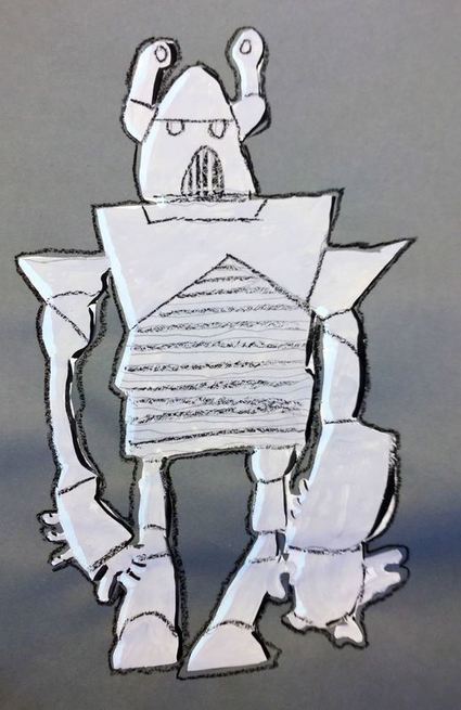
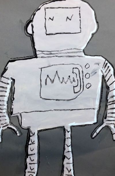
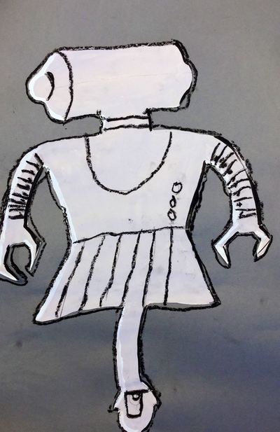
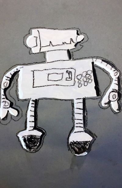
We continued talking about form with this project inspired by Leonardo da Vinci's sketches of a robot! Read more about the details from last year's post here! Otherwise, check out some photos below!
0 Comments
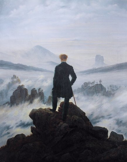
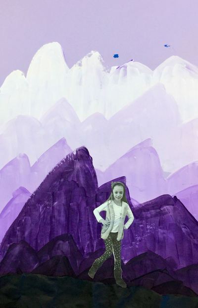
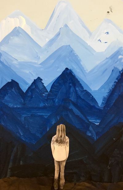
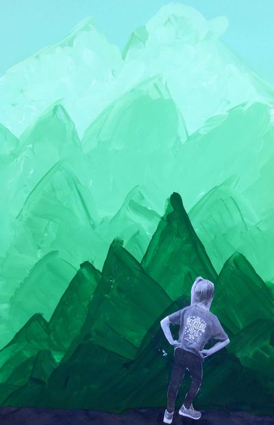
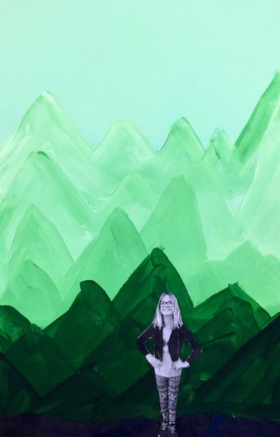
Caspar David Friedrich has always been one of my favorite landscape painters and I have always wanted to teach about him! Friedrich was a 19th century Romantic landscape painter. Romanticists were artist who believed in the beauty and awe of nature and sought to depict emotions through their landscapes. While looking through some of his paintings, students talked about the different emotions his paintings evoked and why they may have experienced those feelings. Friedrich is most well-known for the painting Wanderer Above a Sea of Fog which can be seen below. This painting has been hugely inspirational for many movie and book covers and the kids loved seeing the influence it had. Throughout this project, we really focused on space and value. We noticed that as things got farther away from us in the picture, the colors got lighter and became tints. We also noticed that things got higher on the painting. Things that are closer are lower and darker in the painting. We made sure to take these things into account when making our artwork.
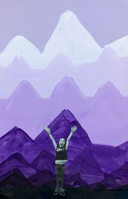
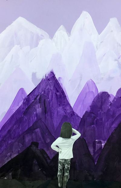
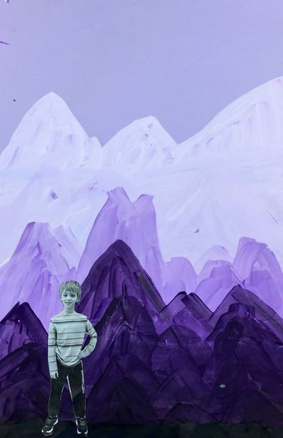
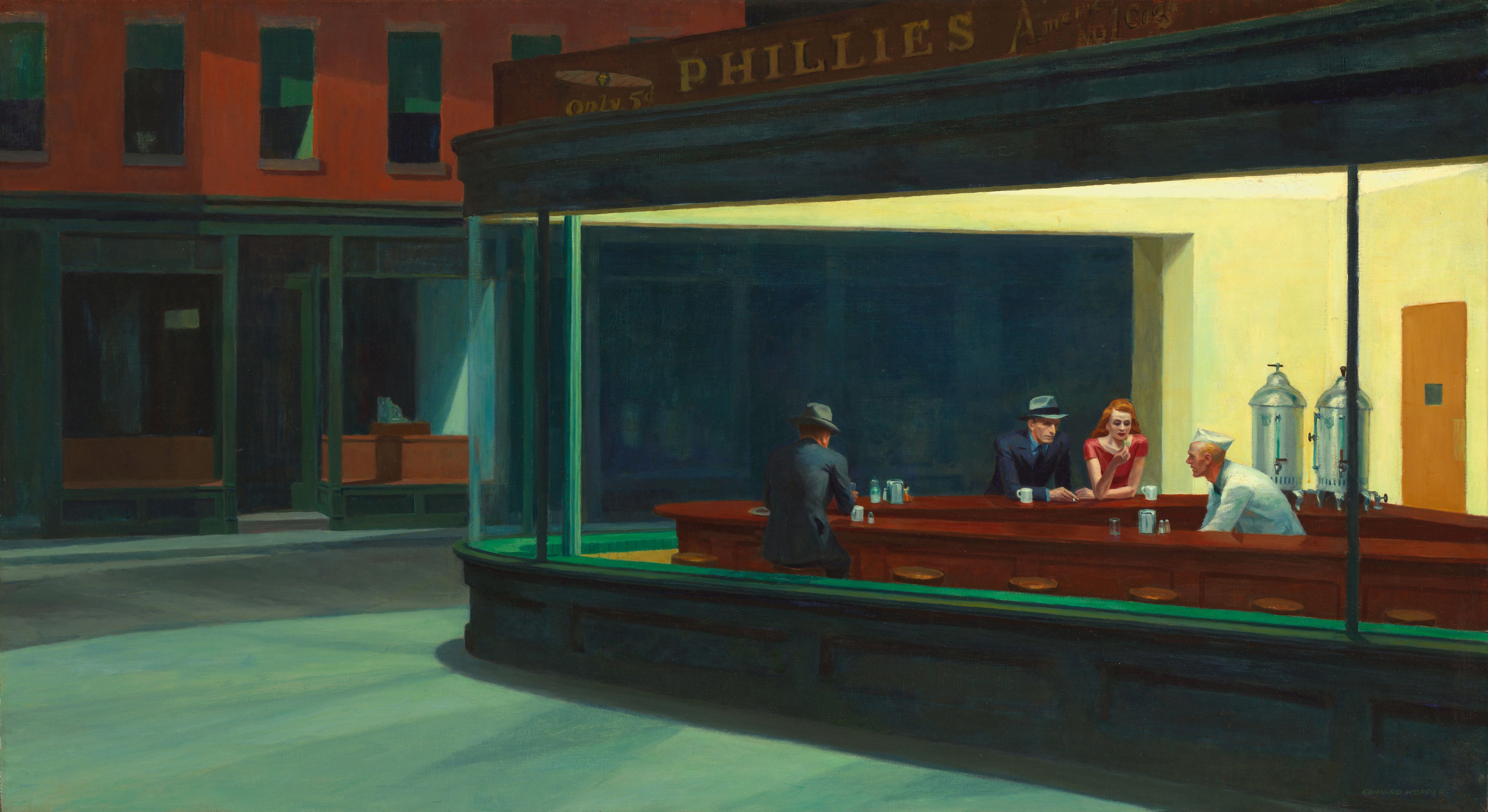
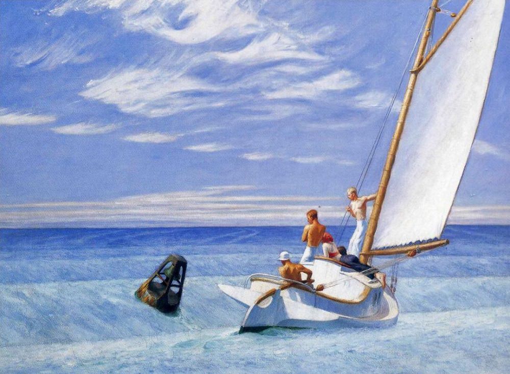
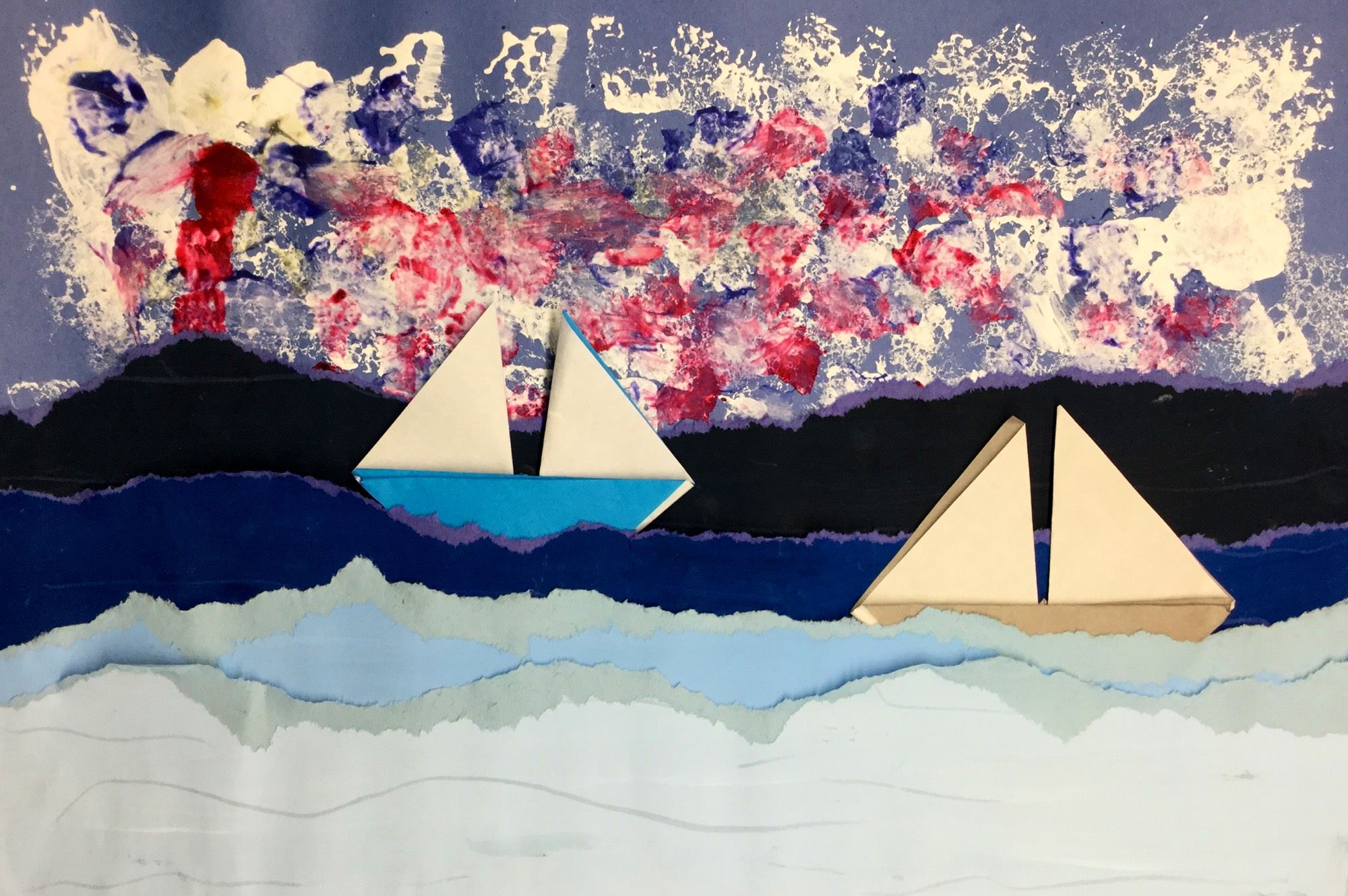
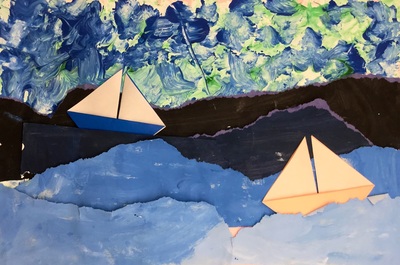
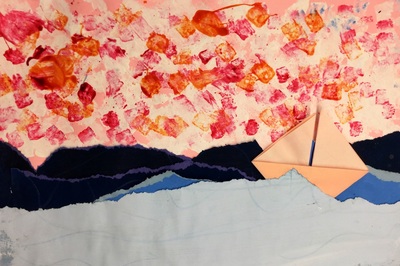
The first day, students chose a blue, green, or purple background. They were expected to paint with whatever color paper they had chosen. Students scooped out a bit of their chosen color onto a magazine page (these work great as paint palettes because they can be thrown away when finished) and I came around and gave them a squirt of white paint. I told them that the tip to mixing tints was always to add the color to the white paint. Students added a touch of color to their white, mixed it, and painted a mountain towards the top of their paper. Then they added a little bit more of the color, making it slightly darker, and painted another mountain below the first one, making sure that it overlapped. They painted four rows of tinted mountains on the first day. The second day, students scooped out some more of their color and I gave them a squirt of black this time. When mixing shades, we learned that this was opposite of how we mixed tints. With shades, we had to add a touch of black into the color instead of the other way around. Students painted four rows of shaded mountains, making sure they reached the bottom of their papers. When they were done, we had a discussion about what it would feel like to stand on top of a mountain and what kind of poses they would strike. We finished off class by taking out pictures in those poses. The last day of the project, students received a strip of black paper and their photograph of their self from the previous class. Students tore one edge of the black strip of paper and then crumpled it up to give it some texture. They glued this to the bottom of their paper to make it look like the land they would be standing on. Then they cut out their picture and glued it down to look as if they were the wanderer on top of the mountain. When they were finished, we did a little writing activity and placed ourselves into the role of the wanderer. We wrote about where we would travel to and what we would want to see/do while we were there. Students also had the option to draw a picture of where they would go on the back of the worksheet. I loved reading about where they would go! 2nd grade carried on with learning about value. This time, we used it when creating seascapes rather than landscapes. We decided to check out one of my favorite artists, Edward Hopper. Hopper was an American realist painter. He liked to paint lonely scenes of everyday American life. His paintings come off as being uneventful moments captured in time. He is most well-known for his highly parodied painting, Nighthawks. This project is loosely based on Cassie Stephens' Leif Erickson background. 2nd grade recapped on space, value, and tints and shades. We noticed that in this painting by Hopper, the lighter colors were at the bottom of the painting and the darker colors were further away. This was opposite of what we noticed with landscapes. Students partnered up and one partner painted two 6x18 tints and the other painted two 6x18 shades. This project, they got to mix their own tints and shades. We learned that when mixing tints, we start with white and add our color to it. With shades, we start with the color and add black to it.
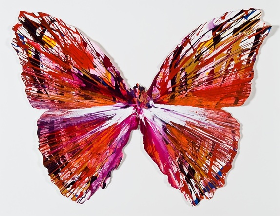
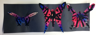
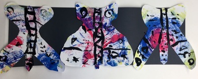
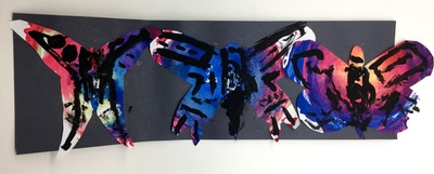
The second day, students sponge painted a background paper with white. They then sponge-painted two more colors on top of their white paint. Then they CAREFULLY tore each of their strips of paper from the previous class in half and gave one half to their partner. Now each student had two tints and two shades. Students ordered their torn strips from lightest to darkest (lightest at the bottom). They glued down their strips, starting with the shades in the center of their paper and worked their way down to the tints at the bottom. The final day dealt with Mr. Calvert taking on one of his biggest fears, origami! We sat in a big ole' circle and worked step-by-step together until we folded an origami sailboat. Students had the chance to make two boats if they wished. The last steps to do were to curl the tops of their waves and then glue down their boats, being careful to take space and size into consideration if they had two boats. 2nd grade took a look at contemporary British artist, Damien Hirst. Damien has a wide variety of art but we focused on his spin paintings. Hirst has a table that spins in a circular motion. He puts paint onto the table and as it spins, it moves the paint around. Sometimes he takes the spin paintings and then cuts them into new shapes like the butterfly above. 2nd grade learns about butterflies in their classroom so I thought this would be a good tie in.
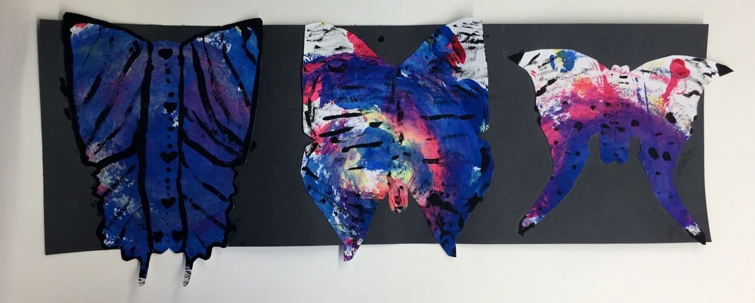
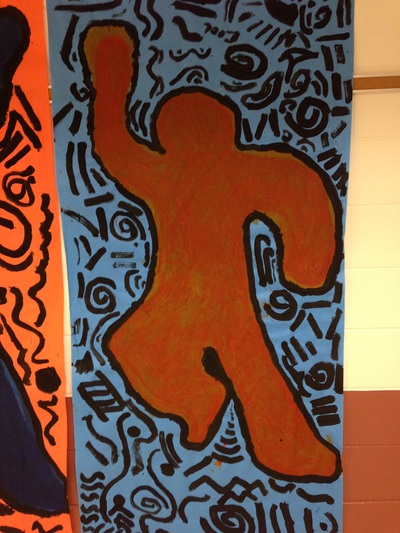
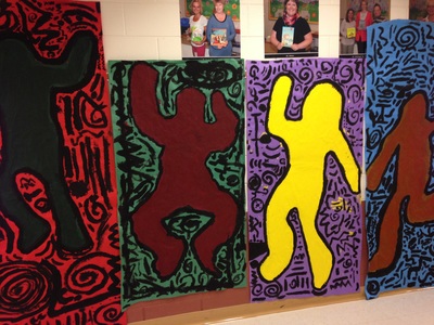
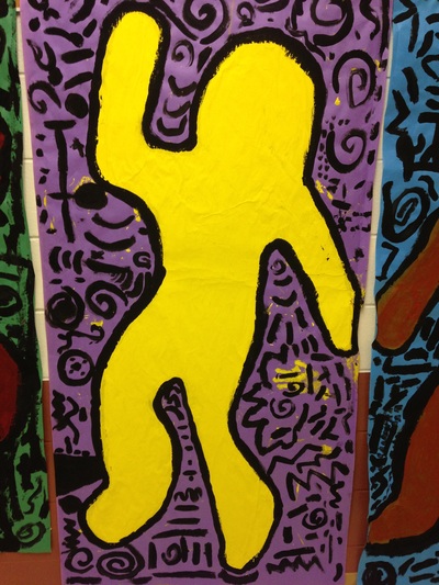
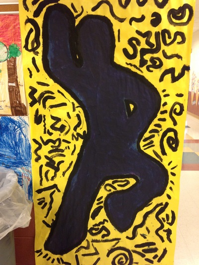
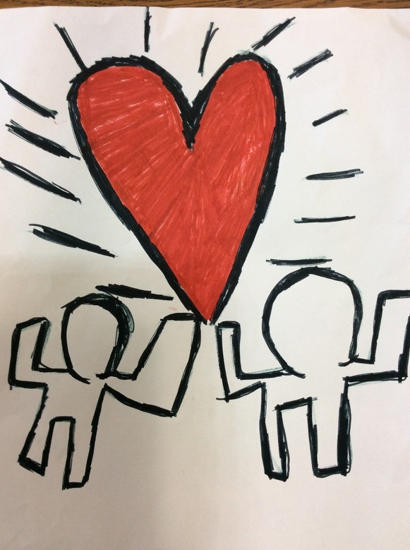
Although we don't have a spinning table, we used paper plates instead to create our spin paintings. Each student was given 3 plates. They used the primary colors and applied the paint thickly to their plate. Then they flipped their plate over onto a sheet of paper, pressed their finger in the center of the plate, and then rotated it. As the plate rotated, the primary colors mixed and created the secondary colors. The kids thought this was the raddest thing EVER! The next day, we took our 3 spin paintings and traced a circle around the edge of the paintings. Students cut out that circle and folded it in half so it looked like a taco. We then talked about symmetry and how a butterflies wings are the same on both sides. I showed them how to draw half of a basic butterfly and cut it out. They were welcome to make more complicated butterflies. They thought it was awesome that after cutting it out and unfolding the plate, they now had a full butterfly! For future purposes, I need to find a more effective way of teaching how to draw a butterfly. The last day, we glued our three butterflies down onto a strip of paper. Then we used black paint to paint lines and shapes onto the wings, focusing on making them symmetrical. The students LOVED learning about Keith Haring. Mr. Haring was an American Pop Artist who was a prominent street artist during the 1980's. Artists are constantly striving to have their work seen by as many people as they can. The more widely seen the works are, the more likely the artist will make money and become famous. Keith Haring had a brilliant idea one day while riding the subway in New York City. In the subway, they would typically cover up old advertisements with large black sheets of butcher paper. He decided to start drawing on these black sheets of paper with chalk. Because the subway system is so popular, it allowed millions of people to see his drawings everyday. What Haring was doing though was illegal. He was arrested multiple times for his graffiti vandalism even though his drawings were only done in chalk. However, because his drawings brought happiness to so many people, he was willing to be arrested if it meant that people could see his work. He started to become more and more famous and began to be hired to paint murals in communities. As he became more famous, his work also became more expensive due to demand. He decided to open his own store called the Pop Shop where he sold shirts, buttons, prints, etc of his work for a low price. He believed that anyone should be able to see and own his work, not just the rich. His work is still highly recognized today and is especially well-known for his ability to show movement in his paintings. Our first day of the project, each table was given a large sheet of butcher paper based on their table color. One student from each table laid on the paper and the other students traced around them. Then, using their paper's complementary color (red and green, blue and orange, or purple and yellow), they painted in their figure. We had to put about 3 coats of paint on it. After painting a coat, I then had them do a little activity each class. The first class, I had taped up a bunch of black paper around my room. Students were given chalk and they could go around and draw 'graffiti' inspired my Haring's drawings. Haring's cartoonish drawings never had facial features and typically featured a bold black outlines and one solid color for the body. Another day, after adding another coat of paint, students played a game called 'Roll-A-Haring'. They were given a worksheet that had 6 different heads on it, 6 bodies, and 6 legs. Students would roll a die and the number would correspond to a head on the worksheet. They would then do it for the body and the head. They had a blast creating all different kinds of Haring-esque drawings. After getting a few coats of paint on our murals over several class periods, we added a bold black outline and then a bunch of crazy movement lines on the background.
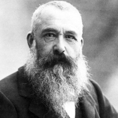
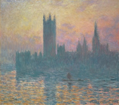
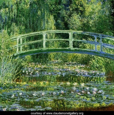
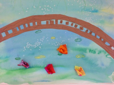
Claude Monet was a French painter who led the Impressionist art movement. Impressionism was a revolutionary movement in which artists began to emphasize showing their brushstrokes. They were greatly influenced by color and light. They painted this by going outside and painting the same pictures over and over, just painting them at different times of the day and in different weather. These factors would ultimately change the light and colors seen in an artwork. As he grew older, he began to go blind. Because of this, he kept painting bigger and bigger and bigger. This was so that he could see what he was doing. He is well-known for painting haystacks and Parliament over and over again. However, his most famous works are of his lily pond that he had at his house. I had the chance to see a bunch of his works during winter break and thought that my second graders would enjoy learning about him too! The kids were super interested in Monet and I actually had to stop them from asking so many questions because we almost ran out of art time without making any art! I'm glad that they were so excited to learn about him.
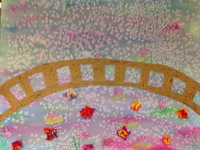
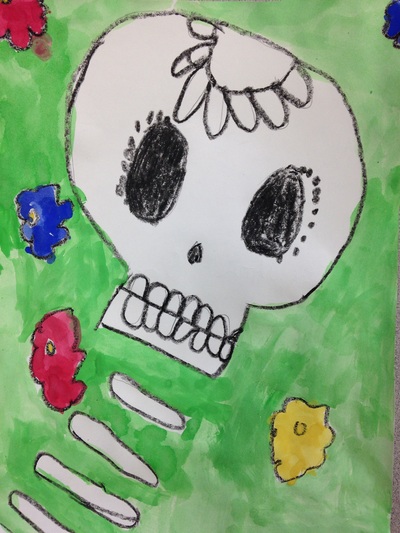
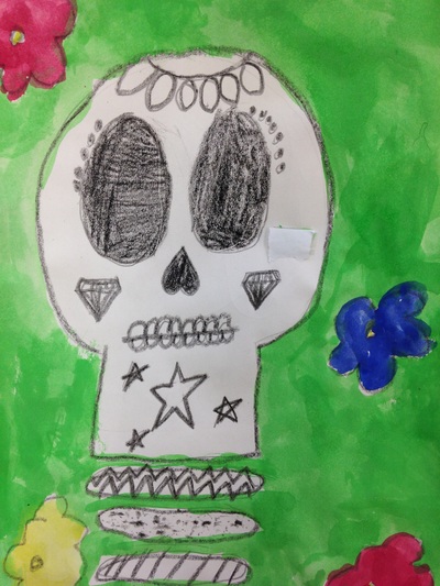
Our first day of the project was spent talking about warm and cool colors and the wet-on-wet painting technique. We started off by drawing some grass, vines, and lilies with crayon. We then used the wet-on-wet watercolor technique to paint cool colors over top of everything. We finished off the day by adding a pinch of salt to our wet paint. The salt sucks up some of the water and paint and leaves a cool effect when it dries. The second class, we cut out two long brown arches. These made the floor and railing of our bridge. Students finished off the bridge for the day by adding vertical pieces that were a finger-widths apart. For the final class, I showed them how to use small squiggly lines to create a wood grain on their bridge. We also glued a couple pieces of tissue paper together and then wrapped them around the back of our pencils to create some 3D lily flowers. Day of the Dead is a Mexican holiday that is celebrated from October 31st to November 2nd. It is a Mexican holiday in which they celebrate the lives of people who have passed away. The oftentimes bring things like presents, food, and flowers to graves. Rather than mourn for people who have passed, they celebrate the good memories that they have of the person. Although it traditionally depicts decorated skulls, it is not a scary holiday like Halloween. It is a joyous holiday.
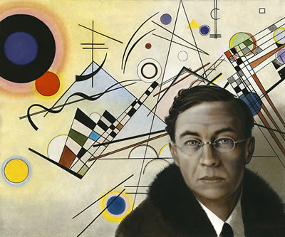
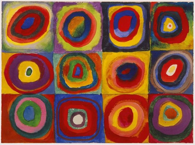
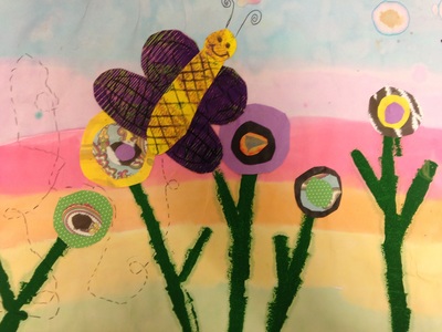
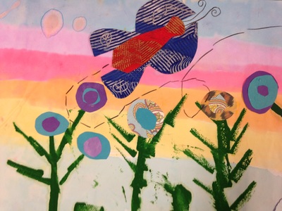
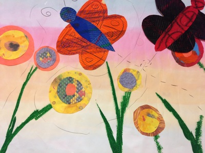
This was a quick one day project. We had to work pretty quickly to get this one done. We started off by drawing a skull and spine for our skeleton. Then we took a look at some traditional sugar skull designs and drew them onto our skulls. Next, we drew some flowers in the background. After they had finished drawing, they traced everything with a black crayon. Lastly, we used tempera cakes to paint our background and flowers, being careful not to paint our skeleton. For this project, we took a look at some artwork by Wassily Kandsinky. Mr. Kandinsky was a Russian painter who was one of the first people to ever paint abstractly/non-representationally. He was largely influenced by music due to his synesthesia. Synesthesia is a condition in which one of your senses becomes activated due to the stimulation of another sense. So when Kandinsky heard music, he would oftentimes see colors and vice versa. We started off the project by learning about rainbows. This was pretty easy for the kiddos, as expected but I wanted to brush up on it just to be on the safe side. To paint the background, they used liquid watercolors. I LOVE liquid watercolors. Some of the colors were kind of faint so they don't look super bright. When painting, I emphasized that they should start their rainbow about a third of the way down their paper. From there it proceeded to orange, yellow, and green. Green was at the bottom of the paper. Then they carried their rainbow order back to the top of the page so that blue was at the very top and then violet. This was a way of creating a sunset by using the order of a rainbow. Then they used sponge brushes to add stems and leaves.
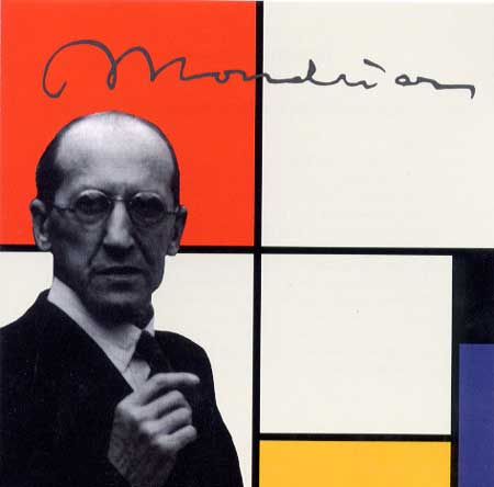
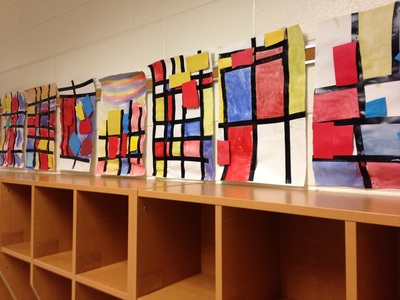
For the next class, they used oil pastels to create patterns on a piece of paper. Then they painted over the paper using two different colors. Lastly, they used paint scrapers to scrape designs into the paint, showing off their oil pastel patterns. This piece will turn into our butterfly later on. Then they began to cut out circles to be their flowers. We based our flowers on Kandinsky's Squares with Concentric Circles. They needed to add several circles to create each flower. For the final day of the project, they cut apart their painted paper into a butterfly. We briefly talked about symmetry and how a butterfly has symmetrical wings. They used black colored pencils to draw designs onto the wings and to add a dotted flutter line behind the butterfly. For our second project of the year, we learned about my favorite artist, Piet Mondrian! Mondrian was a Dutch painter who lived from 1872 to 1944. He was a leader of the artistic movement 'de stijl.' "Mondrian, and the artists of De Stijl, advocated pure abstraction and a pared down palette in order to express a utopian ideal of universal harmony in all of the arts. (www.theartstory.org)"
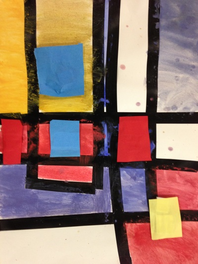
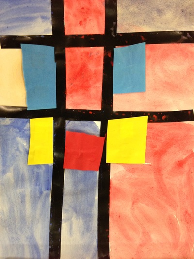
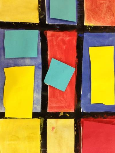
Mr. Mondrian is known for only using the primary colors (red, yellow, and blue). He also only use straight vertical and horizontal lines which created squares and rectangles. No diagonals! These were the focus of our lessons. We began class by watching OK GO's music video The Primary Colors. Then we watched Broadway Boogie-Woogie (named after and inspired by one of Mondrian's paintings). The kids loved the Boogie-Woogie video! And if they were super quick cleaners at the end of class, we watched it a second time. Throughout the lesson I stressed the primary colors and how they were the building blocks to all the other colors. You cannot mix any two colors together to make a primary color. You have to go to Walmart or another store to buy them! The kids caught on pretty quickly to the primary colors. Then we turned our attention to vertical and horizontal lines. They seemed to struggle with this a bit more so it's something we're going to have to go back and review in a later project. The first day of the project, we used black electrical tape to create the horizontal and vertical lines. Then the students painted the squares the lines created, remembering to only use red, yellow, and blue. They also had the option to leave some of the squares white like Mr. Mondrian did. For the second class, I stopped them before they could come in the room. We then went over some flashcards of various colors and the students had to tell me whether they were the primary colors or not. They retained their knowledge of primary colors pretty well from the previous class! We then briefly reviewed last class before jumping into the final steps of the project. We talked about what the difference between 2D and 3D was. Things that are 3D are things that we can see all the way around! We then cut squares and rectangles from red, yellow, and blue sheets of paper and glued small pieces of cardboard to the back of them. They could also stack the cardboard so that some of the paper cutouts stood out further from their painting than other did. Voila! Now they had a 3D painting! Fun Fact for you all: I lovvvvvve architecture. It's my favorite thing to learn about in art history. Needless to say, I was in love with this project.
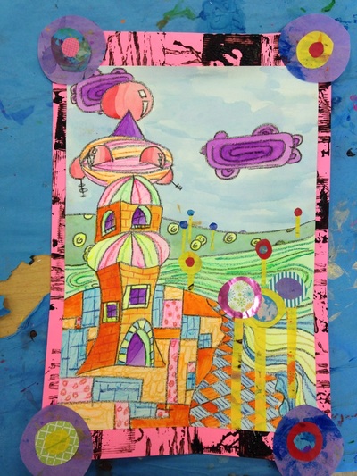
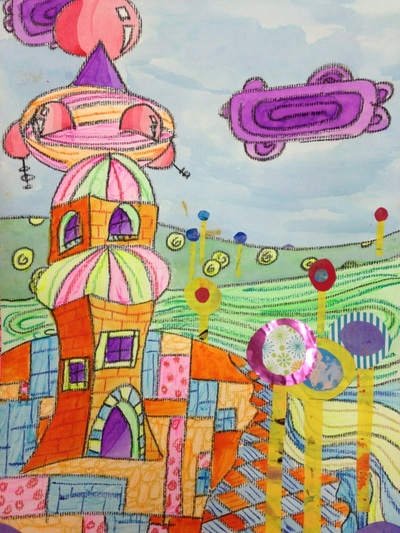
This is another one of Tasha's projects and probably my favorite one. She also taught most of this project too but it was too awesome not to share. We learned about Friedenreich Hundertwasser who is a super cool architect and painter. He has a very Seuss-esque style to his buildings. With this lesson, we talked about foreground, middle ground, background, and horizon line. The students drew their buildings in the foreground. Then added some details to them. Then they drew the fore, middle, and background. They added patterns and designs to the landscape. We painted using liquid watercolors. We then used fancy paper to create circular trees (making sure our trees got smaller as they went back into space). For the border/frame, we printed using black around the edges and then added some more circles that were similar to our trees. |
Devon CalvertHarmony and Consolidated Elementary Art Teacher in Milton, WI. UW-Eau Claire graduate. WAEA President. Apple Teacher. Archives
March 2019
Categories
All
|

 RSS Feed
