|
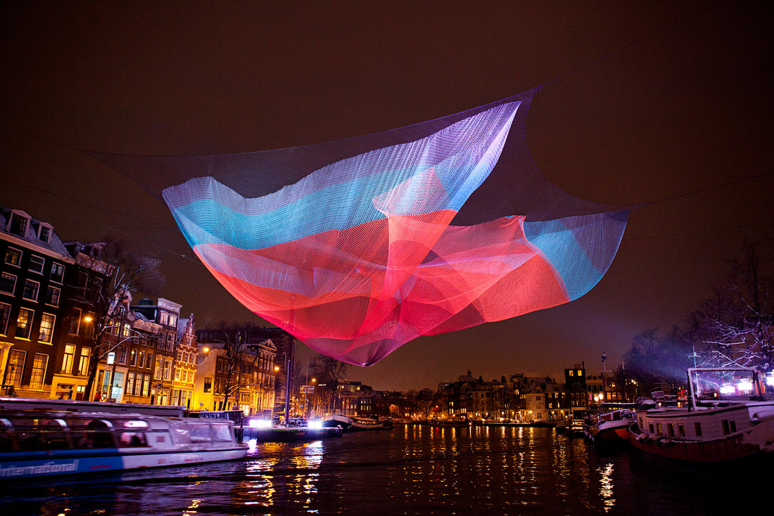
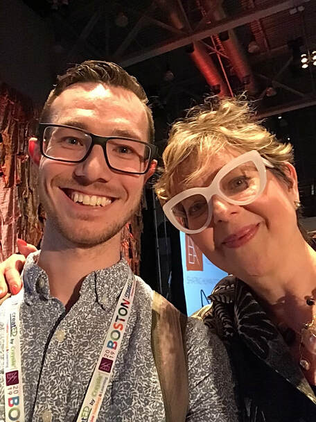
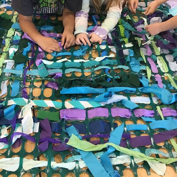
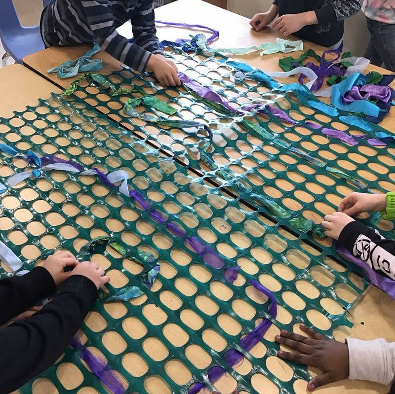
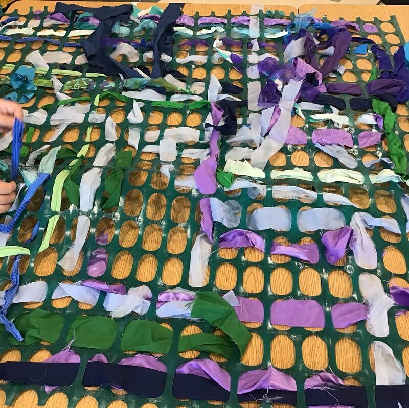
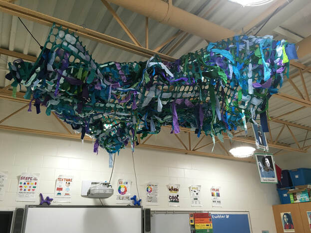
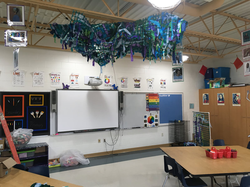
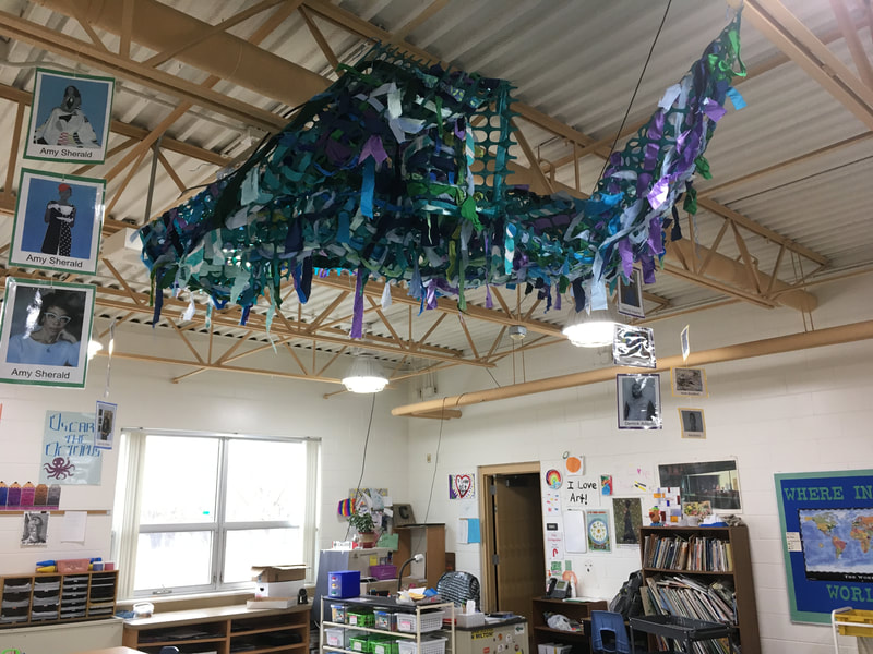
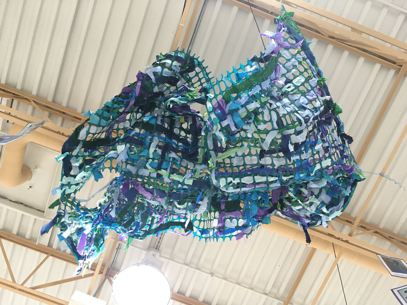
A few years back, I was lucky enough to receive a $300 grant from the Wisconsin Art Education Association/Handweavers Guild for a fibers project. I chose to do a snow-fence weaving with some fabric. I was intrigued by Janet Echelman's work. She is an American artist who was rejected from seven different art schools but never gave up. She painted for ten years before winning a grant to go to India to make art. After arriving in India, her paints never showed up in the mail so she was forced to adapt to something new to make artwork for several shows that she had coming up. While there, she made a large installation out of the local fisherman's nets. She then began to create large and larger works of art. One thing that I lve about her is that she is the definition of STEAM. The amount of math, science, technology, engineering, collaboration, and art that goes into her work is phenomenal. They now are oftentimes placed in parts of cities that are less than desirable. Because of her sculptures' popularity, the crowds that come to see them oftentimes force out unwanted activities while bringing attention to areas of cities that need it. The sculptures are really interesting because they are made out of a light netting that catches the breeze. So when the wind blows, it's almost as if you can see the wind as it ripples through the netting. Janet describes her works as "sculptures of wind." I can't tell you how excited I was to finally get to see Janet give a presentation at the NAEA19 convention and then get to meet her afterwards! This year, I had my 2nd grade students work collaboratively on some large-scale weavings. I split each class into 4 groups and then they worked together to weave fabric strips into large squares of snow-fencing. I like weaving into snow-fencing because the holes are fairly large and it make sit easier for each student to succeed when weaving. After each 2nd grade class had a chance to weave into the fencing, I wired the 4 weavings together to make one large weaving. I then strung it up to my ceiling. While tying it up, I was conscious of twisting, turning, and manipulating certain parts of the weaving so it took on an organic form similar to Janet's work. I love watching students lie underneath it and stare up at it! After meeting Janet, I was so impressed by not only her work, but also her personality and demeanor. She was wonderful to talk to and after explaining/showing her my students' project inspired by her, she asked me if she could send my students a video. Of course I said "yes!"
0 Comments
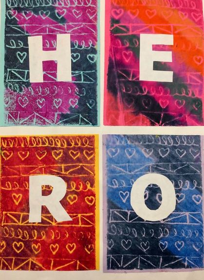
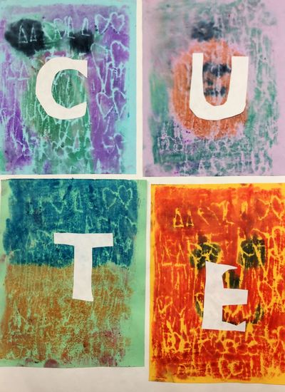
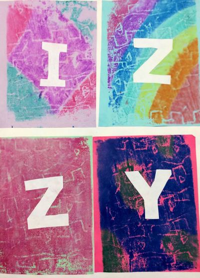
Another project from Cassie Stephens! This project was inspired by the street artist, J Goldcrown. He was originally from London but now lives in LA and NYC where he makes his work. He spray paints layers upon layers of hearts on walls using bright, vibrant colors! This was a quick one-day'er for our 2nd graders. I don't typically do holiday related projects unless I can find an artist who ties in with that theme. J Goldcrown seemed like a perfect opportunity to practice drawings hearts!
Students spent class drawing heart after heart using chalk. They went over their hearts several times so that they appeared a little bit brighter and bolder. We also focused on overlapping to create a layered effect. This was great practice for students who struggled initially drawing hearts. The repetitive shape helped them to practice it over and over. Lastly, they traced each heart a couple times with their fingers so it smudged just a bit. Check out these Robert Indiana inspired prints! This project came from Cassie Stephens and her fabulous blog! Read the details from last year here!
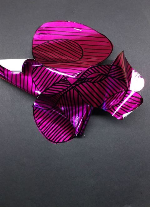
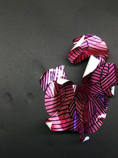
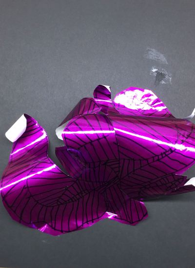
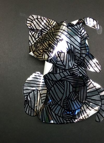
Here's another repeat from last year. Students learned about Frank Gehry and his titanium covered buildings. You can read the details here! Enjoy the pictures below as well!
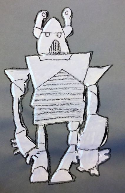
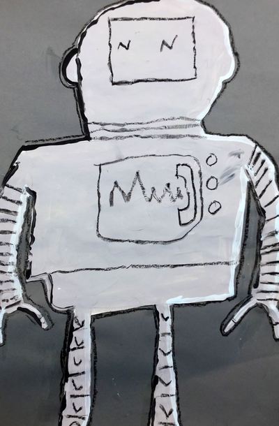
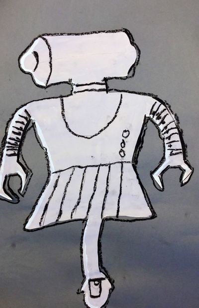
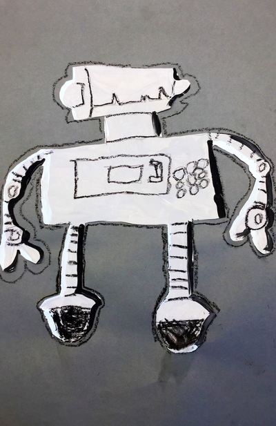
We continued talking about form with this project inspired by Leonardo da Vinci's sketches of a robot! Read more about the details from last year's post here! Otherwise, check out some photos below!
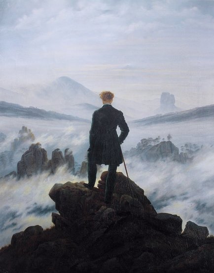
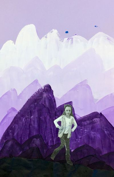
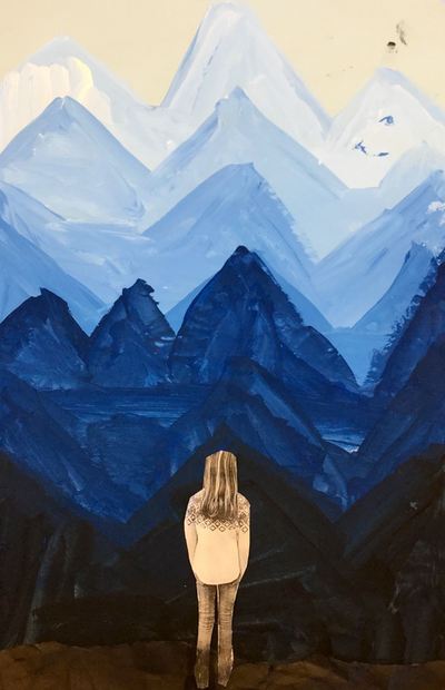
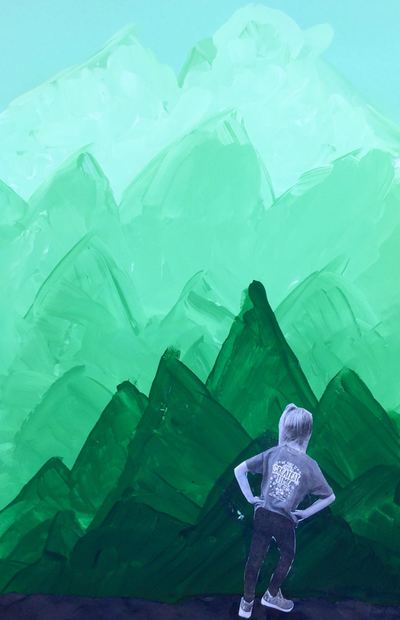
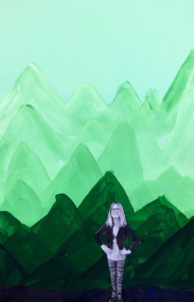
Caspar David Friedrich has always been one of my favorite landscape painters and I have always wanted to teach about him! Friedrich was a 19th century Romantic landscape painter. Romanticists were artist who believed in the beauty and awe of nature and sought to depict emotions through their landscapes. While looking through some of his paintings, students talked about the different emotions his paintings evoked and why they may have experienced those feelings. Friedrich is most well-known for the painting Wanderer Above a Sea of Fog which can be seen below. This painting has been hugely inspirational for many movie and book covers and the kids loved seeing the influence it had. Throughout this project, we really focused on space and value. We noticed that as things got farther away from us in the picture, the colors got lighter and became tints. We also noticed that things got higher on the painting. Things that are closer are lower and darker in the painting. We made sure to take these things into account when making our artwork.
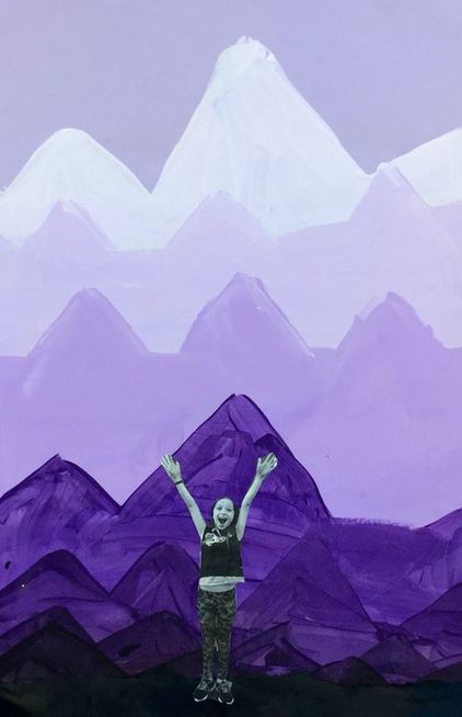
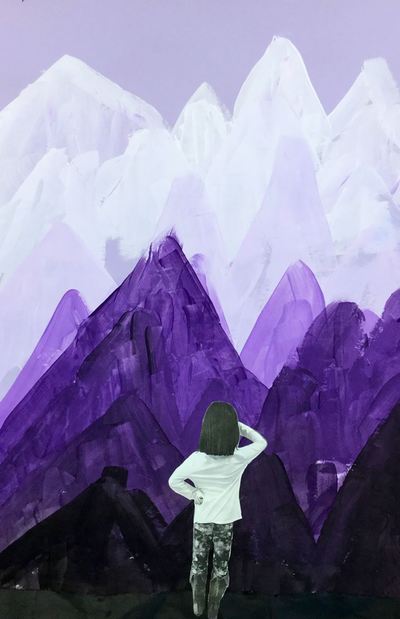
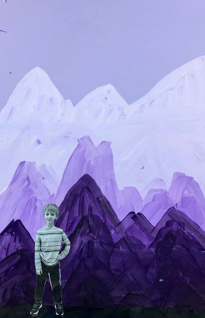
The first day, students chose a blue, green, or purple background. They were expected to paint with whatever color paper they had chosen. Students scooped out a bit of their chosen color onto a magazine page (these work great as paint palettes because they can be thrown away when finished) and I came around and gave them a squirt of white paint. I told them that the tip to mixing tints was always to add the color to the white paint. Students added a touch of color to their white, mixed it, and painted a mountain towards the top of their paper. Then they added a little bit more of the color, making it slightly darker, and painted another mountain below the first one, making sure that it overlapped. They painted four rows of tinted mountains on the first day. The second day, students scooped out some more of their color and I gave them a squirt of black this time. When mixing shades, we learned that this was opposite of how we mixed tints. With shades, we had to add a touch of black into the color instead of the other way around. Students painted four rows of shaded mountains, making sure they reached the bottom of their papers. When they were done, we had a discussion about what it would feel like to stand on top of a mountain and what kind of poses they would strike. We finished off class by taking out pictures in those poses. The last day of the project, students received a strip of black paper and their photograph of their self from the previous class. Students tore one edge of the black strip of paper and then crumpled it up to give it some texture. They glued this to the bottom of their paper to make it look like the land they would be standing on. Then they cut out their picture and glued it down to look as if they were the wanderer on top of the mountain. When they were finished, we did a little writing activity and placed ourselves into the role of the wanderer. We wrote about where we would travel to and what we would want to see/do while we were there. Students also had the option to draw a picture of where they would go on the back of the worksheet. I loved reading about where they would go! This is a project based on the artist, Sol LeWitt. I did something similar last year. You can read the details here. This year, I just had students color it using markers instead of gluing down strips of paper.
This was a new project for me this year. I got the idea from the fabulous Cassie Stephens!
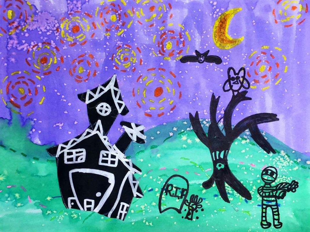
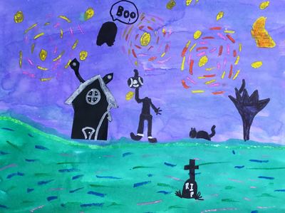
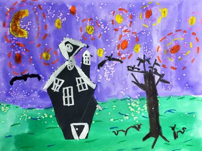
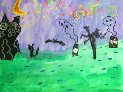
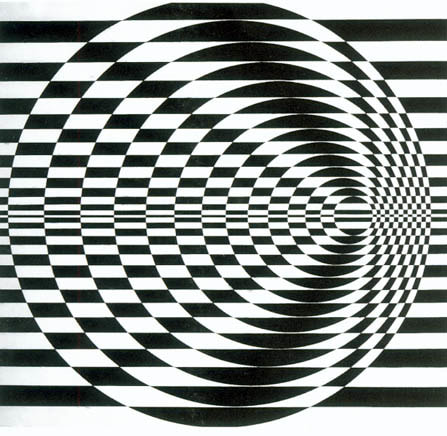
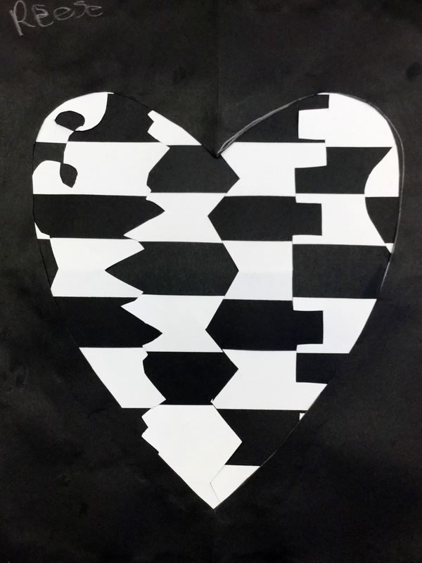
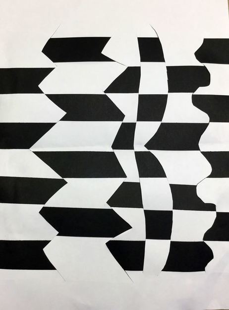
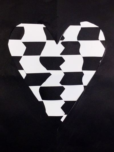
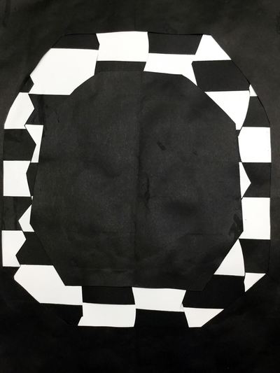
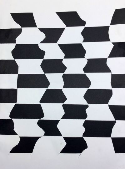
We learned a bit about Vincent Van Gogh before starting this spooky lesson. Students started off by making small dashes using oil pastels on the ground and sky. In the sky, they focused on using warm colors and making radiating circles to represent the stars. Next, they used watercolors to paint over their oil pastels. The second day, I introduced them to Tim Burton and his creepy architecture. We noticed that a lot of things in his movies are crooked. We also noticed that his buildings were smaller at the bottom and bigger at the top. This helps to create an eerie feeling. Students took these observations to heart and drew, cut out, and glued down their haunted house. The final day, students used black and silver sharpies to add details to their houses, as well as some other details to their backgrounds (cats, gravestones, etc). 2nd graders recently learned about the Op artist, Bridget Riley. Ms. Riley is an artist from London who specializes in creating optical illusions in her artwork. Her artwork is usually large-scale because it has a more disorientating effect on the viewer when it is larger. The kids thought her artwork was super cool! They were blown away by the fact that even though the painting wasn't moving, it gave the effect that it was. This Bridget Riley project was different than what I have done in the past. This is a project that I got from my friend, Tasha Newton, over at iartmyjob.wixsite.com !This year, I had students create a weaving inspired by her work.
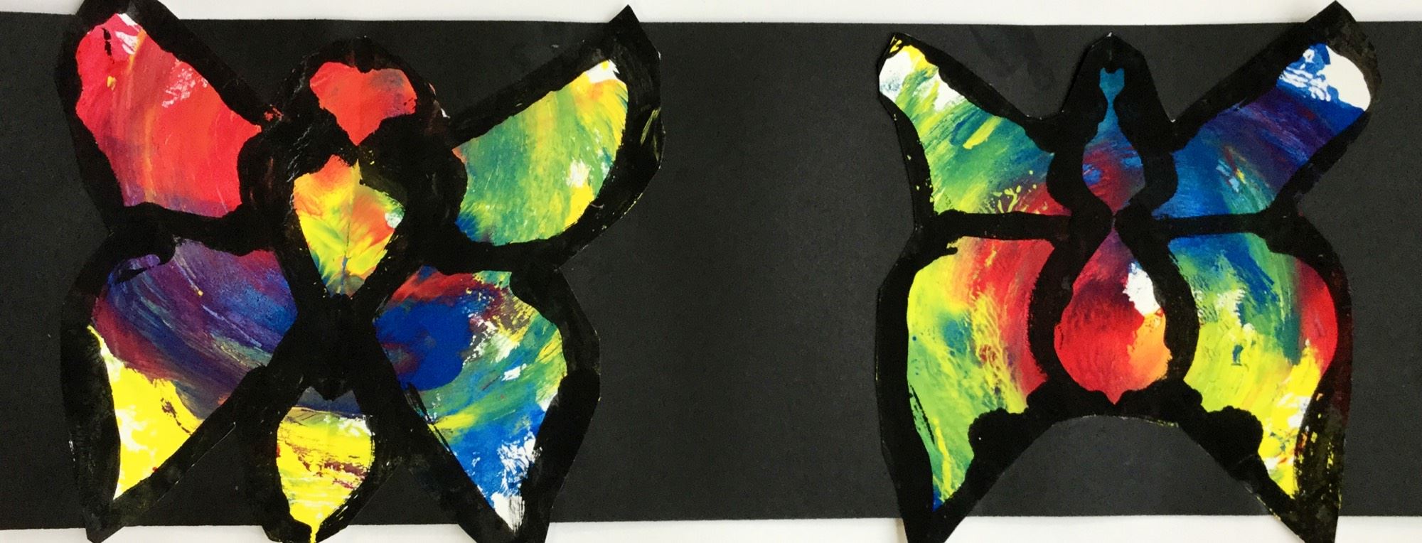
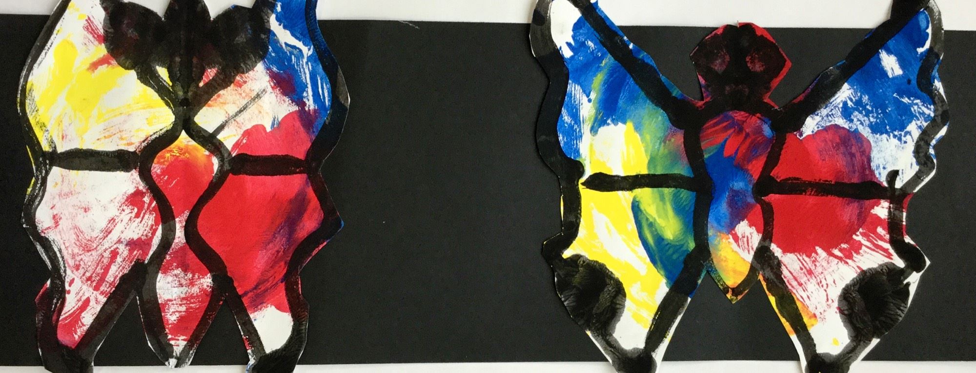
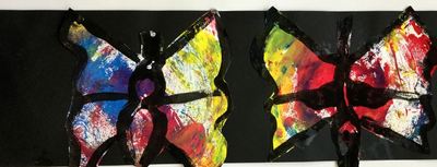
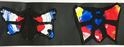
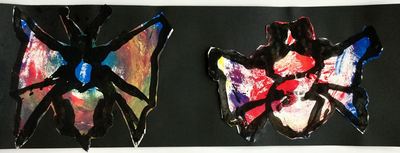
On day one, I introduced students to her work. Then, they received a white sheet of paper that had been folded in half. They cut 5 crazy lines into it (curly, angled, etc). Then they began to weaving into these oddly cut shapes. The second day, they finished their weaving. Then they chose a black sheet of paper, folded it in half, and cut a geometric shape from it. They glued the black paper with the shape cut out of it on top of their weaving. One class was a day behind the others so they just created the weaving and didn't glue the black paper on top. 2nd grade took a look at contemporary British artist, Damien Hirst. Damien has a wide variety of art but we focused on his spin paintings. Hirst has a table that spins in a circular motion. He puts paint onto the table and as it spins, it moves the paint around. Sometimes he takes the spin paintings and then cuts them into new shapes like the butterfly above. 2nd grade learns about butterflies in their classroom so I thought this would be a good tie in.
Although we don't have a spinning table, we used paper plates instead to create our spin paintings. Each student was given 2 plates. They used the primary colors and applied the paint thickly to their plate. Then they flipped their plate over onto a sheet of paper, pressed their finger in the center of the plate, and then rotated it. As the plate rotated, the primary colors mixed and created the secondary colors. The kids thought this was the raddest thing EVER! The next day, we took our 2 spin paintings and traced a circle around the edge of the paintings. Students cut out that circle and folded it in half so it looked like a taco. We then talked about symmetry and how a butterflies wings are the same on both sides. I showed them how to paint half of a butterfly with black paint and then fold their paper in half to print the other side of it. The last day, we cut out and glued our two butterflies down onto a strip of paper. I think doing it this way turned out better than how I did it last year. Last year, I had the kids try to paint the symmetry rather than just fold it in half and print it. |
Devon CalvertHarmony and Consolidated Elementary Art Teacher in Milton, WI. UW-Eau Claire graduate. WAEA President. Apple Teacher. Archives
March 2019
Categories
All
|






 RSS Feed
