|
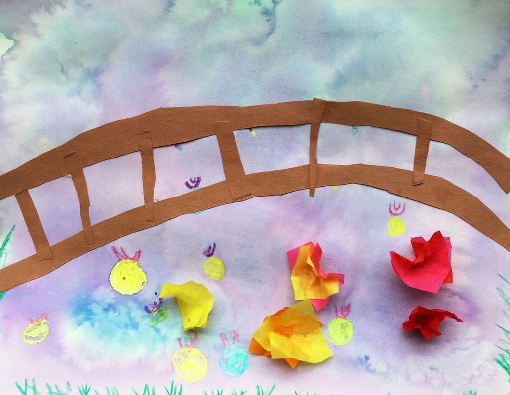
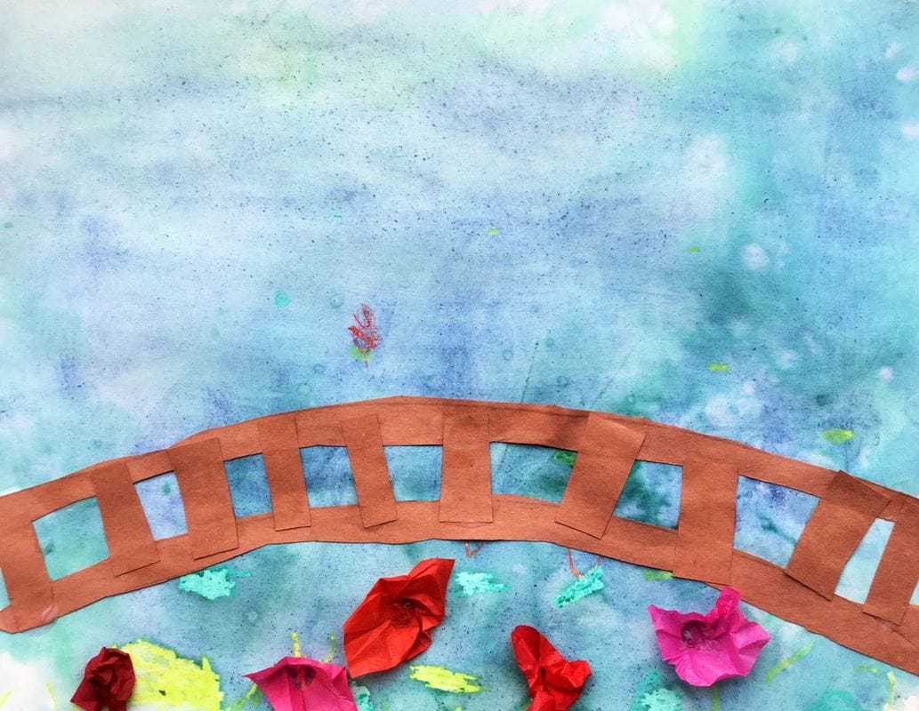
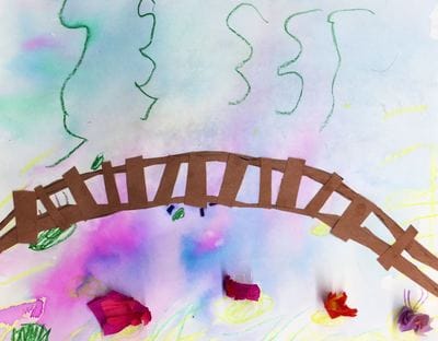
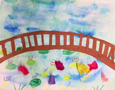
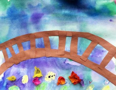
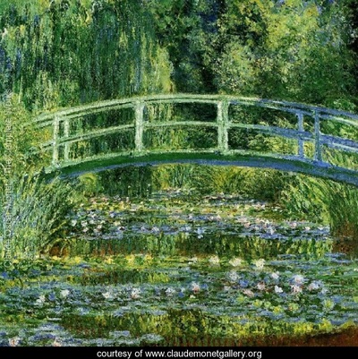
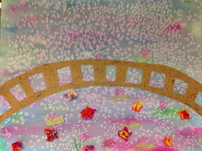
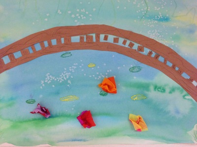
This is a project that I did last year with my 2nd graders that I decided to bring back again for this year. We learned about Claude Monet and his history changing art-style, Impressionism. Impressionists focused on painting light and its effects on color. I found that this year's 2nd graders were much more successful with their wet-on-wet watercolor technique. I'm not sure if I taught it differently or what but I was very impressed with their painting results. This year, I cut out the part where students drew on the bridge's woodgrain too.
Here is a link to the project instructions from last year: http://devoncalvert.weebly.com/2nd/monets-lily-pond
0 Comments
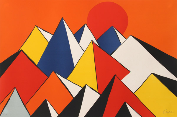
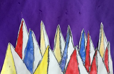
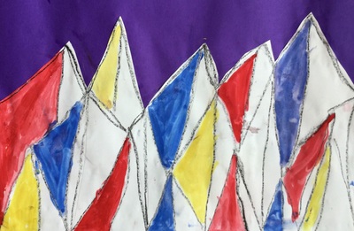
Alexander Calder was an American artist who is most well-known for his large metal mobiles that hang from ceilings. We took a look at his paintings instead and I was pleased to hear that the first thing my artists noticed was his use of the primary colors!
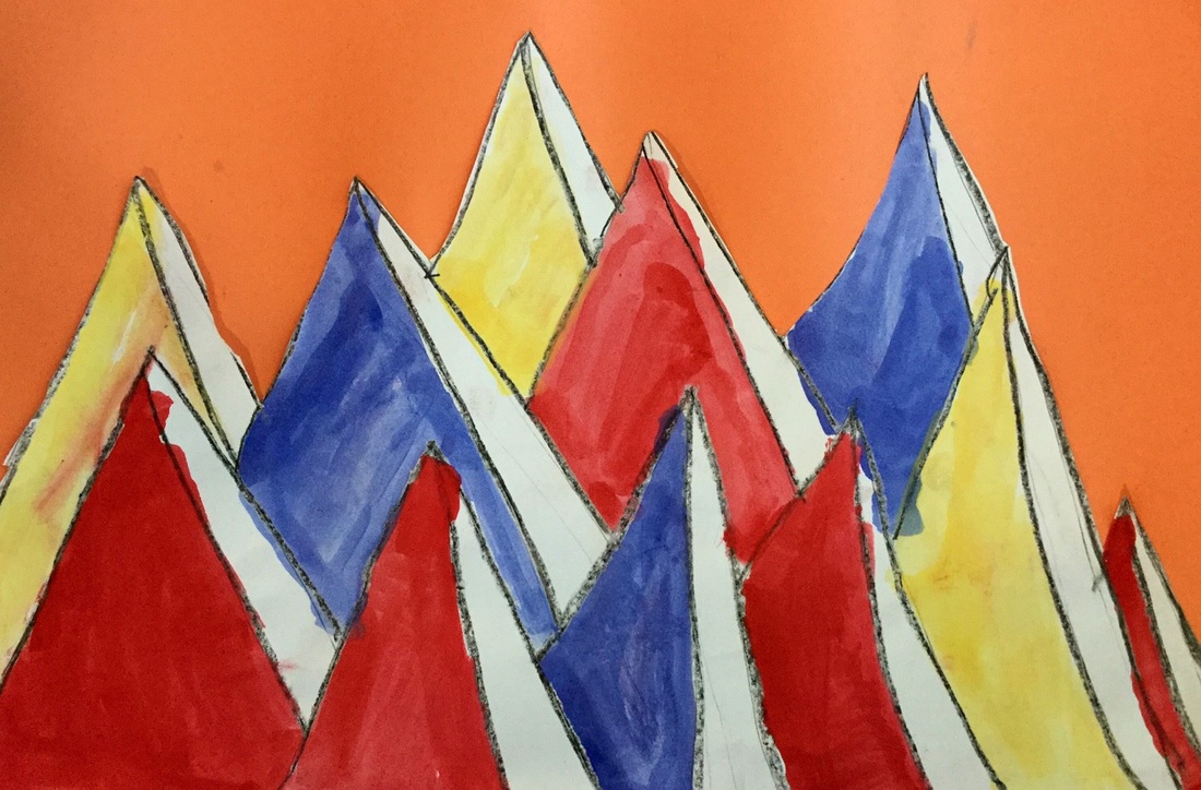
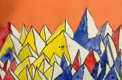
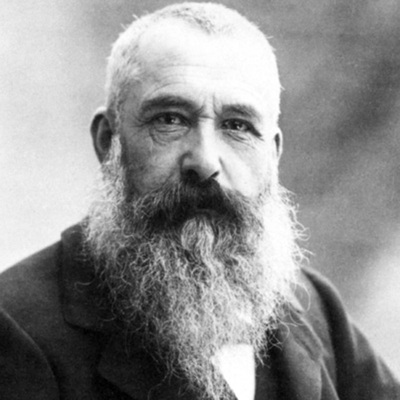
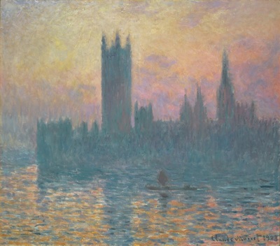
We kicked off the project by drawing triangles on our paper. I emphasized that their triangles needed to start at the bottom of their paper and gradually work their way up. After drawing each triangle, students drew another line diagonally downwards from the triangle's peak which created a pyramid-like effect. Students quickly noticed that by working from the bottom up, it created the illusion of space from all of the overlapping. After they finished drawing, they traced everything with a black crayon. On the second day of class, we cut out our triangles/mountains. Then we painted using the primary colors. With our paintings, we only ended up painting one side of each triangle. This created an effect like light was hitting one side of the triangle. Lastly, we glued our paintings down to a secondary colored background. It got a little messy because students were gluing down wet paintings but I didn't want to spend another class period just to cut them out and glue them to their backgrounds. Claude Monet was a French painter who led the Impressionist art movement. Impressionism was a revolutionary movement in which artists began to emphasize showing their brushstrokes. They were greatly influenced by color and light. They painted this by going outside and painting the same pictures over and over, just painting them at different times of the day and in different weather. These factors would ultimately change the light and colors seen in an artwork. As he grew older, he began to go blind. Because of this, he kept painting bigger and bigger and bigger. This was so that he could see what he was doing. He is well-known for painting haystacks and Parliament over and over again. However, his most famous works are of his lily pond that he had at his house. I had the chance to see a bunch of his works during winter break and thought that my second graders would enjoy learning about him too! The kids were super interested in Monet and I actually had to stop them from asking so many questions because we almost ran out of art time without making any art! I'm glad that they were so excited to learn about him.
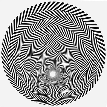
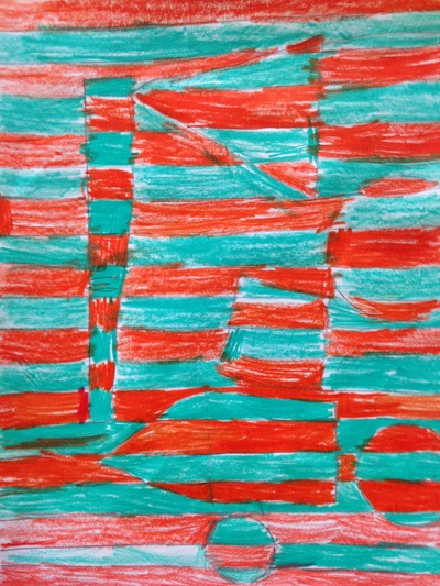
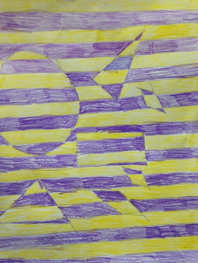
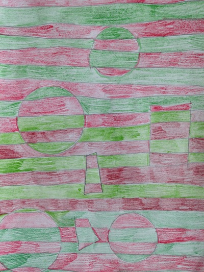
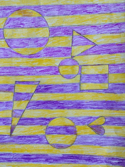
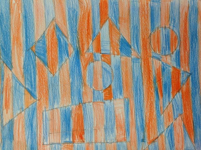
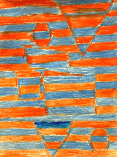
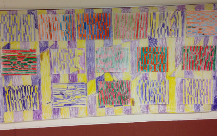
Our first day of the project was spent talking about warm and cool colors and the wet-on-wet painting technique. We started off by drawing some grass, vines, and lilies with crayon. We then used the wet-on-wet watercolor technique to paint cool colors over top of everything. We finished off the day by adding a pinch of salt to our wet paint. The salt sucks up some of the water and paint and leaves a cool effect when it dries. The second class, we cut out two long brown arches. These made the floor and railing of our bridge. Students finished off the bridge for the day by adding vertical pieces that were a finger-widths apart. For the final class, I showed them how to use small squiggly lines to create a wood grain on their bridge. We also glued a couple pieces of tissue paper together and then wrapped them around the back of our pencils to create some 3D lily flowers. 2nd graders recently learned about the Op artist, Bridget Riley. Ms. Riley is an artist from London who specializes in creating optical illusions in her artwork. Her artwork is usually large-scale because it has a more disorientating effect on the viewer when it is larger. The kids thought her artwork was super cool! They were blown away by the fact that even though the painting wasn't moving, it gave the effect that it was.The kids started off the project by drawing straight and thin lines using a straight edge. They needed to make sure their lines were parallel or they wouldn't achieve the optical effect. Then they drew at least six geometric shapes. This led to a discussion on the difference between geometric and organic shapes. The next couple classes were spent talking about complementary colors which were used to color their artwork. Complementary colors are colors that are directly across from each other on the color wheel. I usually tell them to remember the Vikings (yellow and purple), Bears (blue and orange), and Christmas (red and green). When coloring, they were to alternate colors for each row.
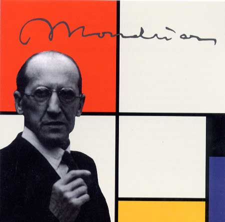
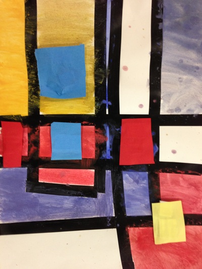
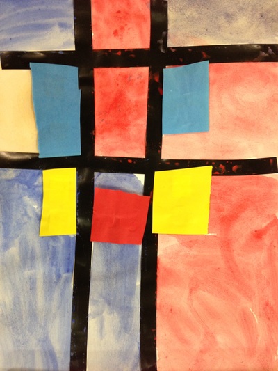
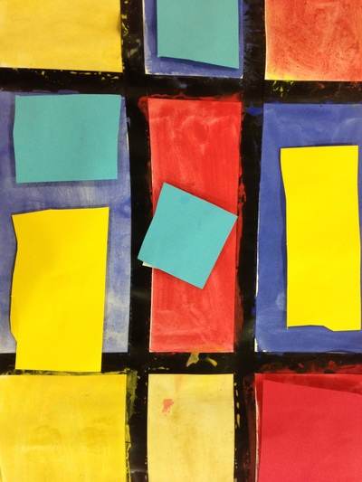
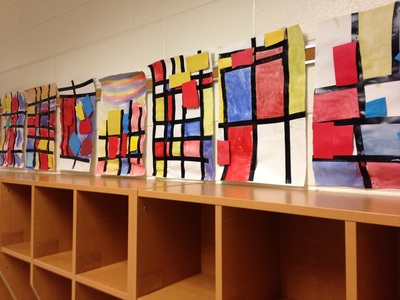
For our second project of the year, we learned about my favorite artist, Piet Mondrian! Mondrian was a Dutch painter who lived from 1872 to 1944. He was a leader of the artistic movement 'de stijl.' "Mondrian, and the artists of De Stijl, advocated pure abstraction and a pared down palette in order to express a utopian ideal of universal harmony in all of the arts. (www.theartstory.org)"
Mr. Mondrian is known for only using the primary colors (red, yellow, and blue). He also only use straight vertical and horizontal lines which created squares and rectangles. No diagonals! These were the focus of our lessons. We began class by watching OK GO's music video The Primary Colors. Then we watched Broadway Boogie-Woogie (named after and inspired by one of Mondrian's paintings). The kids loved the Boogie-Woogie video! And if they were super quick cleaners at the end of class, we watched it a second time. Throughout the lesson I stressed the primary colors and how they were the building blocks to all the other colors. You cannot mix any two colors together to make a primary color. You have to go to Walmart or another store to buy them! The kids caught on pretty quickly to the primary colors. Then we turned our attention to vertical and horizontal lines. They seemed to struggle with this a bit more so it's something we're going to have to go back and review in a later project. The first day of the project, we used black electrical tape to create the horizontal and vertical lines. Then the students painted the squares the lines created, remembering to only use red, yellow, and blue. They also had the option to leave some of the squares white like Mr. Mondrian did. For the second class, I stopped them before they could come in the room. We then went over some flashcards of various colors and the students had to tell me whether they were the primary colors or not. They retained their knowledge of primary colors pretty well from the previous class! We then briefly reviewed last class before jumping into the final steps of the project. We talked about what the difference between 2D and 3D was. Things that are 3D are things that we can see all the way around! We then cut squares and rectangles from red, yellow, and blue sheets of paper and glued small pieces of cardboard to the back of them. They could also stack the cardboard so that some of the paper cutouts stood out further from their painting than other did. Voila! Now they had a 3D painting! |
Devon CalvertHarmony and Consolidated Elementary Art Teacher in Milton, WI. UW-Eau Claire graduate. WAEA President. Apple Teacher. Archives
March 2019
Categories
All
|


 RSS Feed
