|
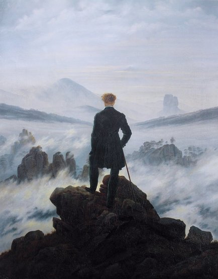
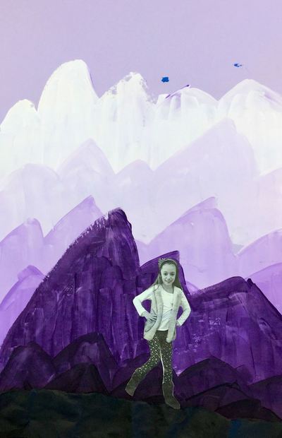
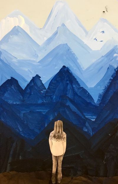
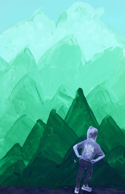
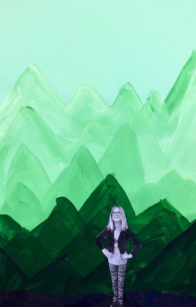
Caspar David Friedrich has always been one of my favorite landscape painters and I have always wanted to teach about him! Friedrich was a 19th century Romantic landscape painter. Romanticists were artist who believed in the beauty and awe of nature and sought to depict emotions through their landscapes. While looking through some of his paintings, students talked about the different emotions his paintings evoked and why they may have experienced those feelings. Friedrich is most well-known for the painting Wanderer Above a Sea of Fog which can be seen below. This painting has been hugely inspirational for many movie and book covers and the kids loved seeing the influence it had. Throughout this project, we really focused on space and value. We noticed that as things got farther away from us in the picture, the colors got lighter and became tints. We also noticed that things got higher on the painting. Things that are closer are lower and darker in the painting. We made sure to take these things into account when making our artwork.
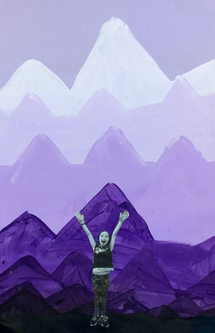
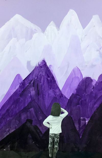
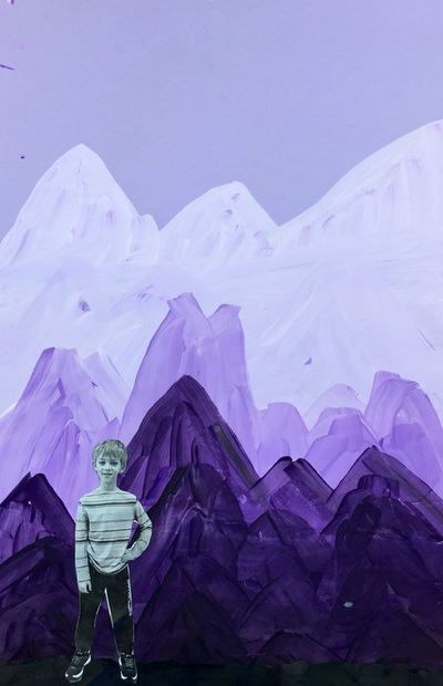
The first day, students chose a blue, green, or purple background. They were expected to paint with whatever color paper they had chosen. Students scooped out a bit of their chosen color onto a magazine page (these work great as paint palettes because they can be thrown away when finished) and I came around and gave them a squirt of white paint. I told them that the tip to mixing tints was always to add the color to the white paint. Students added a touch of color to their white, mixed it, and painted a mountain towards the top of their paper. Then they added a little bit more of the color, making it slightly darker, and painted another mountain below the first one, making sure that it overlapped. They painted four rows of tinted mountains on the first day. The second day, students scooped out some more of their color and I gave them a squirt of black this time. When mixing shades, we learned that this was opposite of how we mixed tints. With shades, we had to add a touch of black into the color instead of the other way around. Students painted four rows of shaded mountains, making sure they reached the bottom of their papers. When they were done, we had a discussion about what it would feel like to stand on top of a mountain and what kind of poses they would strike. We finished off class by taking out pictures in those poses. The last day of the project, students received a strip of black paper and their photograph of their self from the previous class. Students tore one edge of the black strip of paper and then crumpled it up to give it some texture. They glued this to the bottom of their paper to make it look like the land they would be standing on. Then they cut out their picture and glued it down to look as if they were the wanderer on top of the mountain. When they were finished, we did a little writing activity and placed ourselves into the role of the wanderer. We wrote about where we would travel to and what we would want to see/do while we were there. Students also had the option to draw a picture of where they would go on the back of the worksheet. I loved reading about where they would go!
0 Comments
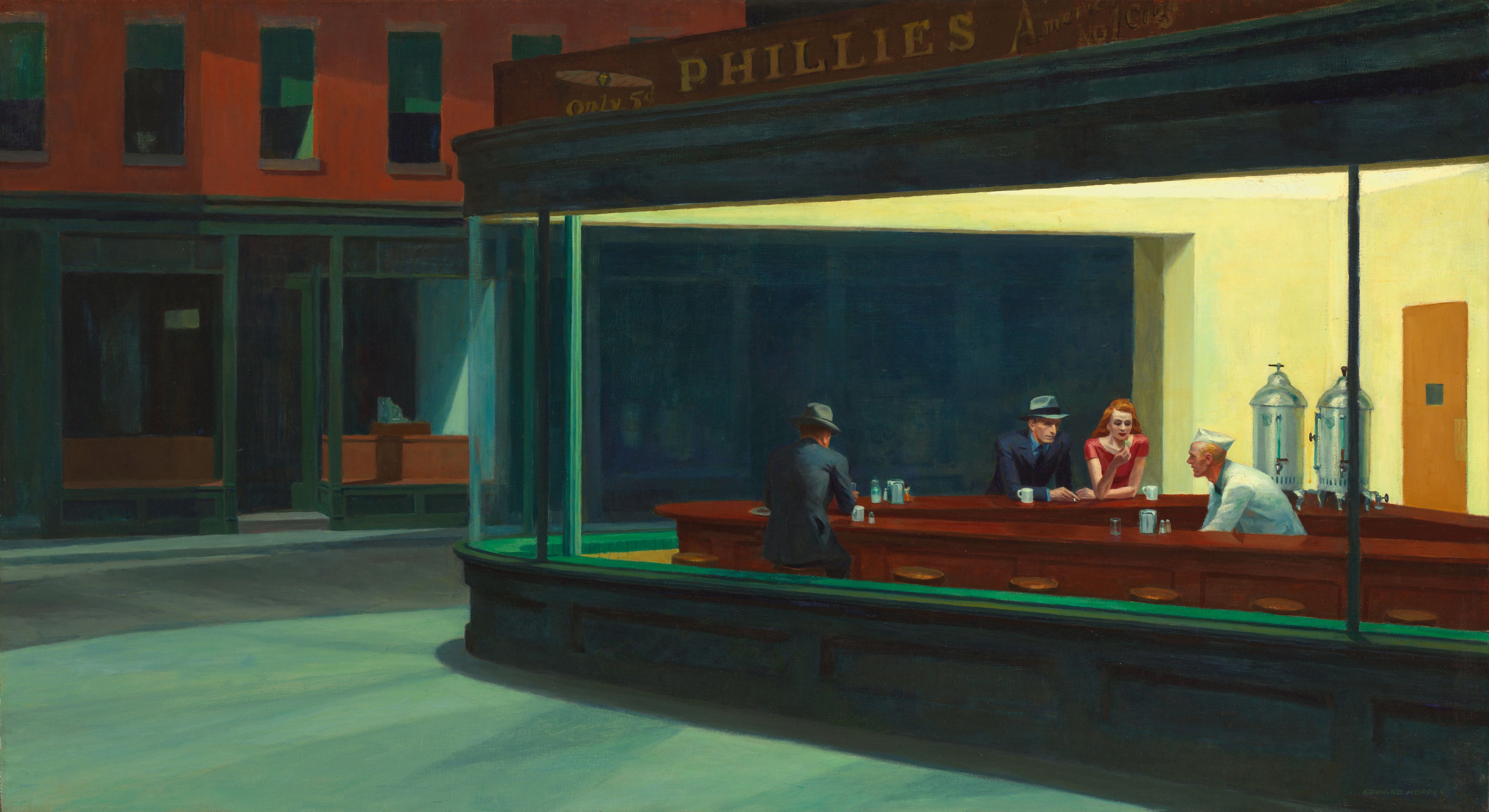
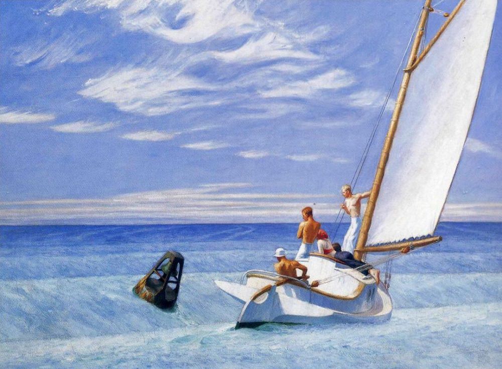
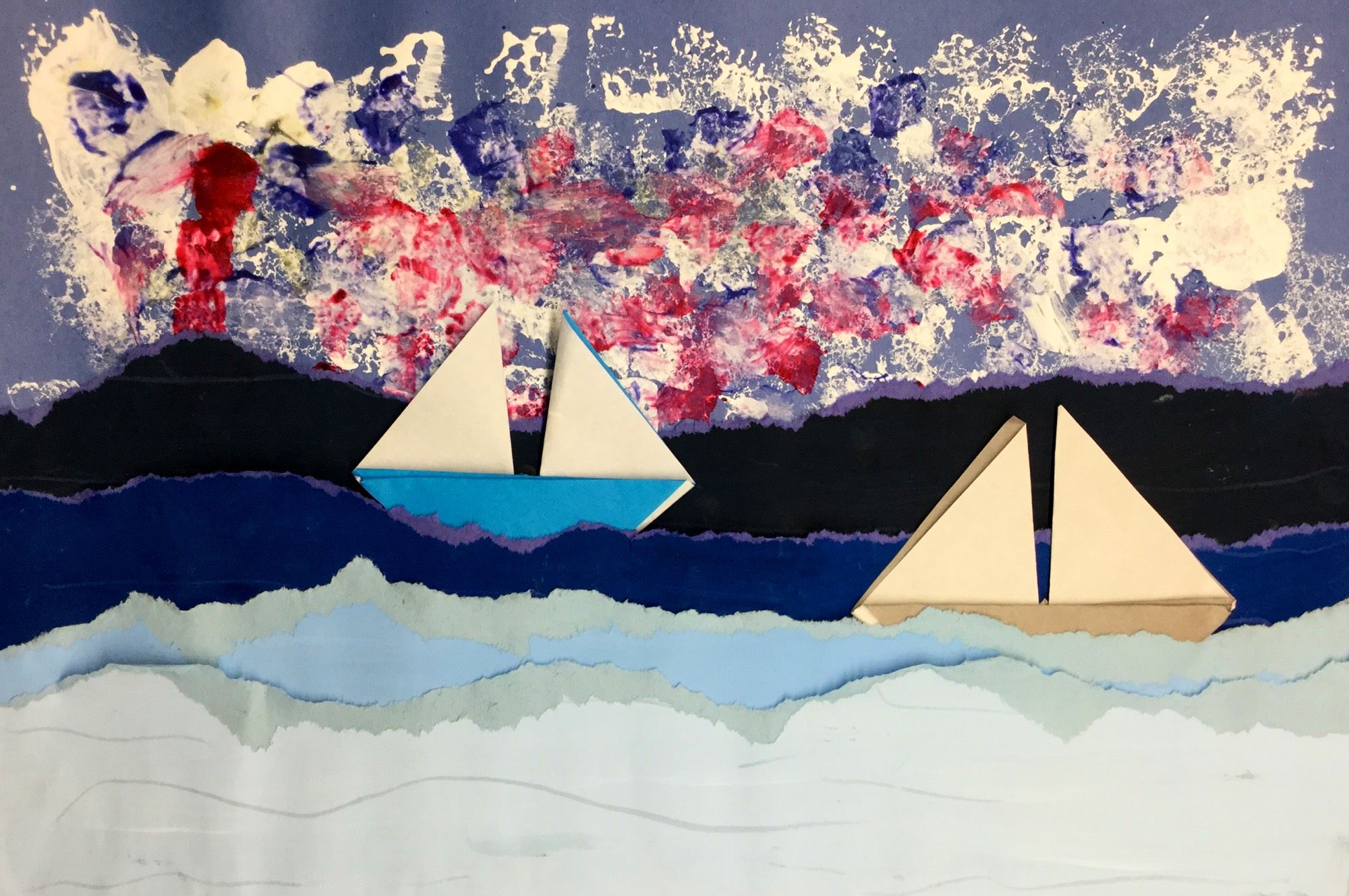
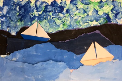
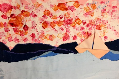
2nd grade carried on with learning about value. This time, we used it when creating seascapes rather than landscapes. We decided to check out one of my favorite artists, Edward Hopper. Hopper was an American realist painter. He liked to paint lonely scenes of everyday American life. His paintings come off as being uneventful moments captured in time. He is most well-known for his highly parodied painting, Nighthawks. This project is loosely based on Cassie Stephens' Leif Erickson background. 2nd grade recapped on space, value, and tints and shades. We noticed that in this painting by Hopper, the lighter colors were at the bottom of the painting and the darker colors were further away. This was opposite of what we noticed with landscapes. Students partnered up and one partner painted two 6x18 tints and the other painted two 6x18 shades. This project, they got to mix their own tints and shades. We learned that when mixing tints, we start with white and add our color to it. With shades, we start with the color and add black to it.
The second day, students sponge painted a background paper with white. They then sponge-painted two more colors on top of their white paint. Then they CAREFULLY tore each of their strips of paper from the previous class in half and gave one half to their partner. Now each student had two tints and two shades. Students ordered their torn strips from lightest to darkest (lightest at the bottom). They glued down their strips, starting with the shades in the center of their paper and worked their way down to the tints at the bottom. The final day dealt with Mr. Calvert taking on one of his biggest fears, origami! We sat in a big ole' circle and worked step-by-step together until we folded an origami sailboat. Students had the chance to make two boats if they wished. The last steps to do were to curl the tops of their waves and then glue down their boats, being careful to take space and size into consideration if they had two boats. Just like with our lions, we did this project because they are doing a song about elephants in Mr. Kamp's room. Loving the collaboration between our classes!
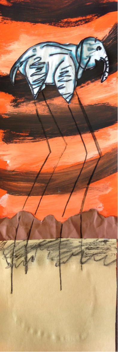
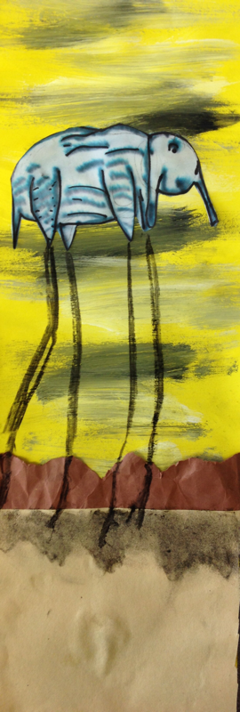
2nd grade learned about Surrealist artist, Salvador Dali. Dali was a really weird dude. Some people believe that he may have actually been insane. He is the most famous surrealist artist. This was an art movement that focused on showing things that were just tooooo strange to be true. Dali liked to paint things that he dreamt. And let's be frank, some pretty weird stuff can happen in your dreams. His most famous painting shows several limp, melted clocks. We focused on a painting of his that had elephants in it. While the elephants body looks normal, it is balanced on top of extremely long stilt-like legs. We started off by watching a video of an elephant drawing a picture of an elephant. I told them that if an elephant could do that, then they could too. We looked at how to break the elephant down into simple shapes and then drew it. We had to change the legs a bit so that we could make the long stilts later on in the project. After they hey finished drawing, we used a black washable marker to trace over our drawing. After tracing it, we brushed some water on to it. Because it was a water-based black marker, the black begins to spread and separate, turning it grayish and making the wrinkles look more realistic. We let it dry and then retraced the elephant again. For the background, we talked about warm colors which are colors that remind us of fire (red, yellow, and orange). These colors give our sky kind of an eerie feeling like Dali's. While our background was still wet, we lightly brushed white and black in spots to create a cloud streaked sky. This led us into the discussion of tints and shades. A tint is any color that has white mixed with it and a shade is any color that has black mixed with it. The he final day, we cut out the elephant and glued it on. We glued on a tan ground. Then we tore a brown strip of paper to create mountains. We crumpled our mountains up into a ball so that when we glued them down, they were wrinkled. This creates something called texture. Texture is how something feels or how it looks like it feels. Lastly, they used charcoal to add their stilt legs and a shadow to the mountains. This project was packed full of new art vocal for the kids! |
Devon CalvertHarmony and Consolidated Elementary Art Teacher in Milton, WI. UW-Eau Claire graduate. WAEA President. Apple Teacher. Archives
March 2019
Categories
All
|



 RSS Feed
