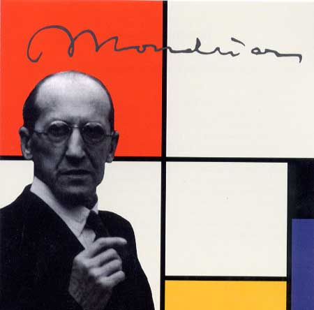
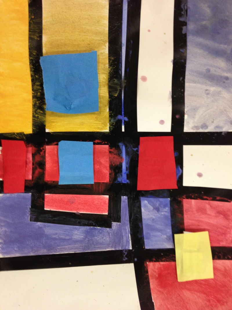
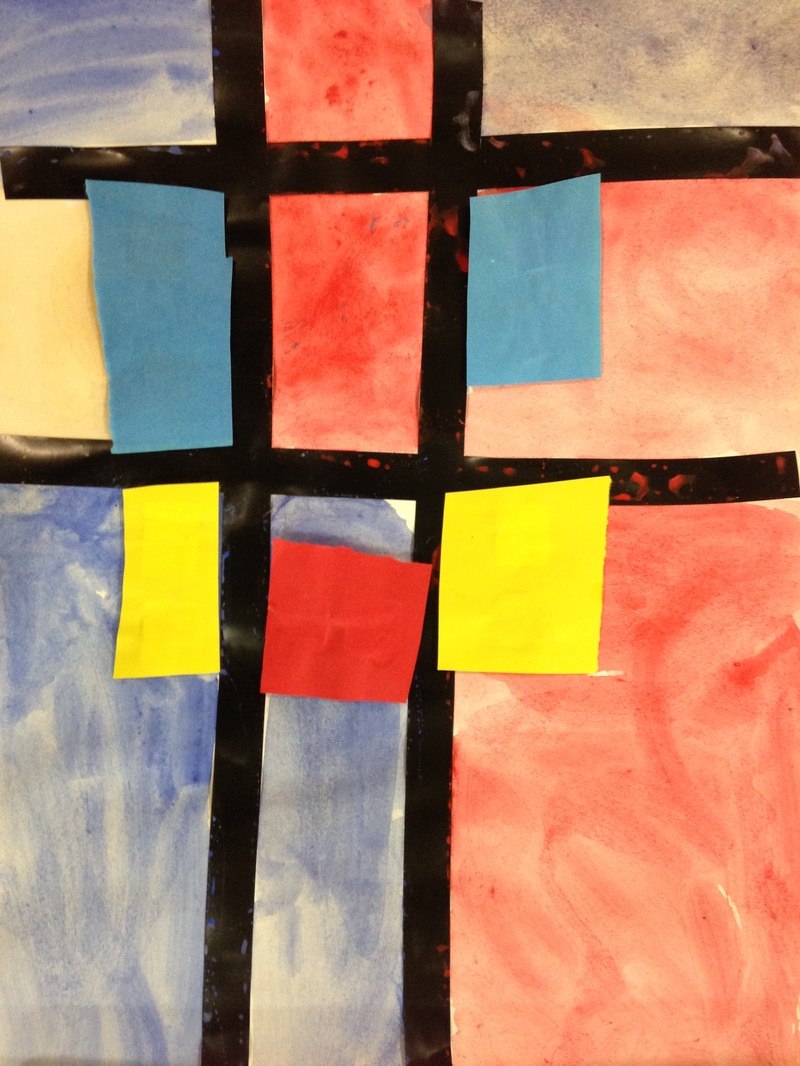
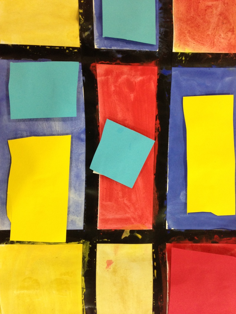
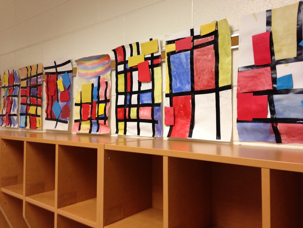
 For our second project of the year, we learned about my favorite artist, Piet Mondrian! Mondrian was a Dutch painter who lived from 1872 to 1944. He was a leader of the artistic movement 'de stijl.' "Mondrian, and the artists of De Stijl, advocated pure abstraction and a pared down palette in order to express a utopian ideal of universal harmony in all of the arts. (www.theartstory.org)" Mr. Mondrian is known for only using the primary colors (red, yellow, and blue). He also only use straight vertical and horizontal lines which created squares and rectangles. No diagonals! These were the focus of our lessons. We began class by watching OK GO's music video The Primary Colors. Then we watched Broadway Boogie-Woogie (named after and inspired by one of Mondrian's paintings). The kids loved the Boogie-Woogie video! And if they were super quick cleaners at the end of class, we watched it a second time. Throughout the lesson I stressed the primary colors and how they were the building blocks to all the other colors. You cannot mix any two colors together to make a primary color. You have to go to Walmart or another store to buy them! The kids caught on pretty quickly to the primary colors. Then we turned our attention to vertical and horizontal lines. They seemed to struggle with this a bit more so it's something we're going to have to go back and review in a later project. The first day of the project, we used black electrical tape to create the horizontal and vertical lines. Then the students painted the squares the lines created, remembering to only use red, yellow, and blue. They also had the option to leave some of the squares white like Mr. Mondrian did. For the second class, I stopped them before they could come in the room. We then went over some flashcards of various colors and the students had to tell me whether they were the primary colors or not. They retained their knowledge of primary colors pretty well from the previous class! We then briefly reviewed last class before jumping into the final steps of the project. We talked about what the difference between 2D and 3D was. Things that are 3D are things that we can see all the way around! We then cut squares and rectangles from red, yellow, and blue sheets of paper and glued small pieces of cardboard to the back of them. They could also stack the cardboard so that some of the paper cutouts stood out further from their painting than other did. Voila! Now they had a 3D painting!
0 Comments
This is the first project I did with my second graders. We talked about vertical and horizontal lines, as well as primary colors. We used black tape to make the lines and then watercolors to paint our squares. The next lesson, I talked about 3D art vs 2D art. I was observed by one of my university professors for this lesson and my students were terrific! We started off that lesson by making marshmallow and toothpick sculptures as an engager. The students then hot glued chunks of foam onto their paintings before gluing square pieces of primary colored paper on top. This made some of the squares pop out. 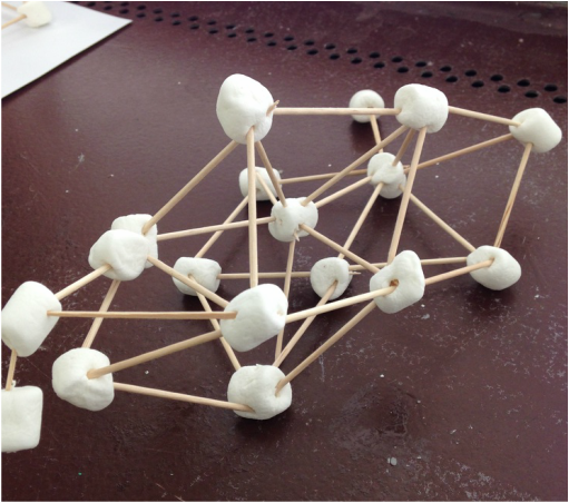 Marshmallow sculpture. 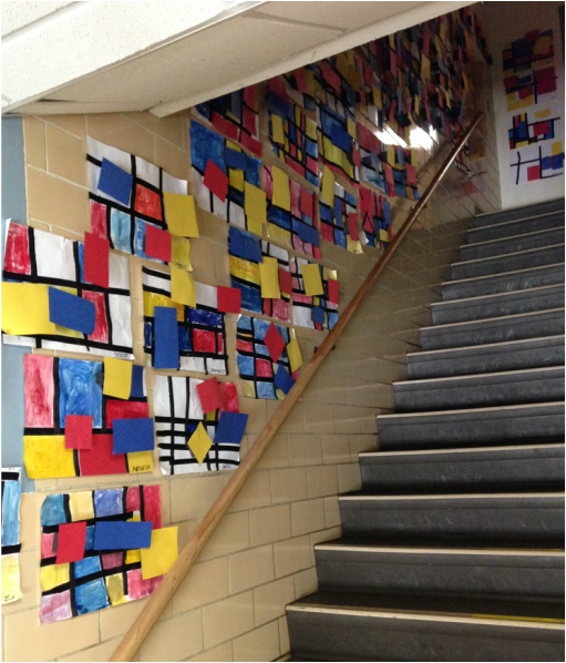 Mondrian-inspired art hanging in the hallway. |
Devon CalvertHarmony and Consolidated Elementary Art Teacher in Milton, WI. UW-Eau Claire graduate. WAEA President. Apple Teacher. 

Archives
March 2019
Categories
All
|
 RSS Feed
