|
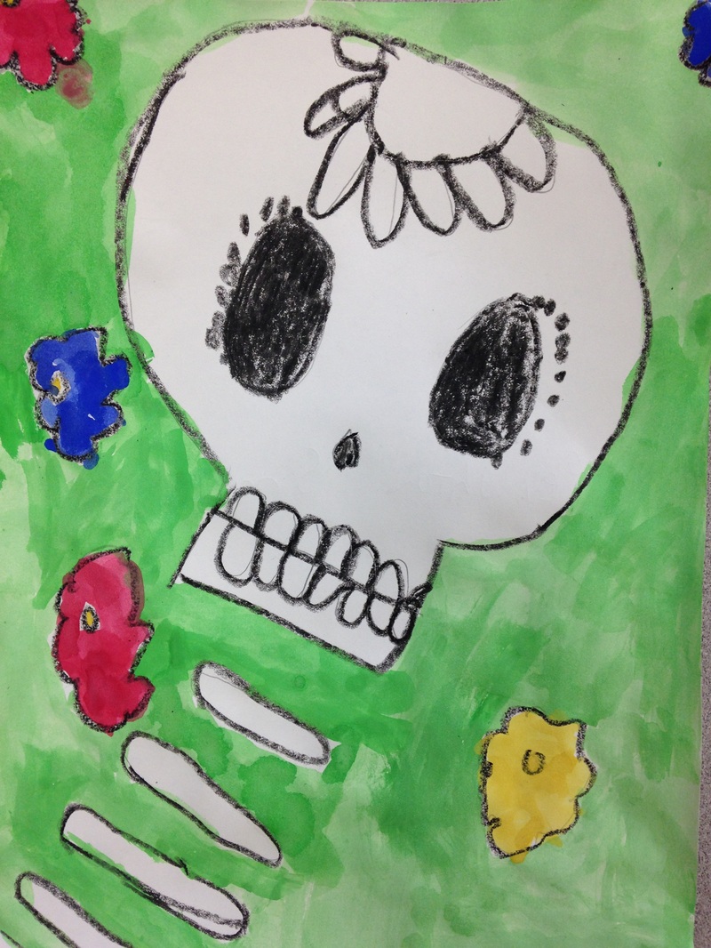
Day of the Dead is a Mexican holiday that is celebrated from October 31st to November 2nd. It is a Mexican holiday in which they celebrate the lives of people who have passed away. The oftentimes bring things like presents, food, and flowers to graves. Rather than mourn for people who have passed, they celebrate the good memories that they have of the person. Although it traditionally depicts decorated skulls, it is not a scary holiday like Halloween. It is a joyous holiday. This was a quick one day project. We had to work pretty quickly to get this one done. We started off by drawing a skull and spine for our skeleton. Then we took a look at some traditional sugar skull designs and drew them onto our skulls. Next, we drew some flowers in the background. After they had finished drawing, they traced everything with a black crayon. Lastly, we used tempera cakes to paint our background and flowers, being careful not to paint our skeleton.
0 Comments
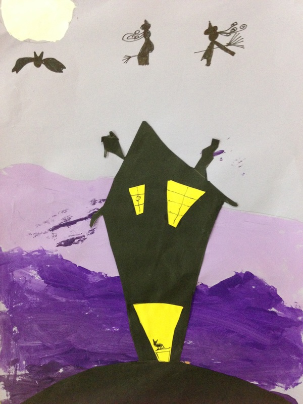
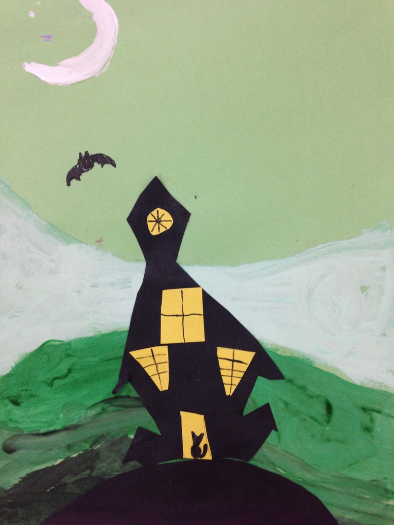
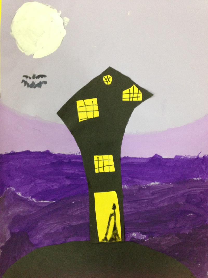
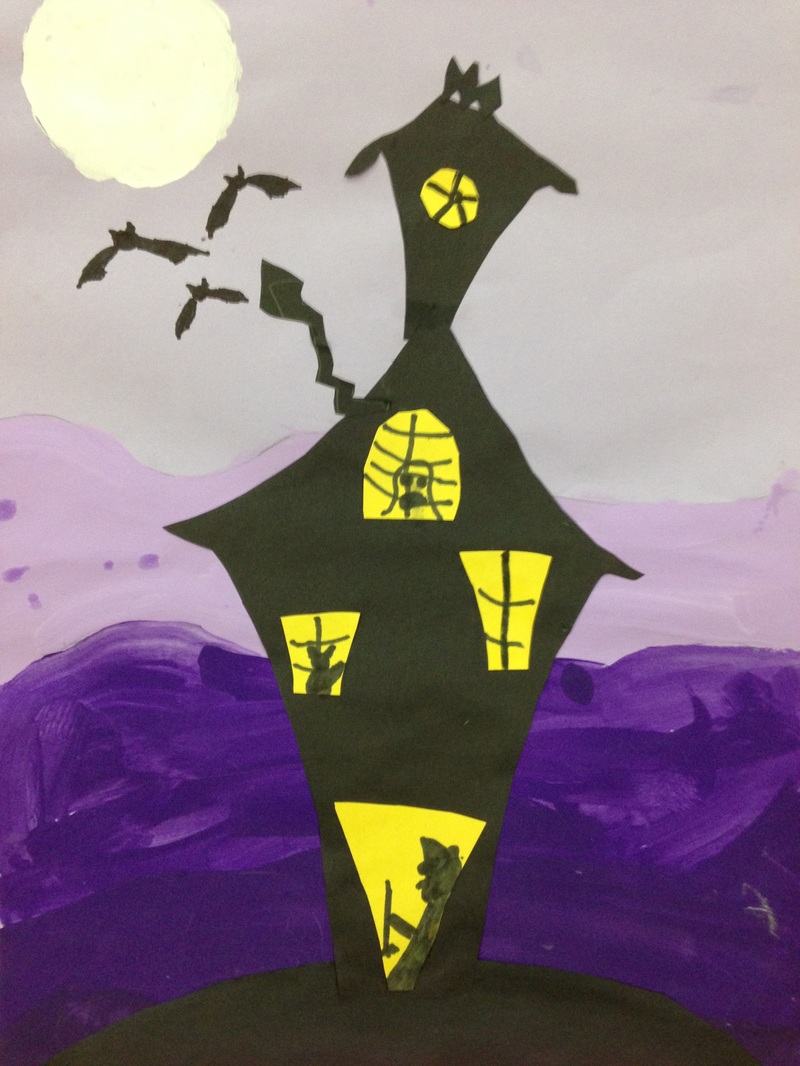
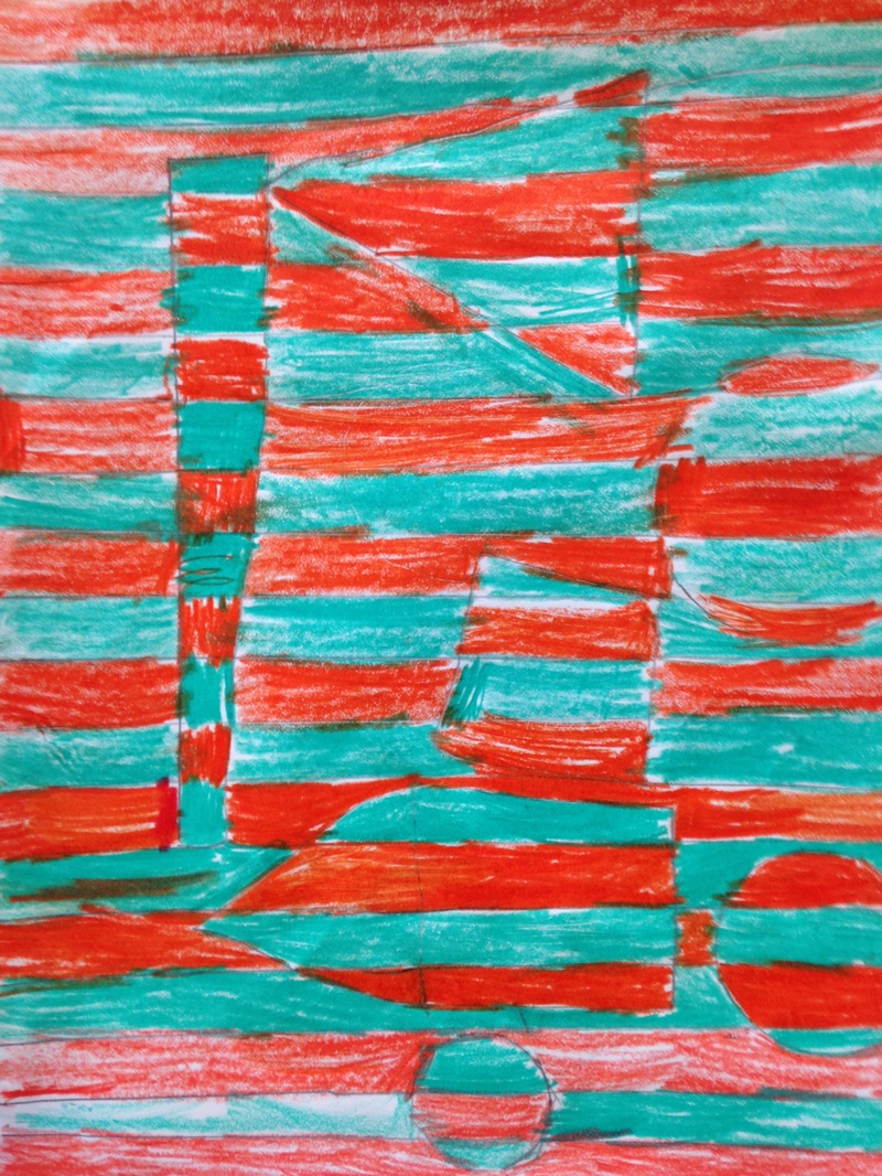
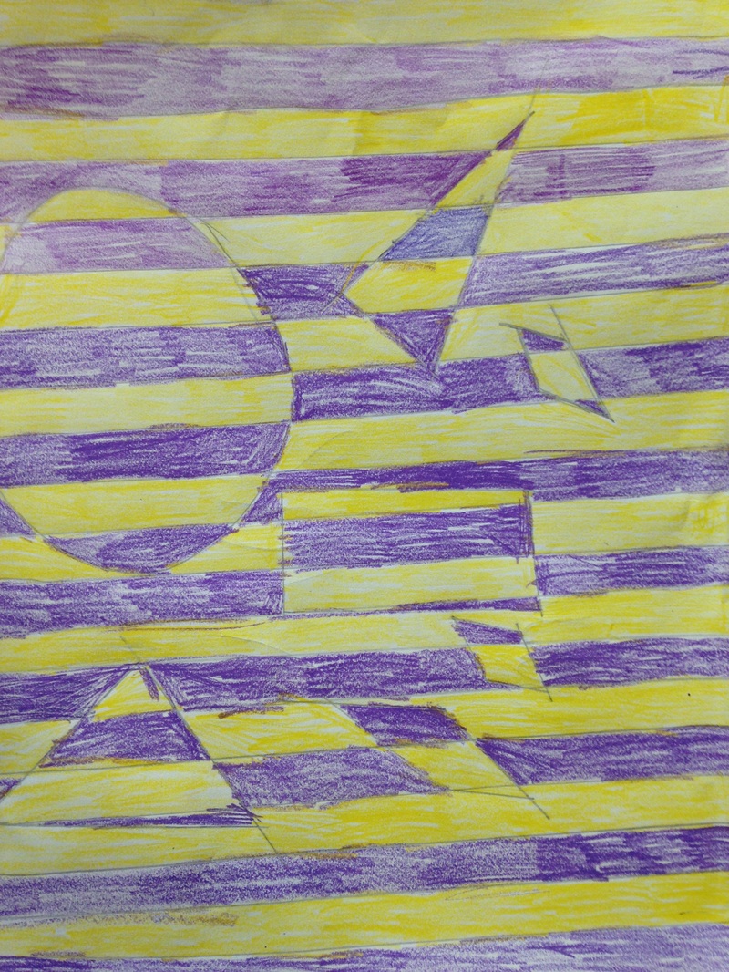
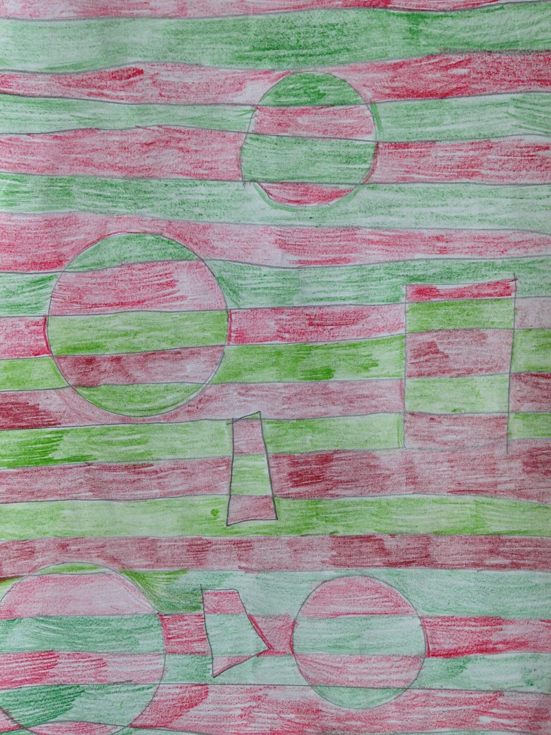
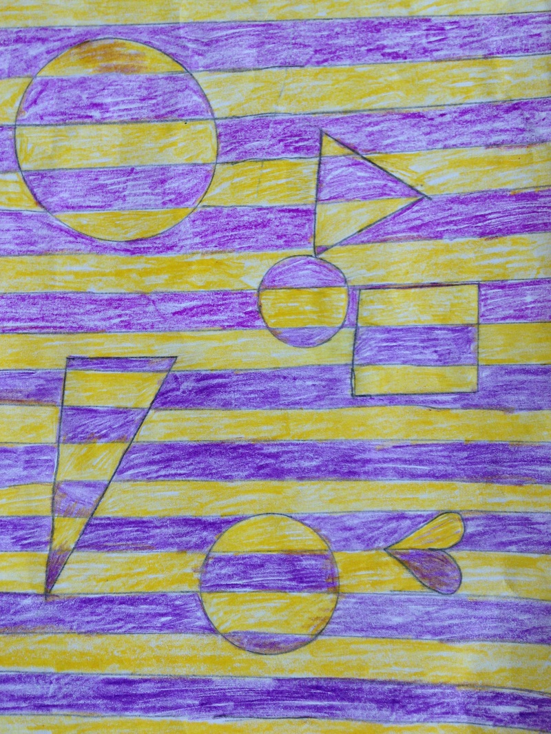
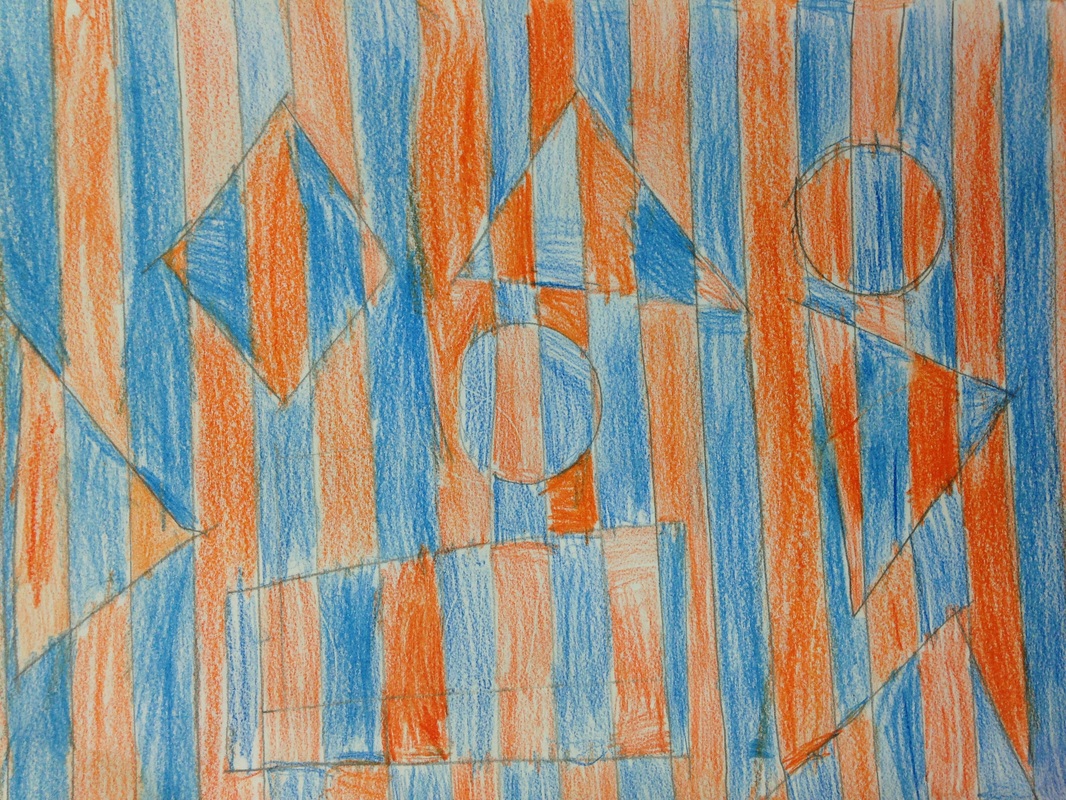
Tim Burton?!? Art project?!? Yes. As the kids put, I am the coolest art teacher EVER! With the spooky month of October upon us, I decided that we needed to make some equally spooky artwork. Who better to study than Tim Burton! Mr. Burton is my favorite movie director. I'm a huge fan of The Nightmare Before Christmas. Mr. Burton is a movie director/producer, writer, and artist. Most of the character and set designs for his movies were created by Burton himself. Tim Burton was an outcast while growing up and many of his lead characters are also misfits. He also has a creepy yet comedic feel to his movies. We watched a few clips from his movies throughout the project too. During his clips, we noticed that oftentimes, his architecture is smaller at the ground-level and then gets wider at the top. A lot of his stuff is also crooked. This creates and unnerving effect.  For the first day of the project, we talked about value. Value is how light or dark a color is. We practiced arranging different colors from lightest to darkest. We also looked at some pictures of landscapes and noticed that the further away the ground is, the lighter/whiter is usually looks. We also saw that the further away something is, the higher on our page it appears. We then applied this knowledge to our artwork. We started off by creating a white moon. Then, they created four different grounds and painted the ground that was furthest away the lightest color. The colors they used to paint were based on the colors of the paper they chose. So if they chose an orange paper, they were to use different orange paints. While I had already pre-mixed the colors with black or white, the students were expected to be able to paint their landscapes from lightest to darkest by identifying their colors without my help. The next class, we created a small black hill for our haunted house to go on. We recapped on Burton's architecture and how things are typically crooked and/or smaller at the bottom and bigger at the top. Students drew and then cut out their house. For the third class, they cut out a door and windows to add to their house. The windows were also expected to be crooked and/or smaller at the bottom and bigger at the top. During the final class, we added windows panes with sharpie, as well as other spooky details such as witches, cats, ghosts, bats, etc. 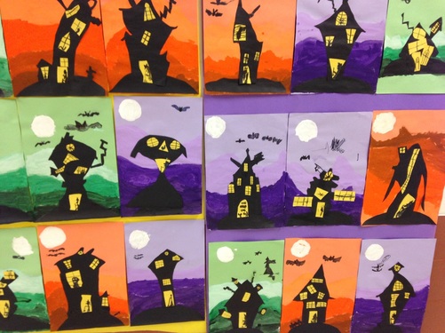 2nd graders recently learned about the Op artist, Bridget Riley. Ms. Riley is an artist from London who specializes in creating optical illusions in her artwork. Her artwork is usually large-scale because it has a more disorientating effect on the viewer when it is larger. The kids thought her artwork was super cool! They were blown away by the fact that even though the painting wasn't moving, it gave the effect that it was.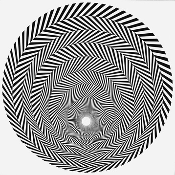 I had the pleasure of seeing this work by Ms. Riley when I was out in New York City a couple years ago. The kids started off the project by drawing straight and thin lines using a straight edge. They needed to make sure their lines were parallel or they wouldn't achieve the optical effect. Then they drew at least six geometric shapes. This led to a discussion on the difference between geometric and organic shapes. The next couple classes were spent talking about complementary colors which were used to color their artwork. Complementary colors are colors that are directly across from each other on the color wheel. I usually tell them to remember the Vikings (yellow and purple), Bears (blue and orange), and Christmas (red and green). When coloring, they were to alternate colors for each row.  Some students finished early so I drew up a large scale version of their project and let them color it in. Then we taped our artwork on top of it to hang in the hallway. |
Devon CalvertHarmony and Consolidated Elementary Art Teacher in Milton, WI. UW-Eau Claire graduate. WAEA President. Apple Teacher. 
Archives
March 2019
Categories
All
|


 RSS Feed
