|
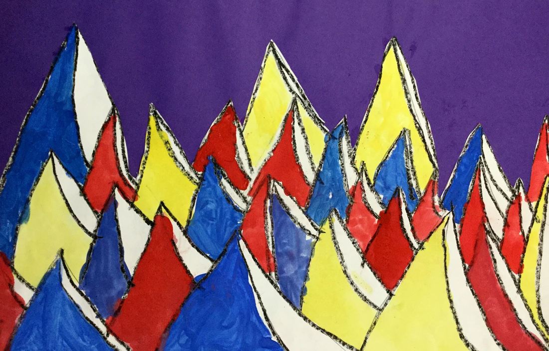
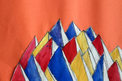
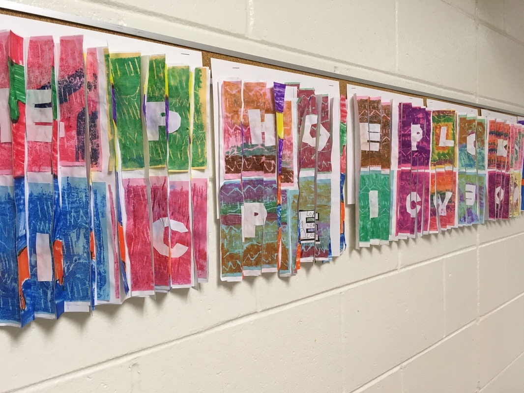
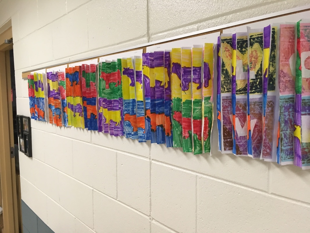
Here are some photos of our Alexander Calder project this year and my write up from last year to go with it.
0 Comments
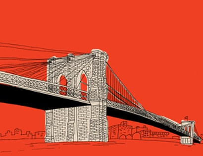
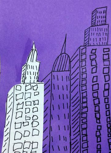
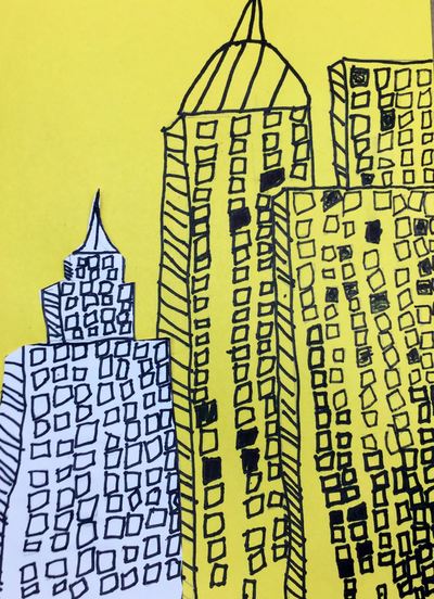
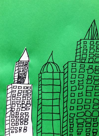
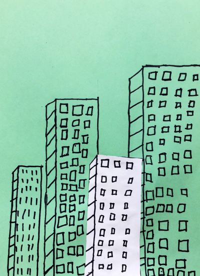
To finish off the school year, I thought we would do one last architecture project. Architecture is my favorite thing to learn about in art! I saw this project over at Deep Space Sparkle and knew that I just had to do it! We also quickly looked at Marz Jr.'s illustrations. I didn't go too in-depth on him but he is an illustrator who often depicts iconic buildings or things from pop culture in his works. Many times, the thing that he is trying to draw your attention to he will leave white while the background is colored. This contrast in colors creates a focal point. With Chicago being so close to us, the students and I talked about the history surrounding the architecture. We talked about the Great Chicago Fire and how a clumsy ole' cow tipped over a lantern. The ensuing fire burnt down a large chunk of the city. This left architects with an open canvas to rebuild and re-design the city. Architects had to work vertically due to limited space and this was largely made possible because of the recent invention of steel.
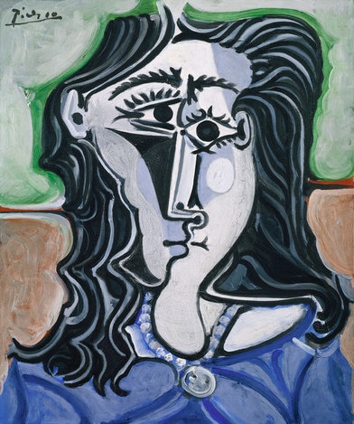
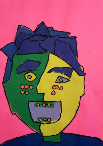
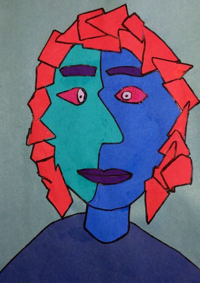
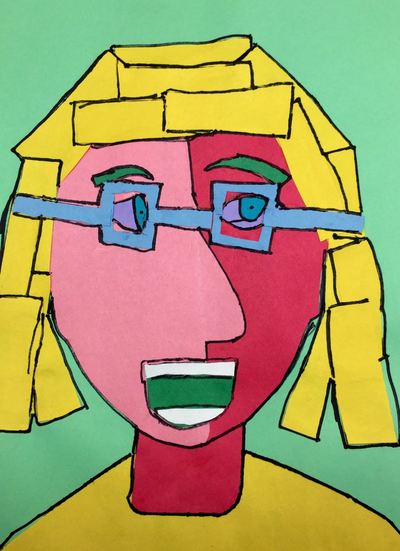
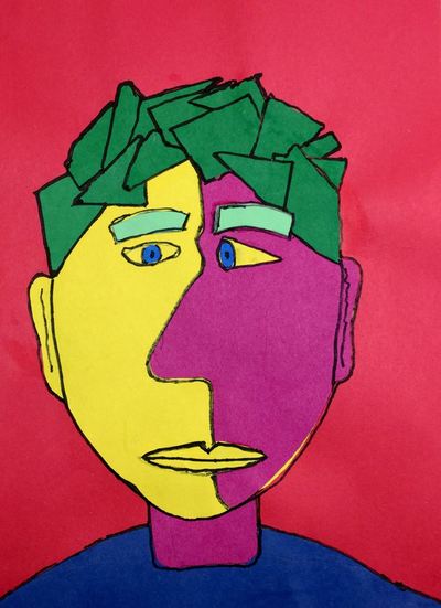
Throughout this project, we talked about the repeated geometric shapes in buildings. We also talked about space and how size and overlapping create this feeling. I had one student ask me about Antoni Gaudi which blew me away because he is one of the few architects who uses organic shapes rather than geometric. She had read a book about him! Students drew 2-3 buildings on a colored background and then one more building on a white paper. Then they sharpie'd and erased. After gluing their white building down, we talked about why the white building was the first thing we noticed. This is called the focal point or emphasis. This is due to the contrasting color of the white building. Pablo Picasso was a Spanish artist who was known to use a variety of mediums. At the young age of 13, he was already considered a child prodigy in art, surpassing his father who was also an artist. He is considered one of the greatest artists to ever live. He is most well-known for an art style that he founded with Georges Braque called Cubism. Cubism attempted to show all the sides of something at once. Typically this could only be done in sculptures. It is characterized by a broken glass effect, showing more than one point of view at once, and many geometric shapes. After talking about Picasso with the students, we started off the project by choosing two colors to be our face. Students used a tracer that I had made to trace a head onto each sheet of paper. I had them use a tracer because I thought it would be too hard for them to get the exact same head twice. On one of the heads that they traced, I walked them through drawing a side profile of a face. Picasso commonly showed a face looking at you from straight on, as well as from the side at the same time. Then they cut out one head and the half side profile and glued the side profile onto the head. Lastly, they cut out a neck and glued that on.
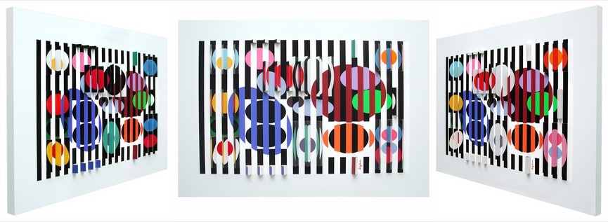
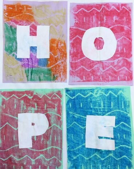
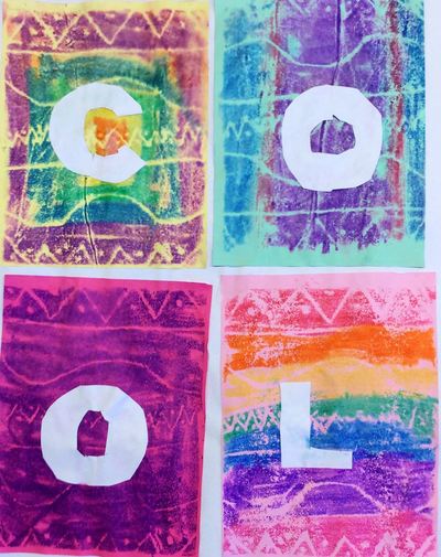
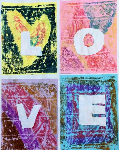
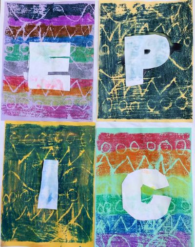
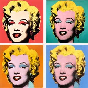
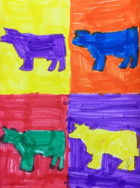
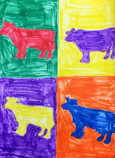
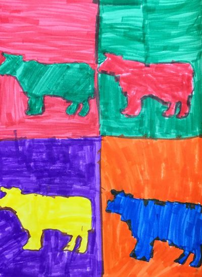
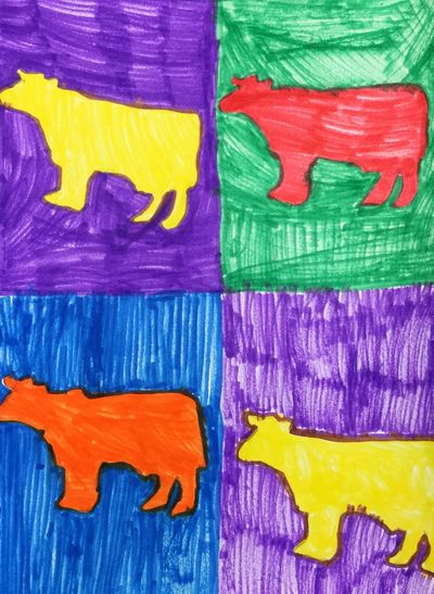
The next day, they cut out shoulders and glued the shoulders and head and neck onto their background. I also showed them how to draw eyes as if looking at you straight on, as well as eyes from the side. Lastly, they drew a mouth and glued that on. The 3rd day, I showed them how to draw curved rectangles to be the eyebrows. I also showed them how to cut up paper into geometric shapes and then arrange them to form hair. They could also add any other details that might be unique to them such as glasses and freckles. On the final day, they used a sharpie to outline everything that they had glued on. These will be displayed at our end of the year art show and I can’t wait to see the parents’ reactions Now that we've finished up Pop Artists Andy Warhol and Robert Indiana, we are going to merge the two projects into one. To do this, we looked at artist Yaacov Agam. Yaacov is originally from Israel and is known for his paintings and architecture. His artwork is a blend of Op Art and Kinetic Art. His work looks similar to an accordion fold. On one side of each fold is one artwork and on the other side of the fold is another artwork. So depending on where you are standing, you could see two different artworks! He called these works of art Agamographs. You can read about the Andy Warhol project here. And the Robert Indiana project here. While the two Pop Art pieces were easy, the Agamograph proved to be much trickier. The first day was spent drawing one inch lines on the back of each artwork. I pre-cut one inch strips so that all they had to do was line up the strip each time and trace along it. This was tricky because I didn't know that we were going to turn these into Agamographs until after we had started the projects so our two artworks were two different sizes. We got things sorted out in the long run though and made it work. After students traced their lines, they accordion folded a large sheet of paper. I had printed lines on the sheet so that they knew where to fold each time. The 2nd day we numbered the back side of one of our artworks so we knew what order our strips needed to be glued down in. Students then cut along their traced strips and glued them down in the correct order on their accordion fold. On the final day, they did the same thing as last class except with the other artwork. It was a stressful project but so worth it! Robert Indiana is a contemporary American Pop Artist. Robert works with popular words in his work such as Love, Amor, and Hope. A lot of his art draws inspiration from what is happening in the world. For example, his “Hope” sculpture was made for Obama's presidency. He makes paintings of words too but is most well-known for his sculptures. 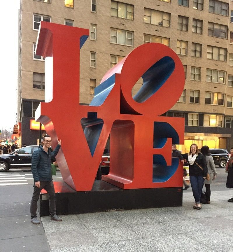 My friend, Tiffany and I, in front of one of Indiana's sculptures in NYC! My friend, Tiffany and I, in front of one of Indiana's sculptures in NYC! This was a project that I got from the lovely Cassie Stephens! The first day was spent creating a pattern on a small sheet of paper and then transferring their pattern over to a piece of styrofoam. The 2nd and 3rd days were a whirlwind of printing! Students colored on their styrofoam with markers and then printed them onto damp slips of paper. The first day was spent doing one-color prints. On the 2nd day, I showed them the beauty of rainbow prints! The final day was spent gluing their four best prints down to a sheet of paper and then cutting out the letters to a 4 letter word of their choosing and gluing them down. They turned out great and will look awesome on our Agamographs that we will be making! 2nd grade took some time to learn about the King of Pop, Andy Warhol! Warhol was a pop artist who would oftentimes repeat an image over and over but change the colors for each repetition. He was influenced by things that were popular during his time such as celebrities, rockstars, and everyday objects. He is most well known for his prints of Marilyn Monroe and Campbell's soup cans. After talking about his use of popular images, we talked about how the large statue of Bessie the Cow outside of Arby's was a well-recognized statue in the Janesville/Milton area. We used this as inspiration for our artwork.
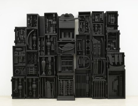
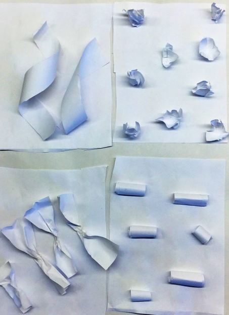
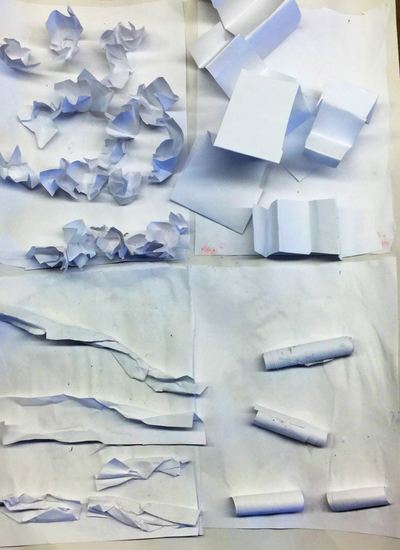
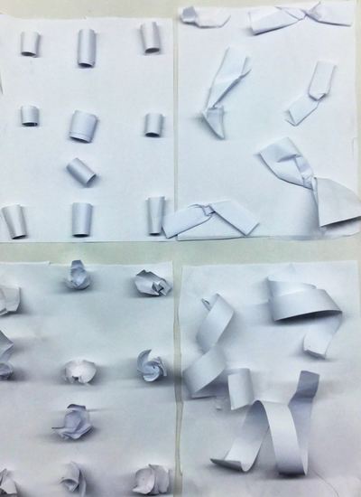
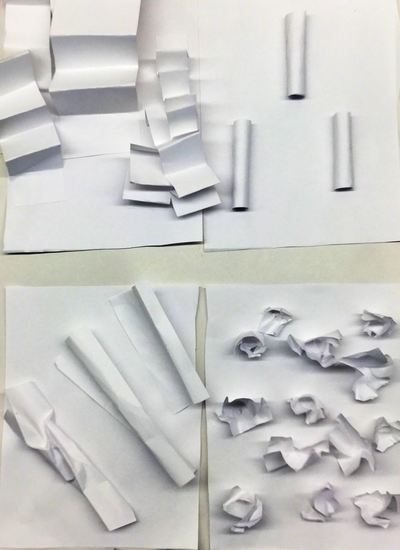
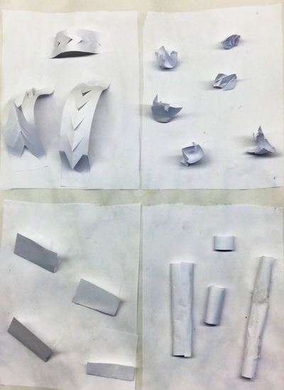
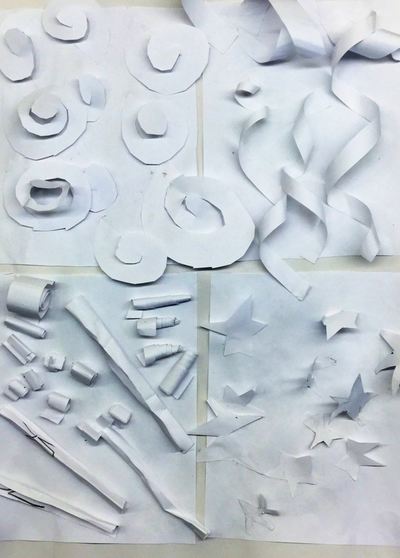
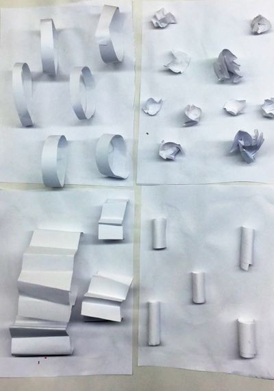
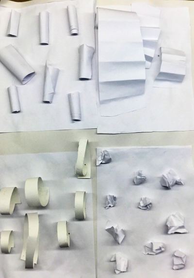
This is a project that I typically do with 3rd grade except that we paint instead. This time I changed up the medium and gave it a shot with 2nd grade. Students traced four cows onto their paper. After tracing their cows, students used markers and the complementary colors to color in their cows and backgrounds. This project will later be turned into an Agamograph! Louise Nevelson was an American (after immigrating from Russia as a child) sculptor most well-known for her monochromatic (all one color) assemblages. Her assemblages usually featured various sized wooden boxes with random objects such as chair legs, tools, car wheels, etc placed within the boxes Everything was then painted the same color. Mrs. Nevelson helped to pave the way for female artists around the world. This was a project that I did with 3rd grade last year but I wanted to give it a shot this year with our 2nd graders. I saw the idea on Pinterest and decided to tie in Louise Nevelson as an art history reference. We started out by folding a sheet of printer paper into quarters. Those quarters were cut apart and then glued onto a larger sheet of white paper. For this project, I required that everyone use white paper. From there, I demoed how to manipulate paper in different ways by folding it, crumpling it, bending it, curling it, etc. We talked about how doing these different processes to the paper created different textures. Texture is how something feels. We briefly talked about how texture can be broken down into two categories: actual and implied. Implied texture is when an artwork conveys how something might feel such as a lamb LOOKING like it is soft. Actual texture is how something ACTUALLY feels. So for our project, we focused on actual texture.
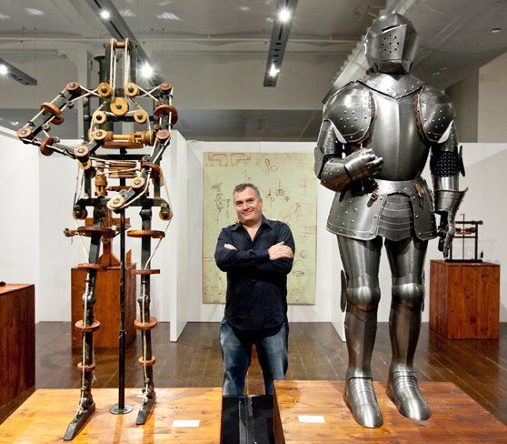
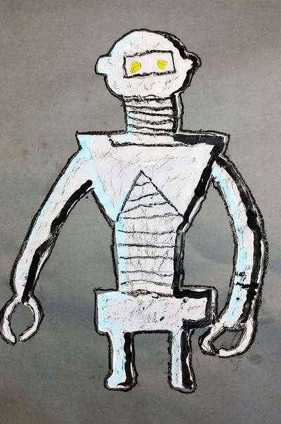
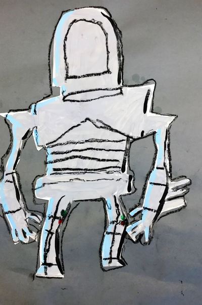
The students spent two or three days manipulating paper. It was pretty open-ended and allowed for students to experiment with the paper to create new textures that I hadn't thought of. Throughout this project, I also began to stress being thoughtful with their texture placement. This is really one of the first times that we have considered composition when making art. 2nd grade took some time to learn about Renaissance Man, Leonardo da Vinci. We took a look at some of his paintings and discussed the Renaissance, but the project really focused on da Vinci more as an inventor. Thousands of pages of his sketches and notes have been found. The man was brilliant! He came up with ideas for planes, helicopters, tanks, guns, and robots hundreds of years before they were ever actually made! We took this as an opportunity to make our own robots! I got this project from my friend, Tiffany Beltz, at a lesson exchange and have been antsy to use it with my kiddos! I got the idea to tie robots in with da Vinci from some other blogger that I saw on pinterest somewhere.
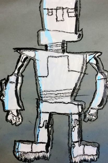
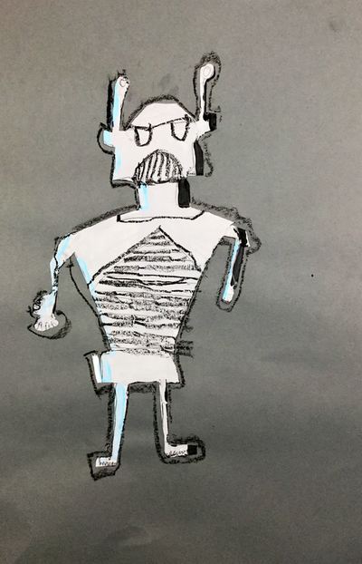
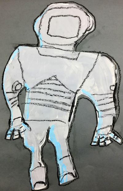
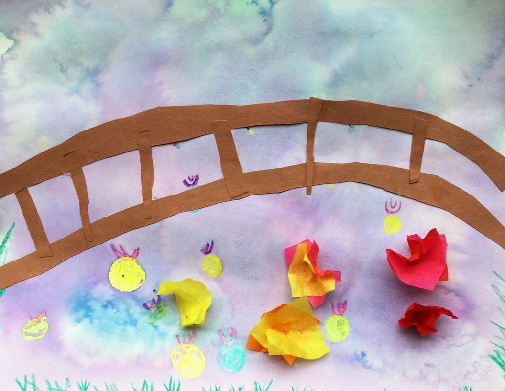
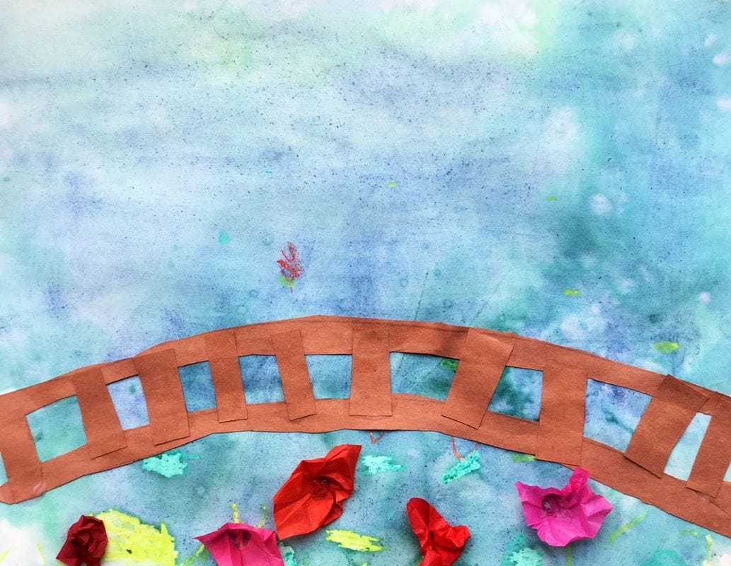
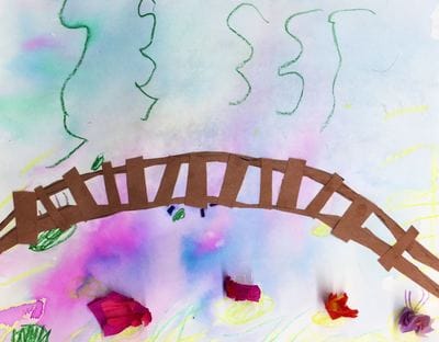
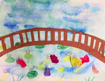
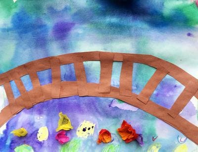
The first day was spent drawing our robots. Students were given a sheet that had all kinds of robot body parts that they could choose from to draw. The second day, we talked about form again. We talked about it previously with Frank Gehry. However, when we studied Gehry, we were making an artwork that was actually 3D. With da Vinci, we were working with the illusion for form or 3D. Students carefully painted their entire robot grey. Then they painted a light blue highlight on one side of their robot. On the other side, they painted black for a shadow. This gave the look that our robots had sides and form. The 3rd day, we re-drew our entire robot so we knew where all of our details were. Then they cut it out and glued it onto a grey sheet of paper. The final day, they used a black oil pastel to trace all of their pencil lines. When they were all finished, they were given a worksheet and they had to come up with their own invention. I encouraged them to think of areas in their lives that were difficult and that they wished were easier. Some of the inventions were so creative! This is a project that I did last year with my 2nd graders that I decided to bring back again for this year. We learned about Claude Monet and his history changing art-style, Impressionism. Impressionists focused on painting light and its effects on color. I found that this year's 2nd graders were much more successful with their wet-on-wet watercolor technique. I'm not sure if I taught it differently or what but I was very impressed with their painting results. This year, I cut out the part where students drew on the bridge's woodgrain too.
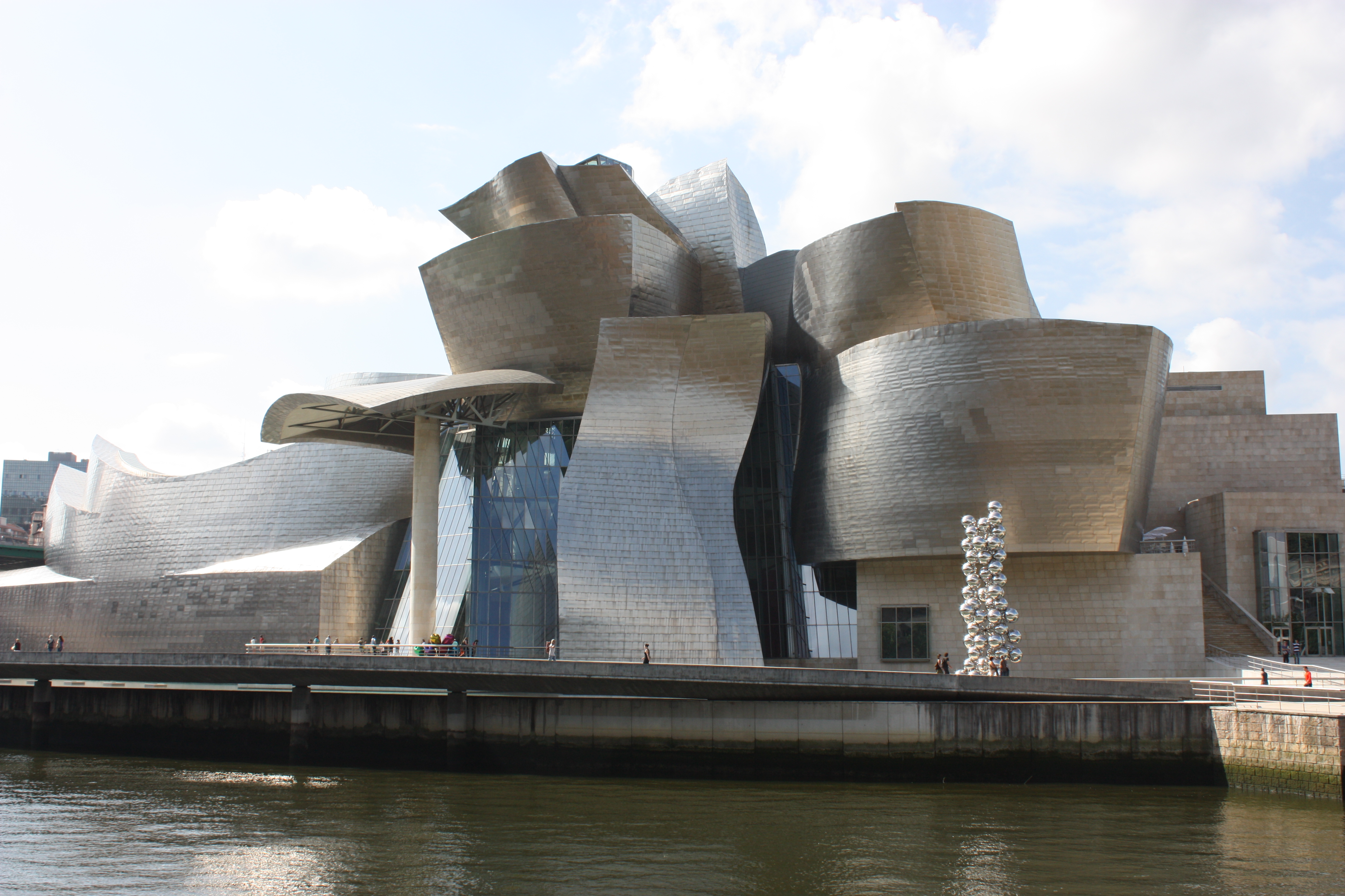
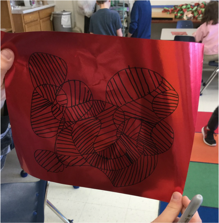
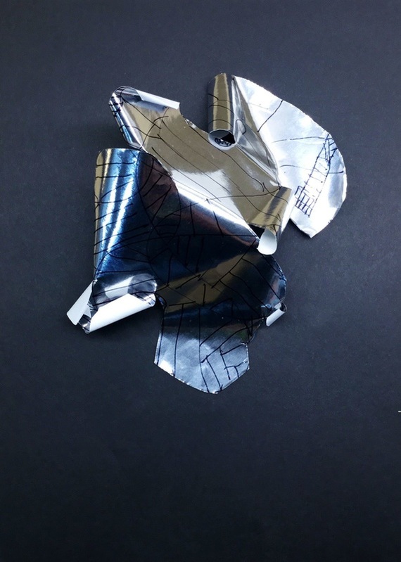
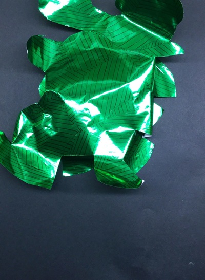
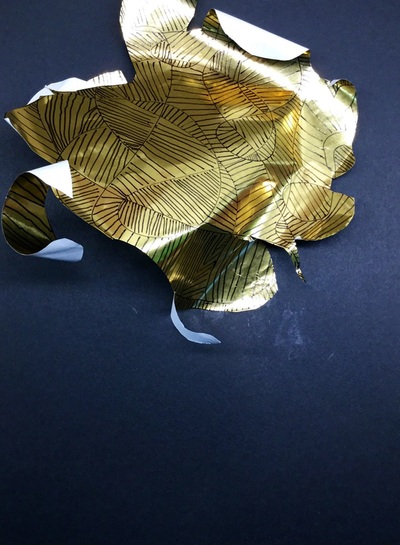
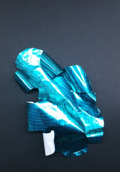
Here is a link to the project instructions from last year: http://devoncalvert.weebly.com/2nd/monets-lily-pond Frank Gehry is a Canadian-American architect most widely known for his large, titanium exterior buildings. His architecture features a lot of curves and gives his buildings a sense of movement. They have been credited with helping the economy of cities that they are featured in because of their popularity with tourists. This was a short project that was packed full of some big art concepts for the artists. We talked about movement in art and even though Gehry's buildings don't physically move, their curves give them the sense of mevement. We also talked about form and how form is another word for 3D or something that looks like it's 3D. Lastly, we talked abotu different kinds of lines. Typically, line is something that I hit really hard with kindergarten but since I didn't have these guys in kindergarten, we needed some work on our line knowledge. We really hammered knowing the difference between horizontal, vertical, and diagonal. We got to use shiny metallic paper on this project. The kids FREAKED! We started off by drawing a squiggly line with a sharpie that filled our paper and overlapped in several areas. Students needed to be careful that they didn't turn that squiggle into a scribble or the next step would become a little too hard. After their squiggly line, they then filled in all of the shapes it created with vertical, horizontal, and diagonal lines. This was meant to look like the paneling on Gehry's buildings. The second class was spent cutting out our shape and then cutting 4-6 slits into the shape. I then stapled down one part of their sculpture to a black paper. They were then free to glue and curl whatever parts of their paper that they wanted, as long as their artwork took on form and wasn't flat. Some chose to glue down several parts of their project, others chose to curl some pieces in and others out.
I thought this project turned out super cool! I just wish that the photos did them justice. Because of their shiny surface, they don't show their form super well. |
Devon CalvertHarmony and Consolidated Elementary Art Teacher in Milton, WI. UW-Eau Claire graduate. WAEA President. Apple Teacher. Archives
March 2019
Categories
All
|
 RSS Feed
