|
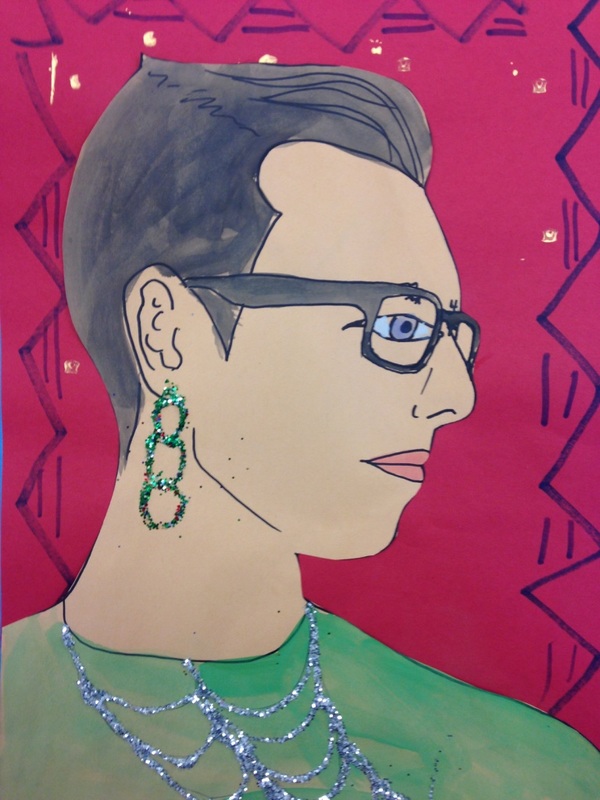
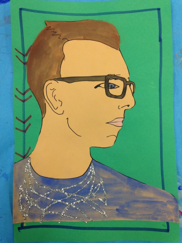
This is another one of Tasha Newton's projects. For this project, we talked about the frontalism. Frontalism is the way that Egyptians use to depict themselves in paintings. They typically are shown with their legs from a side view, their torso as if being looked at straight on, their head turned to the side, and their eye as if it is being looked at straight on. We also talked about hieroglyphics. First, we took our picture with our heads turned to the side. I Printed them out on large 11x17 sheets of paper. We then cut them out, traced them, and then added our details. I made sure to emphasize that the eye should be drawn as if it is being looked at straight on. They could also add a little stylization to the edge of the eye. They then retraced everything with a black marker. We then painted it using tempera cakes. We added a pattern around the edge of a background piece of paper using markers and gold hieroglyphic stamps. We cut out our heads and glued them onto the background. Lastly, they drew designs that they could then add glitter to. The glitter could be used to adorn headbands, earrings (the kids got a kick out of my picture with an earring), shirts, etc.
0 Comments
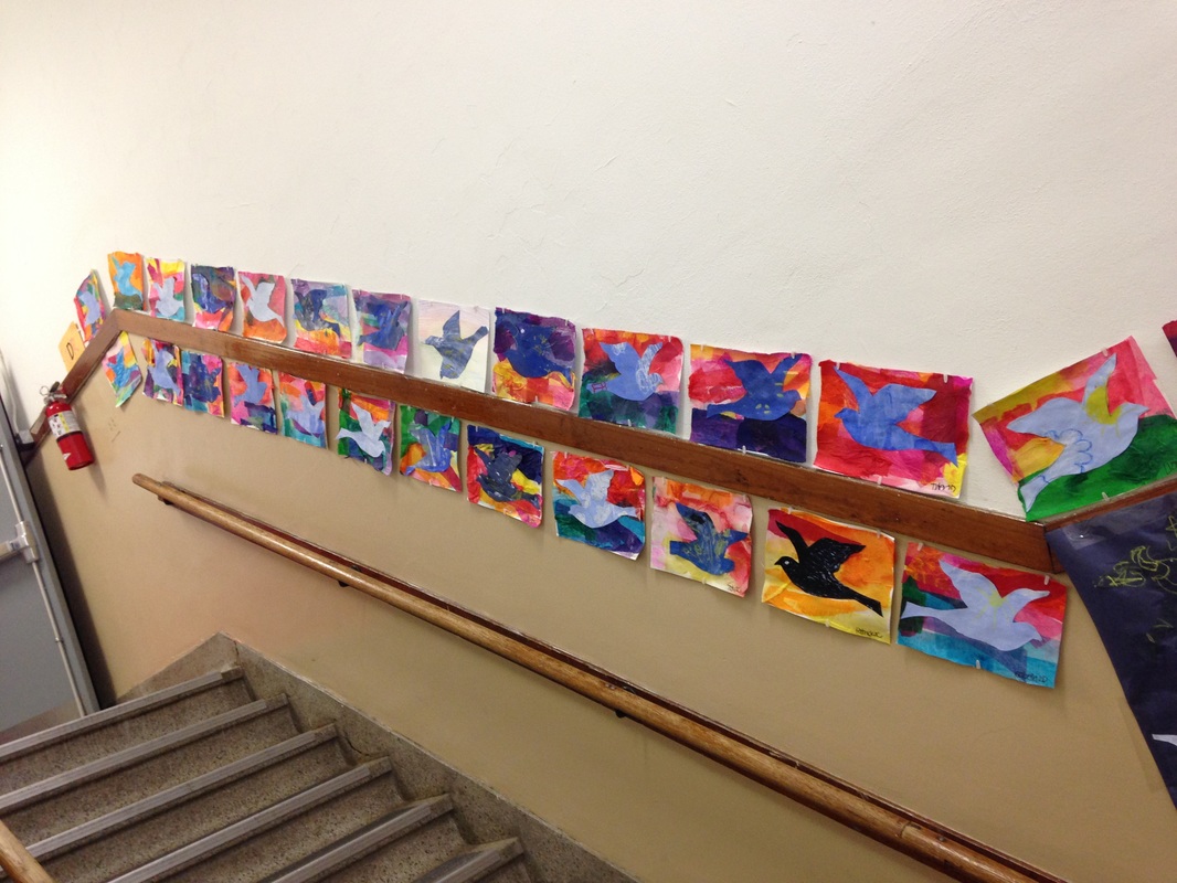
We read a book about Monet to start off class. First they drew lily pads, grass, vines, etc using crayons. I then talked to them about the wet-on-wet watercolor technique and how water and wax from the crayons don't get along very well so the crayons would show through their paintings. I talked about using salt in their watercolor paintings and how the salt sucks in the water, creating an interesting effect. The next class we made tissue paper lilies that we glued onto our paintings. They also used a tracer to cut out a bridge that I then stapled onto their painting. The bridge was longer than the paper so when I stapled it on, it would pop out (re-referencing 3D art from a previous project). 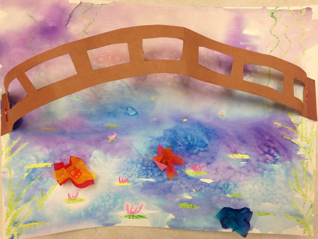 My example. As always, I started off class with a book. In this case it was Dinner at Magritte's. This project was inspired by a lesson that Cassie Stephens (check out her blog!) did based on Magritte's The Promise. First off, we talked about tints and shades. Then we folded a large sheet of paper in half and painted one half a tint of blue and the other half a shade of blue. The next class we drew stars, moons, etc onto the shade of blue. On the tint, we drew clouds and the sun. Then they used a bird tracer to draw a bird onto both the tint and shade (two birds total). Then they used Mod Podge to glue tissue paper onto a background. I talked about using analogous colors, such as blues and greens for the ground and pinks, reds, and oranges for the sky to create a sunset. They then cut out both their birds and glued one onto their tissue paper sunset. The second bird was given to me. I created a couple large murals to put their second birds onto. This is the first project I did with my second graders. We talked about vertical and horizontal lines, as well as primary colors. We used black tape to make the lines and then watercolors to paint our squares. The next lesson, I talked about 3D art vs 2D art. I was observed by one of my university professors for this lesson and my students were terrific! We started off that lesson by making marshmallow and toothpick sculptures as an engager. The students then hot glued chunks of foam onto their paintings before gluing square pieces of primary colored paper on top. This made some of the squares pop out. 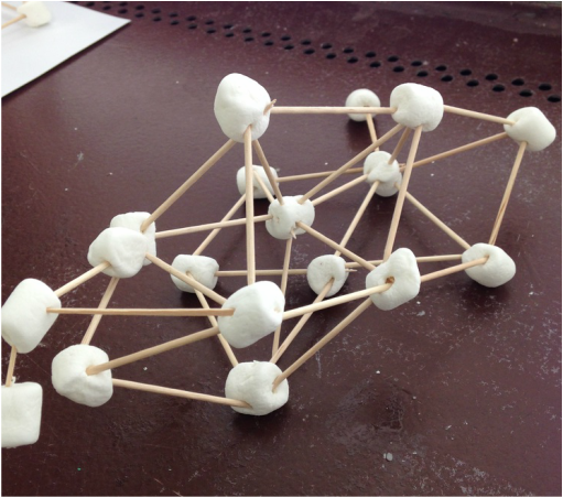 Marshmallow sculpture. 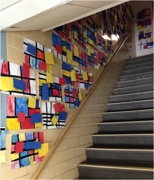 Mondrian-inspired art hanging in the hallway. |
Devon CalvertHarmony and Consolidated Elementary Art Teacher in Milton, WI. UW-Eau Claire graduate. WAEA President. Apple Teacher. 
Archives
March 2019
Categories
All
|


 RSS Feed
