|
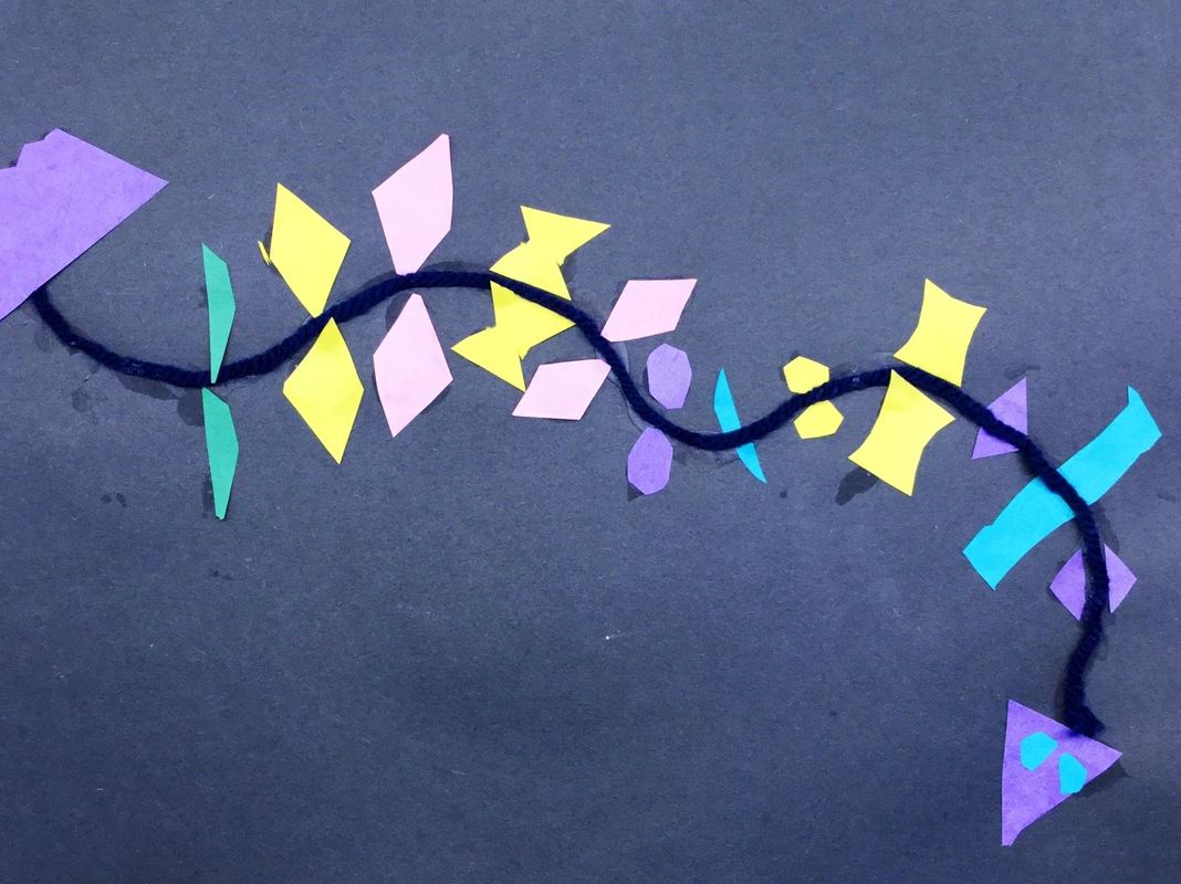
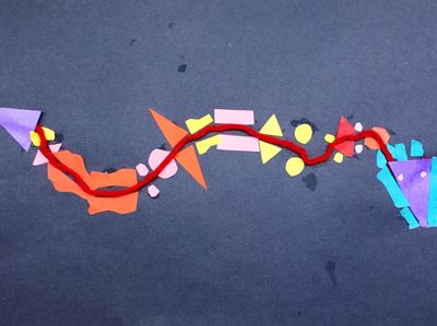
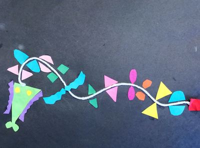
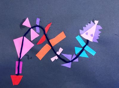
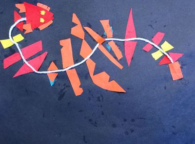
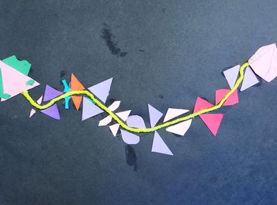
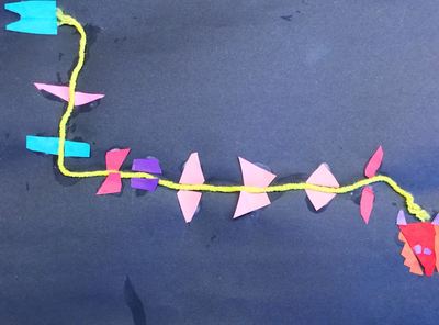
So we did this project a while ago in celebration of the Chinese New Year on January 28th. We talked about how there are 12 animals that rotate each year and how those animals represent certain characteristics in people. We also learned a bit about the significance of certain colors to the Chinese as well as a bit of history regarding the Chinese New Year.
We started of by gluing down a piece of yarn onto our paper. Then we talked about symmetry and how things that are symmetrical are the same on both sides. We discussed some things that we see often that are symmetrical like people's faces and butterfly wings. After making a head and tail for their dragon, students were asked to fold pieces of paper in half and cut out various shapes. This would create two of each shape. They were then to glue one of each shape on either side of the yarn, making it symmetrical from the head all the way back to the tail.
0 Comments
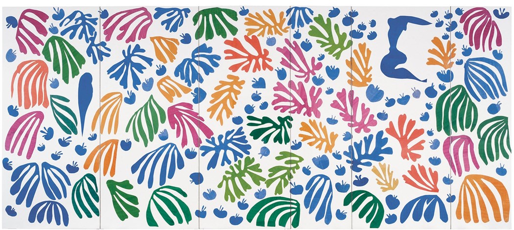
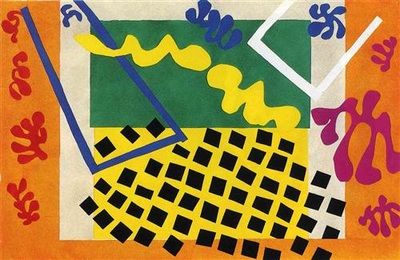
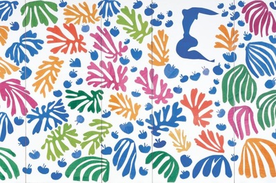
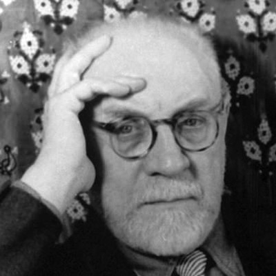
For this project, we checked out Henri Matisse's work. Matisse was a French artist who is most well-known for the paper cutouts (collages) he made. He used a mixture of both organic and geometric shapes to create his works. Late in life, he developed cancer. After a botched surgery, he was left wheelchair-bound and his vision was beginning to fail him. He oftentimes made art from the comfort of his bed, bringing the outside world into his room through his artwork. We started off the project watching a couple videos about Mr. Matisse. Then we discussed the difference between organic and geometric shapes. This was the big focus of the project. I explained to them that organic shapes look like blobs of spilled milk and geometric shapes are shapes that usually have names (circles, squares, diamonds, etc). The first day of the project was spent cutting out shapes of various sizes, colors, and a blend of geometric and organic shapes.
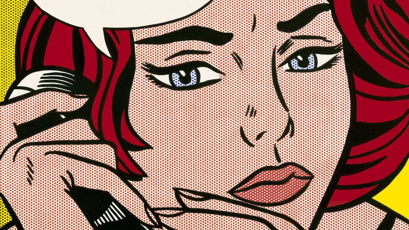
The following two classes were also spent cutting out and gluing shapes. Throughout the process, I emphasized that they be thoughtful with their shape placement when gluing stuff down. I'm really happy with some of the compositions! We learned about the second most famous Pop Artist (behind Mr. Warhol), Roy Lichtenstein! Roy Lichtenstein started out as a graphic designer. One day, his kids challenged him to recreate a picture of Mickey Mouse and Donald Duck that they had seen in a comic book. He took the challenge upon himself and recreated it perfectly. This would go on to spur his iconic style. He is most well-known for his paintings of comic book pictures. Many of his paintings depict women or scenes from WWII comics. He is also known for only using the primary colors (red, yellow, and blue). To create other colors, he used ben-day dots. If you have ever looked at a comic closely, the colors are made up of tiny dots of colors. If a bunch of red dots are placed closely together, the image appears red. If they red dots are spaced further apart so that there is more white space between them, the color begins to appear more purple. The primary colored dots can also be overlapped to give the appearance of other colors, such as putting red and blue on top of each other to create the illusion of purple.
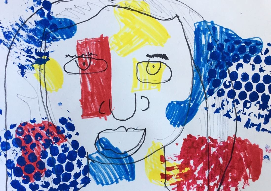
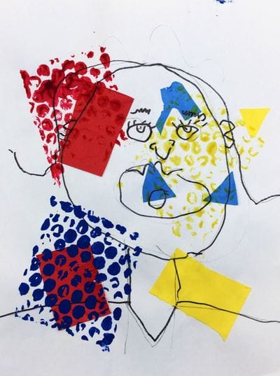
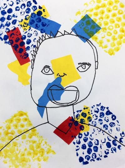
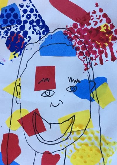
We touched up on our organic and geometric shapes from kindergarten to start things off. Then we practiced cutting these shapes out of primary colored papers and gluing them down to our backgrounds. Students were expected to fill up a good chunk of their paper. The second day, we got a crash course on the proportions of the face. We really emphasized drawing our eyes in the middle of our head and NOT on our forehead. After drawing their self-portrait, they traced it with a sharpie. Lastly, they used bubble wrap to prints dots using the primary colors onto their backgrounds. The bubble wrap prints look king of like large ben-day dots like Lichtenstein used. While I had fun with the project, I need to come up with a more effective way to teach this one.Maybe draw the shapes on next year with markers instead of cutting them out of paper? I saw this project floating around somewhere on Pinterest and thought it would be a great chance to touch on shapes again with me first graders!
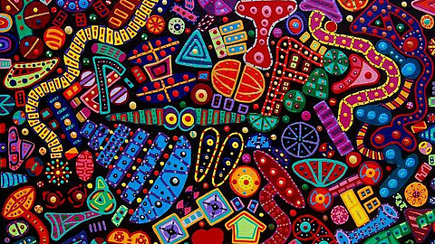
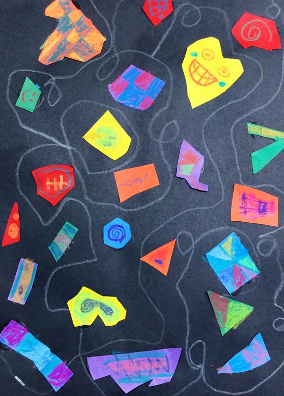
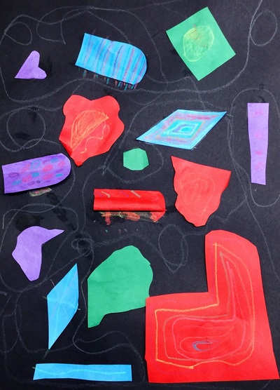
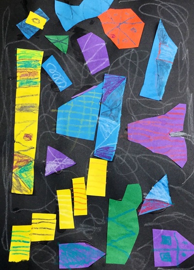
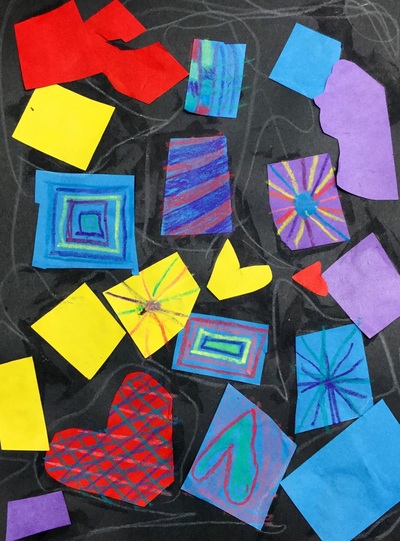
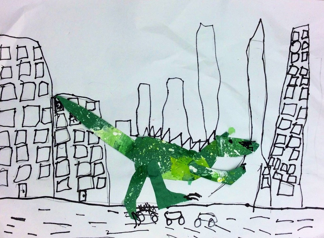
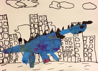
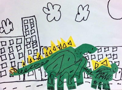
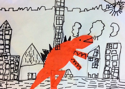
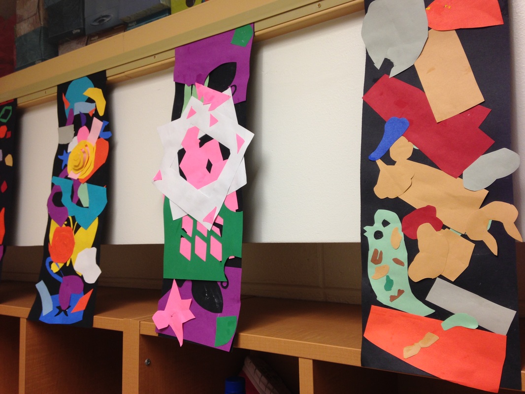
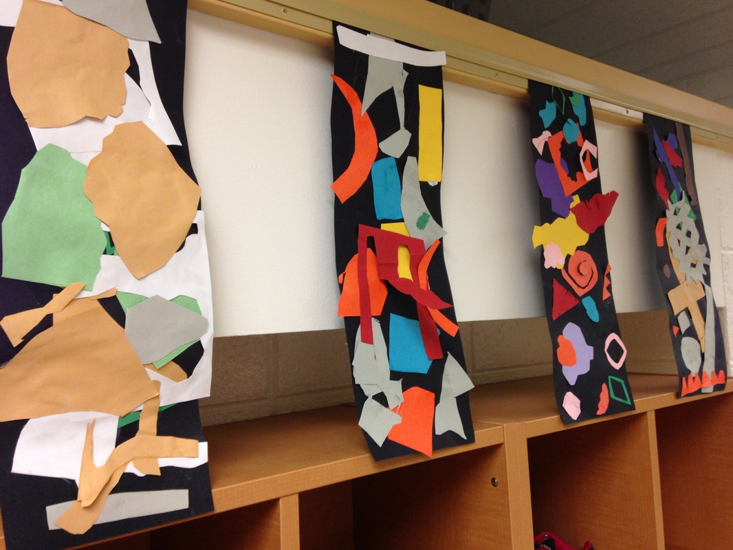
Reggie Laurent is a contemporary artist who makes abstract paintings. His artwork features brightly colored shapes on a black background. The shapes vary from geometric to organic. On top of the shapes, he paints vibrant lines and patterns. Throughout the project, we talked a lot about the difference between organic and geometric shapes. I usually say that geometric shapes are shapes that have a name or that they are shapes with a lot of straight edges. Organic shapes are shapes that are blobs. We cut out tons of organic and geometric shapes and glued them to a black background. When gluing, we glued so that our shapes didn't touch each other. Our scissors were SUPER hungry so we did TONS of cutting. We recapped on using our glue properly too. The 2nd class, we finished up cutting and gluing. After that, we used a white crayon to create squiggly lines between our shapes. Lastly, we used construction paper crayons to add lines and patterns to our shapes. Dinosaurs and architecture?! Yes please!! We read the book If the Dinosaurs Came Back and used that as inspiration for this project (as well as whoever it was that I saw posted this). We recapped on the difference between geometric and organic shapes, taking note that cities have a lot of geometric shapes. After drawing and sharpie'ing their cities. They created a dinosaur of their choosing out of some scrap paper. Lastly, they added some details to their dinosaurs. When they finished, they were asked to write about the topic "If the dinosaurs came back..." It made for some pretty funny things that they would do with the dinosaurs!
For this project, we checked out Henri Matisse's work. Matisse was a French artist who is most well-known for the paper cutouts (collages) he made. He used a mixture of both organic and geometric shapes to create his works. Late in life, he developed cancer. After a botched surgery, he was left wheelchair-bound and his vision was beginning to fail him. He oftentimes made art from the comfort of his bed, bringing the outside world into his room through his artwork. We started off the project watching a couple videos about Mr. Matisse. Then we discussed the difference between organic and geometric shapes. This was the big focus of the project. I explained to them that organic shapes look like blobs of spilled milk and geometric shapes are shapes that usually have names (circles, squares, diamonds, etc). The first day of the project was spent only cutting out shapes. I stressed that their cutouts should be various sizes, colors, and a blend of geometric and organic shapes.
Most of the second class was spent cutting out shapes as well. I allowed them to start gluing shapes onto their black background with the last ten minutes of class left. I emphasized that they needed to lay out their shapes first though to get an idea of where they wanted their shapes at. Students were welcome to keep cutting if they felt they needed too, which many did! On the final day of the project, the students finished cutting out any shapes that they needed and glued them onto their background. When they were finished, they took a quick quiz on Mr. Matisse. |
Devon CalvertHarmony and Consolidated Elementary Art Teacher in Milton, WI. UW-Eau Claire graduate. WAEA President. Apple Teacher. Archives
April 2018
Categories
All
|




 RSS Feed
