|
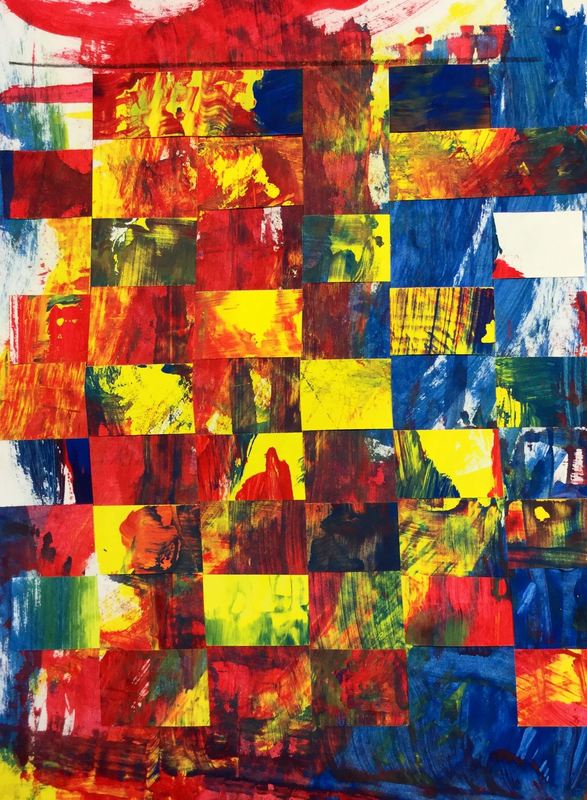
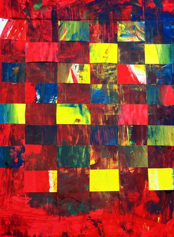
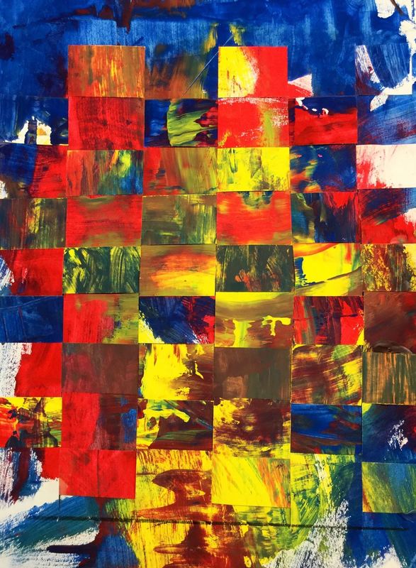
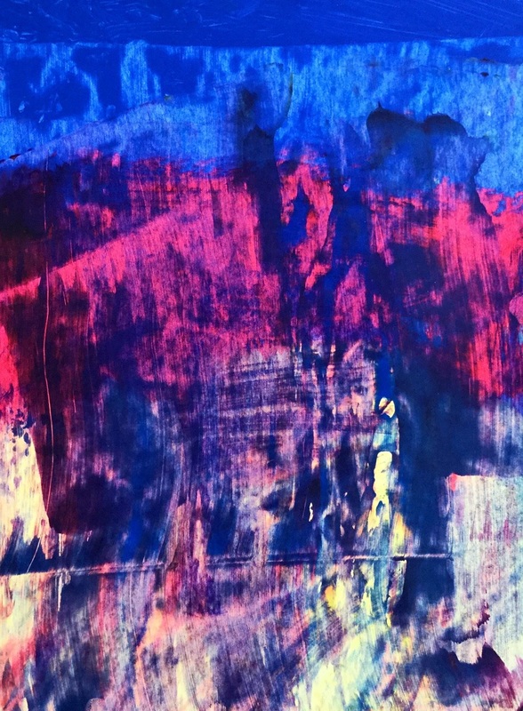
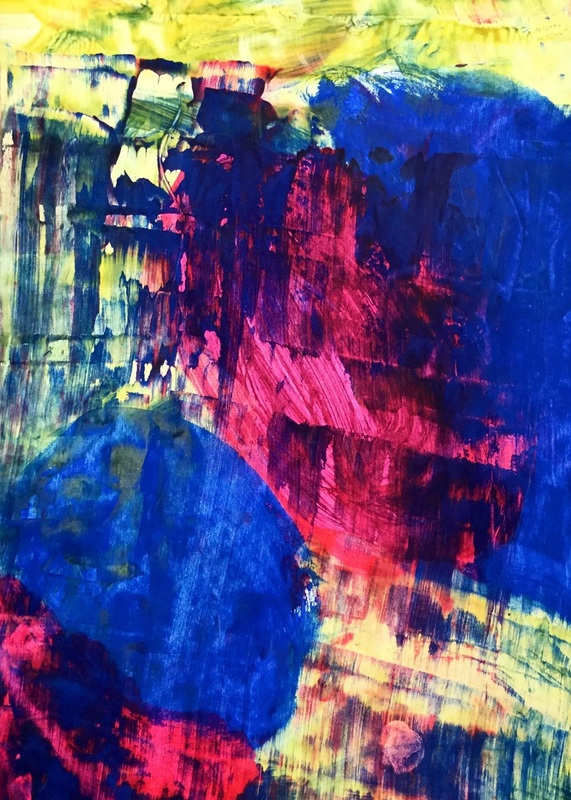
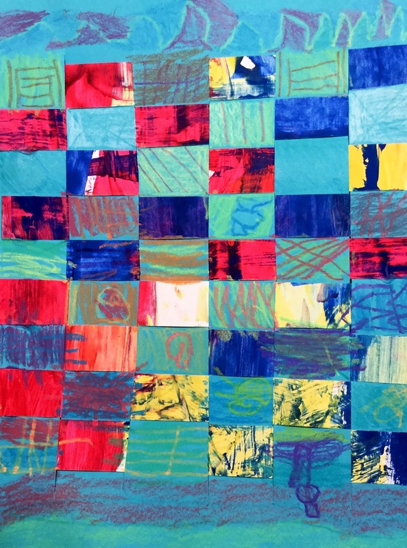
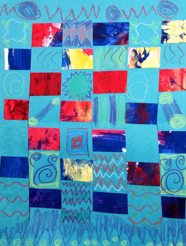
Here is a project I do based on Gerhard Richter. Students create two paint-scraped paintings using the primary colors. When they scrape the paint, the colors mix and create secondaries. Afterwards, I cut up one of their paintings and they weave their two artworks together. Here's a write-up on a previous Richter project I did. 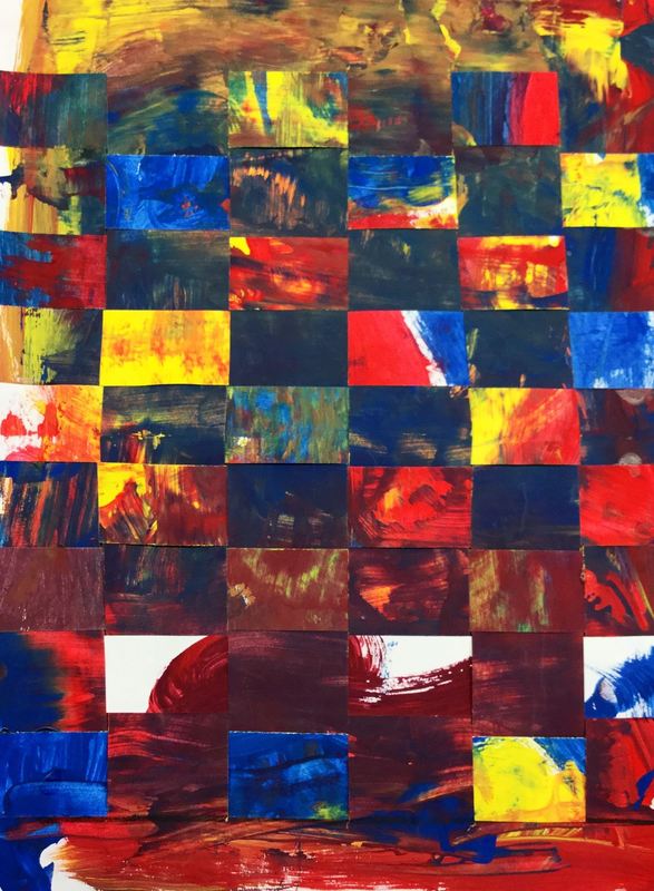
0 Comments
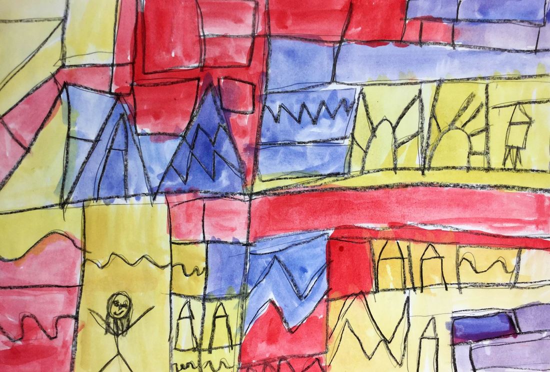
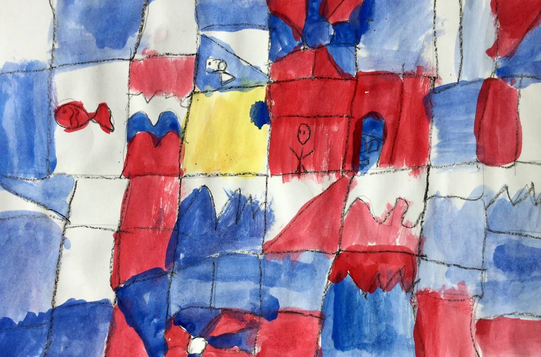
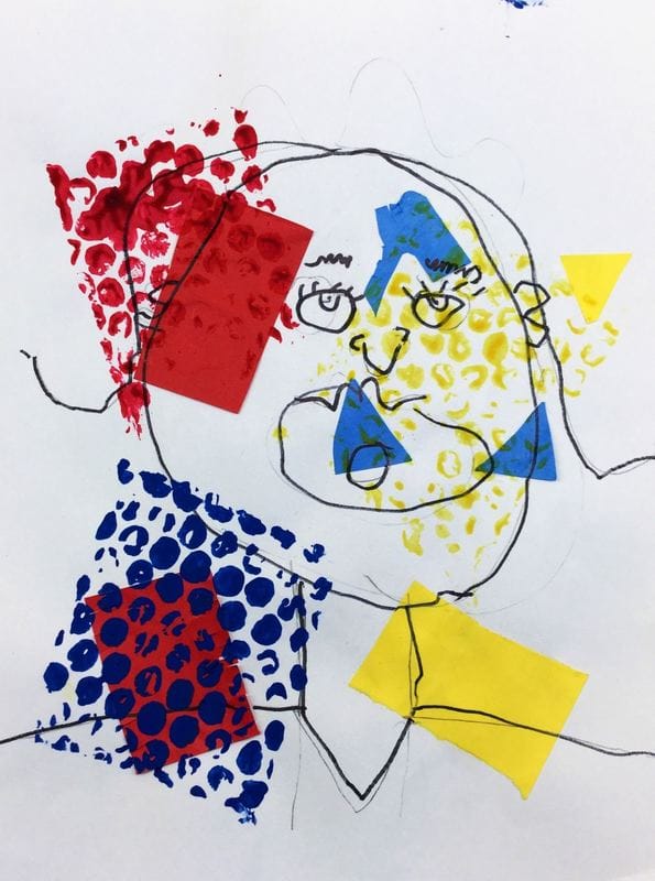
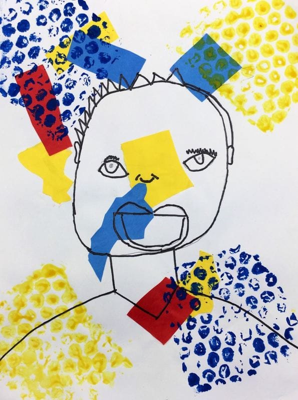
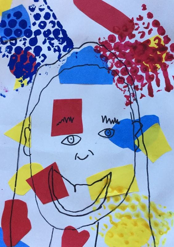
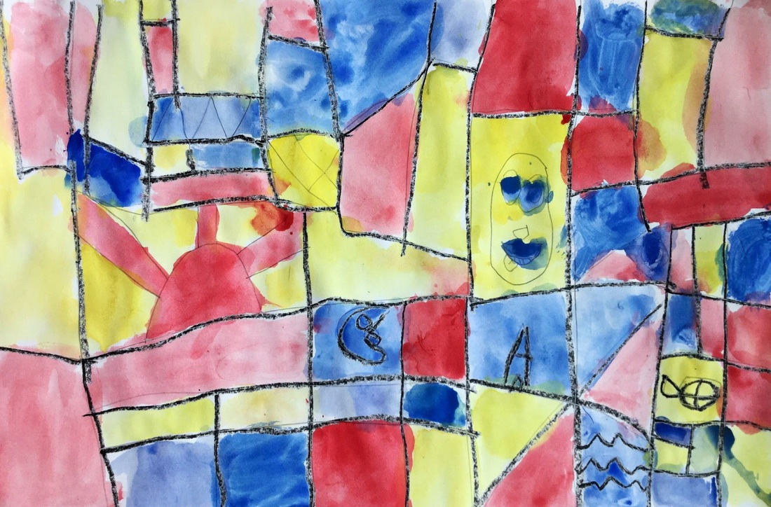
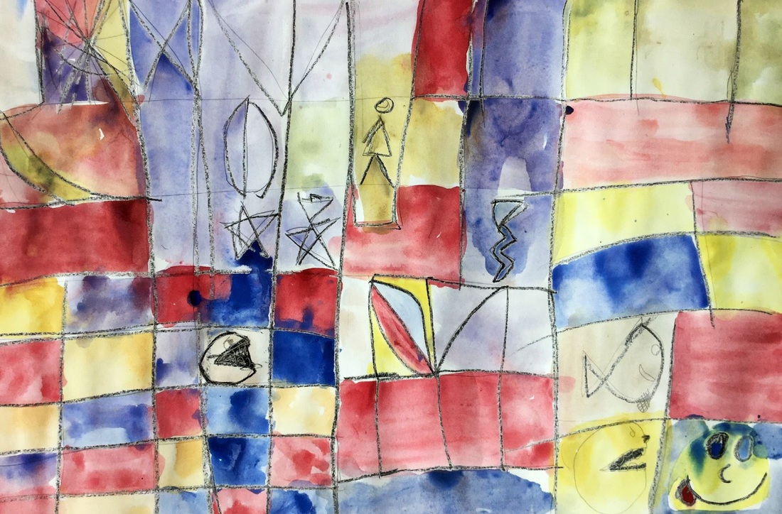
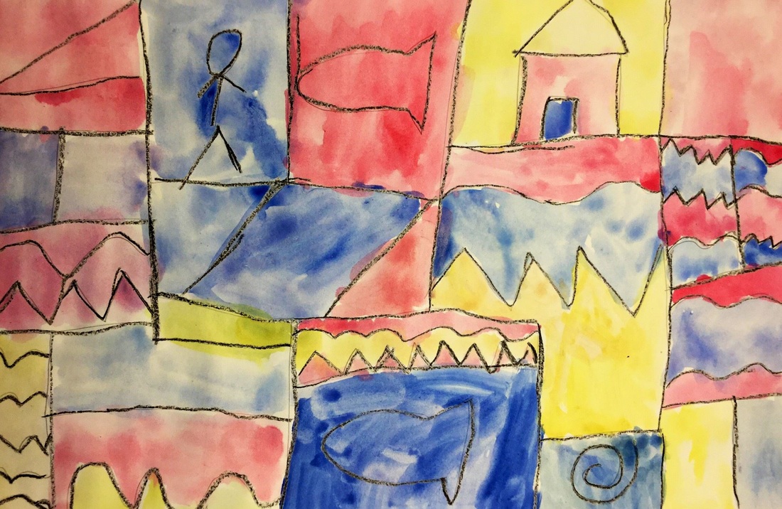
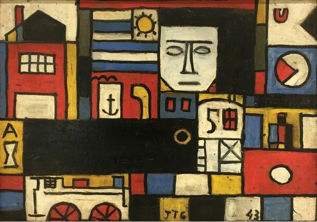 Like last year, 1st grade started the year with Joaquin Torres Garcia and his primary colored paintings! You can read all the details in last year's post which can be found here. Enjoy the pictures below! 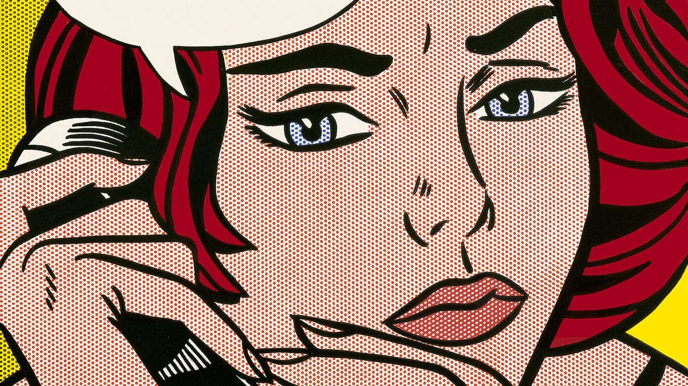 We learned about the second most famous Pop Artist (behind Mr. Warhol), Roy Lichtenstein! Roy Lichtenstein started out as a graphic designer. One day, his kids challenged him to recreate a picture of Mickey Mouse and Donald Duck that they had seen in a comic book. He took the challenge upon himself and recreated it perfectly. This would go on to spur his iconic style. He is most well-known for his paintings of comic book pictures. Many of his paintings depict women or scenes from WWII comics. He is also known for only using the primary colors (red, yellow, and blue). To create other colors, he used ben-day dots. If you have ever looked at a comic closely, the colors are made up of tiny dots of colors. If a bunch of red dots are placed closely together, the image appears red. If they red dots are spaced further apart so that there is more white space between them, the color begins to appear more purple. The primary colored dots can also be overlapped to give the appearance of other colors, such as putting red and blue on top of each other to create the illusion of purple. We touched up on our organic and geometric shapes from kindergarten to start things off. Then we practiced cutting these shapes out of primary colored papers and gluing them down to our backgrounds. Students were expected to fill up a good chunk of their paper. The second day, we got a crash course on the proportions of the face. We really emphasized drawing our eyes in the middle of our head and NOT on our forehead. After drawing their self-portrait, they traced it with a sharpie. Lastly, they used bubble wrap to prints dots using the primary colors onto their backgrounds. The bubble wrap prints look king of like large ben-day dots like Lichtenstein used. While I had fun with the project, I need to come up with a more effective way to teach this one.Maybe draw the shapes on next year with markers instead of cutting them out of paper? 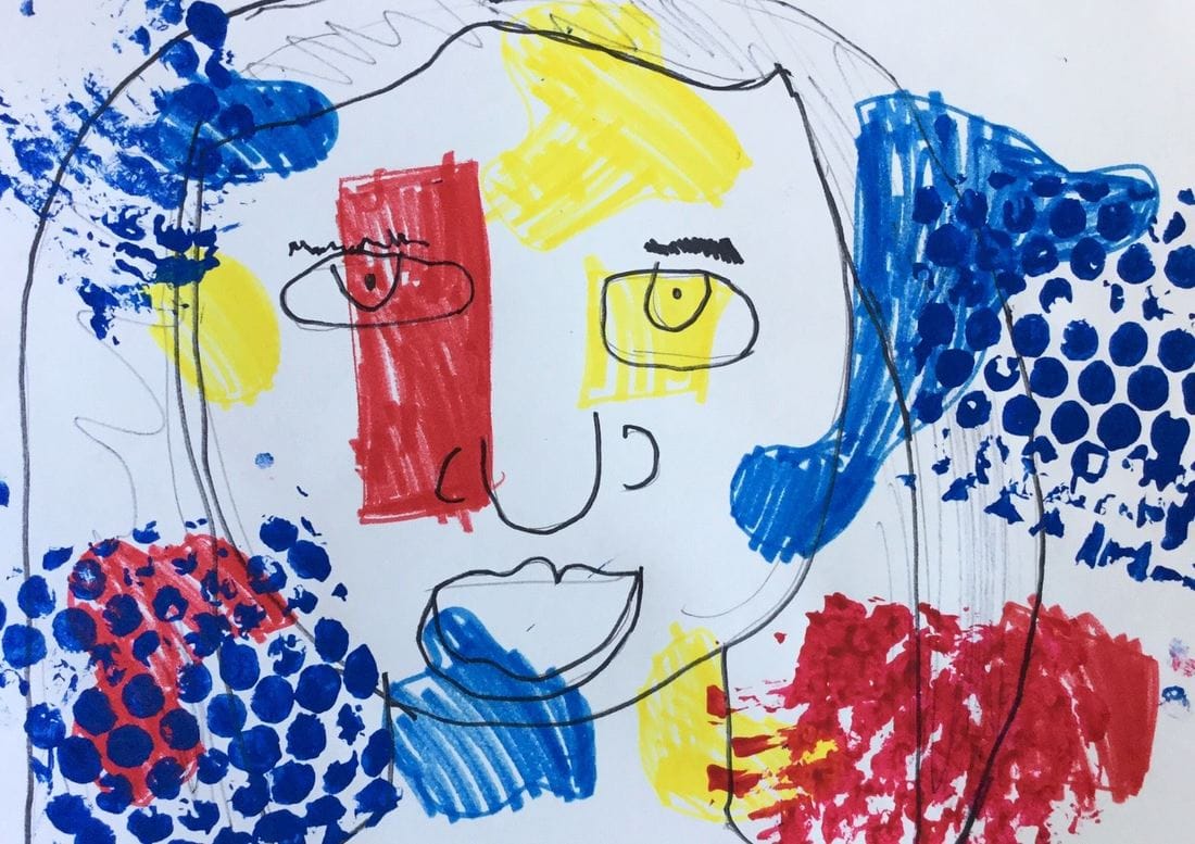 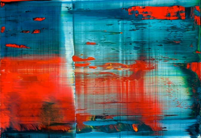 Gerhard Richter is a contemporary German artist who is well-known for his photorealistic paintings that he then blurs using a soft brush or squeegee. He is also famous for creating abstract paintings and then using a squeegee to scrape away paint. For this project, we painted two sheets of paper the primary colors. When painting, we had to work thickly and quickly with our paint so that it wouldn't dry. After students had covered their papers with the primary colors, they used a strip of tagboard to scrape away the paint on their paper. As they scraped, the primary colors would mix together and create the secondary colors. The kids thought this was the COOLEST THING EVERRRRR and I thought it was pretty cool too for re-learning our color mixing! As they scraped, they could also change the pressure to their scraping and it would create different effects on their paper. 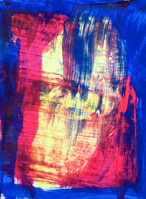 Each student made two paintings. One of the paintings they got to keep, the other painting I cut up into small strips that we then used in a weaving project. For the weaving project, each student got a sheet of paper that had slits cut into it. Students then practiced weaving their painted paper strips into it. Some students caught onto this right away while others struggled. I was really proud of the ones who got it and then helped teach it to their friends who were struggling with it. Throughout the weaving, we talked about patterns and how it is similar to ABAB patterns that they may have learned about in music. On the final day, we used construction paper crayons to add a different pattern to each row of the weaving. I think next time I will have them just do one pattern on the entire weaving rather than a new pattern for each row. 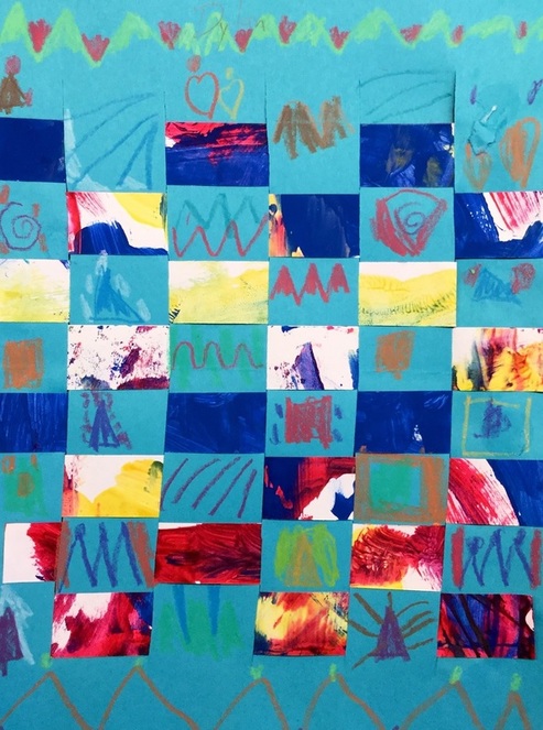 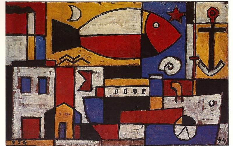 This is a project that I saw over at shinebritezamorano.com which is a super awesome art teacher blog. 1st grade recently finished up their project on Joaquin Torres Garcia. He was a Constructivist from Uruguay who used the primary colors in his work. His work looks a lot like Piet Mondrian’s except that Joaquin’s also uses some symbols within his work. Joaquin’s strong use of vertical and horizontal lines was a good recap for my 1st graders. We broke up our paper into various vertical and horizontal lines which created different sized squares and rectangles when they overlapped. Then we added other lines that we knew like angles and curves. We added a few symbols such as fish, people, houses, etc. Last but not least, we retraced everything with a black crayon. The second (and final) day of the project we used tempera cakes to paint everything using only our primary colors. |
Devon CalvertHarmony and Consolidated Elementary Art Teacher in Milton, WI. UW-Eau Claire graduate. WAEA President. Apple Teacher. 
Archives
April 2018
Categories
All
|


 RSS Feed
