|
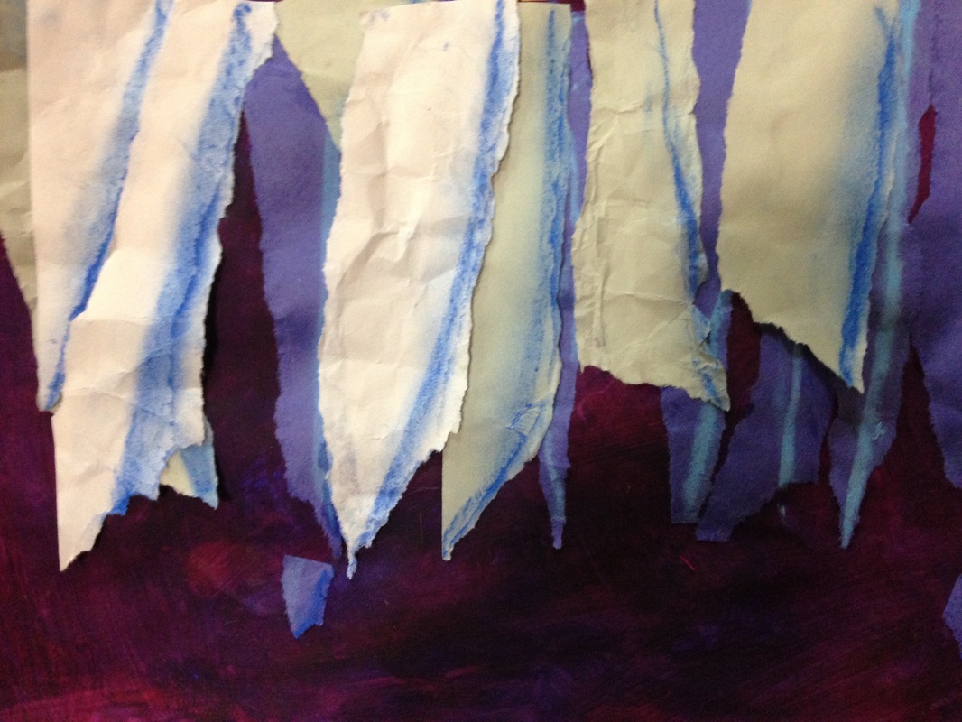
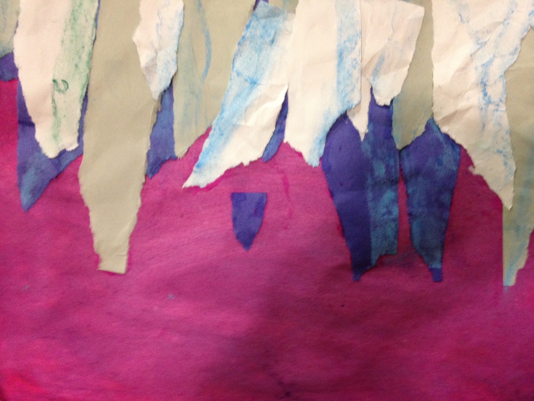
So this was a project that I got from a super rad teacher named Don Masse. He runs the Shine Brite Zamorano blog which is one of my faves! I had the privilege of meeting him during an art Twitter chat that I recently hosted. So we kicked off this project by watching videos of ice caves. We also talked about Wisconsin's ice caves on the Apostle Islands. We began the art-making by talking about secondary colors. Secondary colors are made by mixing two primary colors together. So the secondary colors are purple, green, and orange. Although we only used purple for this project, I thought it would be a good idea to at least talk about the other two. Students painted their paper red and then painted blue on top of it, mixing the colors right on their paper to make purple. Depending on how much blue or red they used, could effect whether they ended up with a blue-purple or a red-purple. The first day, we also tore a blue paper into triangular shapes to create icicles. We added a blue shadow with chalk to the same side on each icicle before gluing them down. This was a SUPER messy day because the students were gluing their icicles onto wet paint. The second day, we continued to to tear paper to add icicles. This time we tore grey paper and then white. Some of the icicles we began to crumple up. This created texture in our art. Texture is how something feels or how something looks like it feels. After adding their chalk shadows and gluing them down, we got a great sense of space in our paintings. Now I'm not talking about that space up in the sky, ya'll. Space in art is the illusion of depth. We talked about this on the second day. Because the blue icicles were in the back, and then the grey, and then the white, it created the illusion of depth because the darker colors were furthest away. We also talked about how overlapping creates a sense of depth. This lesson was packed full of art content and they rocked it once again!
0 Comments
|
Devon CalvertHarmony and Consolidated Elementary Art Teacher in Milton, WI. UW-Eau Claire graduate. WAEA President. Apple Teacher. 
Archives
April 2018
Categories
All
|
 RSS Feed
