|
0 Comments
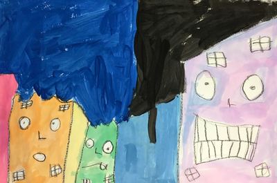
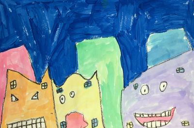
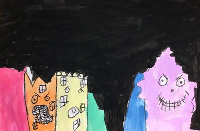
I believe this project was one that I snagged from the Jamestown Elementary blog? It's a great introduction to foreground and background for my 1st graders, as well as a refresher on the order of the rainbow! Read the details here!
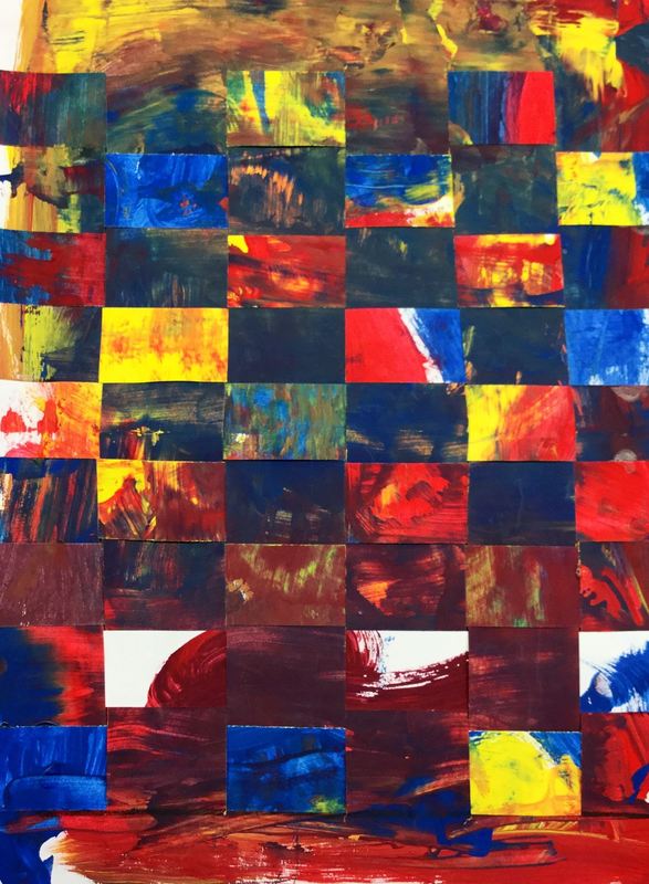
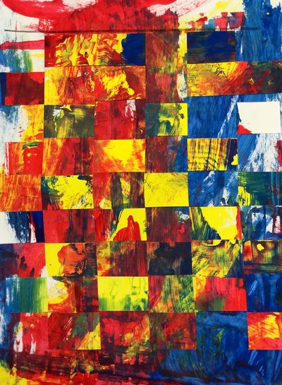
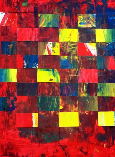
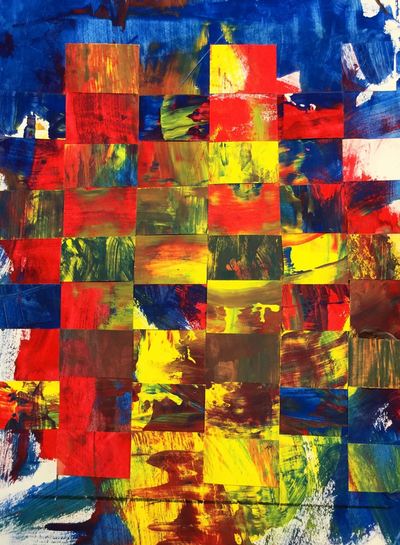
Here is a project I do based on Gerhard Richter. Students create two paint-scraped paintings using the primary colors. When they scrape the paint, the colors mix and create secondaries. Afterwards, I cut up one of their paintings and they weave their two artworks together. Here's a write-up on a previous Richter project I did.
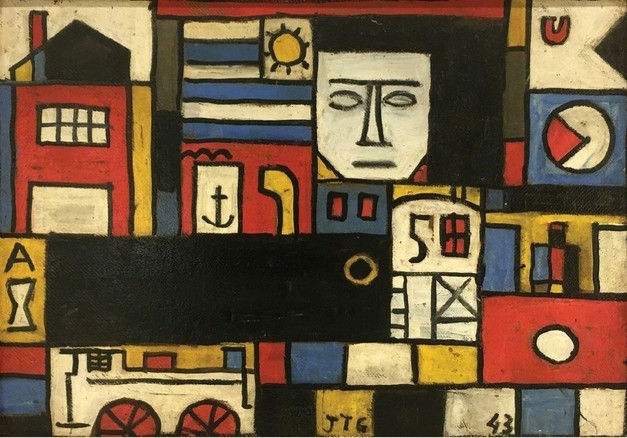
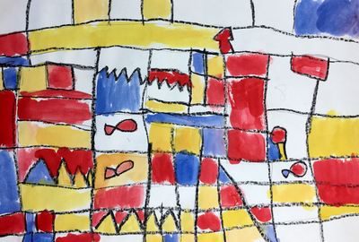
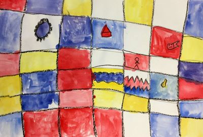
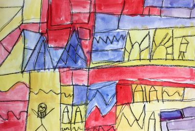
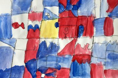
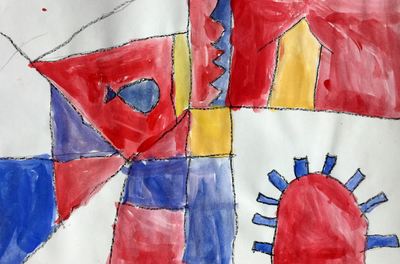
Like last year, 1st grade started the year with Joaquin Torres Garcia and his primary colored paintings! You can read all the details in last year's post which can be found here. Enjoy the pictures below!
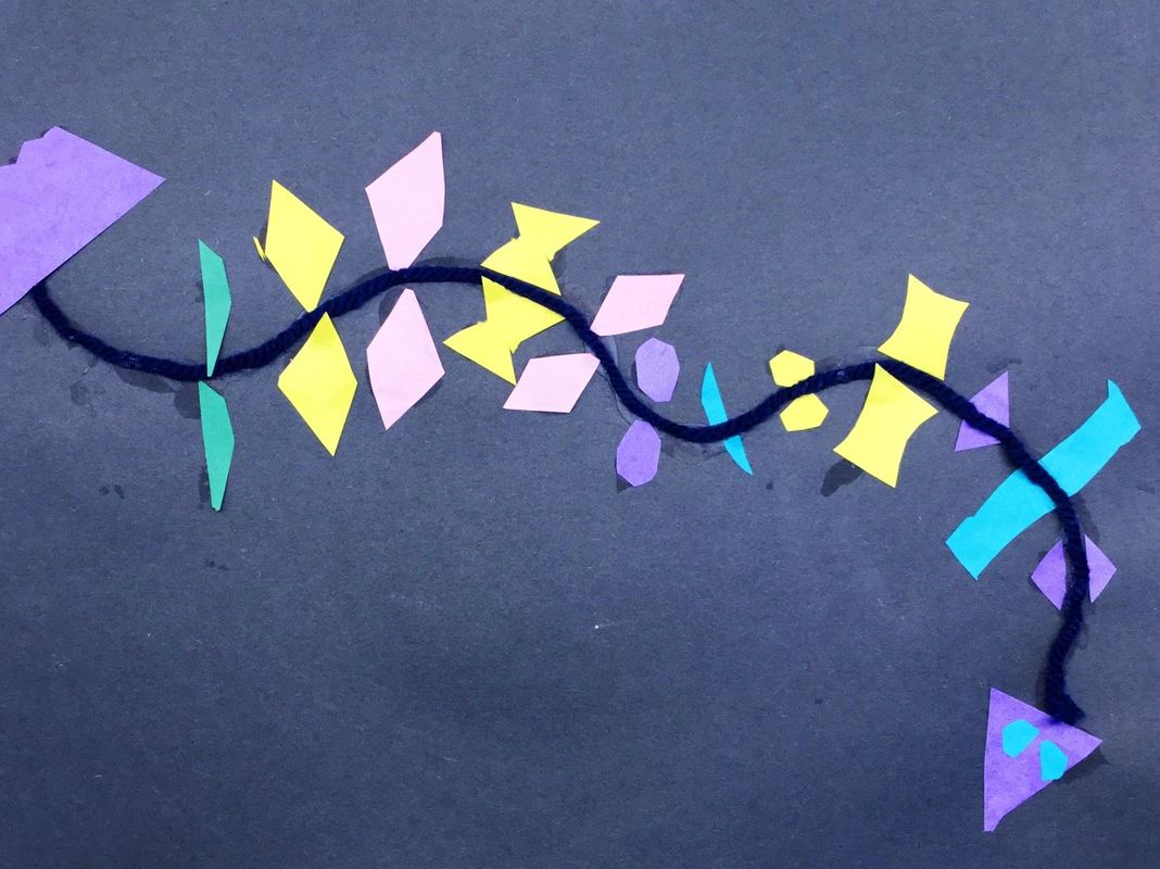
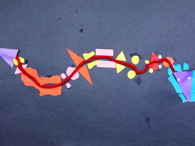
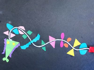
So we did this project a while ago in celebration of the Chinese New Year on January 28th. We talked about how there are 12 animals that rotate each year and how those animals represent certain characteristics in people. We also learned a bit about the significance of certain colors to the Chinese as well as a bit of history regarding the Chinese New Year.
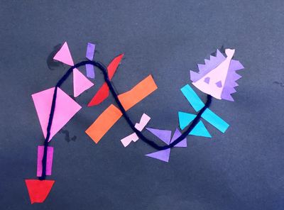
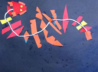
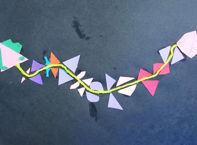
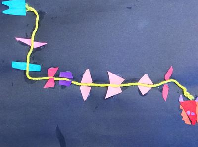
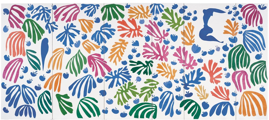
We started of by gluing down a piece of yarn onto our paper. Then we talked about symmetry and how things that are symmetrical are the same on both sides. We discussed some things that we see often that are symmetrical like people's faces and butterfly wings. After making a head and tail for their dragon, students were asked to fold pieces of paper in half and cut out various shapes. This would create two of each shape. They were then to glue one of each shape on either side of the yarn, making it symmetrical from the head all the way back to the tail. For this project, we checked out Henri Matisse's work. Matisse was a French artist who is most well-known for the paper cutouts (collages) he made. He used a mixture of both organic and geometric shapes to create his works. Late in life, he developed cancer. After a botched surgery, he was left wheelchair-bound and his vision was beginning to fail him. He oftentimes made art from the comfort of his bed, bringing the outside world into his room through his artwork. We started off the project watching a couple videos about Mr. Matisse. Then we discussed the difference between organic and geometric shapes. This was the big focus of the project. I explained to them that organic shapes look like blobs of spilled milk and geometric shapes are shapes that usually have names (circles, squares, diamonds, etc). The first day of the project was spent cutting out shapes of various sizes, colors, and a blend of geometric and organic shapes.
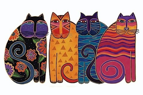
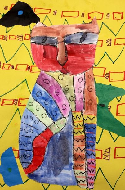
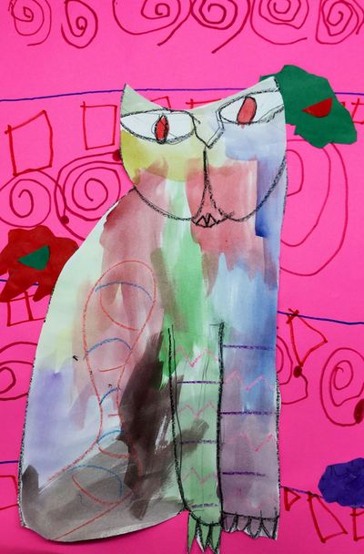
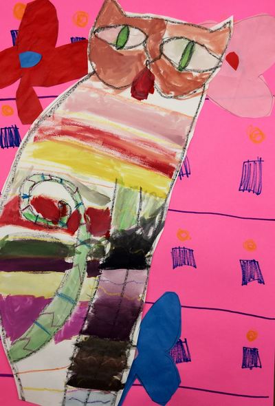
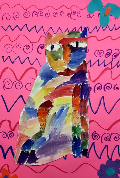
The following two classes were also spent cutting out and gluing shapes. Throughout the process, I emphasized that they be thoughtful with their shape placement when gluing stuff down. I'm really happy with some of the compositions! 1st grade checked out the work of Laurel Burch. Laurel was an American artist who is most well-known for her brightly colored and patterned paintings of animals, particularly cats. What I find so amazing about Laurel is that she had a condition in which her bones were so brittle that they often broke/fractured doing everyday things. It is estimated that she fractured over 100 bones throughout her life. Despite the immense pain that she was often in, her artwork was still so bright and cheerful. It makes you feel happy just looking at it! The first day was spent learning about Laurel and then drawing a cat. After drawing their cat and tracing it with crayon, they added three different patterns to the cats body with crayons.
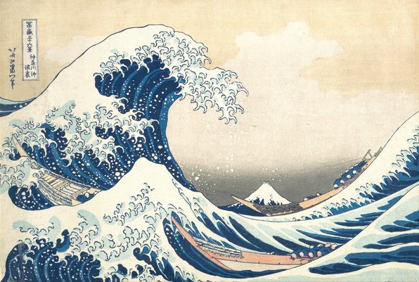
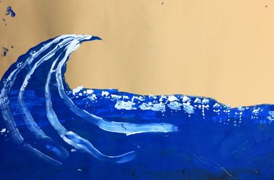
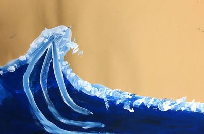
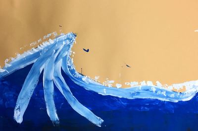
The 2nd day of the project, we talked about tints and shades. This is the first time we have talked about them since they were in kindergarten. Our artists used tempera cakes to mix tints and shades and add them to their cat. They mixed the colors right in the tempera cake pans. The final day was a busy one! They added a pattern to their background with markers. Then we talked about organic shapes and used those to create at least 3 flowers for the background. Lastly, they cut out their cat and glued it to the background. I was somewhat happy with the results, however, I would like to find a better way to go about painting them. A lot of students struggled with thinning out their paint with water and not making the paint go on their paper too thick. It's something that I will have to put more thought into the next time I do the project! Hokusai was a Japanese printmaker most well-known for his series titled Thirty-six Views of Mt. Fuji. Mt. Fuji is very important to the Japanese due to religious reasons. Of the series, The Great Wave off Kanagawa is the most famous. The print shows a menacing wave looking to crash down upon a small Mt. Fuji in the distance. The print symbolizes the everlasting nature of the mountain. While the waves will come and go, the mountain will always be there. This was a project that I got from Laura Lohmann over at Painted Paper. You can check out her project details here.
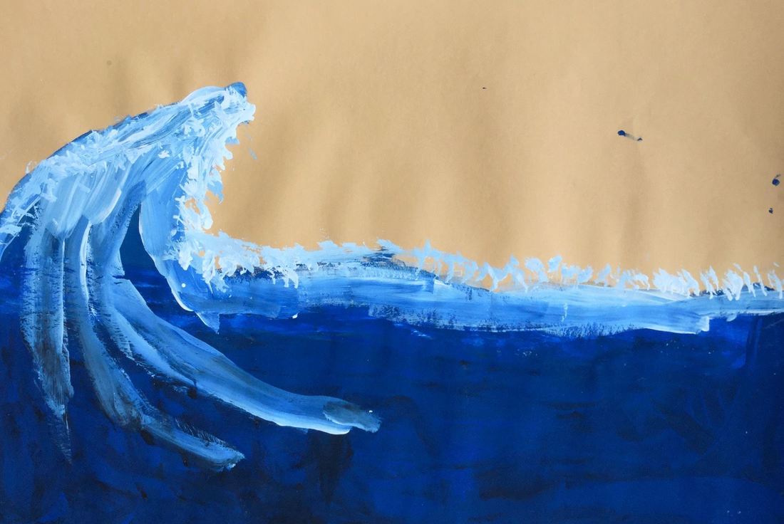
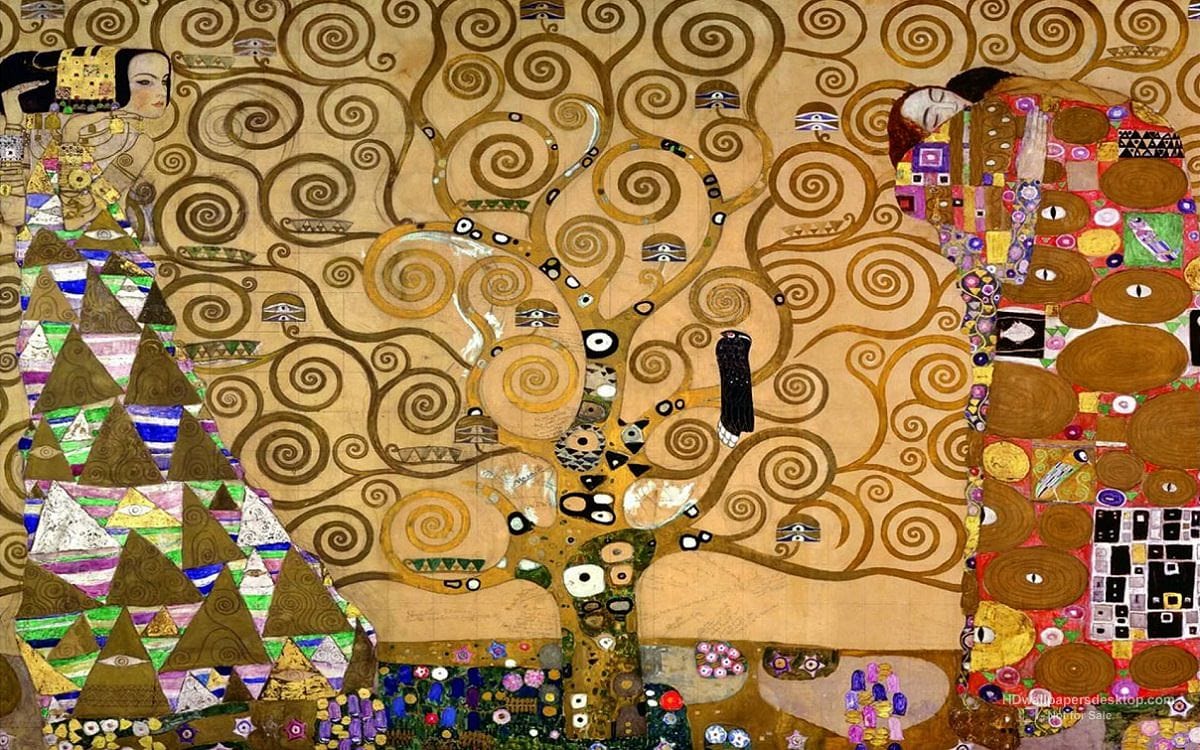
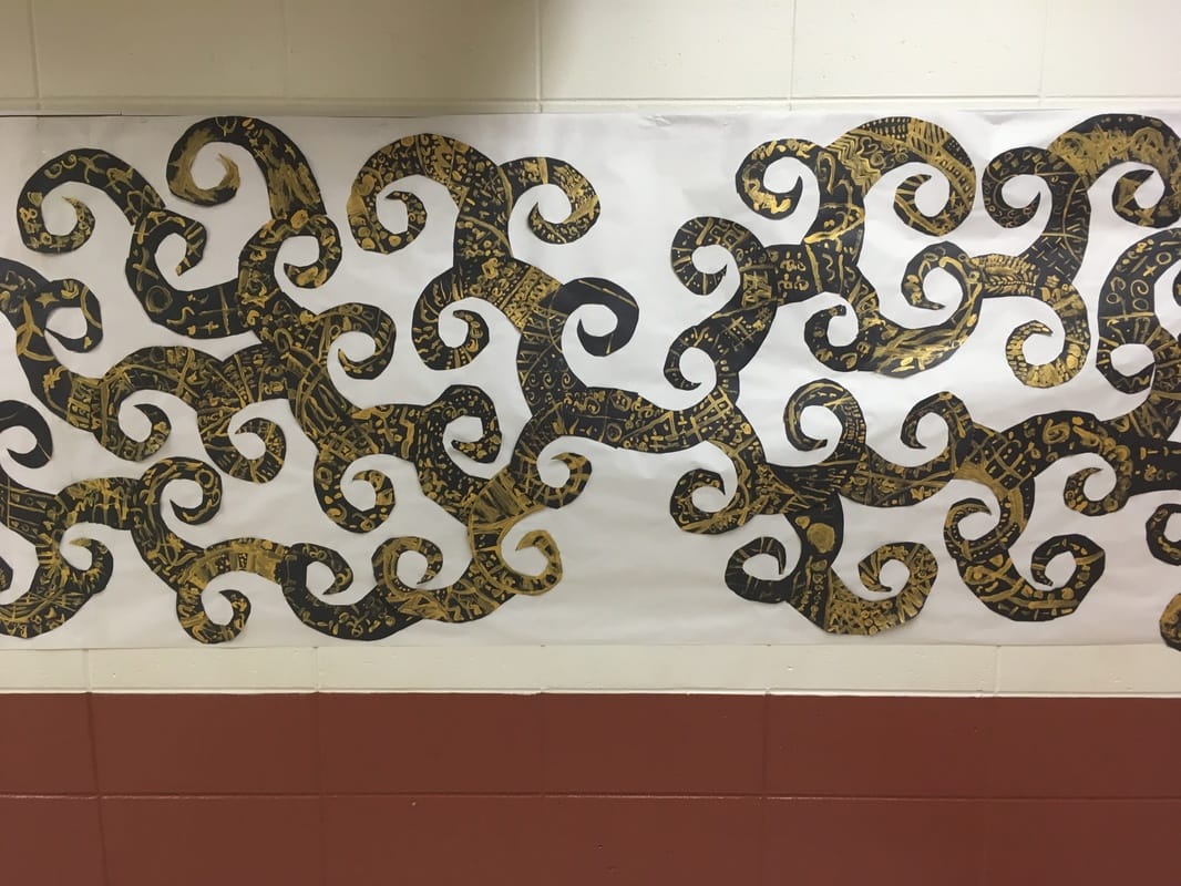
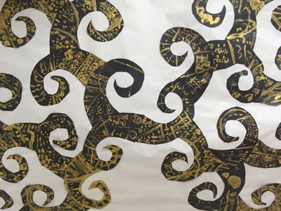
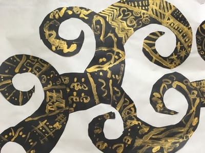
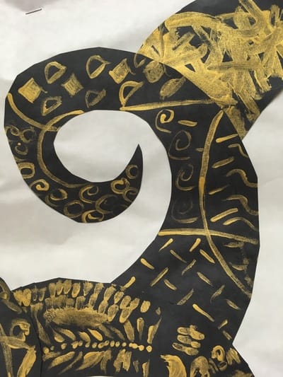
Our first day, we painted using black and white. Students started with white in the middle of their paper. They painted from the middle of their paper to about halfway between the middle and the bottom of their paper. Then they used black and started from the bottom and worked their way up to where they stopped with the white. Some of the black would mix with the white and create a gradient from white to grey to black. We talked about how when a color goes from light to dark, we call that value. The second day, they drew a large "C" shape on the top of their black and white value painting. From the top of the "C", they drew a diagonal line downward. This formed a large menacing wave. They painted their newly drawn wave with blue, as well as painting over their value painting from last class. When they painted the blue over their value painting, it made the top of the wave lighter and the bottom of the wave darker, creating a blue value scale. Then they used white paint to paint along the top of their wave, as well as some ripples in the water. Lastly, they dabbed some white paint along the top of the wave to make it look like spraying water. 1st grade did a quick one day project on Gustav Klimt a while back. Klimt was an Austrian artist known most notably for his painting which feature gold leaf. His artwork is also rich with patterns and spirals.
After taking a look at his work, each student traced a large spiral onto a black sheet of paper. Then they used GOLD PAINT (WOOHOO!) to paint 5 lines on their spiral. The lines helped divide the spiral up into smaller shapes. Lastly, they were asked to paint a different pattern in each of the shapes. When everyone was finished, I glued them together into a large collaborative mural based on Klimt's Tree of Life. |
Devon CalvertHarmony and Consolidated Elementary Art Teacher in Milton, WI. UW-Eau Claire graduate. WAEA President. Apple Teacher. Archives
April 2018
Categories
All
|







 RSS Feed
