|
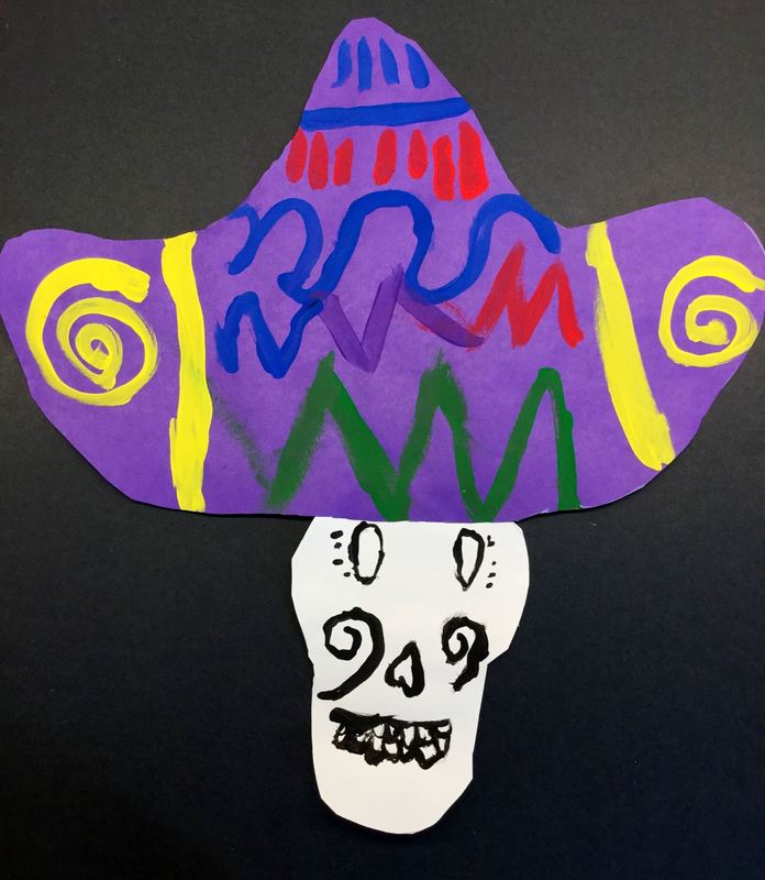
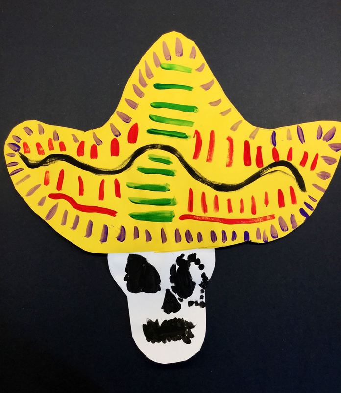
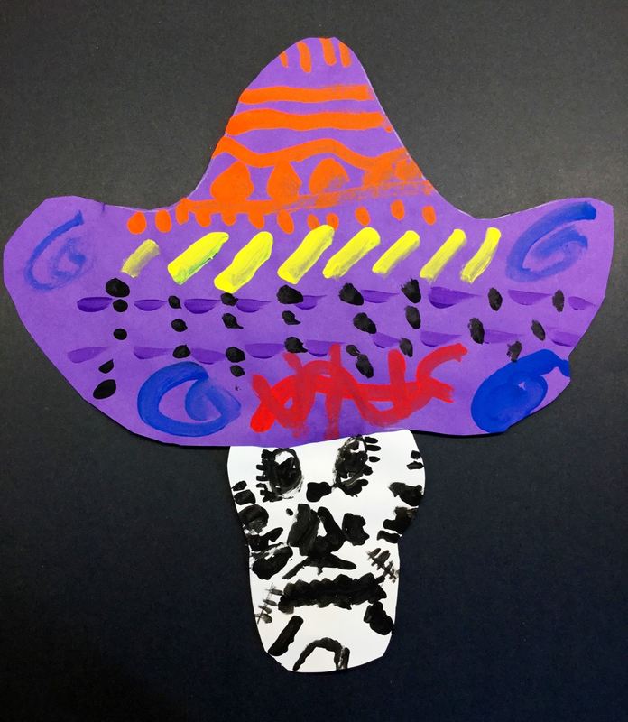
Check out these Day of the Dead inspired skulls and sombreros we made!
0 Comments
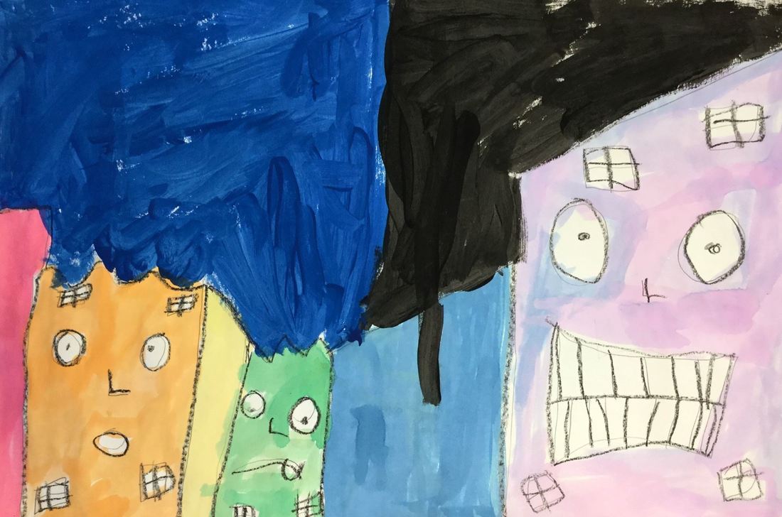
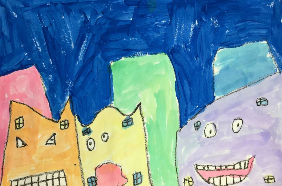
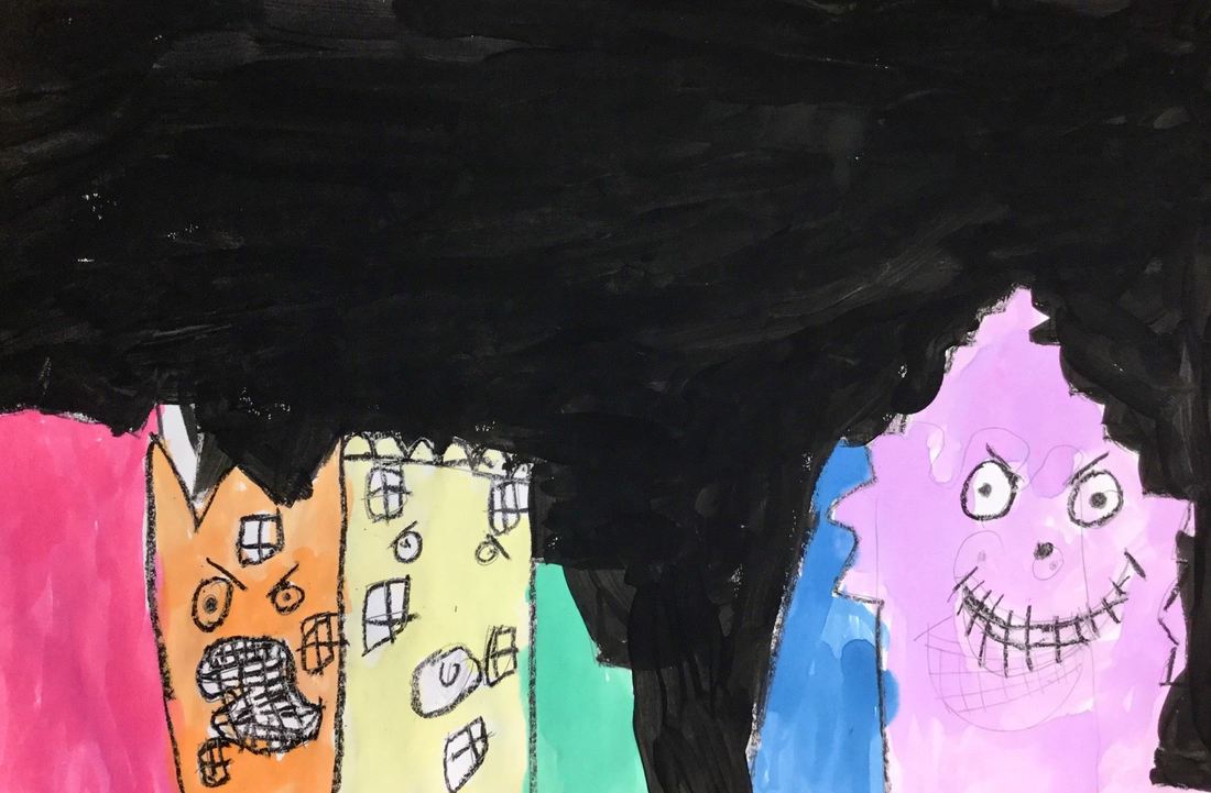
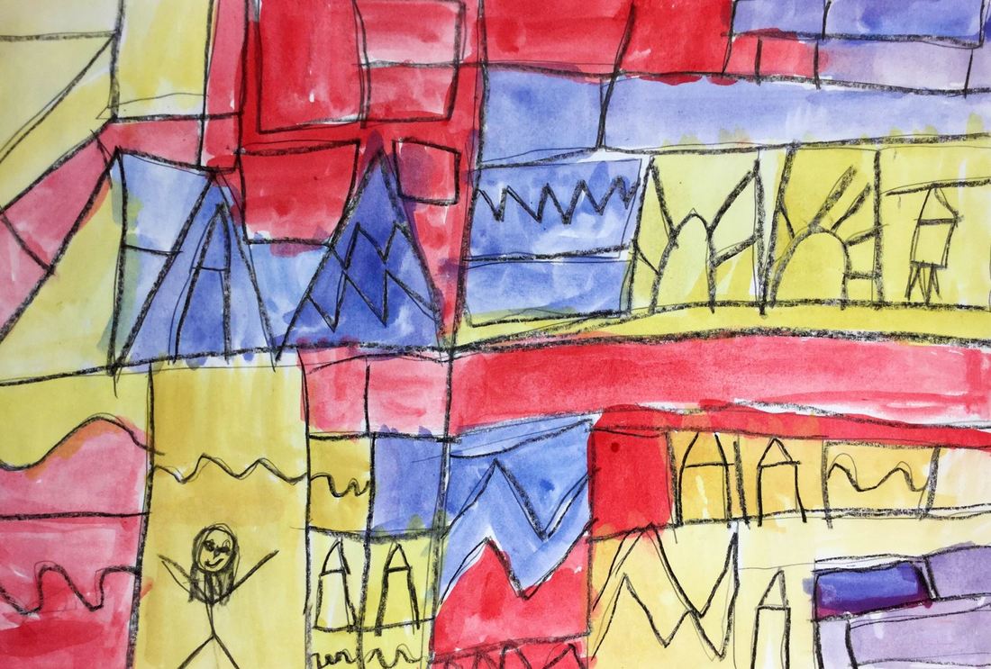
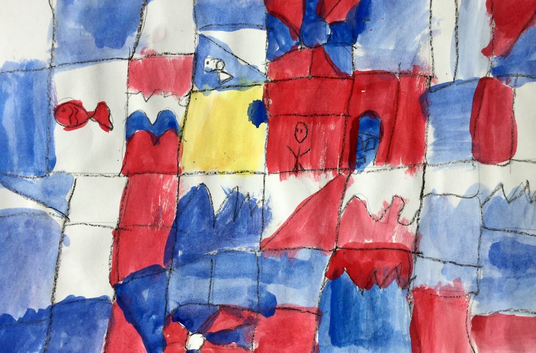
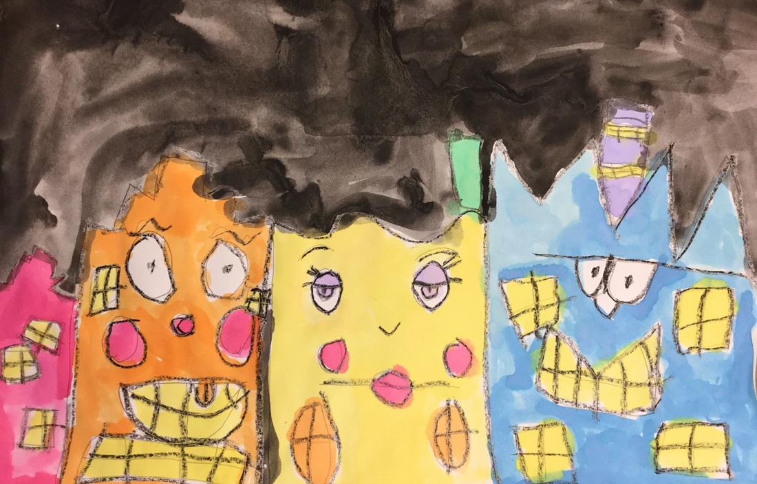
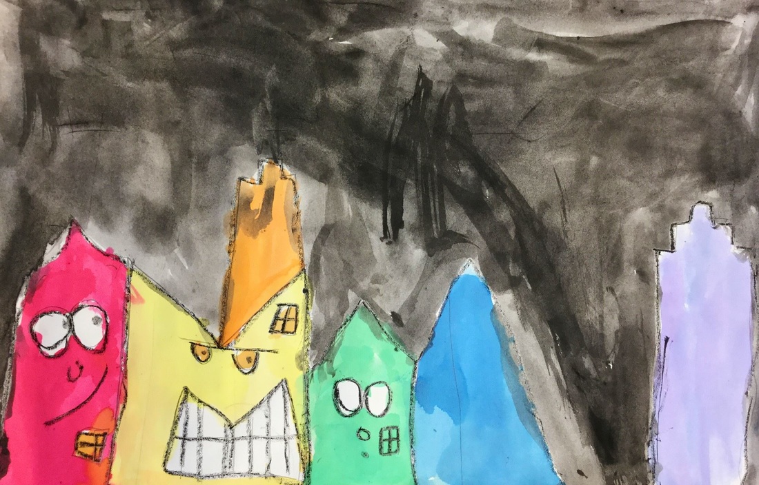
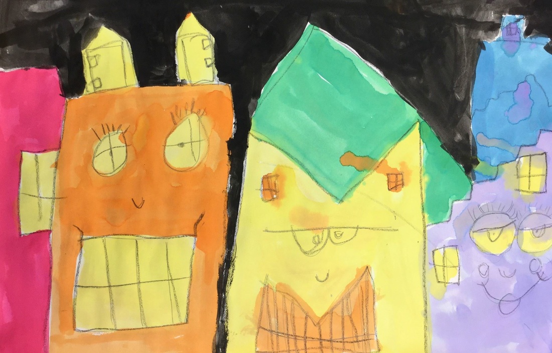
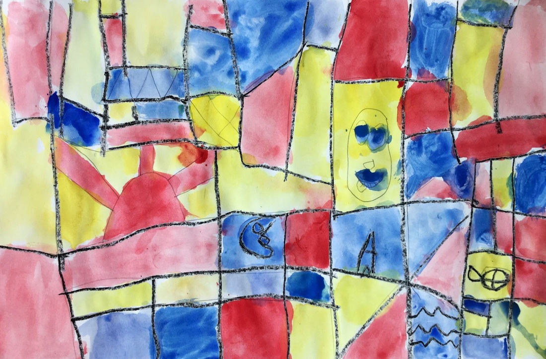
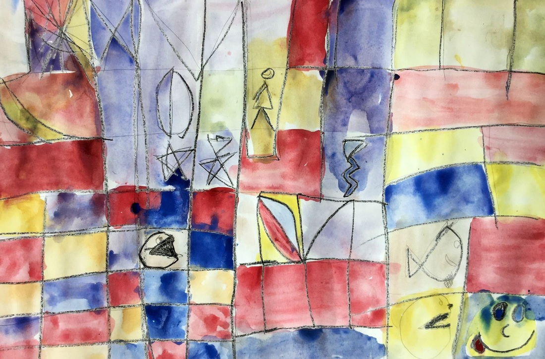
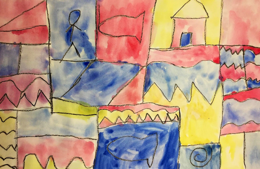
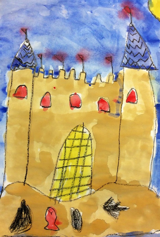
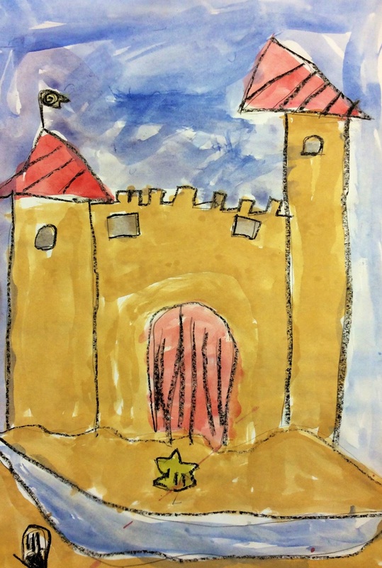
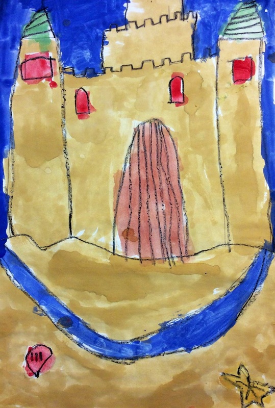
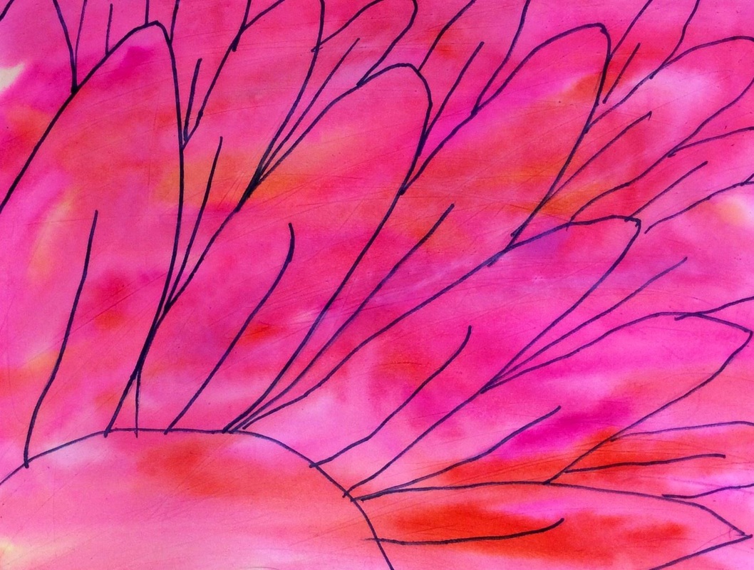
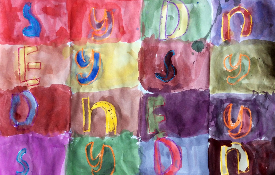
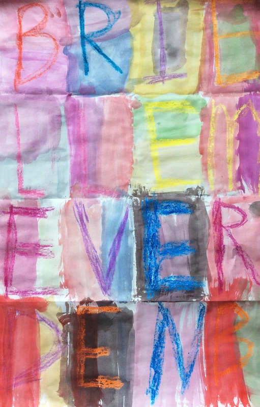
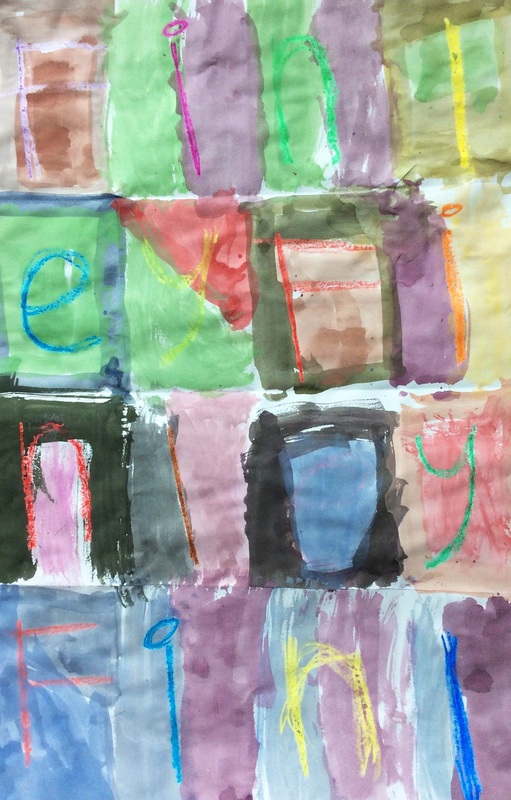
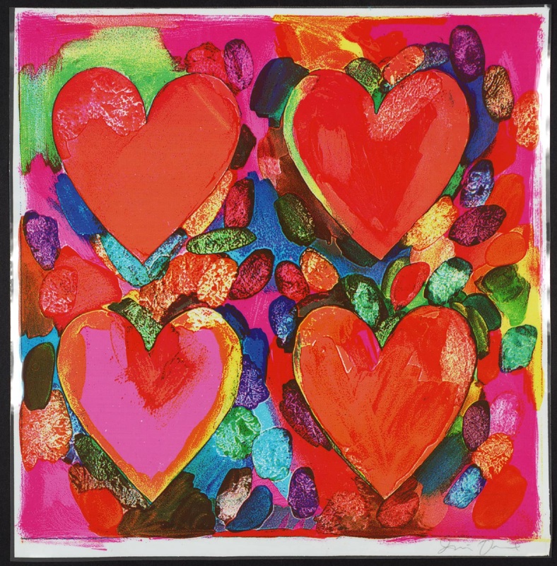
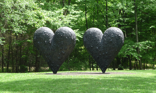
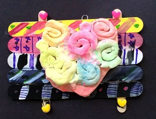
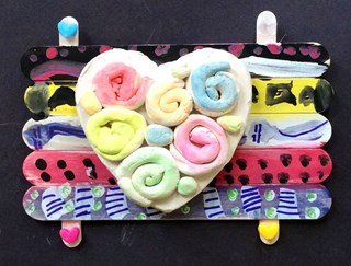
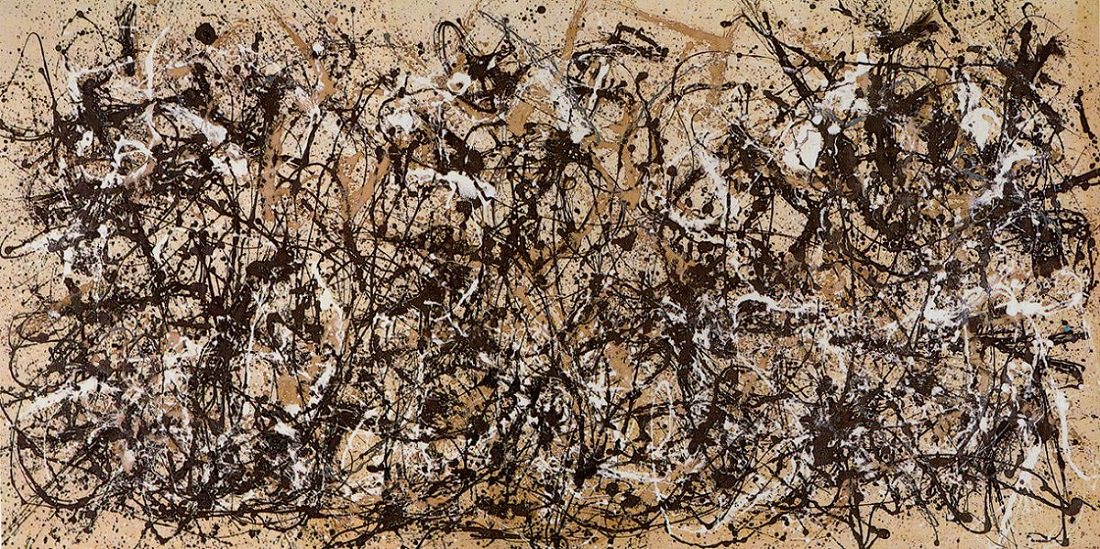
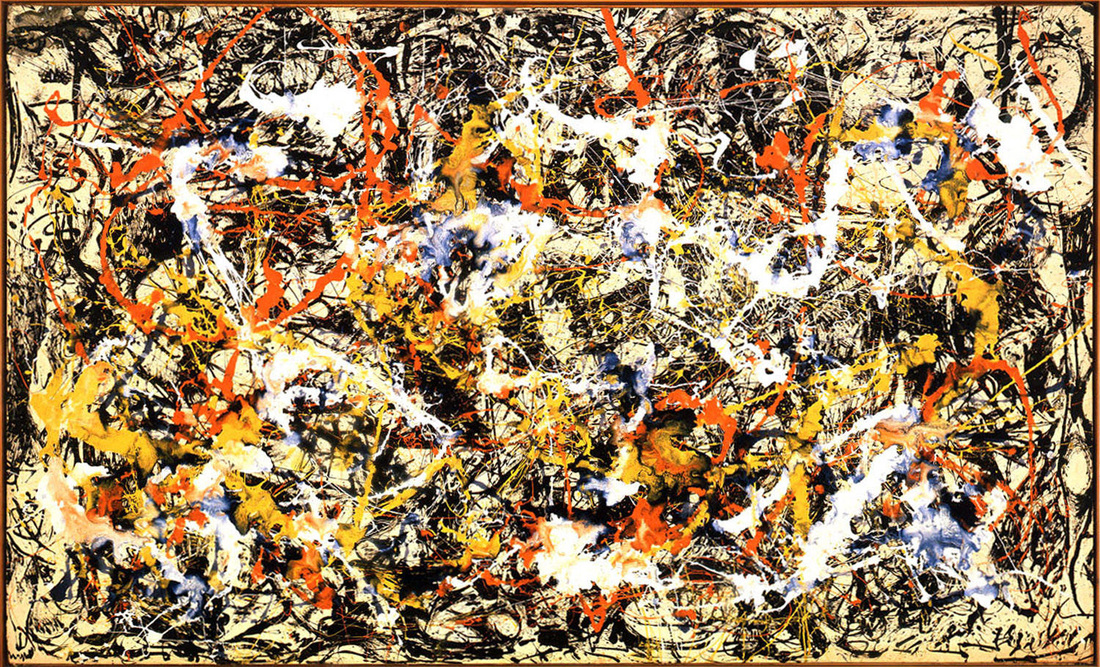
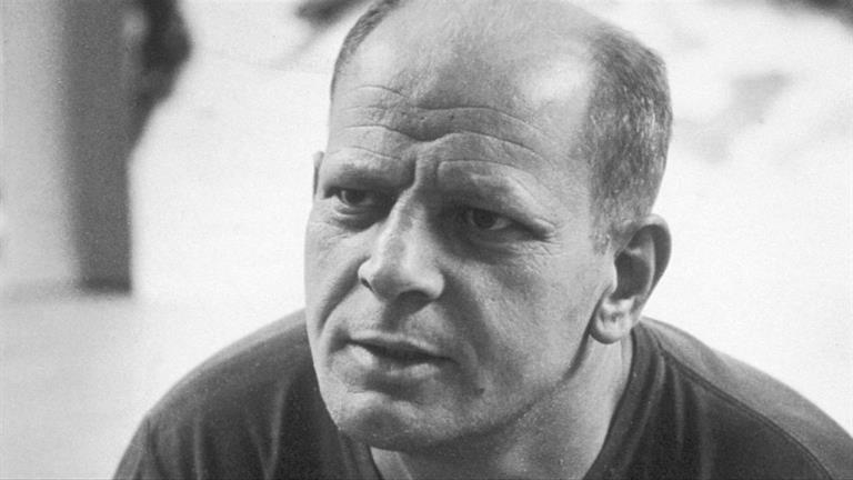
I believe this project was one that I snagged from the Jamestown Elementary blog? It's a great introduction to foreground and background for my 1st graders, as well as a refresher on the order of the rainbow! Read the details here! 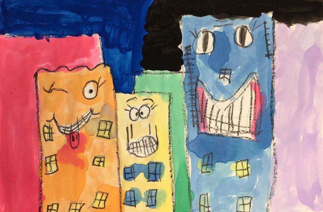 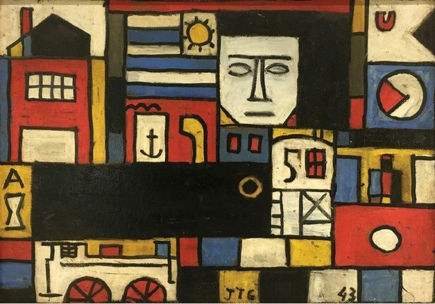 Like last year, 1st grade started the year with Joaquin Torres Garcia and his primary colored paintings! You can read all the details in last year's post which can be found here. Enjoy the pictures below! 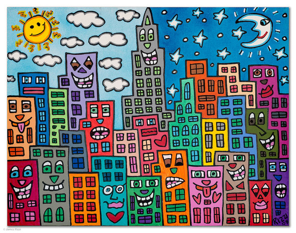 This is a project that I saw over at jamestownelementaryartblog.com James Rizzi was an American Pop Artist who is most well-known for his fun, bright, and cartoon-like depictions of skyscrapers. His skyscrapers typically feature faces with various expressions. We kicked things off by talking about space in Rizzi's work. We noticed that just because some buildings were bigger than others, doesn't mean that the bigger building was closer to us. We came to the conclusion that this idea of space was created by Rizzi's use of overlapping buildings. We also discussed the difference between foreground and background. We also talked about how buildings are typically made up of vertical, horizontal, and diagonal lines. Students drew 3 large buildings and added faces and windows to them. They finished off the class by tracing everything they drew with a black crayon. Next, we added 3 smaller buildings to go in our background and then traced them with a black crayon. We brushed up on ROY G BIV from last year and then used liquid watercolors to paint our buildings in rainbow order. On the last day, we finished up painting our buildings. Then painted our sky black. Lastly, we did some splatter painting with white paint to add stars to our sky. 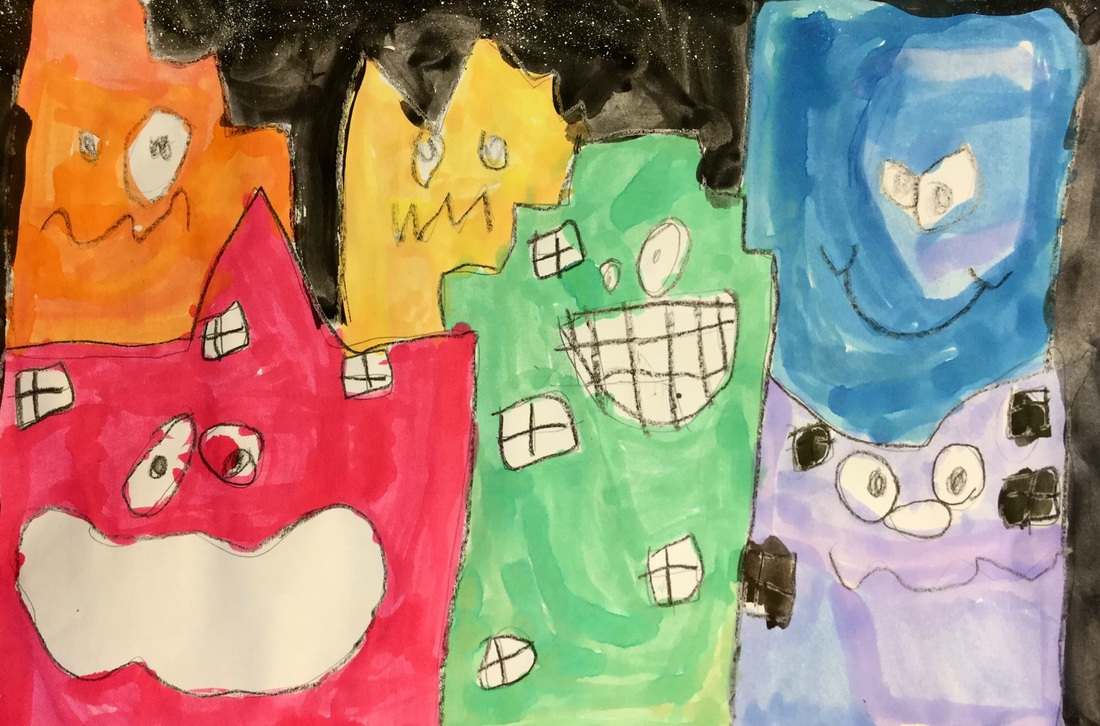 These expressions crack me up! 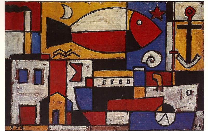 This is a project that I saw over at shinebritezamorano.com which is a super awesome art teacher blog. 1st grade recently finished up their project on Joaquin Torres Garcia. He was a Constructivist from Uruguay who used the primary colors in his work. His work looks a lot like Piet Mondrian’s except that Joaquin’s also uses some symbols within his work. Joaquin’s strong use of vertical and horizontal lines was a good recap for my 1st graders. We broke up our paper into various vertical and horizontal lines which created different sized squares and rectangles when they overlapped. Then we added other lines that we knew like angles and curves. We added a few symbols such as fish, people, houses, etc. Last but not least, we retraced everything with a black crayon. The second (and final) day of the project we used tempera cakes to paint everything using only our primary colors. With our recent string of warm weather, I've been all about summer-inspired projects! This was a project that I saw over at Create Art with Me's blog. It took us two days to do it but we probably could've stretched it out to three days if we had decided to add some more details. We spent the first day re-touching on the idea of space and how we can create it in our artwork. I was impressed that the students remembered the three different ways to create the illusion of space (changing color, size, and overlapping)! We took this into consideration when we drew our mighty sandcastles! Students were free to add details such as flags, draw bridges, etc. They also drew things like starfish and shells in the foreground (also super impressed that they remembered the difference between foreground and background)! After they finished drawing, they traced everything with a black crayon. They second day was spent painting with liquid watercolors and tempera cakes. As always, we also talked about proper use of Mr. Brush! 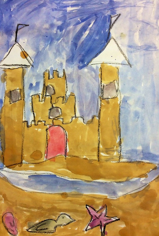 Check out that totes adorbs rubber ducky! 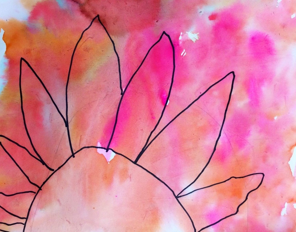 This was a quick one-day project about Georgia O'Keeffe. Believe it or not, she was from Sun Prairie, WI! That blew the kids' minds. We talked about how Georgia's paintings depicted enlarged flowers and because of their size those flowers became the emphasis/focal point of the artwork. We drew out a flower shape, really making sure that our flowers were HUGE! We also talked about how good artists having things come off the edge of the paper. After they drew their flower, they sharpie'd and then erased the pencil lines. We re-touched on the watercolor technique wet-on-wet. This was a method that we used on our fall leaves earlier in the year. We combined this painting technique with warm or cool colors to make these beautiful flowers! 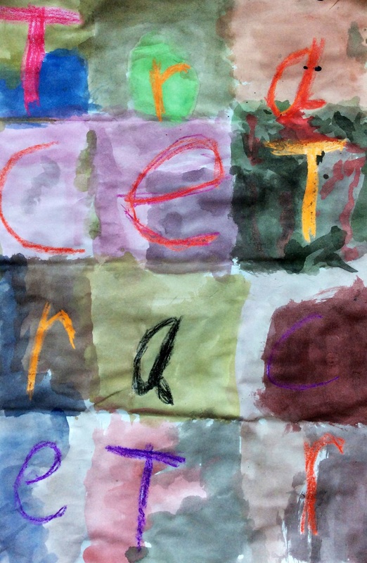 Kindergarten and 1st grade have been learning about Jasper Johns! Jasper Johns is an American Pop Artist who liked to make artwork of things that people had never really thought of as being art before, such as numbers, maps, and flags. His number paintings are often arranged into a grid like the picture above. I used this as motivation to do an artwork about students' names! Students first had to fold their papers twice in each direction (4 total folds) so that they would get 16 squares. They had to write one letter of their name in each square with a crayon, all the way until the end of their paper. I emphasized that they should go over their names a couple times so that their names stuck out from the paint a bit. Next they got to do my favorite thing, PAINT! We used tempera cakes to create tints and shades. A tint is any color that has white mixed with it, such as pink. A shade is any color that has black mixed with it. Students were to use two different colors in each square. These look great hanging above their cubbies! For this project, we checked out Jim Dine. Jim Dine is an American Pop Artist who was born in 1935 and is still alive! The kids love to learn about artists who are still living. Pop art is an art movement in which artists make art about things that are POPular. Mr. Dine chose to make art about hearts. The image of the heart is an iconic image that is recognized world-wide. I'd say that definitely falls into the "popular" category. Although we were a little late, I thought it would be nice to do an art project for Valentine's Day. 1st grade was SOOOOOOO excited to finally get to work with clay. Before the project started, I went ahead and used a cookie cutter to cut out some hearts from the clay. The hearts would act as the base to what the students would be doing. On the first day of the project, I introduced Jim Dine and clay to the students. Each student was given a heart that had been cut out of clay. I then showed them how to make coils (clay spaghetti noodles) by rolling the clay between their hands/table. These coils were then rolled up into little spirals. We attached the spirals to our clay heart base by a technique called "slipping and scoring." This is when you scratch up the two clay surfaces and rub a little water on them. This helps the two clay pieces to stick together. If you do not do this, the clay will probably fall apart in the kiln (clay oven). When I long-term subbed for Tasha Newton in Fall Creek, she showed me that you could slip and score clay using a toothbrush so that's what I had my students do. This makes slipping and scoring SOOOOO much easier. Any little spots that didn't have clay coils, students were to attach a small ball of clay. While the clay dried and was put in the kiln, we worked on our backgrounds. I made the backgrounds beforehand so i didn't have to worry about students burning themselves with the hot glue gun. We talked about patterns and how that is something that repeats over and over. You can have a pattern of lines, shapes, colors, stripes, etc. We used tempera paint to paint our popsicle sticks all one color. We then added patterns on top of the base colors. For the final day of the project, we talked about contrast. If something has high contrast, it means that two things are nothing alike (black and white, red and green, big and small, smooth and rough, etc). If it has low contrast, the two things are somewhat similar. We would be using high contrast on our project. Because our backgrounds had nice bright, saturated colors, our clay hearts would be a bit lighter so that they didn't blend in with our background. We painted our clay hearts using neon tempera cakes. The students were amazed that the clay soaked up the water and paint and was instantly dry after they had painted it! After they finished painting their heart, they used purple and lime green sharpies to add extra details to their backgrounds. We added shapes, stripes, polka dots, etc. Lastly, they glued four small heart-shaped beads onto their background. I glued their hearts to their backgrounds after school. I am not a big fan of working with clay, but I LOVEDDD how these turned out. Mr. Pollock was a painter who lived from 1912 to 1956, ultimately dying in a car crash at the young age of 44. As most of you probably know, Jackson was famous for his "drip paintings." Oftentimes, people exclaim "Well I could've done that!" But the reason Mr. Pollock is famous is because he was a pioneer of the method during a time when people were dabbling more and more into abstract art. He was known for splattering, spraying, squirting, dripping, and pouring paint onto his canvas. He used all sorts of materials to do this such as brushes, sticks, spatulas, spoons, etc. He worked with his canvas on the floor so that he could "dance" around it as he worked. Throughout this project, I made sure to emphasize that our paintings would NOT look like Pollock's. We were just using a few different techniques that might look like something he would do. On the first day of the project, we GENTLY splatter painted white stars onto a black background. We also looked at rocket ships before drawing one and tracing them with a marker. Lastly, we used tempera cakes to paint our rocket. The second day of the project, we cut out 4 or 5 different sized circles. We put a dot of glue stick on the back of each circle and placed them onto a large modified picture frame that I had made. I had removed the glass from the frame. Students could then lightly glue their circles down to the back of the picture frame. Then we placed marbles and paint into the frames. The frames were large and required two students to gently roll the marbles around the frame, creating streaks of paint across our circles. These would later become our planets. I also took a picture of each student while they acted like they were floating. On the final day, we cut out our rocket ship and glued it on. We also glued down our planets onto the background. We cut the picture of ourselves out and glued that down too. So much cutting and gluing this class! Lastly, they used a silver marker to add a tether between their rocket ship and themselves. 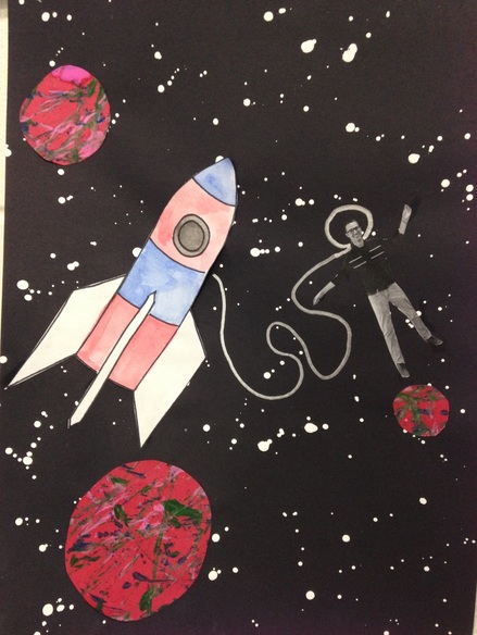 Usually I would put student work here, but I don't think I should be posting pictures of students' faces. So this is what the outcome looked like. |
Devon CalvertHarmony and Consolidated Elementary Art Teacher in Milton, WI. UW-Eau Claire graduate. WAEA President. Apple Teacher. 
Archives
April 2018
Categories
All
|


 RSS Feed
