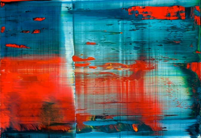
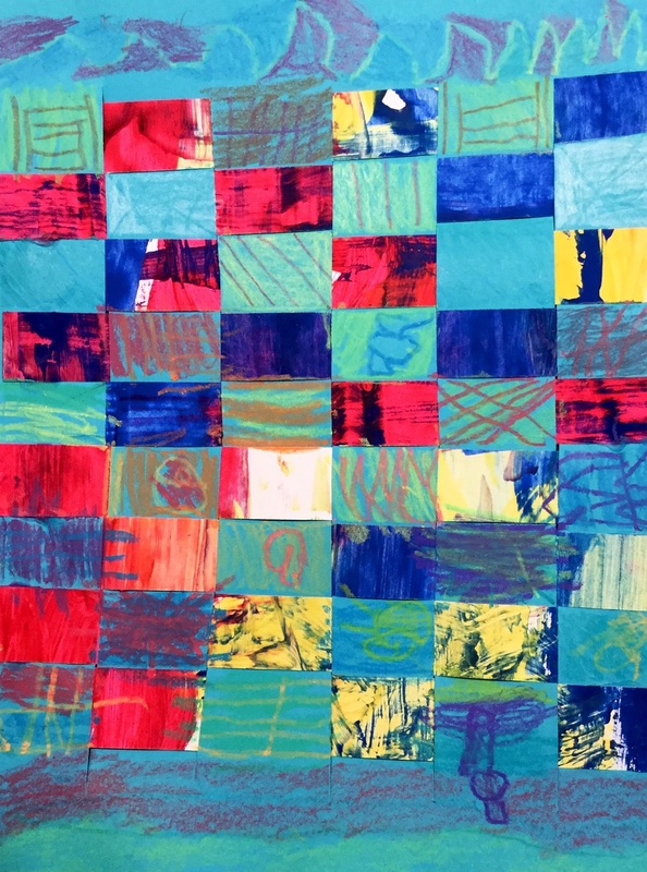
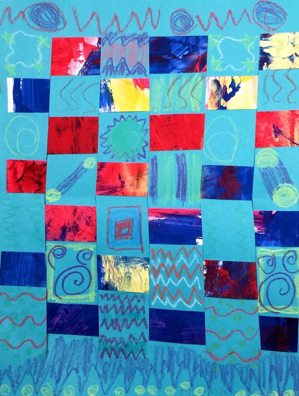
 Gerhard Richter is a contemporary German artist who is well-known for his photorealistic paintings that he then blurs using a soft brush or squeegee. He is also famous for creating abstract paintings and then using a squeegee to scrape away paint. For this project, we painted two sheets of paper the primary colors. When painting, we had to work thickly and quickly with our paint so that it wouldn't dry. After students had covered their papers with the primary colors, they used a strip of tagboard to scrape away the paint on their paper. As they scraped, the primary colors would mix together and create the secondary colors. The kids thought this was the COOLEST THING EVERRRRR and I thought it was pretty cool too for re-learning our color mixing! As they scraped, they could also change the pressure to their scraping and it would create different effects on their paper. 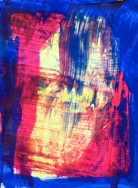 Each student made two paintings. One of the paintings they got to keep, the other painting I cut up into small strips that we then used in a weaving project. For the weaving project, each student got a sheet of paper that had slits cut into it. Students then practiced weaving their painted paper strips into it. Some students caught onto this right away while others struggled. I was really proud of the ones who got it and then helped teach it to their friends who were struggling with it. Throughout the weaving, we talked about patterns and how it is similar to ABAB patterns that they may have learned about in music. On the final day, we used construction paper crayons to add a different pattern to each row of the weaving. I think next time I will have them just do one pattern on the entire weaving rather than a new pattern for each row. 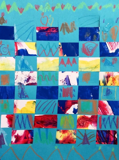
0 Comments
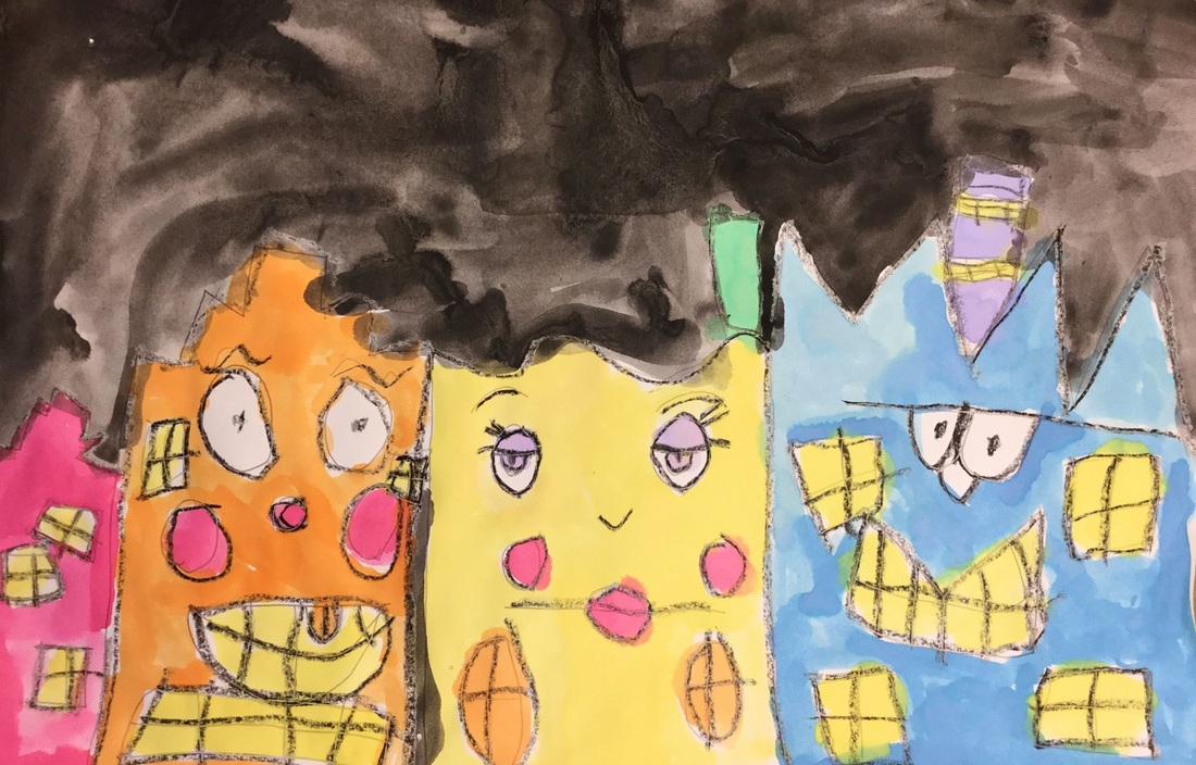
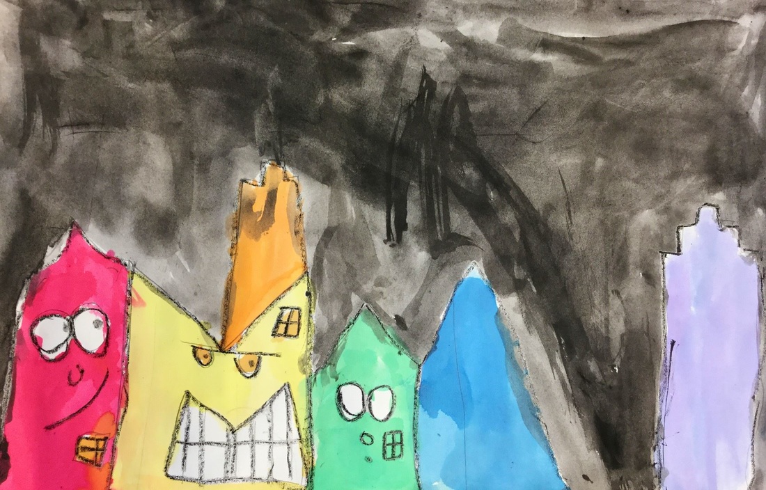
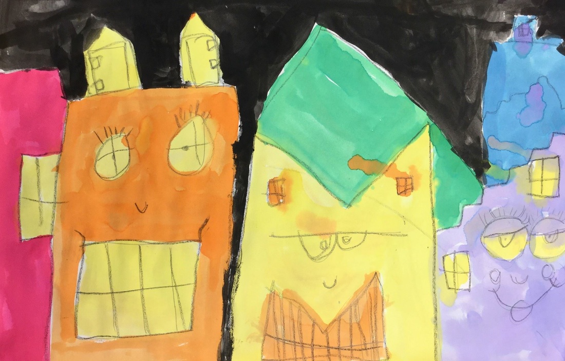
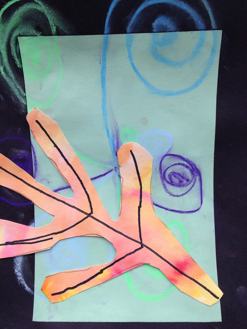
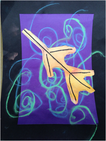
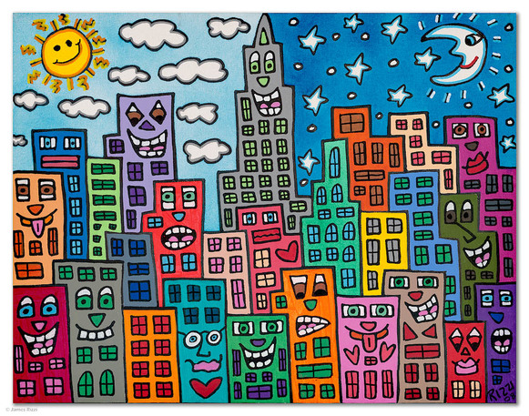 This is a project that I saw over at jamestownelementaryartblog.com James Rizzi was an American Pop Artist who is most well-known for his fun, bright, and cartoon-like depictions of skyscrapers. His skyscrapers typically feature faces with various expressions. We kicked things off by talking about space in Rizzi's work. We noticed that just because some buildings were bigger than others, doesn't mean that the bigger building was closer to us. We came to the conclusion that this idea of space was created by Rizzi's use of overlapping buildings. We also discussed the difference between foreground and background. We also talked about how buildings are typically made up of vertical, horizontal, and diagonal lines. Students drew 3 large buildings and added faces and windows to them. They finished off the class by tracing everything they drew with a black crayon. Next, we added 3 smaller buildings to go in our background and then traced them with a black crayon. We brushed up on ROY G BIV from last year and then used liquid watercolors to paint our buildings in rainbow order. On the last day, we finished up painting our buildings. Then painted our sky black. Lastly, we did some splatter painting with white paint to add stars to our sky. 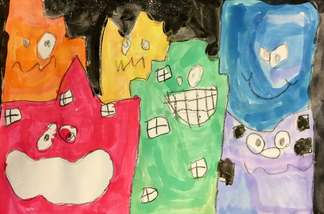 These expressions crack me up! This is a project that I saw on Mrs. Picasso's blog. I've recently taken a liking to her blog. She has some really cool projects. Because our Leif Erikson Day project had pushed us back a bit into the fall, I wanted to do a quick fall project to celebrate the falling of the leaves. During this project, we started out by retouching on cool colors. We had previously learned about these on our Echelman weavings. Then I introduced warm colors to them. Warm colors typically remind us of fire (red, yellow, orange) while cool colors remind us of water and ice (blue, purple, green). Students chose a cool colored paper and glued it in the center of a larger black sheet of paper, creating a black frame around the cool color. This then went on the drying rack to dry for next class. Next, I showed them the wet-on-wet watercolor technique. We used super nice paper (being careful to emphasize how important this paper was) to paint water all over it. Then we took warm colored watercolors and painted them on our wet paper. This causes the colors to bleed and spread out. For the next class, we took our black and cool colored background and created cool colored chalk swirls on the background. We traced the lines a couple times with our fingers to smear the lines a touch. Then we drew a leaf onto our warm colored wet-on-wet paper and added some veins to the leaf with a sharpie. To finish off the project, we cut out the leaf and glued it onto the background. When gluing it to the background, we talked about composition and how good artists let their artwork come off the page a bit. We also talked about making our leaf look like it was floating down to the ground, rather than just being in the center of our page. I also gave them a writing prompt at the end of the project in which they were to write three sentences about why they liked fall.
|
Devon CalvertHarmony and Consolidated Elementary Art Teacher in Milton, WI. UW-Eau Claire graduate. WAEA President. Apple Teacher. 
Archives
April 2018
Categories
All
|


 RSS Feed
