|
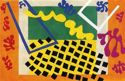
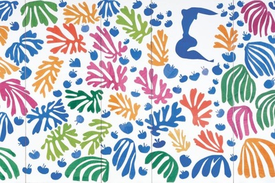
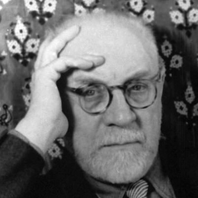
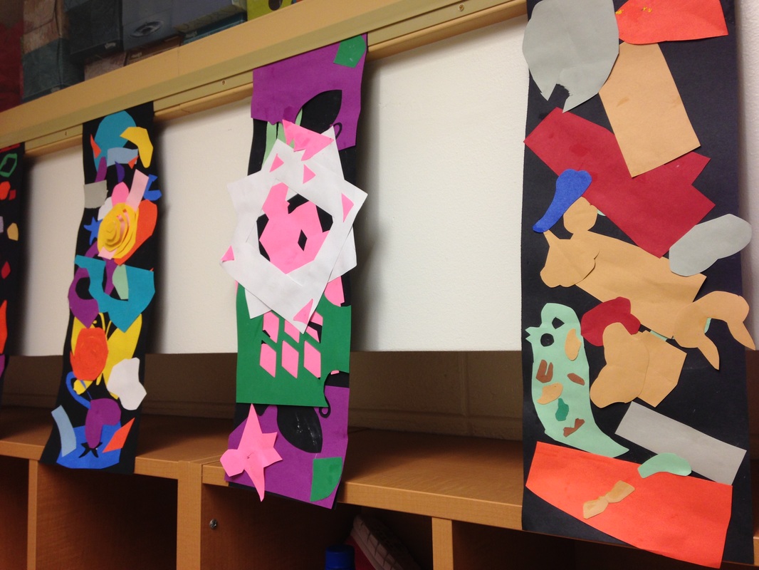
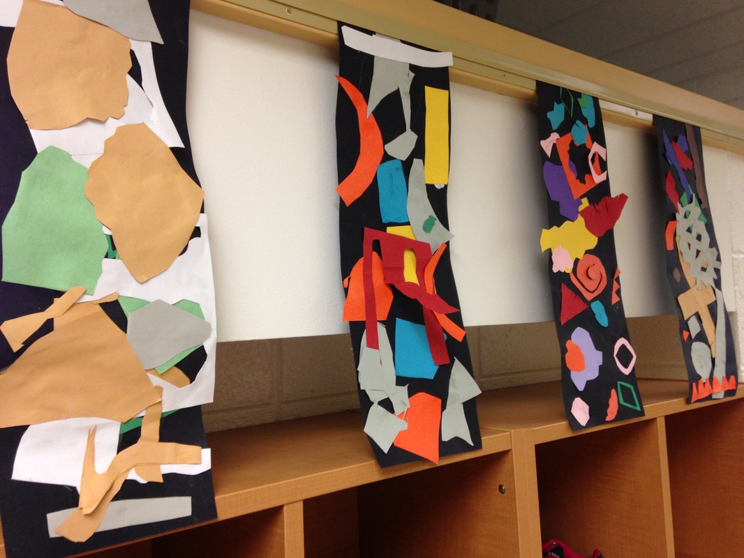
For this project, we checked out Henri Matisse's work. Matisse was a French artist who is most well-known for the paper cutouts (collages) he made. He used a mixture of both organic and geometric shapes to create his works. Late in life, he developed cancer. After a botched surgery, he was left wheelchair-bound and his vision was beginning to fail him. He oftentimes made art from the comfort of his bed, bringing the outside world into his room through his artwork. We started off the project watching a couple videos about Mr. Matisse. Then we discussed the difference between organic and geometric shapes. This was the big focus of the project. I explained to them that organic shapes look like blobs of spilled milk and geometric shapes are shapes that usually have names (circles, squares, diamonds, etc). The first day of the project was spent only cutting out shapes. I stressed that their cutouts should be various sizes, colors, and a blend of geometric and organic shapes.
Most of the second class was spent cutting out shapes as well. I allowed them to start gluing shapes onto their black background with the last ten minutes of class left. I emphasized that they needed to lay out their shapes first though to get an idea of where they wanted their shapes at. Students were welcome to keep cutting if they felt they needed too, which many did! On the final day of the project, the students finished cutting out any shapes that they needed and glued them onto their background. When they were finished, they took a quick quiz on Mr. Matisse.
0 Comments
This is a project that I saw on Mrs. Picasso's blog. I've recently taken a liking to her blog. She has some really cool projects. Because our Leif Erikson Day project had pushed us back a bit into the fall, I wanted to do a quick fall project to celebrate the falling of the leaves.
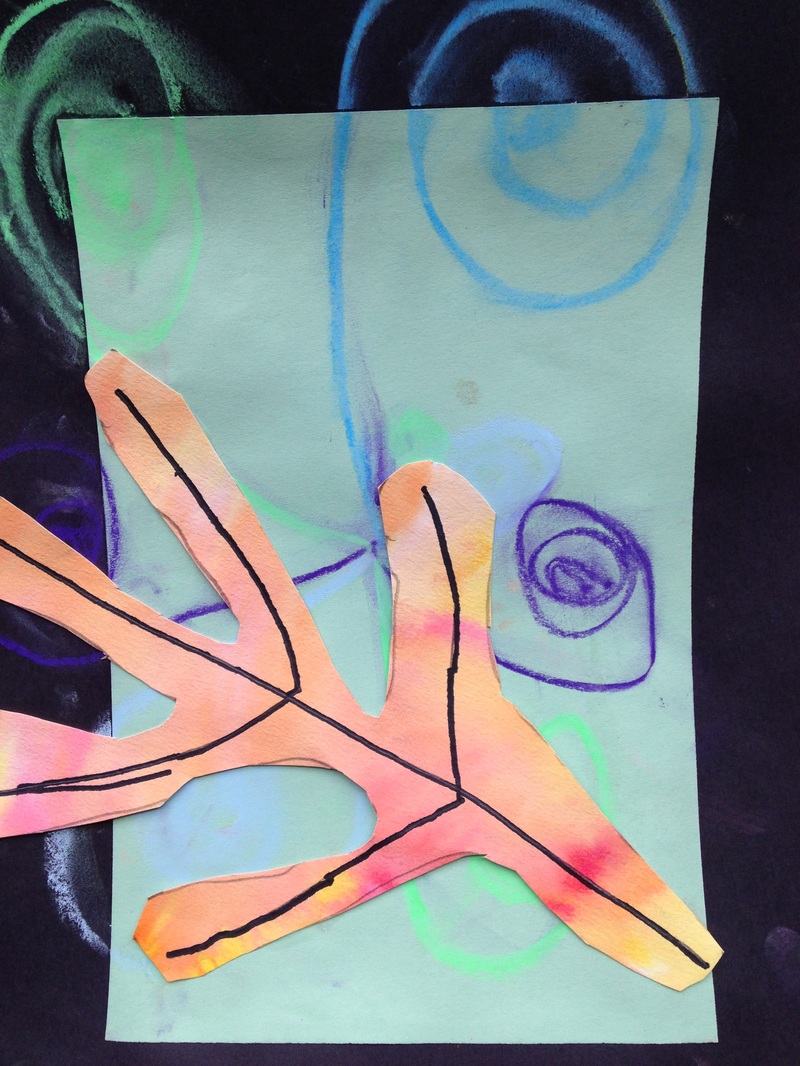
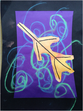
During this project, we started out by retouching on cool colors. We had previously learned about these on our Echelman weavings. Then I introduced warm colors to them. Warm colors typically remind us of fire (red, yellow, orange) while cool colors remind us of water and ice (blue, purple, green). Students chose a cool colored paper and glued it in the center of a larger black sheet of paper, creating a black frame around the cool color. This then went on the drying rack to dry for next class. Next, I showed them the wet-on-wet watercolor technique. We used super nice paper (being careful to emphasize how important this paper was) to paint water all over it. Then we took warm colored watercolors and painted them on our wet paper. This causes the colors to bleed and spread out. For the next class, we took our black and cool colored background and created cool colored chalk swirls on the background. We traced the lines a couple times with our fingers to smear the lines a touch. Then we drew a leaf onto our warm colored wet-on-wet paper and added some veins to the leaf with a sharpie. To finish off the project, we cut out the leaf and glued it onto the background. When gluing it to the background, we talked about composition and how good artists let their artwork come off the page a bit. We also talked about making our leaf look like it was floating down to the ground, rather than just being in the center of our page. I also gave them a writing prompt at the end of the project in which they were to write three sentences about why they liked fall. |
Devon CalvertHarmony and Consolidated Elementary Art Teacher in Milton, WI. UW-Eau Claire graduate. WAEA President. Apple Teacher. Archives
April 2018
Categories
All
|

 RSS Feed
