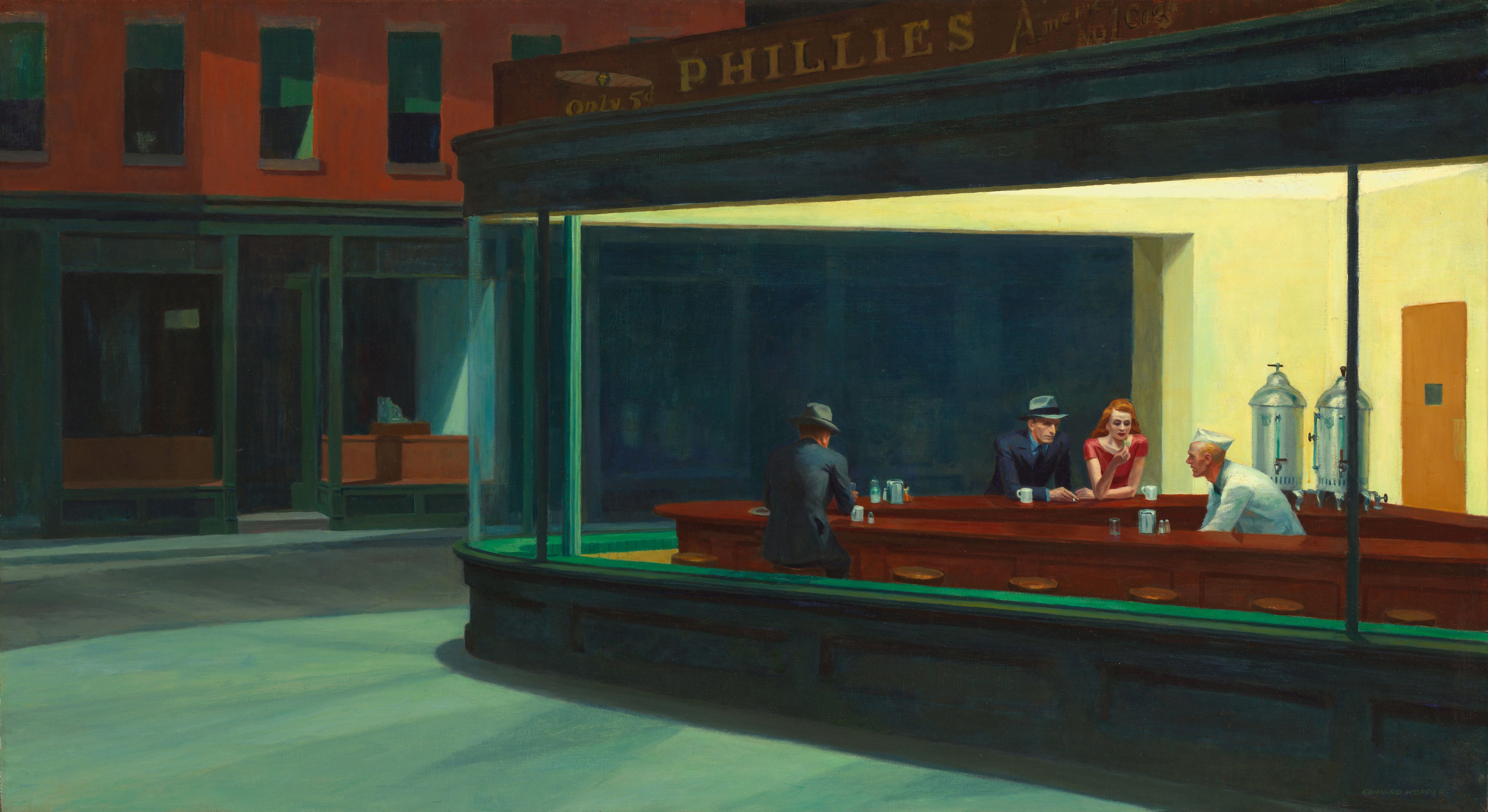
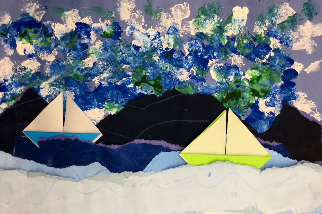
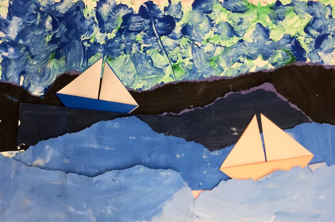
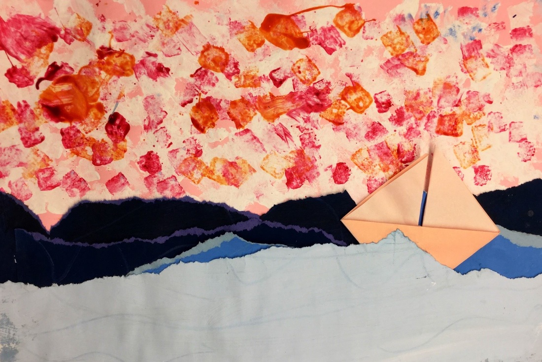
 2nd grade carried on with learning about value. This time, we used it when creating seascapes rather than landscapes. We decided to check out one of my favorite artists, Edward Hopper. Hopper was an American realist painter. He liked to paint lonely scenes of everyday American life. His paintings come off as being uneventful moments captured in time. He is most well-known for his highly parodied painting, Nighthawks. 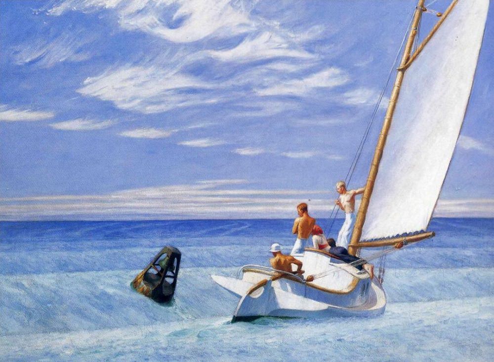 This project is loosely based on Cassie Stephens' Leif Erickson background. 2nd grade recapped on space, value, and tints and shades. We noticed that in this painting by Hopper, the lighter colors were at the bottom of the painting and the darker colors were further away. This was opposite of what we noticed with landscapes. Students partnered up and one partner painted two 6x18 tints and the other painted two 6x18 shades. This project, they got to mix their own tints and shades. We learned that when mixing tints, we start with white and add our color to it. With shades, we start with the color and add black to it. The second day, students sponge painted a background paper with white. They then sponge-painted two more colors on top of their white paint. Then they CAREFULLY tore each of their strips of paper from the previous class in half and gave one half to their partner. Now each student had two tints and two shades. Students ordered their torn strips from lightest to darkest (lightest at the bottom). They glued down their strips, starting with the shades in the center of their paper and worked their way down to the tints at the bottom. The final day dealt with Mr. Calvert taking on one of his biggest fears, origami! We sat in a big ole' circle and worked step-by-step together until we folded an origami sailboat. Students had the chance to make two boats if they wished. The last steps to do were to curl the tops of their waves and then glue down their boats, being careful to take space and size into consideration if they had two boats. 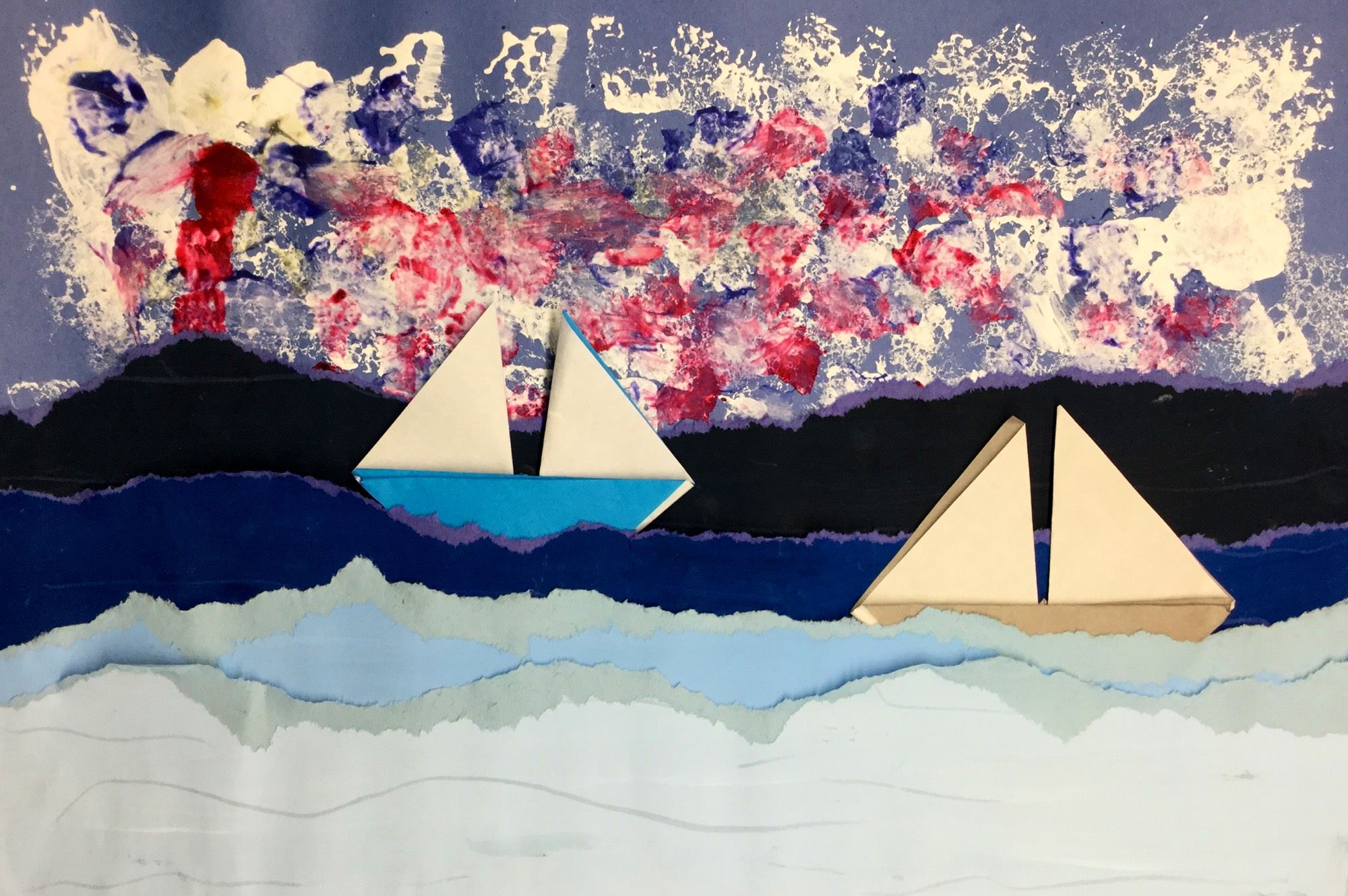
0 Comments
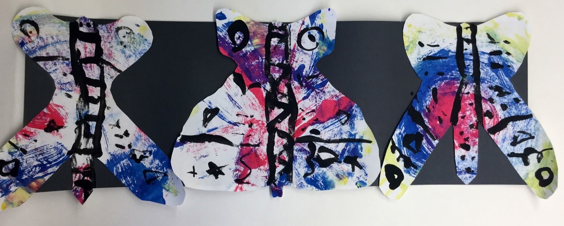
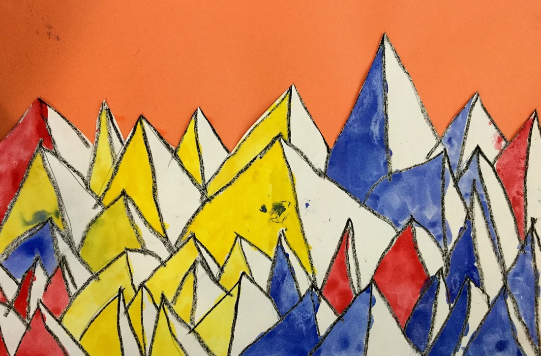
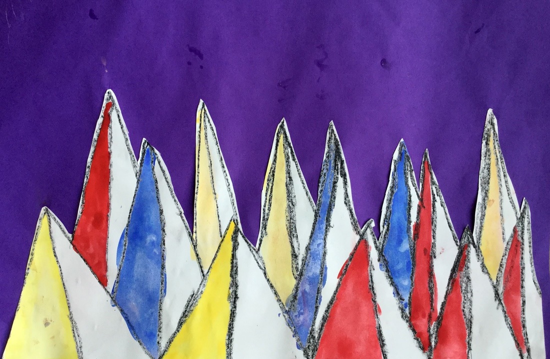
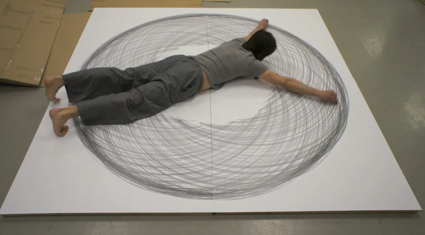
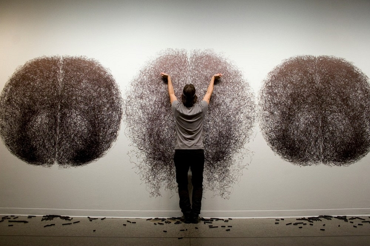
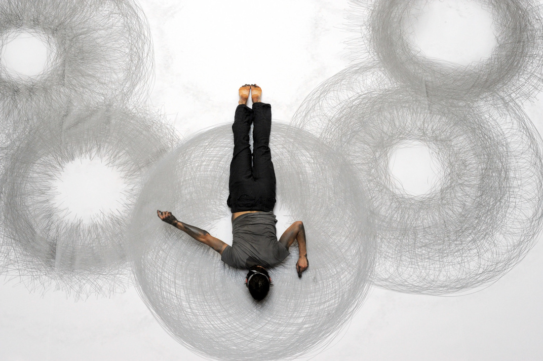
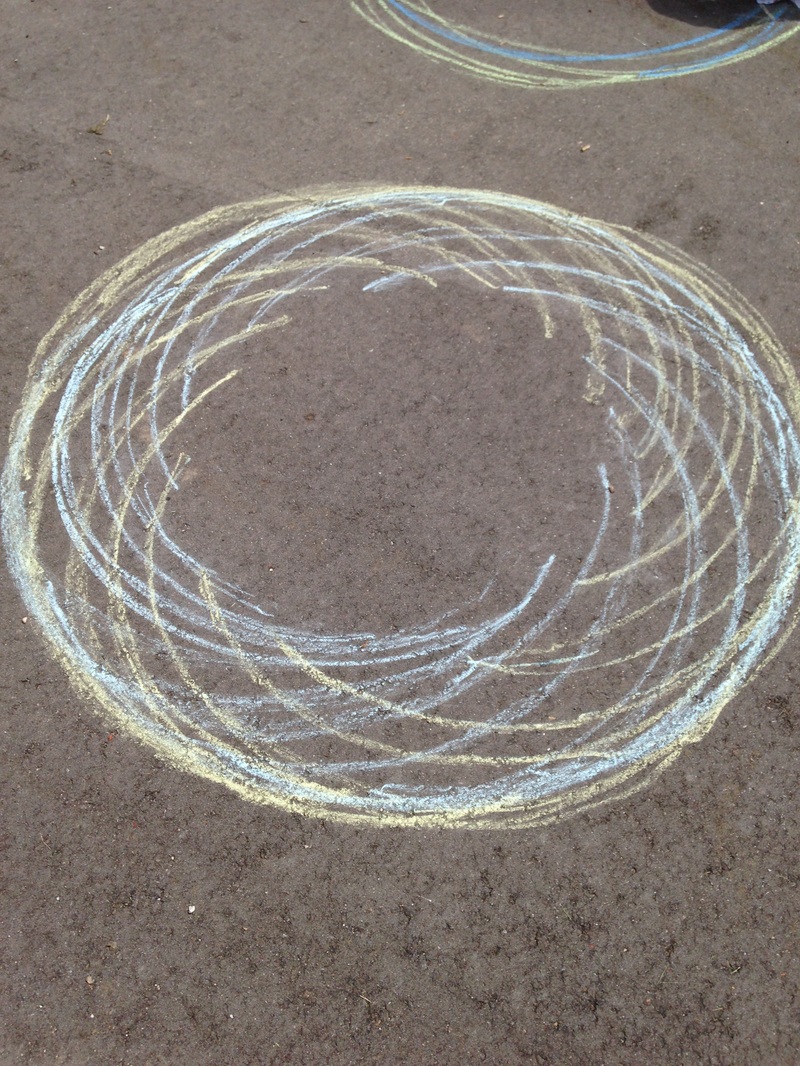
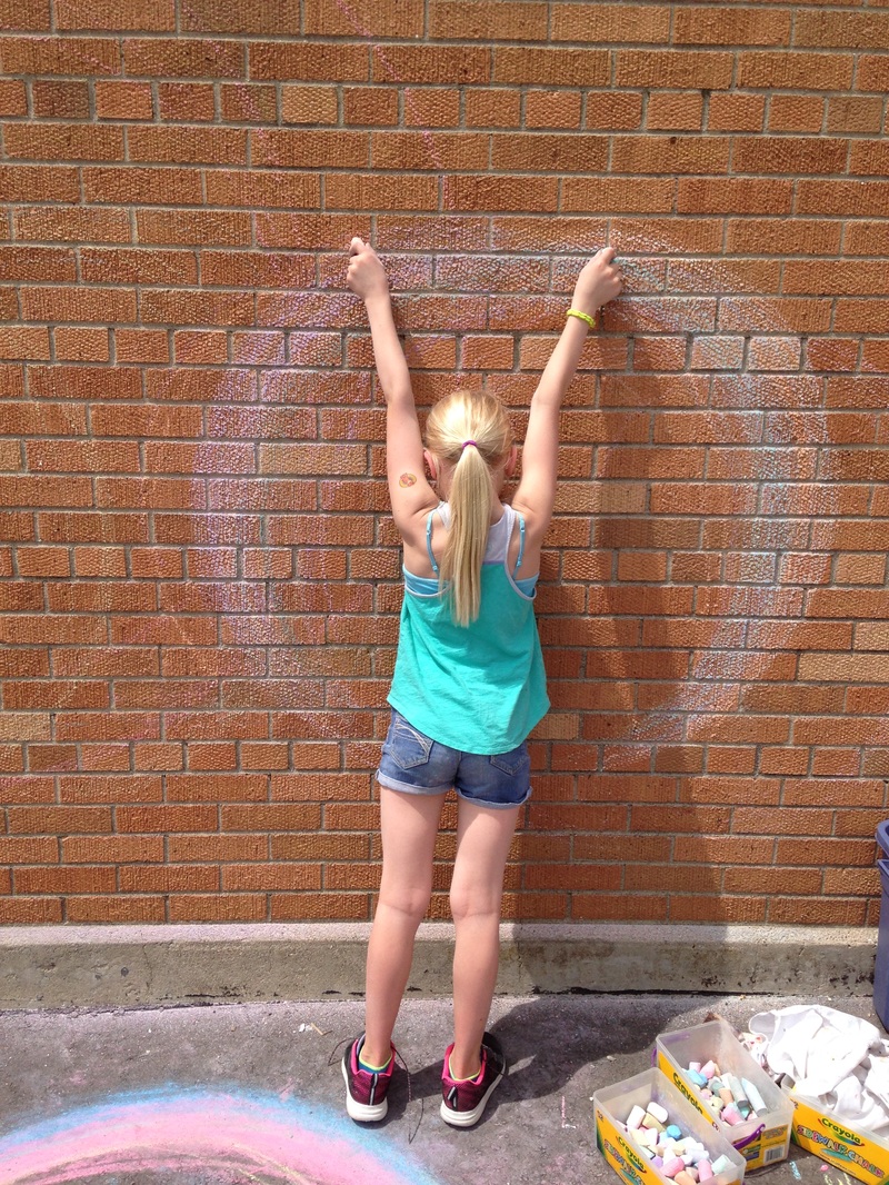
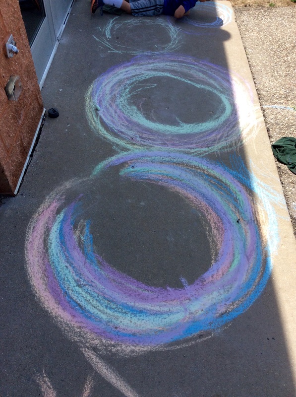
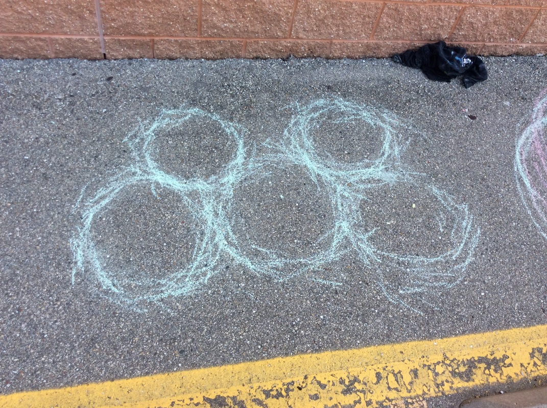
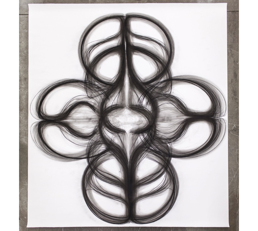
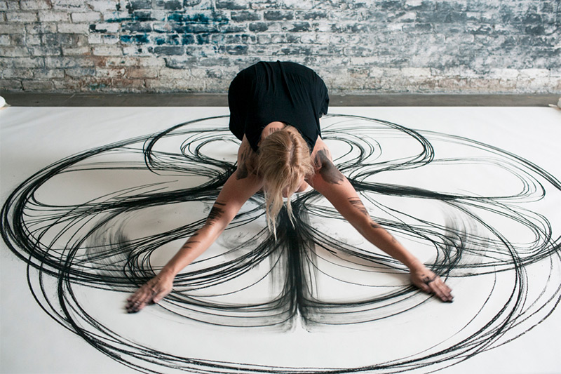
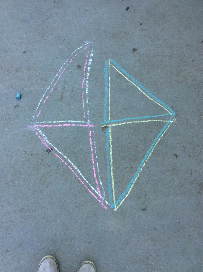
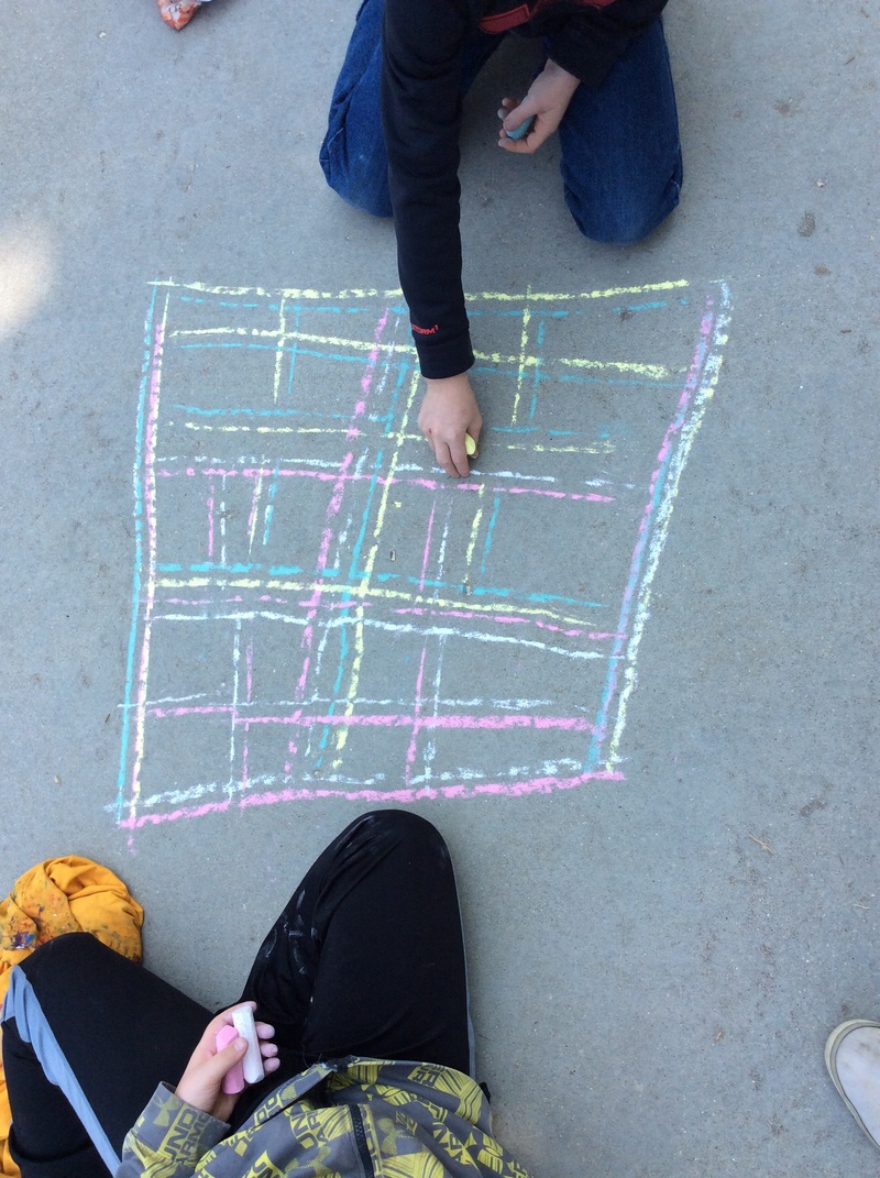
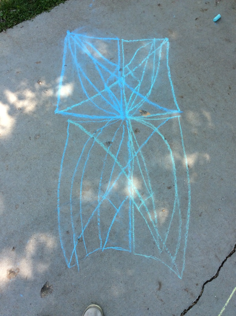
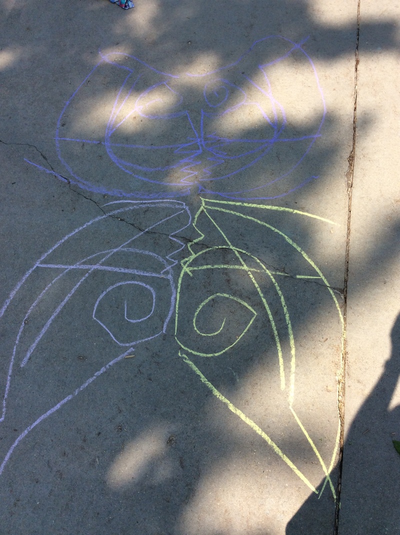
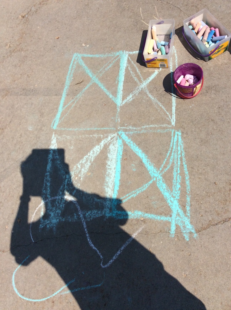
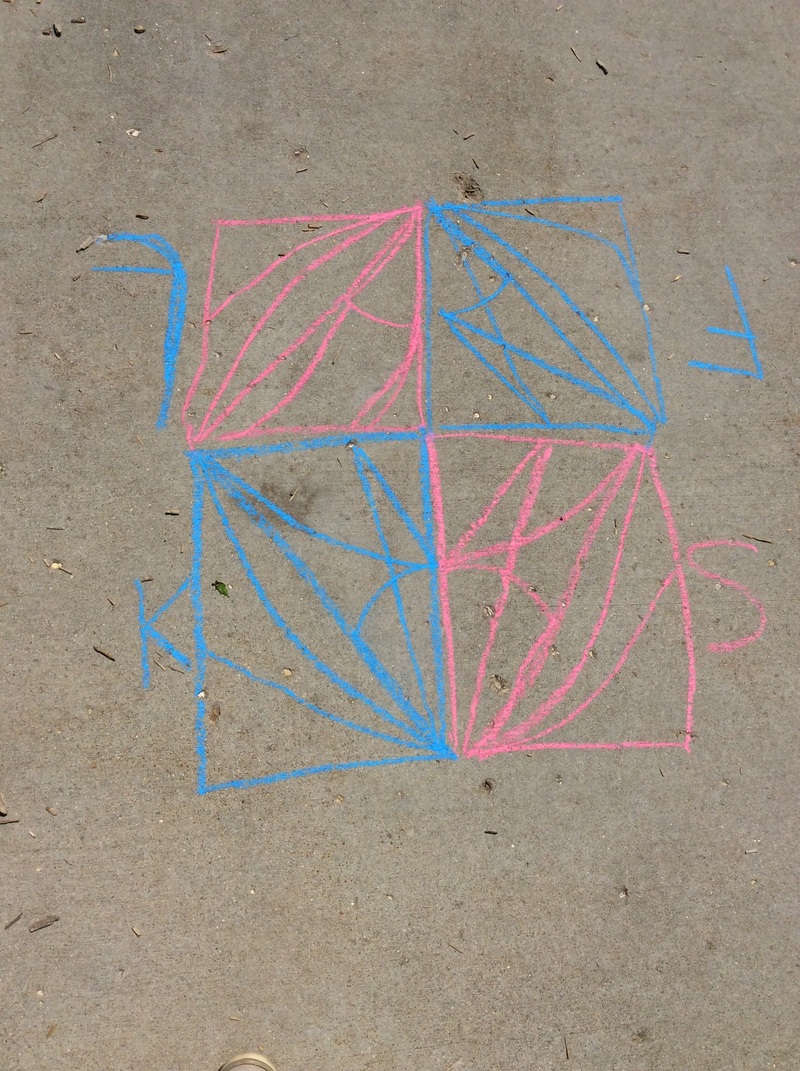
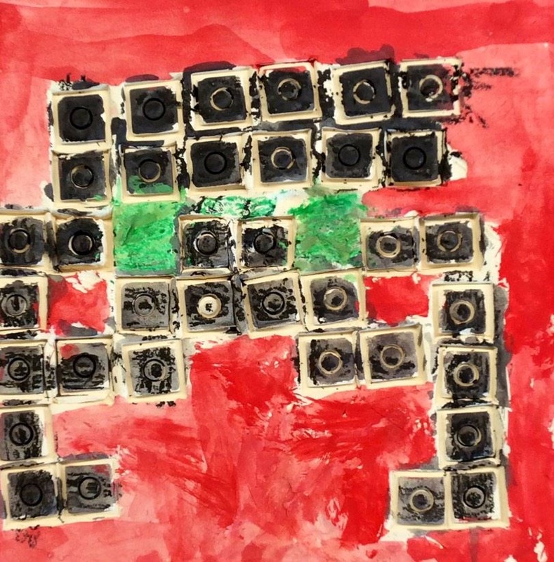
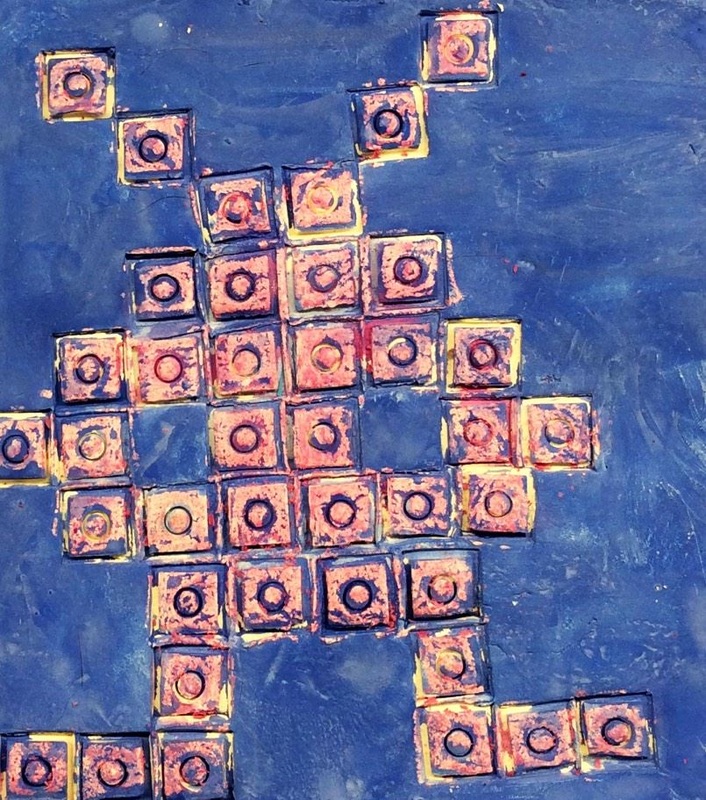
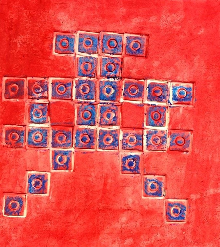
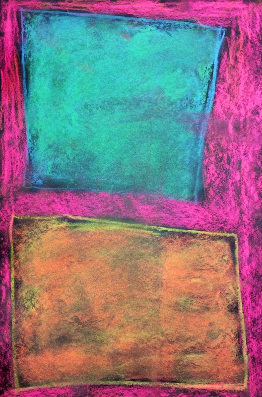
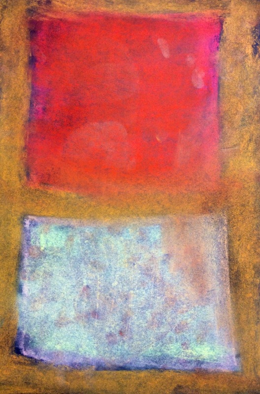
I did this project last year and it was super popular. If you wanna read all the details about the project, click here: http://devoncalvert.weebly.com/2nd/category/burton Otherwise, try not to get too scared looking at these SPOOOOOOOKY haunted houses. 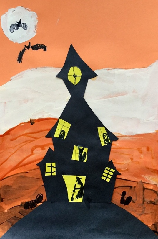 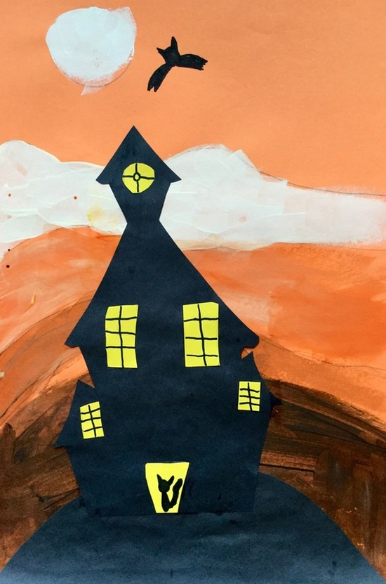 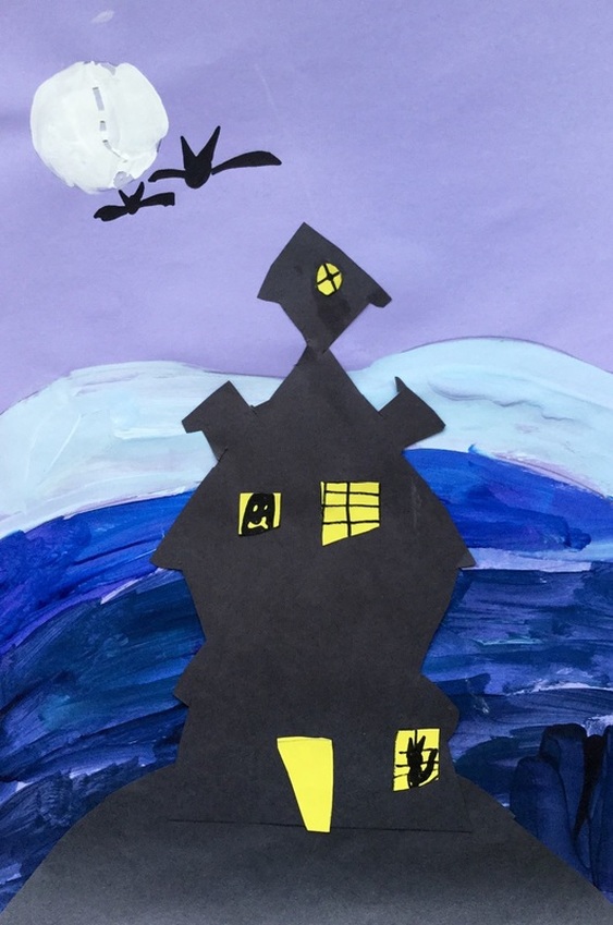 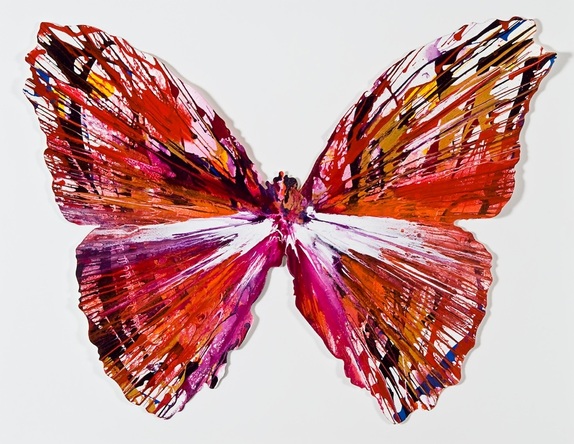 2nd grade took a look at contemporary British artist, Damien Hirst. Damien has a wide variety of art but we focused on his spin paintings. Hirst has a table that spins in a circular motion. He puts paint onto the table and as it spins, it moves the paint around. Sometimes he takes the spin paintings and then cuts them into new shapes like the butterfly above. 2nd grade learns about butterflies in their classroom so I thought this would be a good tie in. Although we don't have a spinning table, we used paper plates instead to create our spin paintings. Each student was given 3 plates. They used the primary colors and applied the paint thickly to their plate. Then they flipped their plate over onto a sheet of paper, pressed their finger in the center of the plate, and then rotated it. As the plate rotated, the primary colors mixed and created the secondary colors. The kids thought this was the raddest thing EVER! The next day, we took our 3 spin paintings and traced a circle around the edge of the paintings. Students cut out that circle and folded it in half so it looked like a taco. We then talked about symmetry and how a butterflies wings are the same on both sides. I showed them how to draw half of a basic butterfly and cut it out. They were welcome to make more complicated butterflies. They thought it was awesome that after cutting it out and unfolding the plate, they now had a full butterfly! For future purposes, I need to find a more effective way of teaching how to draw a butterfly. The last day, we glued our three butterflies down onto a strip of paper. Then we used black paint to paint lines and shapes onto the wings, focusing on making them symmetrical. 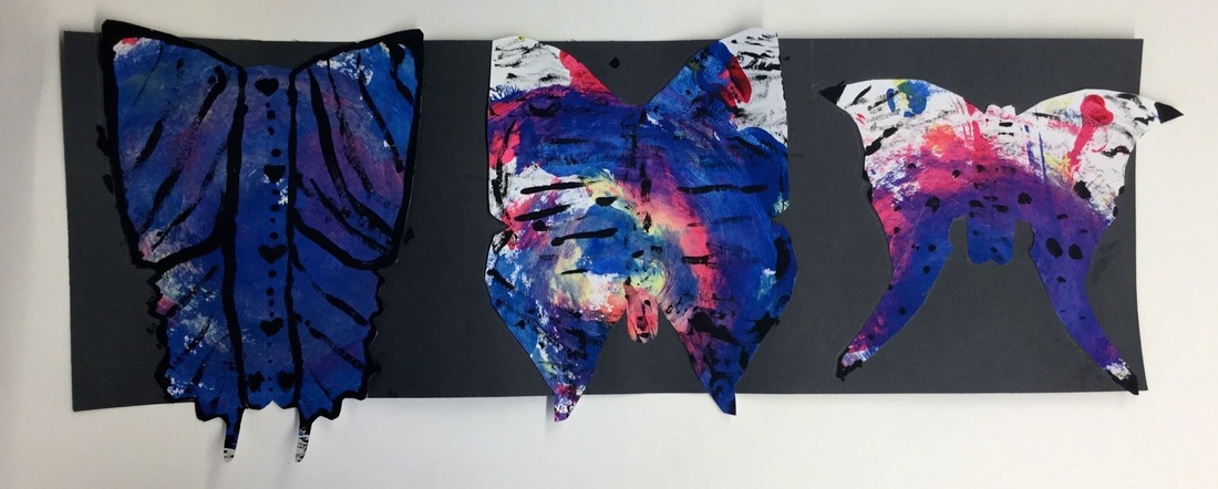  The Sol LeWitt painting that we based our project on. 2nd Grade just finished up learning about Sol LeWitt. Sol was an American artist who passed away just a few years ago. He is known as a conceptual artist as well as a minimalist. Conceptual artists believed that even something as simple as coming up with the idea for an artwork could be considered art and minimalist created work as simply as possible. Sol is most well-known for his instructional wall drawings. He would write up directions for an artwork and then send the directions to a museum or gallery. It was up to the museum/gallery to create the artwork based on his instructions. Because the instructions were open to some interpretation, no two artworks came out the same, even with the same directions. He is also known for his simple shapes, lines, and colors. 2nd grade did a project somewhat similar to this last year with Bridget Riley using colored pencils. This year I put a different spin on it and focused on Sol LeWitt instead. After learning about Sol we had a conversation about complementary colors and where they were in relation to each other on the color wheel. Students were then given a 6x18 sheet of paper that I had folded into thirds. I also pre-cut tons and tons of half inch strips of construction paper. Each table was given a set of complementary colored strips and students were asked to fill up each 1/3 of their 6x18 paper with a different set of complementary colors. By the end of class, they had all three sets of complementary colors displayed across their 6x18. PLEASE NOTE THAT YOU NEED TO DO AN AWESOME JOB OF GLUING OR YOUR SHAPES WILL LOSE ALL THEIR PAPER STIRPS WHEN YOU CUT THEM OUT NEXT CLASS. On the second day of the project, we recapped on Sol LeWitt. Then we did the EXACT. SAME. THING. as we did last class. We glued 1/2 inch strips down onto another 6x18. On the final day of the project, we talked about Sol’s use of geometric shapes. Students used geometric shaped tracers to trace a shape onto each section of one of the 6x18 papers. Students then cut out their shape and glued it down to their remaining 6x18 paper, making sure that they gave their shape a quarter turn so that the shape’s lines were perpendicular to its background. When finished, students tweeted (their version of an exit ticket) what the three sets of complementary colors. Lastly, I found some instructions for a instructional drawing online so students were asked to make their own drawing by following the instructions. At the end of class, we toured our “art museum” and checked out how different everyone’s work was based on the same instructions. This also gave us a chance to talk about how you act in an art museum. Tip #1: Walk SLOWLY. Tip #2: Walk with your hands behind your back. Tip #3: Mutter “That’s interesting” in front of an intriguing artwork. 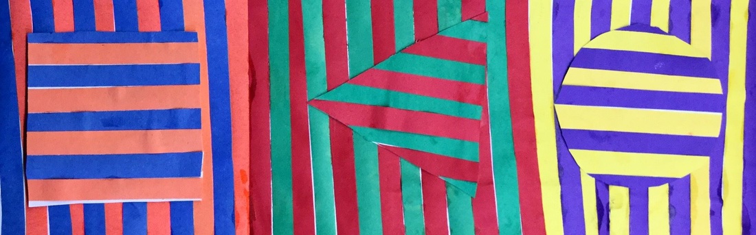 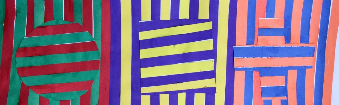 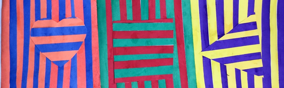 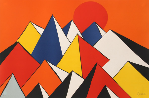 Alexander Calder was an American artist who is most well-known for his large metal mobiles that hang from ceilings. We took a look at his paintings instead and I was pleased to hear that the first thing my artists noticed was his use of the primary colors! We kicked off the project by drawing triangles on our paper. I emphasized that their triangles needed to start at the bottom of their paper and gradually work their way up. After drawing each triangle, students drew another line diagonally downwards from the triangle's peak which created a pyramid-like effect. Students quickly noticed that by working from the bottom up, it created the illusion of space from all of the overlapping. After they finished drawing, they traced everything with a black crayon. On the second day of class, we cut out our triangles/mountains. Then we painted using the primary colors. With our paintings, we only ended up painting one side of each triangle. This created an effect like light was hitting one side of the triangle. Lastly, we glued our paintings down to a secondary colored background. It got a little messy because students were gluing down wet paintings but I didn't want to spend another class period just to cut them out and glue them to their backgrounds. 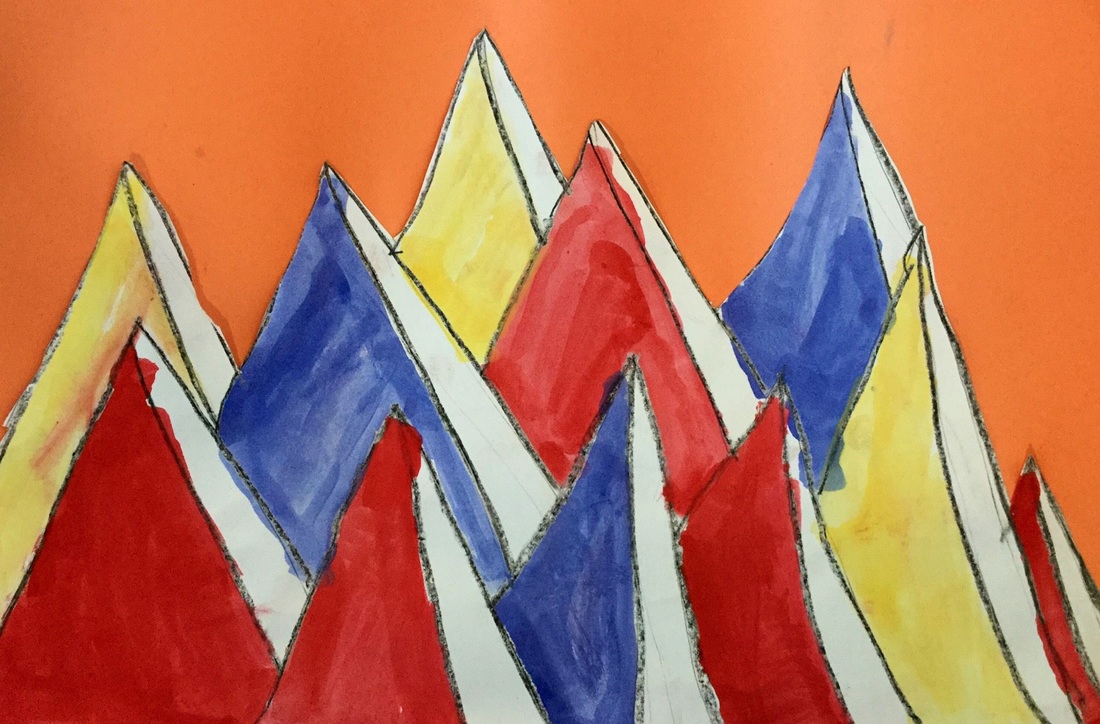 Tony Orrico is very similar to Heather Hansen in many ways. They are both artists/dancers. Both produce symmetrical. And both are kinetic artists (an artist who uses their whole body in the process). Orrico is sometimes referred to as the "Human Spirograph" because his artworks resemble them. Like with Heather Hansen, we talked about symmetry again and how he's not only making symmetrical marks on both sides of his body, but his compositions as a whole are symmetrical. I like how sometimes Orrico also works on walls and not just the ground. I showed students several different techniques that were inspired by him: we kneeled for some, laid down for some, and stood against a wall for some of the drawings. When I did this at Consolidated, I also did it with my 3rd graders and encouraged my 2nd and 3rd graders to overlap each other's work to create a more intricate design. 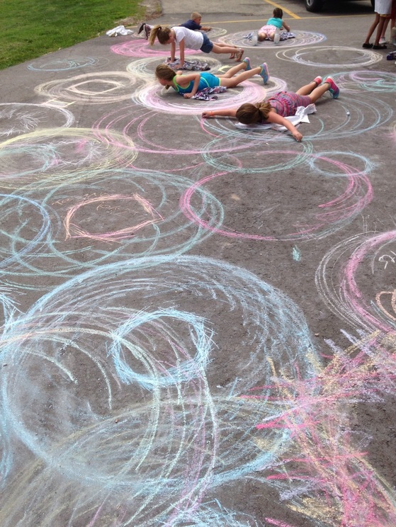 Love how these look when they overlap! 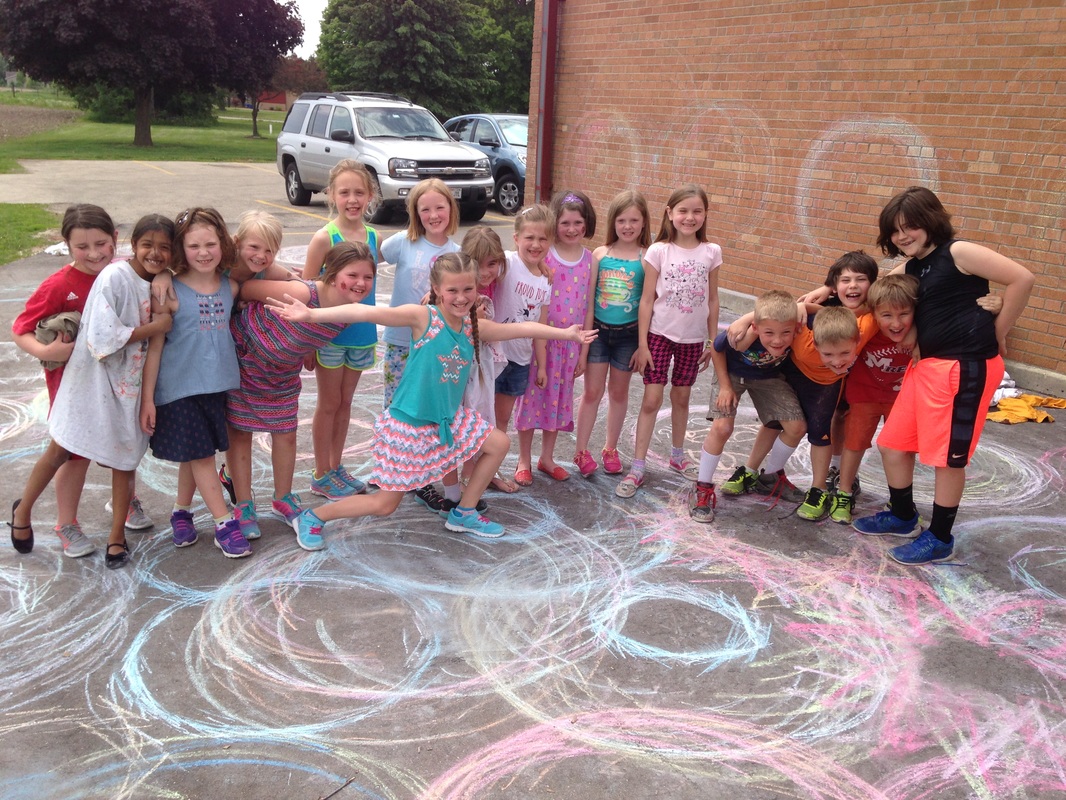 This amazing group was so proud of their artwork! So I had been looking at doing a project about Heather Hansen for a while but Don Masse over at shinebritezamorano.com beat me to the punch (his idea was cooler than mine though)! Heather Hansen is a kinetic artist which means that she moves around and involves her whole body in the art-making process. This is largely due to her background in not only art, but also in dance. Her work is very meditative and requires a lot of concentration and energy from her. Her work is also symmetrical. After discussing Heather Hansen and her symmetrical work with the kiddos, we got right to work! With one of my classes, I used a long sheet of black butcher paper so that everyone's work could fit on one huge banner. The class was split in two so that each person had a partner. One person would lead the activity. The leader would make symmetrical marks with each hand. This meant that students had to have a piece of chalk in each hand which threw them off a little at first. As the leader moved their hands symmetrically across the paper, their partner, who was sitting across from them, mirrored their movements. This created a bi-lateral symmetry. With another class, we went outside and made the drawings on sidewalk, layering colors on top of each other.  This was another project inspired by Don Masse over at shinebritezamorano.com A while back I wrote up part uno to our Invader unit that we had been working on. It was a loooong project for the kids but Invader seems to be their favorite artist they have learned about this year. They had spent lots of time practicing drawing space invaders and then creating one as a paper mosaic. After creating their paper mosaic, they FINALLY got to move onto the final stage of the project. I created large square tiles for each student. I definitely need to either teach the kids how to roll slabs next time or buy a slab roller. Throwing 100-ish slab tiles took FOREVERRRRRR! Students used square legos to gently press into the clay. This left small square indents that represented each pixel of their space invader. We talked about how pressing the lego into clay created a different feeling on the clay. This is called texture. Next time I do this project, I need to find a better way to fire these. This time, I gently stacked 3-4 tiles on top of each other. Because some of them warped as they were drying, when the tiles were stacked up, the weight cracked about ten of them. It wasn't a huge deal. I patched them up with some hot glue and the kids took it in stride. After being fired, we used crayons to color our space invader. Then we used tempera cakes to paint over the space invader and the background. We talked about how we wanted our space invader to really pop out from the background. We learned that we could use to dissimilar colors to create contrast. 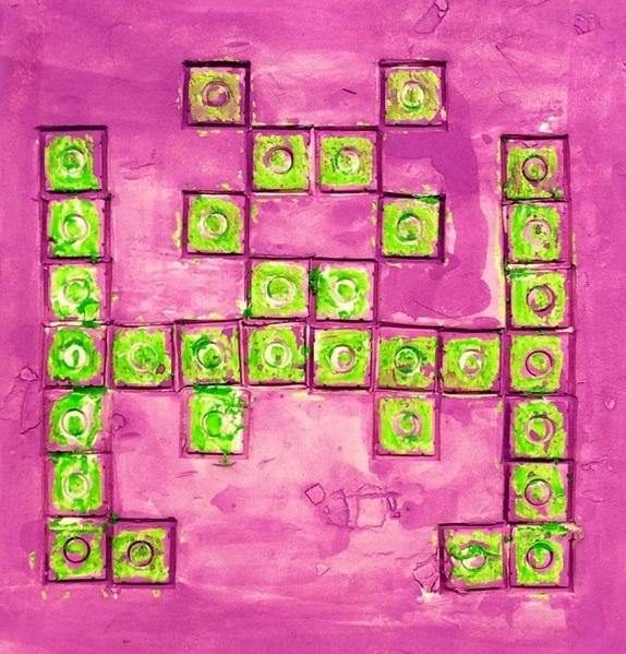 Mark Rothko is one of my favorite painters! I had a class of 1st and 2nd graders who were a day ahead of the rest so they both got to do a quick one-day project on him so that the others could catch up. Rothko liked to make really large paintings. He wanted people to stand close to his paintings so that the only thing they could see was his painting. He believed that he could use colors and their interactions with each other to make people feel different emotions. 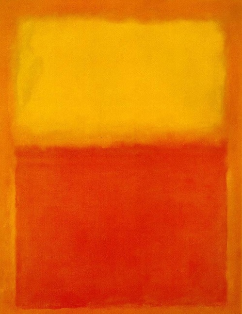 Students hadn't used chalk in awhile so I thought this would be a good opportunity for them to use it. Students were asked to draw two or three large squares or rectangles on the center of their paper. They could leave a little bit of space between each shape or they could have each square or rectangle touch each other. I encouraged them to blend two different colors together for each shape. I didn't tell them which colors to mix together, but encouraged them to think about their knowledge of color theory. Lastly, they filled in the borders around their shapes. 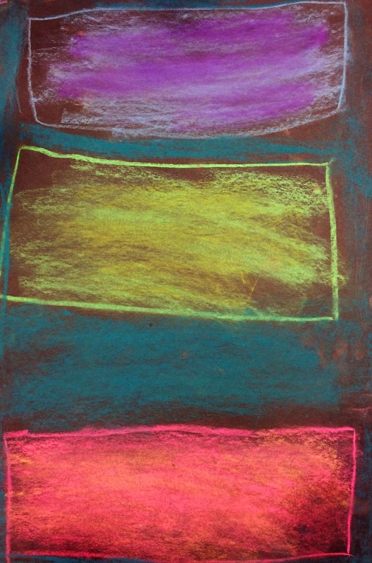 This has been a long project for second grade so I am going to break it down into two blog posts, the second of which I will post next week. 2nd grade has been learning about the French street artist, Invader. Invader is an anonymous artist who uses small bathroom tiles to create mosaics of 8-bit video game characters. He is named after the old arcade game Space Invaders and is most well-known for portraying these in his street art. However, he has moved on to incorporate other video game characters such as Mario and Pac-Man. He likes to display his "invasions" in busy areas of cities due to their high traffic. He believes that everyone should be able to enjoy art, not just people who can afford to go to museums and galleries. 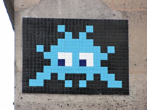 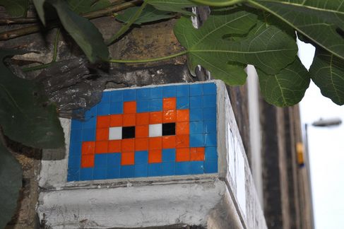 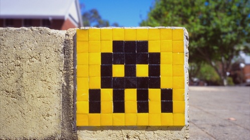 I wanna be sure to stress, like our Keith Haring project, I did not condone street art. While I love it, I made sure to point out to students that this form of art is illegal and they would get in a lot of trouble if they tried it. The first day and a half was spent looking at characters from the Space Invaders. We talked about how all the characters are symmetrical and made up of pixels (or small squares). We used gridded paper to re-create Space Invader characters. I wanted them to have a good understanding of how the Space Invaders were symmetrical before moving on to making their own. After a couple classes of re-creating old space invaders, students finally had the opportunity to create several of their own. My requirements were that it had to have an eye, be symmetrical, and it had to be 8 pixels high and 8 pixels wide. These requirements were to help the students with keeping their invader symmetrical. After a few days of gridded drawings of invaders, we chose our favorite invader that we had created and made a paper mosaic out of it. Throughout the project, we had discussed what a mosaic was. I used a die-cutter to create the squares for the paper mosaics so all of the colors are the same. This part of the project was done more so as a way to show me that they were ready to move on to the final stage of the unit: creating a clay invader. But we will save that for the next blog post! 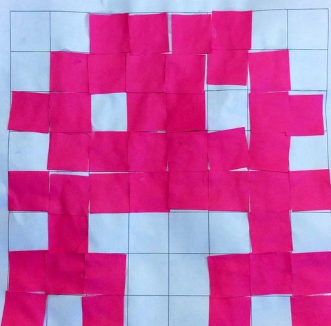 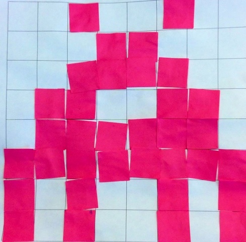 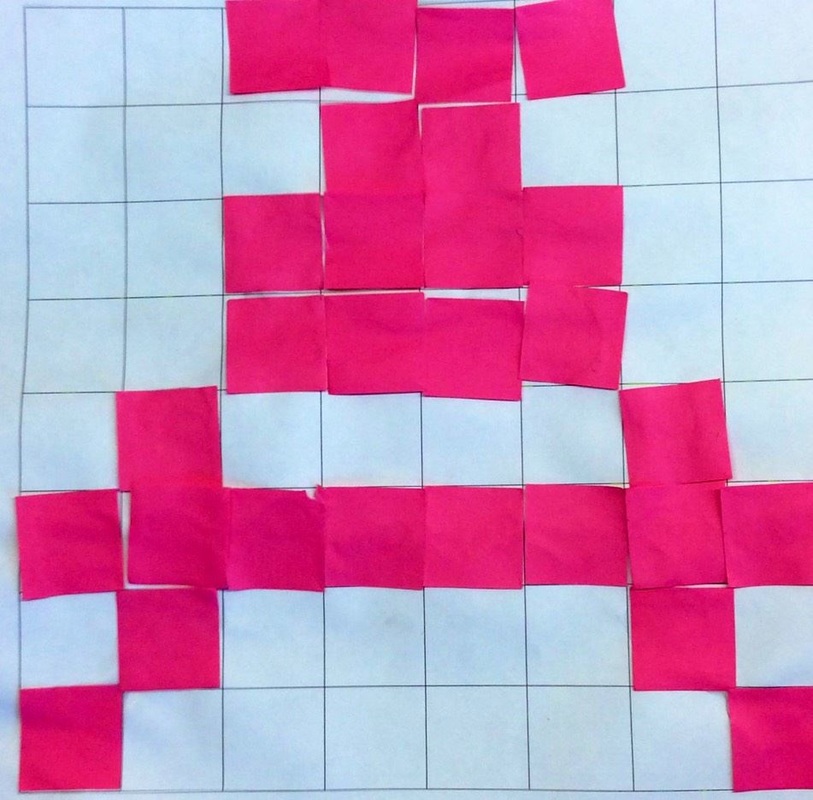 |
Devon CalvertHarmony and Consolidated Elementary Art Teacher in Milton, WI. UW-Eau Claire graduate. WAEA President. Apple Teacher. 
Archives
March 2019
Categories
All
|


 RSS Feed
