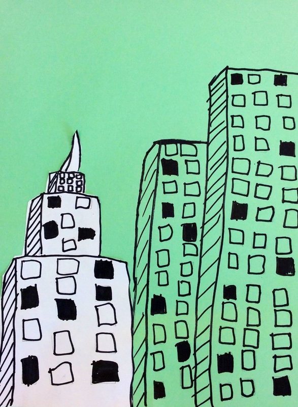
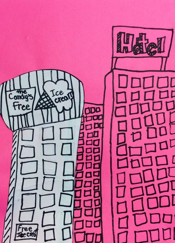
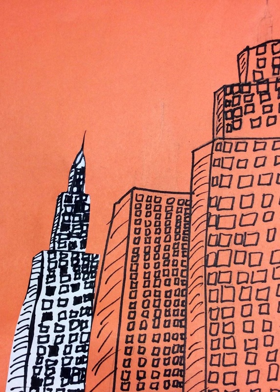
 With my recent trip to Chicago over spring break, I found a lot of inspiration in the architecture. Architecture is my favorite thing to learn about in art! I saw this project somewhere online and decided it would be a good tie in with some history about Chicago. We talked about the Great Chicago Fire and how a clumsy ole' cow tipped over a lantern. The ensuing fire burnt down a large chunk of the city. This left architects with an open canvas to rebuild and re-design the city. Architects had to work vertically due to limited space and this was largely made possible because of the recent invention of steel. Throughout this project, we talked about the repeated geometric shapes in buildings. We also talked about space and how size and overlapping create this feeling. I had one student ask me about Antoni Gaudi which blew me away because he is one of the few architects who uses organic shapes rather than geometric. She had read a book about him! Students drew 2-3 buildings on a colored background and then one more building on a white paper. Then they sharpie'd and erased. After gluing their white building down, we talked about why the white building was the first thing we noticed. This is called the focal point or emphasis. This is due to the contrasting color of the white building.
0 Comments
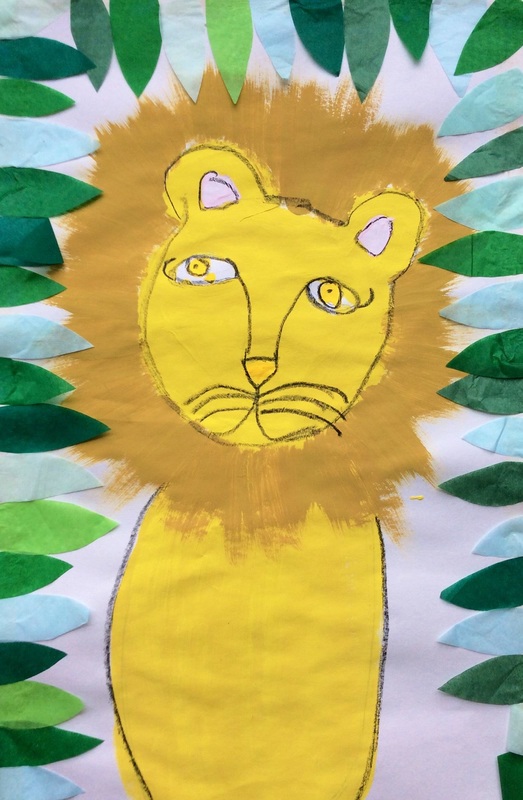
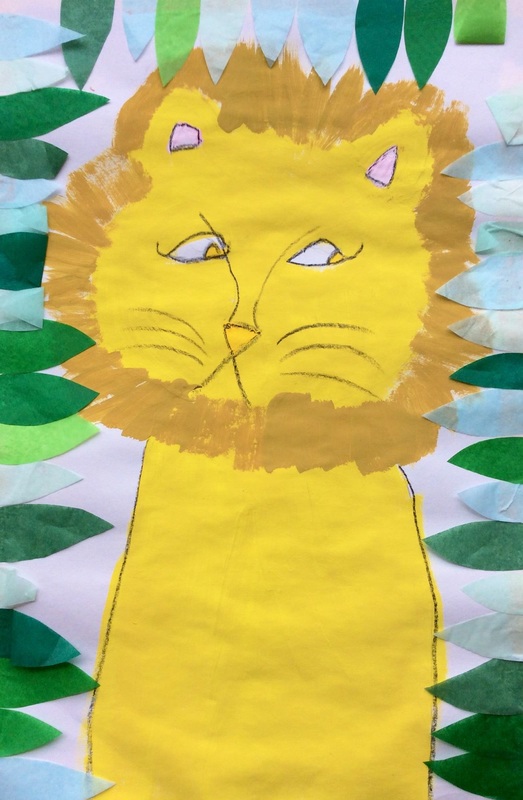
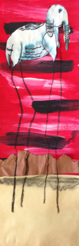
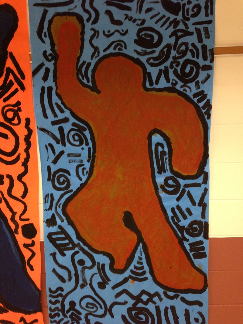
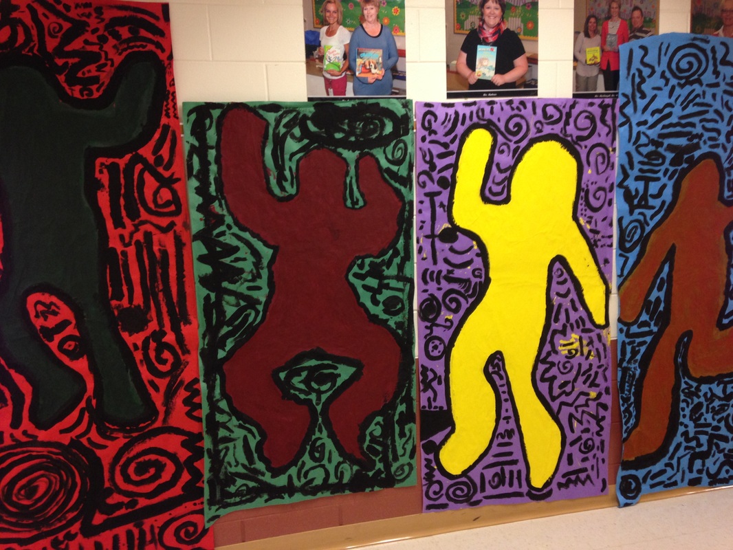
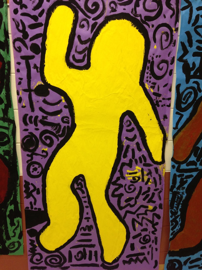
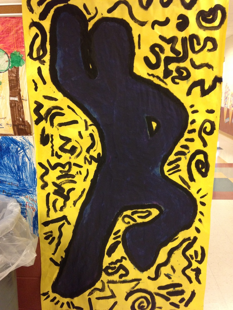
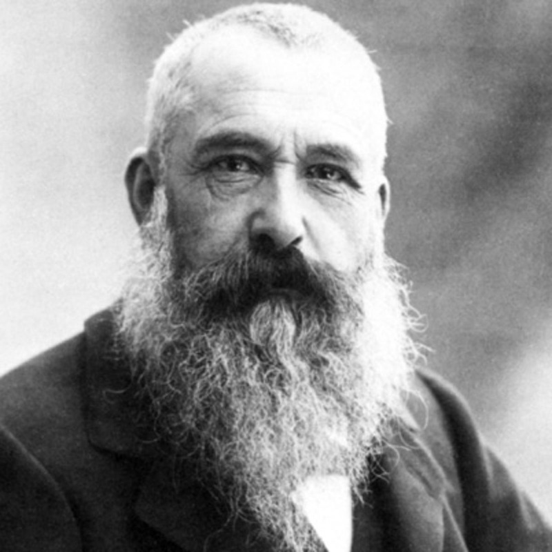
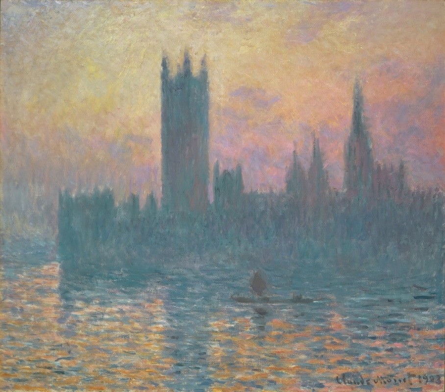
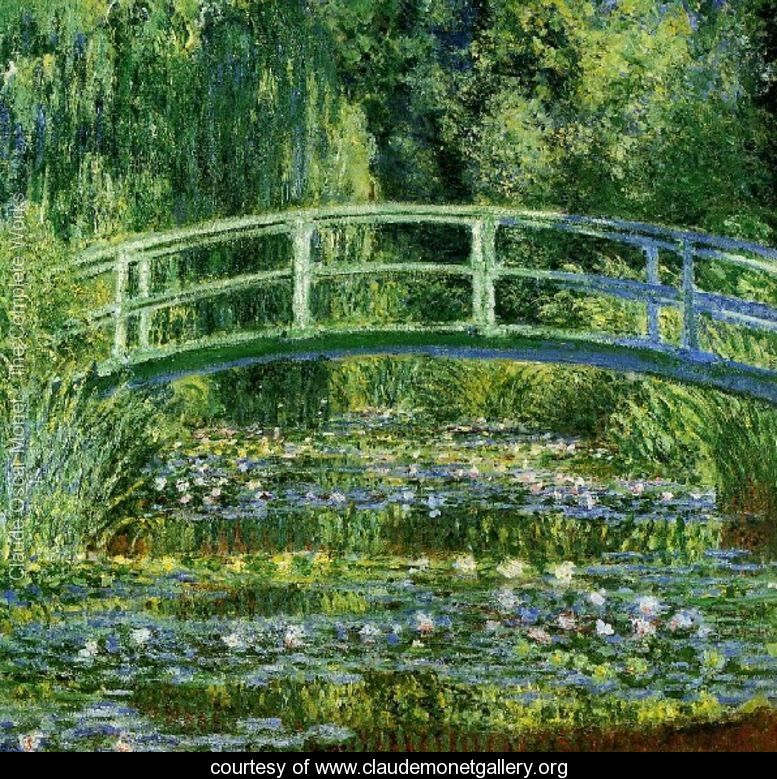
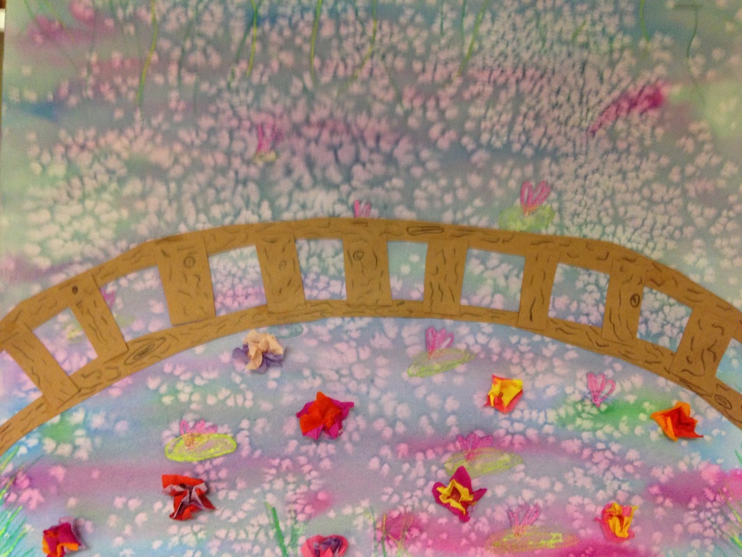
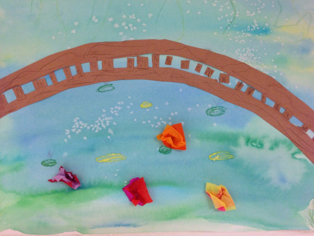
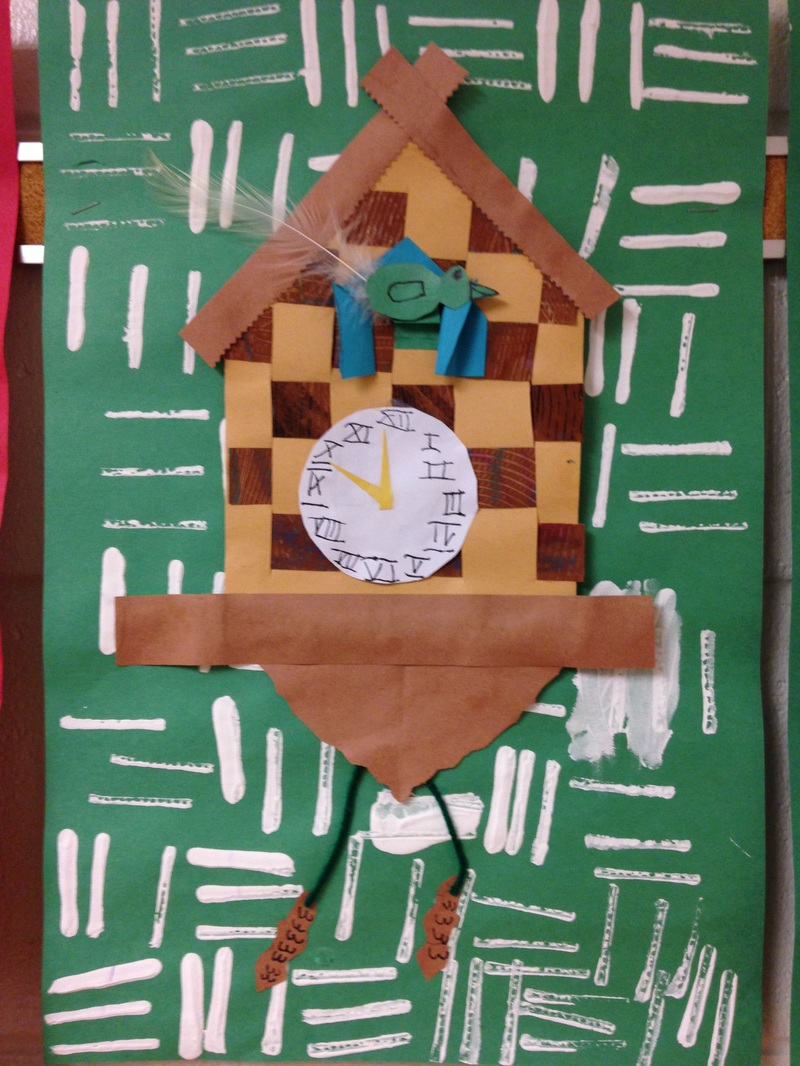
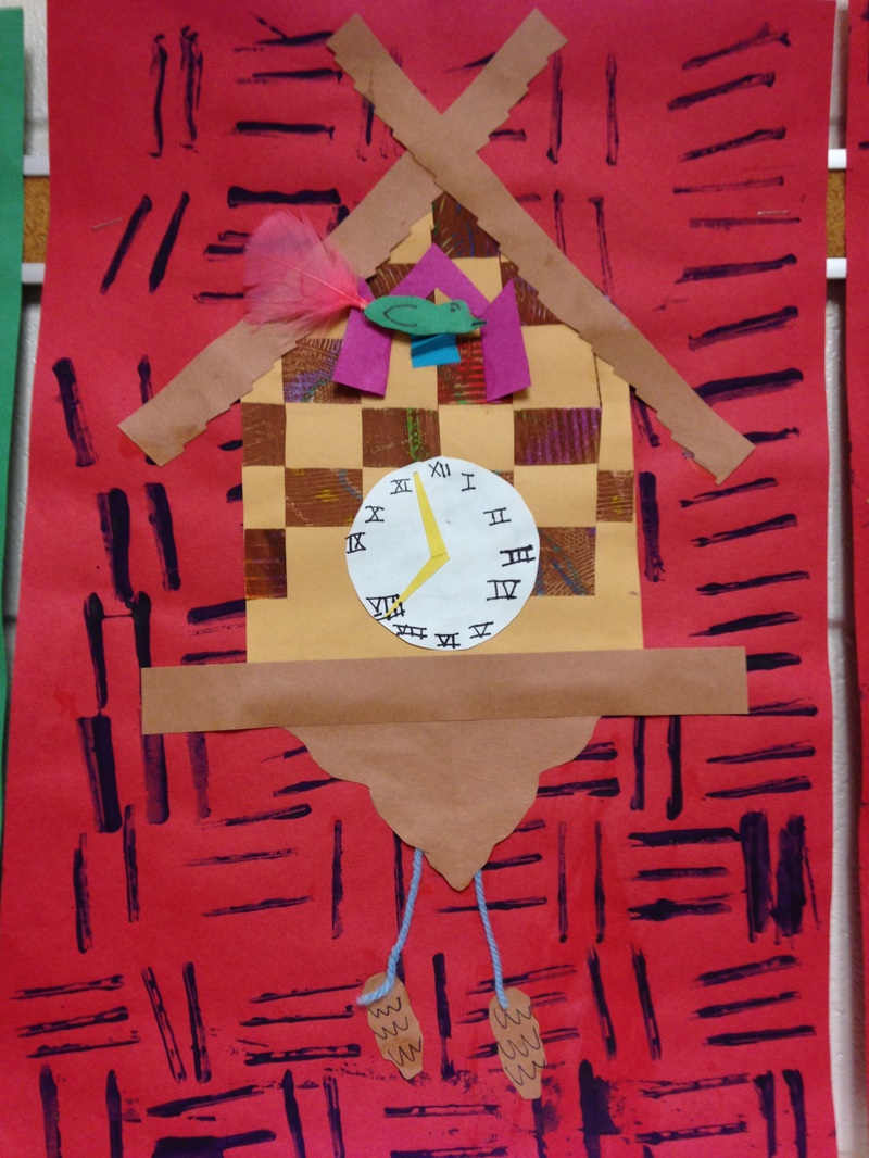
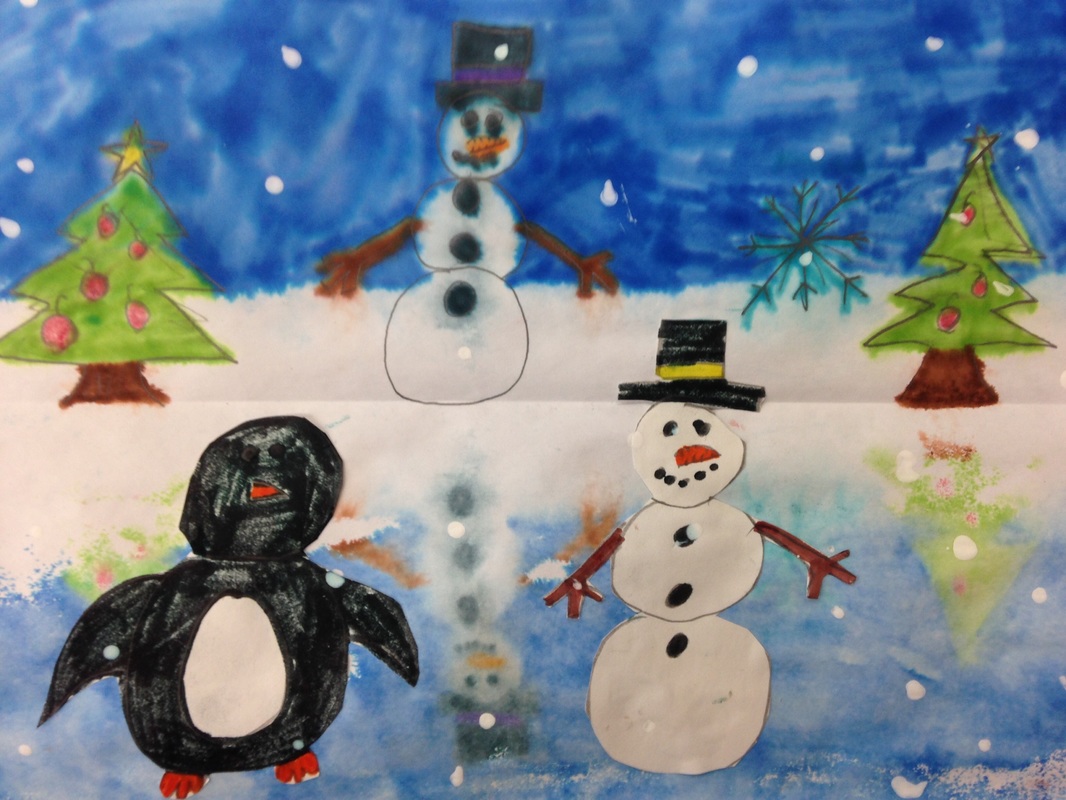
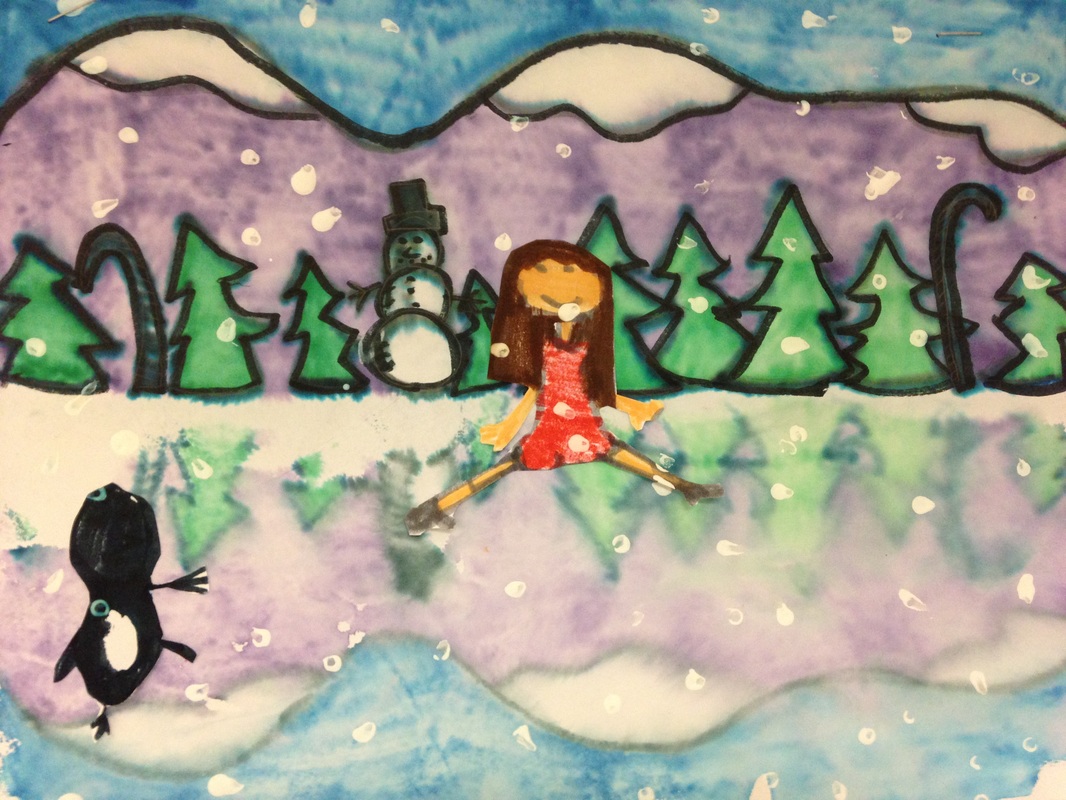
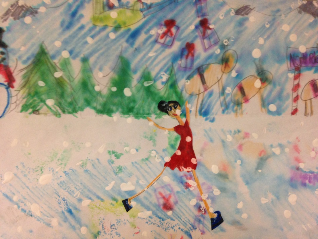
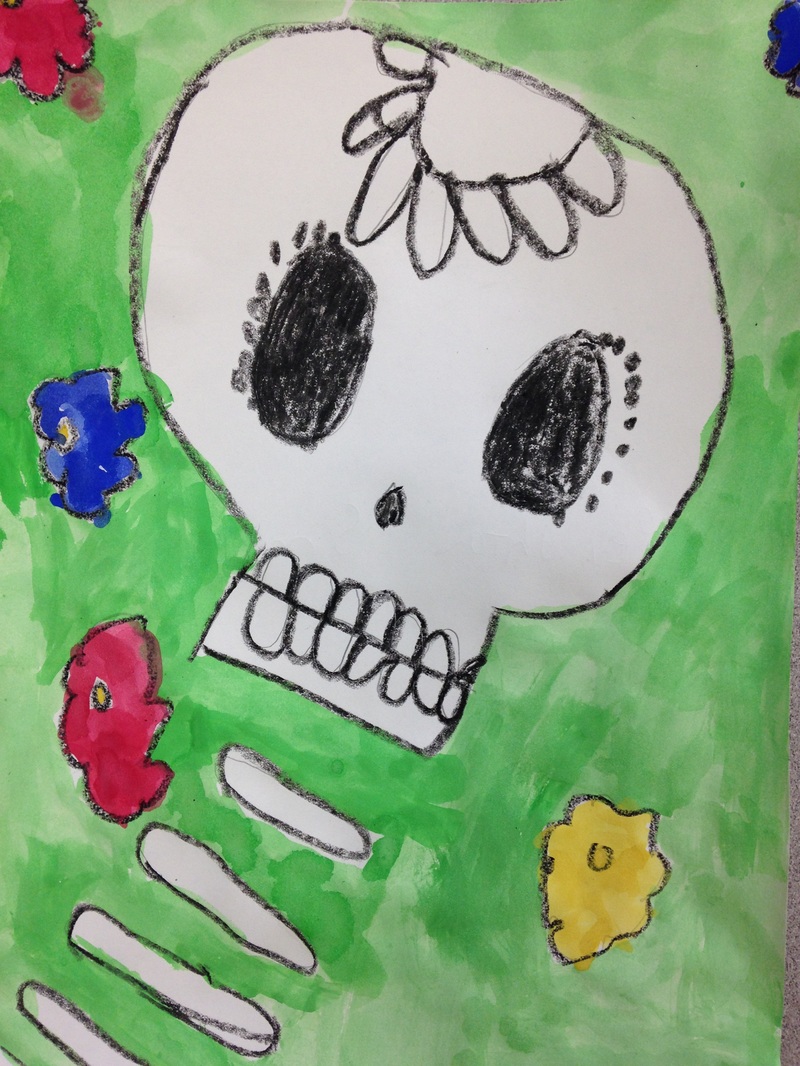
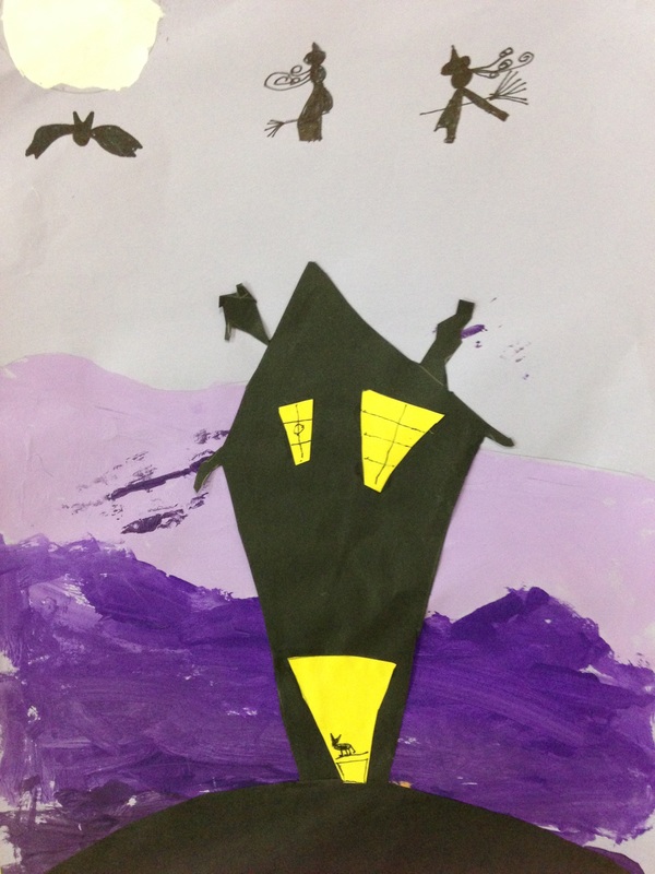
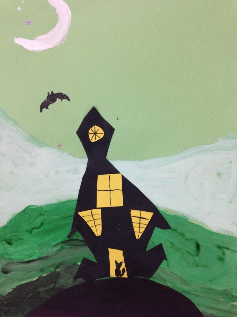
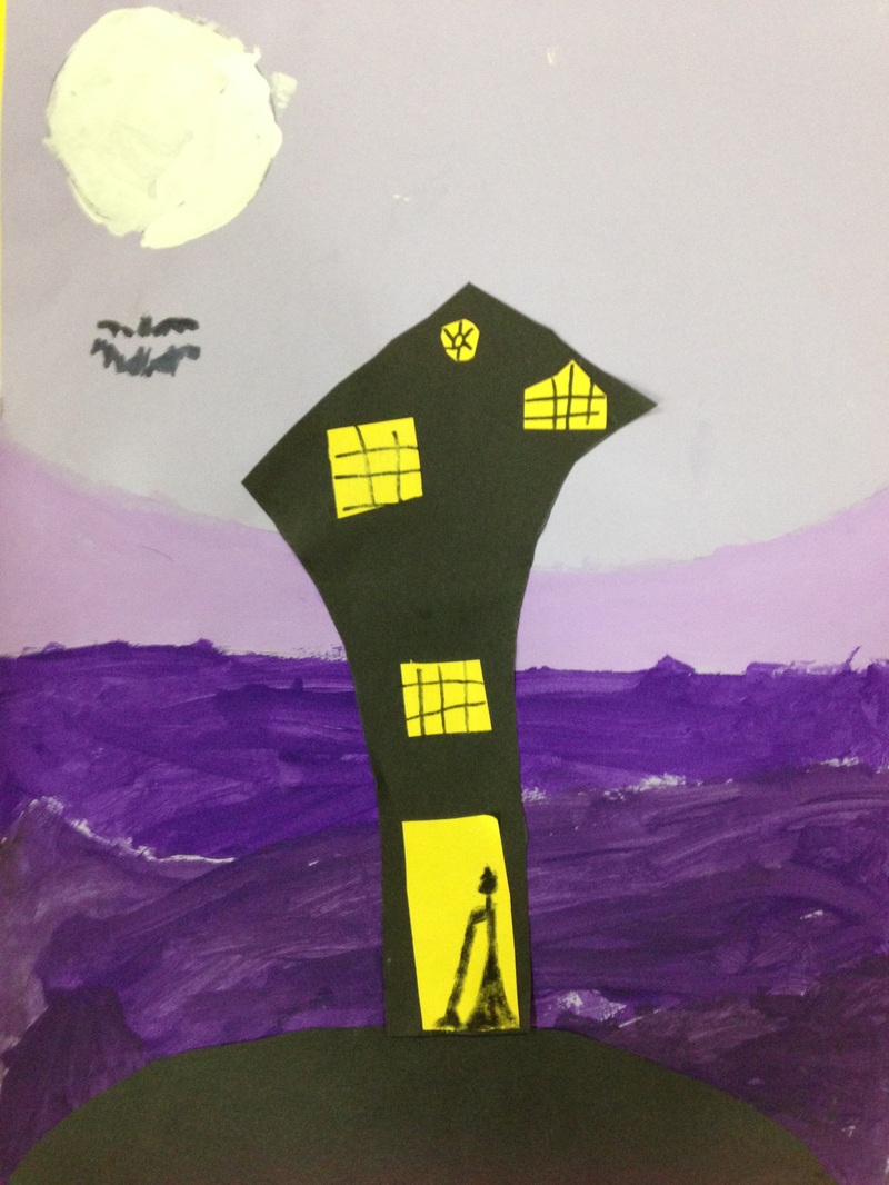
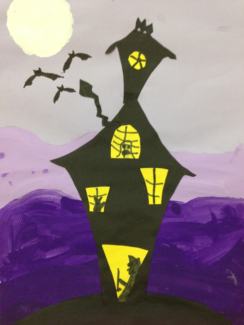
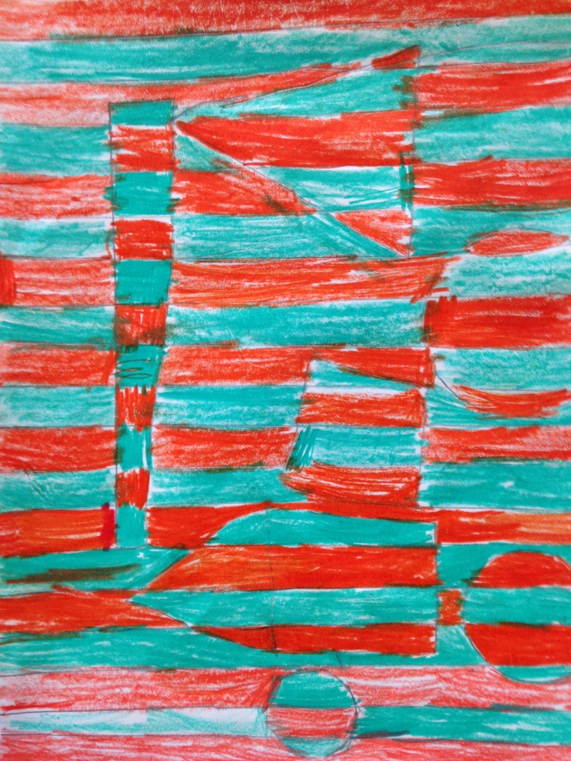
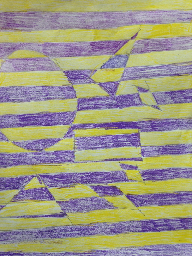
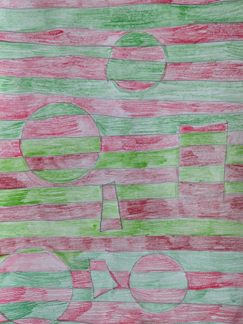
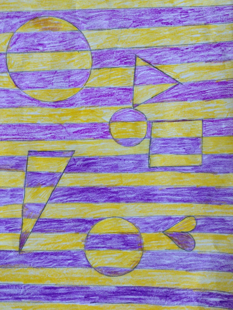
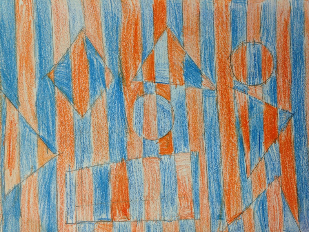
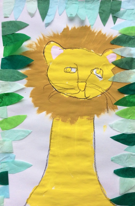 I love all the character that these lions have! 2nd grade is learning about the Carnival of the Animals in music class with Mr. Kamp. The Carnival of the Animals is a series of songs about different animals. Mr. Kamp and I thought it would be fun to carry some of the animals that they are singing about over into my classroom. A lion is one of their songs so I thought learning about Henri Rousseau and his exotic lions would be a good project! Henri Rousseau was a French Post-Impressionist painter who didn't take up painting until he was in his 40s. He is most well-known for his exotic depictions of jungles. However, Rousseau had never actually left France! He had nooooo idea what a jungle actually looked like! He would paint things that he saw in museums, books, and brochures. He would also paint the vegetation that was in his backyard. Because of this, his paintings are oftentimes inaccurate such as a lion in a jungle. In reality, lions do not live in jungles. Rousseau was often criticized by critics and other artists for producing "child-like" paintings. This was largely due to never having been taught how to paint, as well as painting things that he had never actually seen in person. We started off by learning how to draw the lion by breaking it down in simple shapes. Then we painted the lion a yellow-ish color. The next day we painted the eyes, ears, and nose using itty bitty bushes! We also learned how to dry-brush the lion's mane. Dry brushing is when you get just a little bit of paint on your brush. This leaves a "dry" look at the end of the brush stroke, perfect for the edge of our manes! The last day of the project, we outlined everything with a black crayon and glued down green leaves that I had pre-cut for the students. 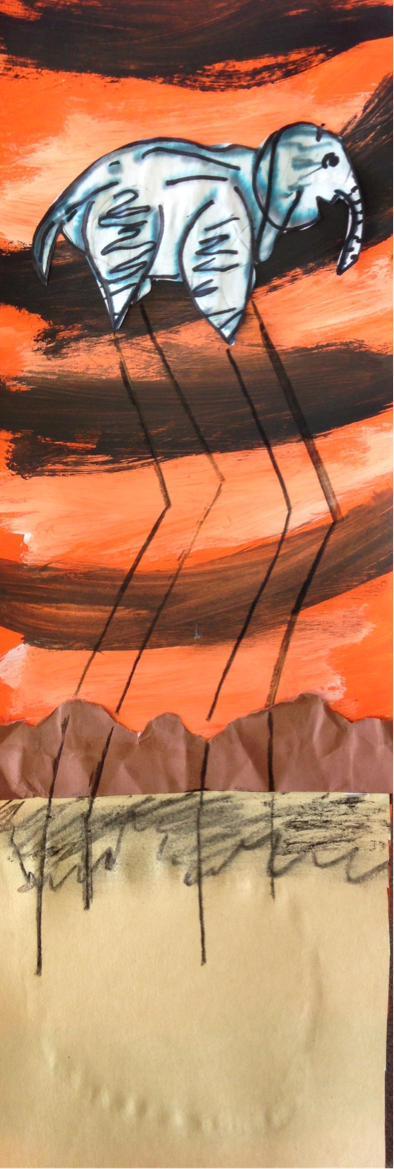 Just like with our lions, we did this project because they are doing a song about elephants in Mr. Kamp's room. Loving the collaboration between our classes! 2nd grade learned about Surrealist artist, Salvador Dali. Dali was a really weird dude. Some people believe that he may have actually been insane. He is the most famous surrealist artist. This was an art movement that focused on showing things that were just tooooo strange to be true. Dali liked to paint things that he dreamt. And let's be frank, some pretty weird stuff can happen in your dreams. His most famous painting shows several limp, melted clocks. We focused on a painting of his that had elephants in it. While the elephants body looks normal, it is balanced on top of extremely long stilt-like legs. We started off by watching a video of an elephant drawing a picture of an elephant. I told them that if an elephant could do that, then they could too. We looked at how to break the elephant down into simple shapes and then drew it. We had to change the legs a bit so that we could make the long stilts later on in the project. After they hey finished drawing, we used a black washable marker to trace over our drawing. After tracing it, we brushed some water on to it. Because it was a water-based black marker, the black begins to spread and separate, turning it grayish and making the wrinkles look more realistic. We let it dry and then retraced the elephant again. For the background, we talked about warm colors which are colors that remind us of fire (red, yellow, and orange). These colors give our sky kind of an eerie feeling like Dali's. While our background was still wet, we lightly brushed white and black in spots to create a cloud streaked sky. This led us into the discussion of tints and shades. A tint is any color that has white mixed with it and a shade is any color that has black mixed with it. The he final day, we cut out the elephant and glued it on. We glued on a tan ground. Then we tore a brown strip of paper to create mountains. We crumpled our mountains up into a ball so that when we glued them down, they were wrinkled. This creates something called texture. Texture is how something feels or how it looks like it feels. Lastly, they used charcoal to add their stilt legs and a shadow to the mountains. This project was packed full of new art vocal for the kids! The students LOVED learning about Keith Haring. Mr. Haring was an American Pop Artist who was a prominent street artist during the 1980's. Artists are constantly striving to have their work seen by as many people as they can. The more widely seen the works are, the more likely the artist will make money and become famous. Keith Haring had a brilliant idea one day while riding the subway in New York City. In the subway, they would typically cover up old advertisements with large black sheets of butcher paper. He decided to start drawing on these black sheets of paper with chalk. Because the subway system is so popular, it allowed millions of people to see his drawings everyday. What Haring was doing though was illegal. He was arrested multiple times for his graffiti vandalism even though his drawings were only done in chalk. However, because his drawings brought happiness to so many people, he was willing to be arrested if it meant that people could see his work. He started to become more and more famous and began to be hired to paint murals in communities. As he became more famous, his work also became more expensive due to demand. He decided to open his own store called the Pop Shop where he sold shirts, buttons, prints, etc of his work for a low price. He believed that anyone should be able to see and own his work, not just the rich. His work is still highly recognized today and is especially well-known for his ability to show movement in his paintings. Our first day of the project, each table was given a large sheet of butcher paper based on their table color. One student from each table laid on the paper and the other students traced around them. Then, using their paper's complementary color (red and green, blue and orange, or purple and yellow), they painted in their figure. We had to put about 3 coats of paint on it. After painting a coat, I then had them do a little activity each class. The first class, I had taped up a bunch of black paper around my room. Students were given chalk and they could go around and draw 'graffiti' inspired my Haring's drawings. Haring's cartoonish drawings never had facial features and typically featured a bold black outlines and one solid color for the body. Another day, after adding another coat of paint, students played a game called 'Roll-A-Haring'. They were given a worksheet that had 6 different heads on it, 6 bodies, and 6 legs. Students would roll a die and the number would correspond to a head on the worksheet. They would then do it for the body and the head. They had a blast creating all different kinds of Haring-esque drawings. After getting a few coats of paint on our murals over several class periods, we added a bold black outline and then a bunch of crazy movement lines on the background. 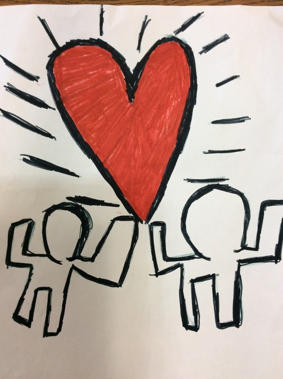 Had a student draw this outside of class and brought it in and gave it to me. Love it when they study up on our artists outside of my class! Claude Monet was a French painter who led the Impressionist art movement. Impressionism was a revolutionary movement in which artists began to emphasize showing their brushstrokes. They were greatly influenced by color and light. They painted this by going outside and painting the same pictures over and over, just painting them at different times of the day and in different weather. These factors would ultimately change the light and colors seen in an artwork. As he grew older, he began to go blind. Because of this, he kept painting bigger and bigger and bigger. This was so that he could see what he was doing. He is well-known for painting haystacks and Parliament over and over again. However, his most famous works are of his lily pond that he had at his house. I had the chance to see a bunch of his works during winter break and thought that my second graders would enjoy learning about him too! The kids were super interested in Monet and I actually had to stop them from asking so many questions because we almost ran out of art time without making any art! I'm glad that they were so excited to learn about him. Our first day of the project was spent talking about warm and cool colors and the wet-on-wet painting technique. We started off by drawing some grass, vines, and lilies with crayon. We then used the wet-on-wet watercolor technique to paint cool colors over top of everything. We finished off the day by adding a pinch of salt to our wet paint. The salt sucks up some of the water and paint and leaves a cool effect when it dries. The second class, we cut out two long brown arches. These made the floor and railing of our bridge. Students finished off the bridge for the day by adding vertical pieces that were a finger-widths apart. For the final class, I showed them how to use small squiggly lines to create a wood grain on their bridge. We also glued a couple pieces of tissue paper together and then wrapped them around the back of our pencils to create some 3D lily flowers. We finished this project a LONNNNNG time ago and I didn't realize that I had never posted it. It's a lesson that I got from the fabulous Cassie Stephens. We started off by using oil pastels on a piece of paper and then painting brown over it. Then we used combs to scrape paint off of the paper. After our brown painted paper had dried, I cut it into strips and students wove the brown strips into a paper loom. This would later become the housing for the clock. Then we trimmed the tops of the clocks so that they came to a point. For the third class, we used a piece of cardboard to print a pattern onto a sheet of paper for the background. We also used fancy scissors to create the trim to our clock. For the final class, we added the clock and I taught the students how to write Roman Numerals. We also added yarn and the pinecone weights to the bottom of the clock. Last but not least, we added our cuckoo bird! This was just a quick project that we did right before winter break. On the first day, we folded our paper in half and used markers to draw a wintery scene on the top half. When they were finished coloring, I sprayed their papers with water and we folded them in half. This printed their marker coloring onto the bottom half of their paper so that it looked like a reflection. On the second day, we drew things on a seperate sheet of paper that could go on our ice. Students drew things like skaters, hockey players, penguins, and one student even drew ice fisherman! For the final day, we cut out the figures and glued them onto the background. Then we gently splatter painted white onto the picture to look like snow. Day of the Dead is a Mexican holiday that is celebrated from October 31st to November 2nd. It is a Mexican holiday in which they celebrate the lives of people who have passed away. The oftentimes bring things like presents, food, and flowers to graves. Rather than mourn for people who have passed, they celebrate the good memories that they have of the person. Although it traditionally depicts decorated skulls, it is not a scary holiday like Halloween. It is a joyous holiday. This was a quick one day project. We had to work pretty quickly to get this one done. We started off by drawing a skull and spine for our skeleton. Then we took a look at some traditional sugar skull designs and drew them onto our skulls. Next, we drew some flowers in the background. After they had finished drawing, they traced everything with a black crayon. Lastly, we used tempera cakes to paint our background and flowers, being careful not to paint our skeleton. Tim Burton?!? Art project?!? Yes. As the kids put, I am the coolest art teacher EVER! With the spooky month of October upon us, I decided that we needed to make some equally spooky artwork. Who better to study than Tim Burton! Mr. Burton is my favorite movie director. I'm a huge fan of The Nightmare Before Christmas. Mr. Burton is a movie director/producer, writer, and artist. Most of the character and set designs for his movies were created by Burton himself. Tim Burton was an outcast while growing up and many of his lead characters are also misfits. He also has a creepy yet comedic feel to his movies. We watched a few clips from his movies throughout the project too. During his clips, we noticed that oftentimes, his architecture is smaller at the ground-level and then gets wider at the top. A lot of his stuff is also crooked. This creates and unnerving effect.  For the first day of the project, we talked about value. Value is how light or dark a color is. We practiced arranging different colors from lightest to darkest. We also looked at some pictures of landscapes and noticed that the further away the ground is, the lighter/whiter is usually looks. We also saw that the further away something is, the higher on our page it appears. We then applied this knowledge to our artwork. We started off by creating a white moon. Then, they created four different grounds and painted the ground that was furthest away the lightest color. The colors they used to paint were based on the colors of the paper they chose. So if they chose an orange paper, they were to use different orange paints. While I had already pre-mixed the colors with black or white, the students were expected to be able to paint their landscapes from lightest to darkest by identifying their colors without my help. The next class, we created a small black hill for our haunted house to go on. We recapped on Burton's architecture and how things are typically crooked and/or smaller at the bottom and bigger at the top. Students drew and then cut out their house. For the third class, they cut out a door and windows to add to their house. The windows were also expected to be crooked and/or smaller at the bottom and bigger at the top. During the final class, we added windows panes with sharpie, as well as other spooky details such as witches, cats, ghosts, bats, etc. 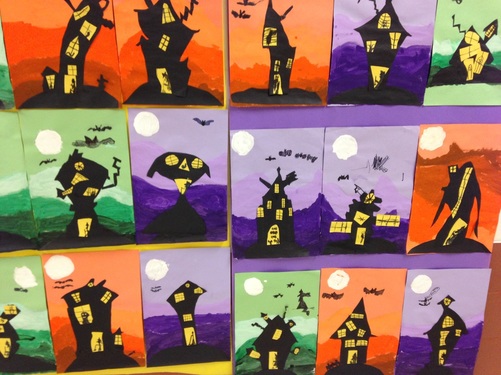 2nd graders recently learned about the Op artist, Bridget Riley. Ms. Riley is an artist from London who specializes in creating optical illusions in her artwork. Her artwork is usually large-scale because it has a more disorientating effect on the viewer when it is larger. The kids thought her artwork was super cool! They were blown away by the fact that even though the painting wasn't moving, it gave the effect that it was.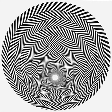 I had the pleasure of seeing this work by Ms. Riley when I was out in New York City a couple years ago. The kids started off the project by drawing straight and thin lines using a straight edge. They needed to make sure their lines were parallel or they wouldn't achieve the optical effect. Then they drew at least six geometric shapes. This led to a discussion on the difference between geometric and organic shapes. The next couple classes were spent talking about complementary colors which were used to color their artwork. Complementary colors are colors that are directly across from each other on the color wheel. I usually tell them to remember the Vikings (yellow and purple), Bears (blue and orange), and Christmas (red and green). When coloring, they were to alternate colors for each row.  Some students finished early so I drew up a large scale version of their project and let them color it in. Then we taped our artwork on top of it to hang in the hallway. |
Devon CalvertHarmony and Consolidated Elementary Art Teacher in Milton, WI. UW-Eau Claire graduate. WAEA President. Apple Teacher. 
Archives
March 2019
Categories
All
|


 RSS Feed
